Radio Button/Check Box/Combo Box Properties
|
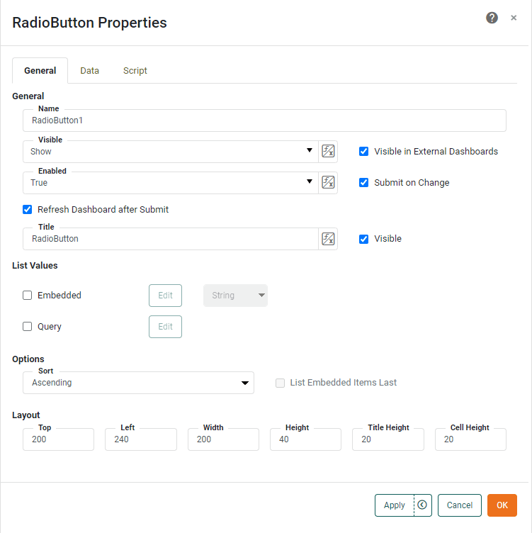
The ‘Properties’ panel for Radio Button, Check Box, or Combo Box provides General, Data, and Script tabs. The next sections discuss the Form-specific properties available under these tabs.
General Tab
The General tab in the ‘Properties’ panel provides the following unique properties for Radio Button, Check Box, and Combo Box.
- Submit on Change
-
When enabled (default), submits the selected value immediately upon selection. Otherwise, a separate ‘Submit’ button is required.
- Refresh Dashboard after Submit
-
Force the dashboard to refresh when the user submits a value from the Form component.
- List Values
-
Specifies the method for populating control labels and values. You can select one or both of the following. If you specify both, the results are merged.
-
Embedded: Manually enter label-value pairs. For Date or TimeInstant type data, select the ‘Calendar’ option to allow users to select values using a calendar interface. Enter the ‘Minimum Date’ and ‘Maximum Date’ to restrict the range of the calendar. For TimeInstant data, select ‘Server Time Zone’ to utilize server time rather than client time.
-
Query: Populate from a query (data block). See Dynamically Set Properties for information on how to use these options.
Optional: To specify a default value, disable the ‘No Default’ option, and choose the desired default from the ‘Default Value’ menu. In the case where the values and labels differ, the menu displays items as
label|value. -
- Sort
-
Specifies the sort order of the items, ‘Ascending’ or ‘Descending’. Enable ‘List Embedded Items Last’ to force items set via the ‘Embedded List Values’ dialog box to the end of the list (i.e., following any query-retrieved items).
- Editable
-
Allows the user to enter an arbitrary string into the Combo Box (in addition to selecting from the list options).
- Select First Item
-
For Check Box, selects the first item when the Dashboard loads (if no items are preselected).
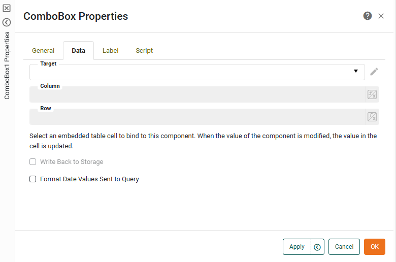
Data Tab
The Data tab in the ‘Properties’ panel provides the following unique property for Combo Box only. Other properties are the same as for Sliders and Spinners. See Slider/Spinner Properties.
- Format Date Values Sent to Query
-
A Date format code that should be used to format any date selected in the ComboBox before it is used in database query. Date format codes are explained in Date Format, but the following unique restrictions apply here:
-
Only the following format tokens are permitted:
y,M,d -
Only the following separators are permitted:
-,/,., comma, space -
A year token is required:
yyoryyyy -
A month token is required:
MorMM -
A day token is required:
dordd
-
Label Tab
The Label tab in the ‘Properties’ panel provides the following unique properties for Combo Box.
- Show Label
-
Displays a label for the Combo Box when selected.
- Label Text
-
The contents of the label. You can enter static text, or use Form components or script to set the contents by pressing the ‘Value Type’ button
 and selecting the ‘Variable’ or Expression’ option. See Dynamically Set Properties for more information.
 - Label Position
-
The position of the label relative to the component.
- Gap
-
The gap in pixels between the component and the label.
Script Tab
See Script Tab for information about this common tab.