Create a CSS File
| Example CSS File for samples of different CSS definitions by Class, ID, etc. |
To prepare the CSS definition file for a Dashboard, create a text file (UTF-8 format, without BOM) that contains the desired Class, ID, or Type definitions. Deploy the CSS file as described in Upload a CSS File. Formatting specified in the CSS file will be applied to all elements that are assigned the given Class or ID or that have the specified Type.
The CSS style for a given property (e.g., background-color) is applied in increasing order of specificity:
-
Global default (*): See CSS Global Default (*) for syntax.
-
CSS Type: See CSS Type and CSS Chart Palette for syntax.
-
CSS Type[attribute=value]: See CSS Type for syntax.
-
CSS Class: See CSS Class and CSS Table Style for syntax.
-
CSS ID: See CSS ID for syntax.
For example, a CSS property value assigned by CSS ID overrides the same property value set by CSS Type. See CSS Properties for details on which component properties (background color, line style, borders, etc.) can be assigned using CSS. See CSS Combinations for information on how to combine different CSS selectors.
| Formatting applied manually from the Format panel always overrides corresponding CSS style. |
CSS Global Dashboard
To specify a CSS definition for the Dashboard as a whole (such as setting a global background color), use the following syntax:
Viewsheet.className {
   background-color: #FFEEBB;
   ...
   ...
}
Viewsheet#IDName {
   background-color: #FFEEBB;
   ...
   ...
}
CSS Global Default (*)
The global default (*) type defines default CSS properties. For example:
* {
  background-color: yellow;
  color: red;
  alpha: 0.5;
  font-style: italic;
  font-weight: bold;
  font-size: 12px;
  font-family: arial;
  border-style: double;
  border-color: blue;
}
The values assigned to are used to set properties for *all CSS Types that do not have CSS explicitly assigned. For example, if a TableTitle style is not specifically defined, the properties for TableTitle are set by , and are therefore *not inherited from the TableTitle parent type, Table. Therefore, if you want to override a property assigned to * for a particular CSS Type, you must also supply overrides for any applicable child CSS Types as well.
To define global custom properties (variables), see CSS Variables.
CSS Type
To specify a CSS Type definition, use the following syntax:
CheckBox {
   background-color: #FFEEBB;
   ...
   ...
}
The Type definition applies styles universally to all elements of a particular type (e.g., all CheckBoxes). To define custom properties (variables) for a particular component type, see CSS Variables.
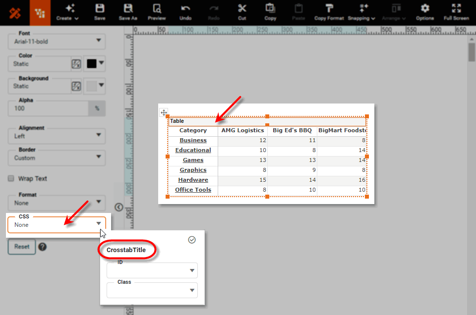
For Dashboard components, the ‘Type’ is displayed in the CSS pop-up in the Format panel. See Add Visual Format for a list of all available CSS component types.
CSS Table Style
To specify a CSS TableStyle definition, use the following syntax.
.className TableStyle[region='region'] {
   ...
   ...
}
For example, to define a class grayHeader that sets the background color of header rows to gray, use the following:
.grayHeader TableStyle[region=HeaderRow]{
   background-color: gray;
}
Use TableStyle without attributes to define global default formatting for tables:
.className TableStyle {
   ...
   ...
}
See CSS Table Style for details on which table regions can be styled using CSS.
CSS Chart Palette
To specify a CSS ChartPalette color definition for color index n, use the following syntax:
ChartPalette[index='n'] {
color: azure;
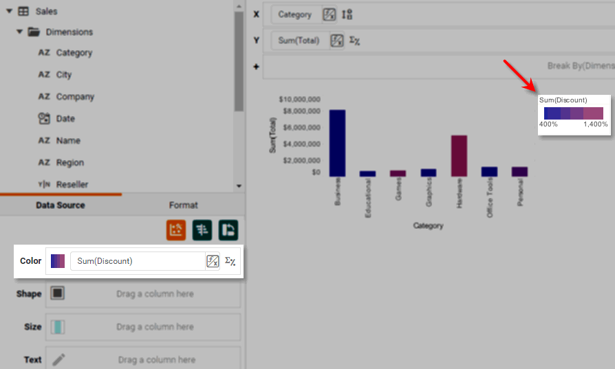
}If a chart uses a gradient color scheme (as, for example, when a measure is placed in the ‘Color’ region of the Visual panel), you can set the starting and ending colors using the CSS ChartPalette color definition as follows:
ChartPalette[index='1'] {
  color: blue;
}
ChartPalette[index='2'] {
  color: red;
}
What is a measure? What is a dimension?A measure is generally used for aggregation, for example summation, averaging, correlation, etc., within a Crosstab, Chart, Text component, or Gauge. Adding a measure to the ‘Y’ region in a chart displays the computed aggregates by using locations on the Y-axis. Adding a measure to the ‘X’ region displays the computed aggregates by using locations on the X-axis. You can also display aggregates by using color, shape, size, or label. A dimension is used to break-down the dataset into multiple groups, often within a Crosstab, Chart, or Selection List. Adding a dimension to the ‘X’ region of a Chart distinguishes the different dimension groups by location on the X-axis. Adding a dimension to the ‘Y’ region distinguishes the different dimension groups by location on the Y-axis. You can add multiple dimensions into the ‘X’ or ‘Y’ regions of a Chart, or into the ‘Rows’ or ‘Columns’ regions of a Crosstab, to create multiple grouping levels. You can also distinguish groups in a dimension by using color, shape, size, or label in a Chart. |
A ChartPalette specification can be combined with CSS Class to tailor the palette to charts with a particular class. See CSS Combinations for an example.
CSS Class
To specify a CSS Class definition, use the following syntax:
.className {
   background-color: yellow;
   ...
   ...
}
For example:
.Header3 {
   background-color: yellow;
   font-size: 24px;
   font-family: arial;
}
See Add Visual Format in Visualize Your Data for information on how to assign a CSS Class or ID to a Dashboard component.
CSS ID
To specify an CSS ID definition, use the following syntax:
#id {
   background-color: #FFEEBB;
   ...
   ...
}
For example:
#SalesTable {
   background-color: yellow;
   font-size: 10pt;
   font-family: arial;
}
See Add Visual Format in Visualize Your Data for information on how to assign a CSS Class or ID to a Dashboard component.
CSS Combinations
To restrict a Type style to a particular Class, use the CSS Type and Class in combination.
To apply a blue color to table titles that have class ‘SalesTable’, use the following syntax:
TableTitle.SalesTable {
   color: blue;
}To apply a blue color to the third color in the chart palette for charts having class ‘SalesChart’, use the following syntax:
Chart.SalesChart ChartPalette[index="3"] {
   color: blue;
}| The initial ‘Chart’ qualifier can be omitted. |
To apply an alternating-row yellow TableStyle to tables with class ‘SalesTable’, use the following:
Table.SalesTable TableStyle[region=Body][pattern=OddRow] {
   background-color: yellow;
}| The initial ‘Table’ qualifier can be omitted. |
Because the Dashboard designer can only assign a Class or ID that is appropriate for the Type of the given component, you can use a single Class name or ID name to assign different styles to different component types. Consider the following CSS definition:
#Highlight {
   background-color: red;
}
Chart#Highlight {
   background-color: pink;
}
Table#Highlight {
   background-color: magenta;
}
In this case, when the Dashboard designer selects the ‘Highlight’ ID for a Chart component, the CSS applies a pink background. When the Dashboard designer selects the ‘Highlight’ ID for a Table component, the CSS applies a magenta background. When the Dashboard designer selects the ‘Highlight’ ID for any other component type, the CSS applies a red background.
See Add Visual Format in Visualize Your Data for information on how to assign a CSS Class or ID to a Dashboard component.
CSS Variables
A CSS variable allows you to easily refer to a value that occurs throughout the CSS definition file. For example, if several CSS properties use primary color rgb(165,69,172), you can define a variable called “primary-color” to refer to this value in CSS definitions. This makes it much easier to implement changes to the style, because you can simply change the variable definition in one place rather than searching for all the occurrences of the value in the CSS file.
Define a variable for the scope of a particular component type (e.g., Text) as follows. (See CSS Type for more about available component types.)
Text  {
   --primary-color: rgb(165, 69, 172);
}
You can then use the variable in any CSS definitions for components of that type. For example, you can style Text components that have class “Header3” as follows:
.Header3 {
   background-color: var(--primary-color);
   font-size: 24px;
   font-family: arial;
}
To define a variable that should be available for ALL component types, define the variable in the CSS Global Default (*) block, for example:
* {
   --primary-color: rgb(165, 69, 172);
   font-style: italic;
   font-weight: bold;
   font-size: 12px;
   font-family: arial;
   border-style: double;
   border-color: blue;
}
You can then proceed to use the “primary-color” variable to apply the specified color for ANY component’s color property, for example:
Chart {
   background-color: var(--primary-color);
}
CSS Export Control
To suppress specified CSS styling when the dashboard is exported, use the following construction:
Viewsheet[print=false] {
   // style definitions
}
For example, to remove CSS style {background-color: #7589e2; color: #BE2945; font-family: "Dialog";} when a dashboard is exported (and replace it with default non-CSS style), add the following definition to the CSS file:
Viewsheet[print=false] {
   background-color: #7589e2;
   color: #BE2945;
   font-family: "Dialog";
}
You can combine Viewsheet[print=false] with other selectors as well, for example:
Viewsheet[print=false] Chart ChartTitle {
   background-color: #7589e2;
   color: #BE2945;
   font-family: "Dialog";
}
See CSS Combinations for more about selector combinations.