Create a Freehand Table
| Access Component Data in Advanced Dashboard Scripting for information on how to reference cells in a Freehand Table. |
A Freehand Table is an advanced component that provides greater layout flexibility than a Table or Crosstab, and also allows the use of formulas in table cells.
Why Create a Freehand Table?
A Freehand Table is an advanced component that enables you to perform groupings and layouts that are not possible in a Crosstab or Regular Table. Most Freehand Tables strongly resemble Crosstabs, but have the following features that you cannot create in a Crosstab.
- Multiple groupings that are NOT hierarchical
-
For example, a Crosstab can display the hierarchical grouping . But a single Crosstab cannot display independent groupings for State and City that are NOT hierarchical. You can only do this in a Freehand Table.
- Cells that compute formulas
-
For example, a Crosstab can display row totals or column totals. But if you want a column that compares values from this Table to values in a different Table or other component, you will need to create a formula cell that performs the desired computation. You can only do this in a Freehand Table.
Because Freehand Tables are usually very similar to Crosstab Tables, it is easiest to create a Crosstab Table that is as “close as possible” to your desired result, and then convert the Crosstab to a Freehand Table, and make the final adjustments. See Convert a Table or Crosstab for instructions on how to do this.
Convert a Table or Crosstab
Watch Video: Add Formulas to Table (Convert to Freehand Table)
This video might show an earlier version of the feature or operation that differs in minor ways from the current version.
You can create a Freehand Table by converting a Table or Crosstab. (This conversion cannot be reversed.) Follow the steps below:
-
Create a Table or Crosstab that is as close as possible to the result that you want. See Create a Table and Create a Crosstab for more details about these components.
The Table Editor and Crosstab Editor are simpler than the Freehand Table Editor, so it is recommended to use these tools for as much of the table design as possible. -
Right-click on the Table or Crosstab and select ‘Convert to Freehand Table’. Note: You can also access menu options from the ‘More’ button (
 ) in the mini-toolbar.
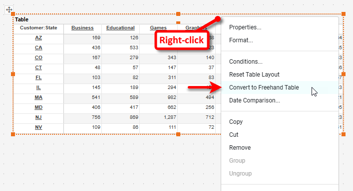
The Table or Crosstab is now a Freehand Table, and can only be edited with the Freehand Table Editor.
-
Press the ‘Edit’ button
 to open the Freehand Table Editor.
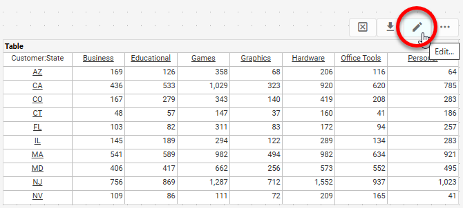
-
Proceed to edit the Freehand Table using the Editor as described in Create a New Freehand Table below.
Create a New Freehand Table
Watch Video: Add Formulas to a Table (Create New Freehand Table)
This video might show an earlier version of the feature or operation that differs in minor ways from the current version.
To create a new Freehand Table, follow the steps below:
Add the Freehand Table
-
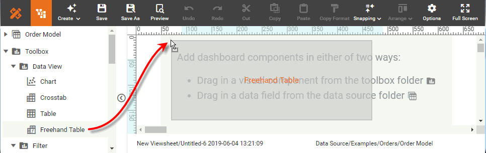
Drag a Freehand Table from the Toolbox panel into the Dashboard.
-
Press the ‘Edit’ button
in the top-right corner of the Freehand Table.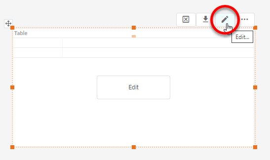
This opens the Freehand Table Editor.
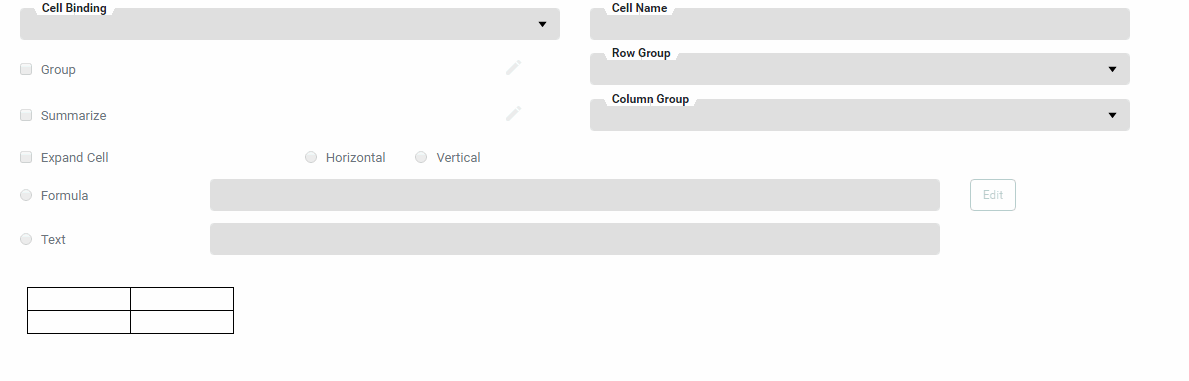
Bind Data to the Freehand Table
-
Drag the desired fields from the data source into the table diagram in the binding dialog box.
A field name is not permitted to contain the “?” symbol when used in a Freehand Table. To display data from such a field, first create a copy of the field as a Calculated Field or as an Expression Column with a legal name (see Create a New Data Field in Prepare Your Data). 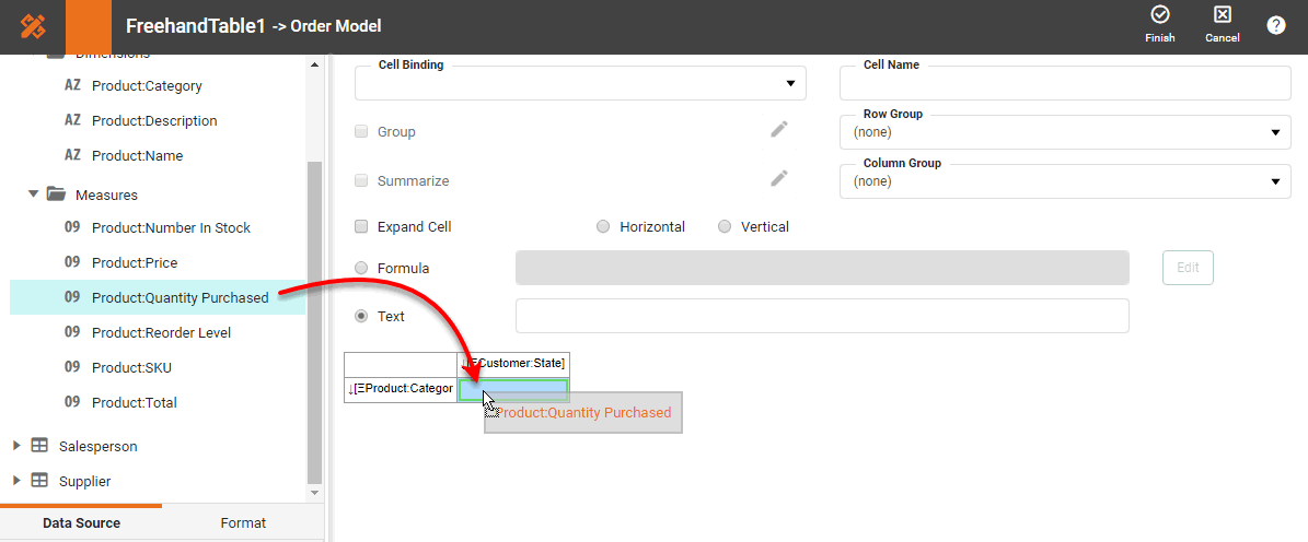
If the Dashboard contains other Tables or Crosstabs, you can use the data in those components as the data source. Simply expand the ‘Components’ folder, and select the desired fields.
There are two restrictions on binding a component to another component’s data:
-
This option is not available in meta-data mode. See Dashboard Options for information about meta-data mode.
-
You will not be able to filter the component using a Selection List or Range Slider. However, you can still filter the component by using a condition (see Add Conditions).
-
Edit a Dimension
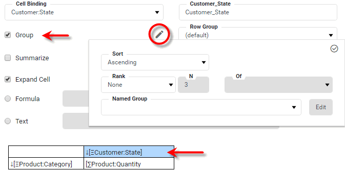
-
Optional: Click on any dimension that you want to group, and select the ‘Group’ option. Press the ‘Edit’ button
next to the ‘Group’ option.What is a dimension?
A dimension is used to break-down the dataset into multiple groups, often within a Crosstab, Chart, or Selection List. Adding a dimension to the ‘X’ region of a Chart distinguishes the different dimension groups by location on the X-axis. Adding a dimension to the ‘Y’ region distinguishes the different dimension groups by location on the Y-axis. You can add multiple dimensions into the ‘X’ or ‘Y’ regions of a Chart, or into the ‘Rows’ or ‘Columns’ regions of a Crosstab, to create multiple grouping levels. You can also distinguish groups in a dimension by using color, shape, size, or label in a Chart.
-
Specify the desired sorting and ranking for the group. Follow the steps below:
Sort and RankApply Basic Sorting below, to sort ungrouped data. -
In the ‘Sort’ menu, specify how the values in the field should be ordered. ‘Ascending’ and ‘Descending’ sort the values in alphabetical or reverse-alphabetical order. ‘By Value (Asc)’ and ‘By Value (Desc)’ sort the values according to the aggregate measure selected in the adjacent menu.
What is a measure?
A measure is generally used for aggregation, for example summation, averaging, correlation, etc., within a Crosstab, Chart, Text component, or Gauge. Adding a measure to the ‘Y’ region in a chart displays the computed aggregates by using locations on the Y-axis. Adding a measure to the ‘X’ region displays the computed aggregates by using locations on the X-axis. You can also display aggregates by using color, shape, size, or label.
To specify an arbitrary sort order, select the ‘Manual’ option in the ‘Sort’ menu, and press the ‘Edit’ button
to open the ‘Manual Ordering’ dialog box. To reorder an item in the ‘Manual Ordering’ dialog box, select the item and press the Up or Down buttons. Press OK to close the dialog box.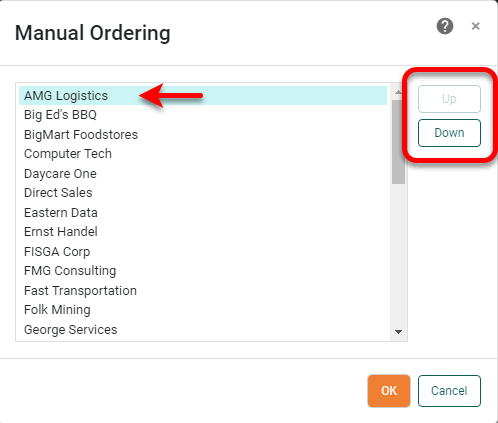
-
For a Date-type field, select the desired level of date grouping (‘Year’, ‘Month’, etc.) from the ‘Level’ menu. Optional: Select ‘As time series’ to force the display of date groups even when the group has no data. In this case the cell is filled either with a null value or with a zero (if the 'Fill Blank Cell With Zero' option is enabled on the Advanced tab of the ‘Table Properties’ dialog box.)
-
In the ‘Rank’ menu, select the ‘Top’ or ‘Bottom’ filter, and specify the (integer) number of top or bottom groups to select. In the adjacent menu, specify the measure by which groups should be ranked.
Select ‘Group all others together’ to create an “Others” category which represents (in aggregate) all the groups excluded by the Top/Bottom ranking filter.
-
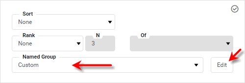
To apply a reusable custom grouping, select the desired custom grouping from the ‘Named Group’ menu. See Named Grouping in Prepare Your Data for information on how to create named groups in a Data Worksheet.
To apply a custom grouping only to this particular table (rather than applying a reusable grouping), select the ‘Custom’ option from the ‘Named Group’ menu. Then follow the steps below:
-
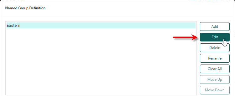
Choose the ‘Custom’ option from the ‘Named Group’ menu. Then press the Edit button.
This opens the ‘Named Group Definition’ dialog box.
-
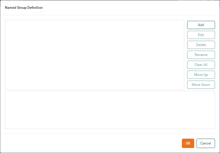
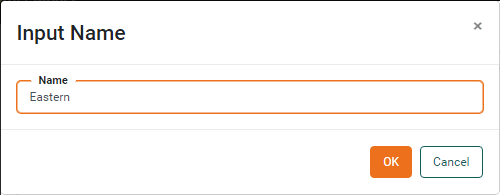
Press the Add button to create a new named group. Enter the name of the group and press OK.
-
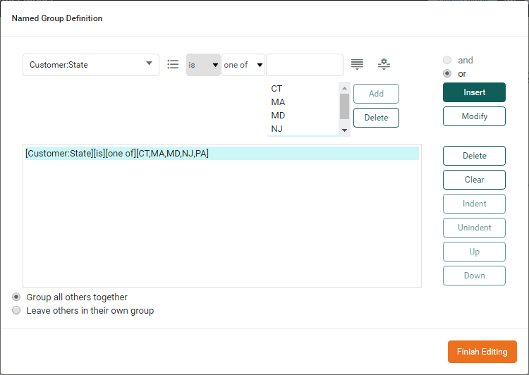
Press the Edit button to open the condition editor.
-
Specify the condition that defines the values that belong to the group. (See Add Conditions for more information about how to specify a condition.)
-
Press Finish Editing to close the Editor.
-
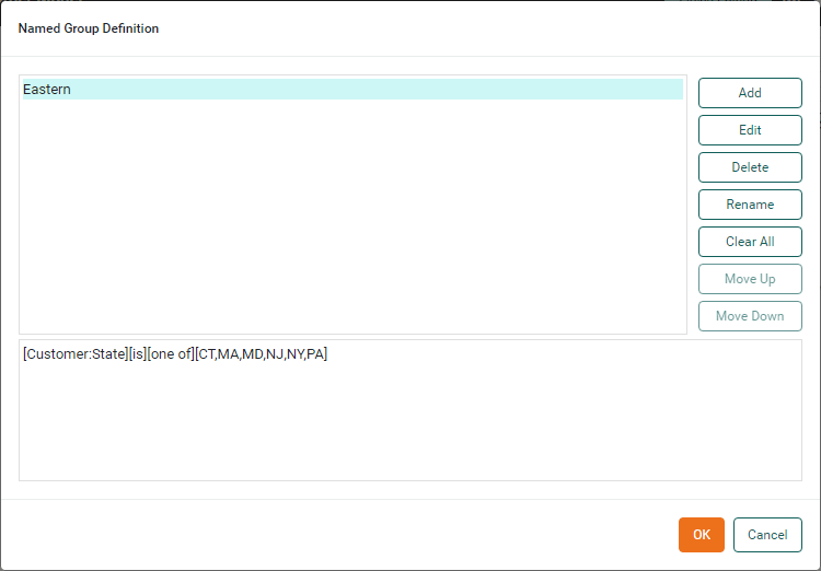
Repeat the above steps to add additional groups. Select ‘Group all others together’ to combine unassigned values into a single group called ‘Others’. Select ‘Leave others in their own group’ to allow unassigned values to each remain in their own group. When you have added all groups, press OK to return to the ‘Group’ panel.
-
Press the ‘Apply’ button
 to close the panel.
-
-
Edit a Measure
-
Optional: Click on any measure that you want to aggregate, and select the ‘Summarize’ option. Press the ‘Edit’ button
next to the ‘Summarize’ option.What is a measure?
A measure is generally used for aggregation, for example summation, averaging, correlation, etc., within a Crosstab, Chart, Text component, or Gauge. Adding a measure to the ‘Y’ region in a chart displays the computed aggregates by using locations on the Y-axis. Adding a measure to the ‘X’ region displays the computed aggregates by using locations on the X-axis. You can also display aggregates by using color, shape, size, or label.
Select the aggregation method. If you select a bivariate aggregation measure (e.g., ‘Correlation’, ‘Weighted Average’, etc.), select the second operand (column) from the ‘with’ menu. Optional: To display the measure as a percentage of the grant total, select the ‘Percentage’ option.
Watch Video: Add Formulas to a Table (Set Aggregation)
This video might show an earlier version of the feature or operation that differs in minor ways from the current version.
-
Press OK.
Change Cell Expansion
-
For any field that returns an array of values, Select ‘Expand Cell’ and set the expansion direction (‘Horizontal’ or ‘Vertical’).
Watch Video: Add Formulas to a Table (Set Cell Expansion)
This video might show an earlier version of the feature or operation that differs in minor ways from the current version.
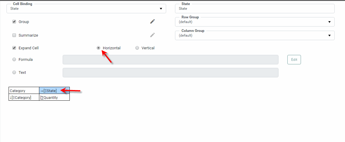
If the cell expansion results in duplicated entries, enable the ‘Merge Expanded Cell’ option in the bottom left panel. This is a useful way to simplify the table when expanded cells all contain the same text, or when borders between the cells are undesirable. If the cells are not merged correctly by default, you may need to explicitly select the ‘Row Group’ or ‘Column Group’ for the merge. These settings determine which particular fields the merge should follow in the row and columns directions.
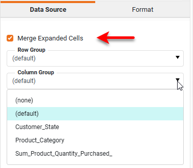
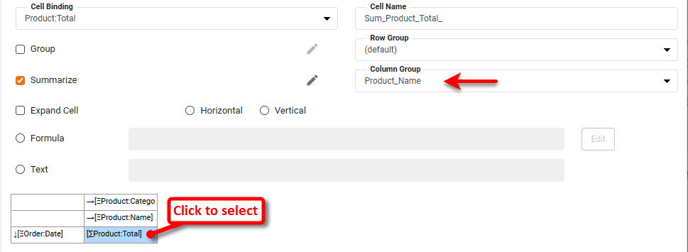
You may also need to set the appropriate ‘Row Group’ or ‘Column Group’ for the summarization, as shown below. To do this, click an aggregate field in the table diagram, and assign the desired grouping dimension from the ‘Row Group’ or ‘Column Group’ menus.
Add Formula Cells
-
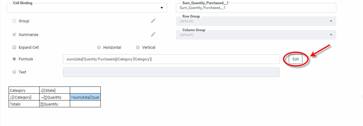
Optional: To populate a cell using script, press the ‘Edit’ button at the bottom of the dialog box. This opens the Script Editor and allows you to create a calculation based on cell values, parameter values, component values, or values from any accessible Data Worksheet.
Watch Video: Add Formulas to a Table
This video might show an earlier version of the feature or operation that differs in minor ways from the current version.
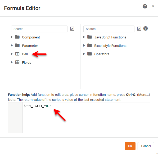
 Reference a Cell
Watch Video: Add Formulas to a Table (Reference Table Values)
This video might show an earlier version of the feature or operation that differs in minor ways from the current version.
Refer to the value in a cell of the table by using syntax
$cell_name, where cell_name is the name assigned in the ‘Cell Name’ field for the cell being referenced.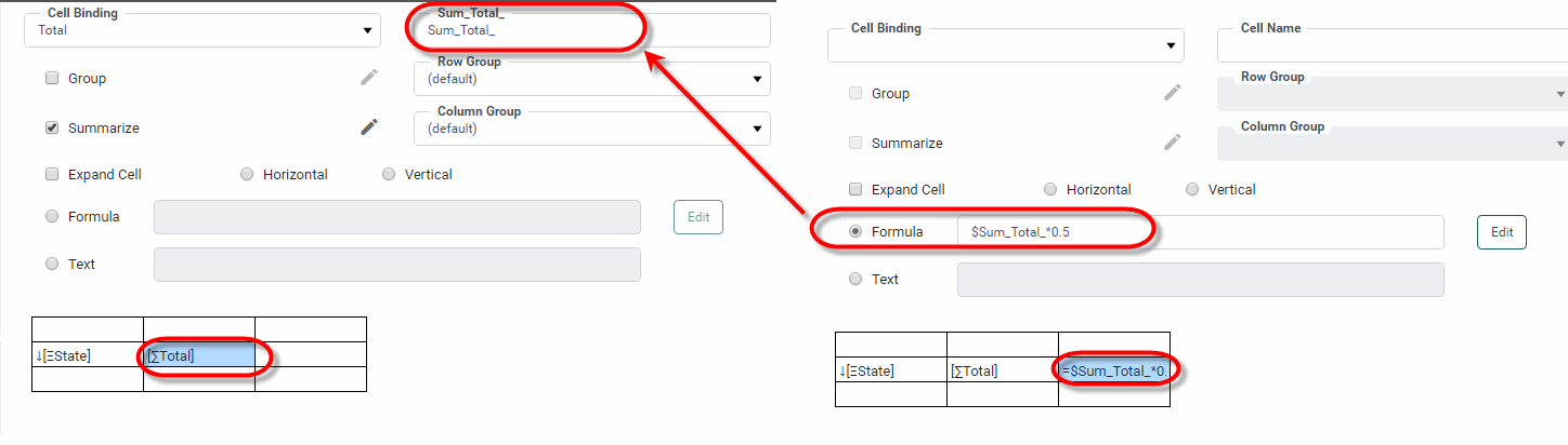
You can insert this reference easily by selecting the field name from the ‘Cell’ folder in the editor. See Table/Crosstab Components in Access Component Data for more advanced cell reference syntax.
To access the underlying data block, use the keyword
data. For example,toList(data['Company'],'sort=desc')returns a unique sorted list of values from the ‘Company’ field of the table’s underlying data block. Use query-style syntax to select data that matches a specified condition. For example,toList(data['Product@Category:$CategoryCell'])returns the value from field ‘Product’ where the value in field ‘Category’ matches the value in the cell named ‘CategoryCell’.Remember to set the ‘Expand Cell’ option for any expression that returns an array of values. See the following sections for more information on how to reference data within a Freehand Table:
-
Reference Query Data for a variety or data referencing techniques.
-
Reference Datasource Data to reference data from other data blocks in the underlying Data Worksheet.
-
Run a Query from Script for more information on using
runQuery()to reference data from an arbitrary Data Worksheet.
-
Add Rows and Columns
-
To add rows and columns, right-click on a cell in the table diagram and select the desired option from the context menu (‘Insert Rows/Columns’, ‘Insert Row’, ‘Append Row’, ‘Insert Column’, ‘Append Column’). To remove a row or column, right-click on a cell in the table diagram and select the desired option from the context menu (‘Delete Row’ or ‘Delete Column’).
Watch Video: Add Formulas to a Table (Add Rows or Columns)
This video might show an earlier version of the feature or operation that differs in minor ways from the current version.
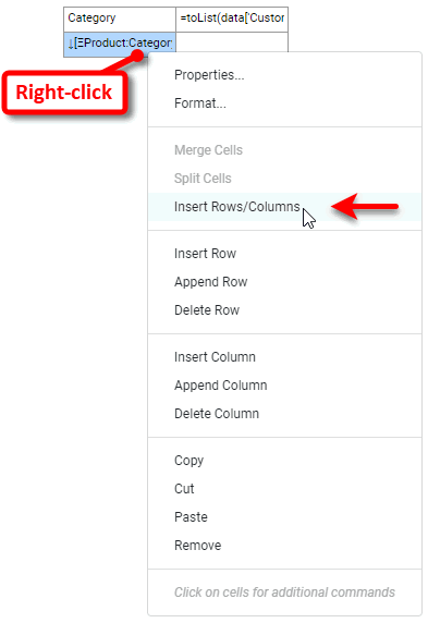
To combine multiple cells into a single cell, Ctrl-click to select the desired cells in the table diagram, then right-click and select ‘Merge Cells’. This is useful when the addition of new rows or columns creates undesired blank cells. Merge these cells together so that a single label or value can be placed in the merged cell. This is typically used for static cells; see above for information on merging expanding cells.
Add Formatting
-
To add formatting to any cell (column or row), select the desired cell or cells, and then select the Format tab in the left panel. See Add Visual Format and Add Data Format for more information about formatting options.
Watch Video: Add Formulas to a Table (Set Date Format)
This video might show an earlier version of the feature or operation that differs in minor ways from the current version.
-
Press the ‘Finish’ button
to close the Editor.
Proceed to format and style the Freehand Table as you would for any Table. See Configure Table Appearance for more information about how to apply styles.
Apply Basic Sorting
| Sort and Rank above to sort groups within a Freehand Table. |
Freehand Tables do not have the ‘Sort’ button  that you find in the column headers of Regular Tables. To perform simple column sorting on a Freehand Table, follow the steps below:
-
Right-click the Freehand Table and select ‘Sorting’ from the menu. Note: You can also access menu options from the ‘More’ button (
) in the mini-toolbar.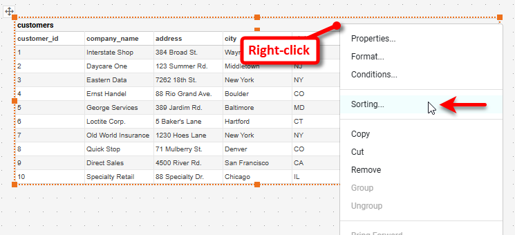
This opens the ‘Sorting’ dialog box.
-
Press the ‘Sort’ button
next to field you want to sort.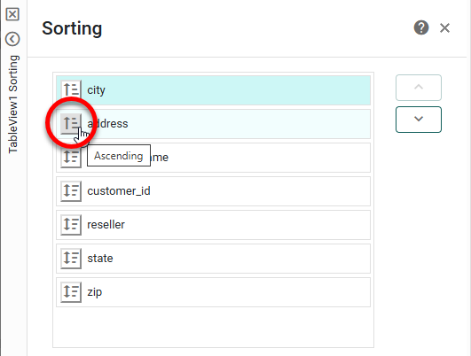
Press once to sort the items in ascending numerical or alphabetical order. Press the button again to sort in descending numerical or reverse alphabetical order. Press the button a third time to reset the original order. When a column is sorted, its sort order is indicated by a ascending-sort arrow
 or descending-sort arrow
  next to the field name.
 -
Optional: For fields with a sort option selected, change the sort priority by pressing the ‘Move Up’ button
 or ‘Move Down’ button
  .
. -
Press OK to close the dialog box and apply the sorting.