Multiple Measure Chart
|
See Also…
Multiple Style Chart, to assign different chart styles to different measures. |
You can display multiple measures by using visual properties (color, shape, size) or by using multiple axes. These approaches are described below.
What is a measure?A measure is generally used for aggregation, for example summation, averaging, correlation, etc., within a Crosstab, Chart, Text component, or Gauge. Adding a measure to the ‘Y’ region in a chart displays the computed aggregates by using locations on the Y-axis. Adding a measure to the ‘X’ region displays the computed aggregates by using locations on the X-axis. You can also display aggregates by using color, shape, size, or label. |
Color, Shape, Size
To display multiple measures using color, size, shape or label representations, drag a desired measure field from the Data Source panel to the ‘Color’, ‘Shape’, ‘Size’, or ‘Text’ region. See Basic Charting Steps for more details.
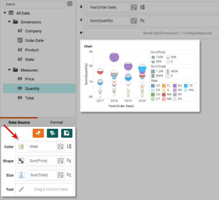
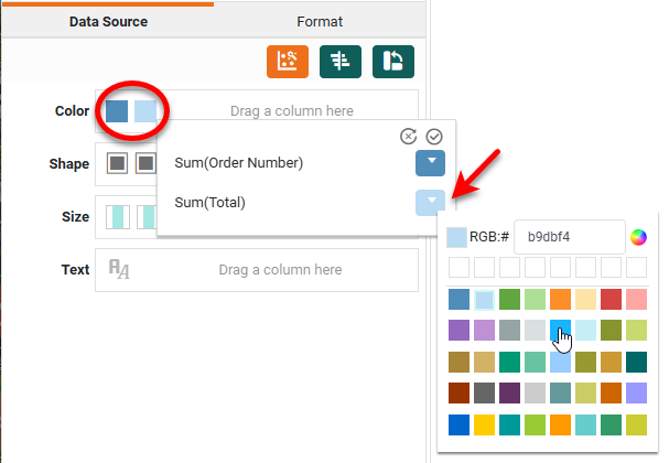
To change the visual appearance (color, shape, size) of the measures independently, press the ‘Edit Color’, ‘Edit Shape’, or ‘Edit Size’ buttons in the Visual panel. This allows you to use different sizes and different shapes such as triangles and circles to represent your measures.
Single Axis
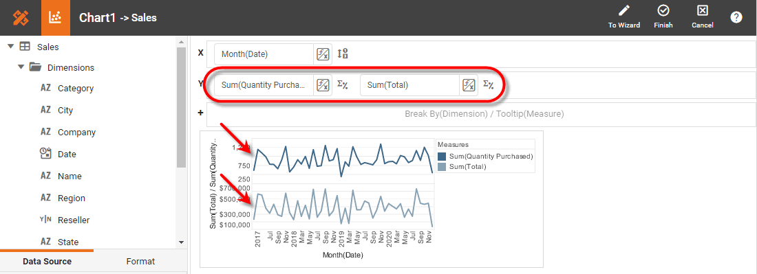
By default, when you add two or more measure fields on the Y-axis, the selected data sets are plotted on adjacent sets of axes, as shown below:
In some cases you may want to display the measures on the same axis. To do this, press the ‘Switch to Single Graph’ button  in the Chart Editor.
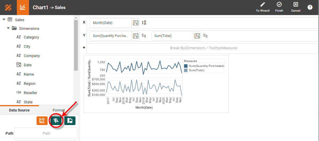
This fits both data sets on the same set of axes.
In either case, you can change the visual appearance (color, shape, size) of the measures independently by pressing the ‘Edit Color’, ‘Edit Shape’, or ‘Edit Size’ buttons in the Visual panel.
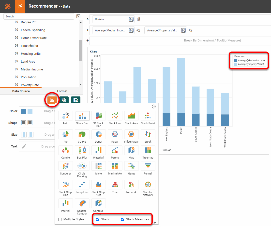
Stack
For some chart types, you can choose to stack multiple measures on top of each other. To do this, follow the steps below:
-
Press the ‘Switch to Single Graph’ button
as shown above. -
Press the ‘Select Chart Style’ button
 , and choose a style that supports measure stacking (Bar, Line, Area, Point, Step Line, or Step Area).
 -
Select the ‘Stack’ option. This displays a ‘Stack Measures’ option.
-
Select the ‘Stack Measures’ option.
-
Press the ‘Apply’ button
 .
.
| When you set a Chart to use the ‘Stack’ option, data values are not displayed at their corresponding locations on the axis, but are offset to create the stacking effect. |
To change the visual appearance (color, shape, size) of the measures independently, press the ‘Edit Color’, ‘Edit Shape’, or ‘Edit Size’ buttons in the Visual panel.
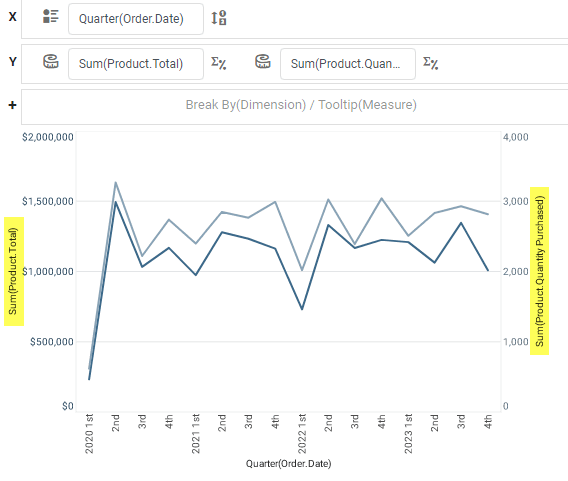
Dual Axis
If the single axis is not appropriate for both measures, for example when one measure has much larger values than the other, you can create a secondary Y-axis on the right side of the chart. See Dual Axis Chart for more details.