Modify Chart Element
The Chart API provides access to charting engine commands using Java object syntax. You can use these commands to directly modify the graphical elements displayed by a Chart, as explained below. To create a Chart entirely using script (rather than modifying an existing Chart), see Create a Chart with API. To change the data displayed on the chart, see Modify Chart Data Binding.
Walkthrough
In this example, you will first bind a chart to a data source, and then make further modifications to the Chart display by using Chart API commands. Follow the steps below:
-
Create a Dashboard. Select the ‘All Sales’ Data Worksheet as the data source. (See Create a New Dashboard.)
The ‘All Sales’ Data Worksheet can be found in the folder. You may need to download the examples.zip file from GitHub into your environment. (This requires access to Enterprise Manager.) See Import and Export Assets for instructions on how to import. -
Add a new Chart component to the Dashboard. (The default name of this Chart is “Chart1”.)
-
Press the ‘Edit’ button
 at the top-right of the Chart to open the Visualization Recommender. Then press the ‘Full Editor’ button at the top right of the Recommender to open the Chart Editor.
 -
Expand the ‘All Sales’ data block. Drag the ‘Employee’ field to the ‘X’ region.
-
Follow the steps below to bind the ‘Total’ field so that it provides three different measures (maximum, minimum, and average) on the chart:
-
From the ‘All Sales’ source, drag the ‘Total’ field to the ‘Y’ region.
-
Press the ‘Edit Measure’ button
 next to the ‘Total’ field. Set the ‘Aggregate’ to ‘Max’, and press the ‘Apply’ button
  .
. -
From the ‘All Sales’ source, drag the ‘Total’ field (a second time) to the ‘Y’ region.
-
Click the ‘Edit Measure’ button
next to the second ‘Total’ field. Set the ‘Aggregate’ to ‘Min’, and click the ‘Apply’ button . -
From the ‘All Sales’ source, drag the ‘Total’ field (a third time) to the ‘Shape’ region of the ‘Visual’ area.
-
Click the ‘Edit Measure’ button
next to the third ‘Total’ field. Set the ‘Aggregate’ to ‘Average’, and click the ‘Apply’ button .
-
-
Press the ‘Select Chart Style’ button
 . Double-click to select the Point Style chart.
 -
Click the ‘Preview’ button
 the toolbar to preview the Dashboard.
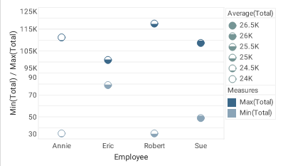
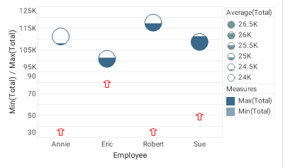
The chart shows maximum and minimum totals for each employee, and the chart shape-coding (interior fill) displays the average totals.
Note that the interior fill, ‘Average(Total)’, is the same for both datasets, so it is not needed in both locations. In the next steps, you will change the ‘Min(Total)’ markers to a solid red arrow-shape. You will also increase the size of the ‘Max(Total)’ markers so that the fill level is more visible. To make these changes, you will use Chart API functions.
Chart API script which operates on the Chart’s EGraphproperty should be placed in element-level script. -
Open the Script Editor: Right-click the Chart and select ‘Properties’ from the context menu. Then select the Script tab.
-
Use script commands to create the required StaticShapeFrame, StaticColorFrame, and StaticSizeFrame objects:
// Create arrow-shaped markers: var shpframe = new StaticShapeFrame(GShape.ARROWBAR); // Create static red color: var colframe = new StaticColorFrame(java.awt.Color(0xFF0000)); // Create static size of 10 pixels: var sizframe = new StaticSizeFrame(10); -
Obtain a handle to each of the two datasets (element sets) by using the EGraph.getElement(index) method.
var elem0 = graph.getElement(0); // Max point element var elem1 = graph.getElement(1); // Min point element -
Assign the visual frames to the appropriate data elements using the element’s GraphElement.setShapeFrame(frame), GraphElement.setColorFrame(frame), and GraphElement.setSizeFrame(frame) properties.
elem1.shapeFrame = shpframe; // Min point element elem1.colorFrame = colframe; // Min point element elem0.sizeFrame = sizframe; // Max point element -
Close the Script Editor, and press ‘Preview’ button
to preview the Dashboard.