Range Slider Properties
|
The ‘Range Slider Properties’ panel provides General, Data, Advanced, and Script tabs. The next sections discuss the component-specific properties available under these tabs.
General Tab
Only the standard properties are available. See General Tab for information about this common tab.
Data Tab
The Data tab in the ‘Range Slider Properties’ dialog box provides the following Range Slider-specific properties:
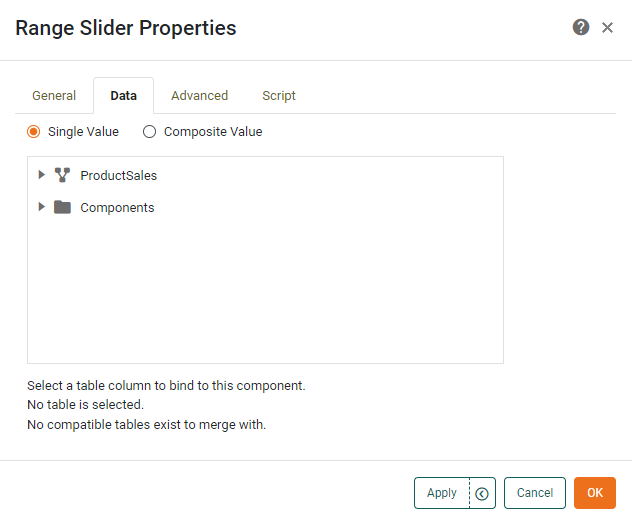
- Single Value
-
Filter data based on one field from the data block (default). Only numeric and date type fields are supported.
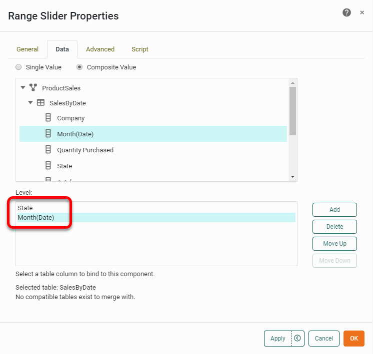
- Composite Values
-
Filter data based on the composition of two or more fields from the data block. All data types are supported. Simply select two or more columns to form the composite value for filtering.
Advanced Tab
The Advanced tab in the ‘Range Slider Properties’ panel provides the following Range Slider-specific properties.
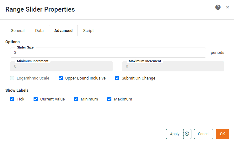
- Slider Size
-
The range of data that is displayed at a given time. There are three cases:
-
String: For string-type fields, the ‘Slider Size’ specifies the number of “periods,” i.e., the number of consecutive (alphabetically ordered) values that should be simultaneously selected.
-
Numeric: For numeric-type fields, the ‘Slider Size’ specifies the number of ‘Minimum Increment’ periods spanned by the slider. The total numerical range simultaneously selected is therefore ‘Slider Size’ × ‘Minimum Increment’.
-
Date: For date-time type fields, ‘Slider Size’ specifies the number of periods to be simultaneously selected, where the period duration is given by the adjacent popup menu: ‘Year’, ‘Month’, ‘Day’, ‘Hour’, or ‘Minute’. For date type fields, the options are ‘Year’, ‘Month’, and ‘Day’. For time type fields, the options are ‘Hour’ and ‘Minute’.
For ‘Day’, ‘Hour’, and ‘Minute’ settings, if the number of ticks exceeds 1500, the range size is automatically adjusted to yield a smaller number of ticks. To create a coarser range selection (e.g., date based on “quarter of year” or string based on “first letter”,) create the appropriate groupings in the Data Worksheet. See Group and Aggregate Data in Prepare Your Data for more information. The ‘Slider Size’ can also be adjusted graphically in the Dashboard by dragging the slider endpoints. See Add Filter Components for more about using Range Sliders.
-
- Minimum Increment
-
For numeric-type fields, this is the smallest amount by which the range can be adjusted.
- Maximum Increment
-
Specifies the largest range that the user can specify. The units are the same as the ‘Slider Size’.
- Upper Bound Inclusive
-
Specifies that the upper bound of the selected range is included in the selection. (For example, if the user sets the slider upper limit to “10”, the result set includes data with values of “10” for this field).
- Logarithmic Scale
-
Sets logarithmic scaling for the slider, which is useful for traversing large numerical ranges. The logarithm base is selected automatically.
- Label
-
The labels to display on the Range Slider:
-
Tick: Show the increments by which the slider can be adjusted.
-
Current Value: Permanently display the slider value above the slider.
-
Minimum: Show the minimum slider value at the left of the slider.
-
Maximum: Show the maximum slider value at the right of the slider.
-
Script Tab
See Script Tab for information about this common tab.