Chart Properties
|
To open the ‘Chart Properties’ panel, right-click body of the chart, and select ‘Properties’ from the context menu. Note: You can also access menu options from the ‘More’ button ( ) in the mini-toolbar. The ‘Chart Properties’ panel provides the following tabs: General, Advanced, Line, Hierarchy, Script.
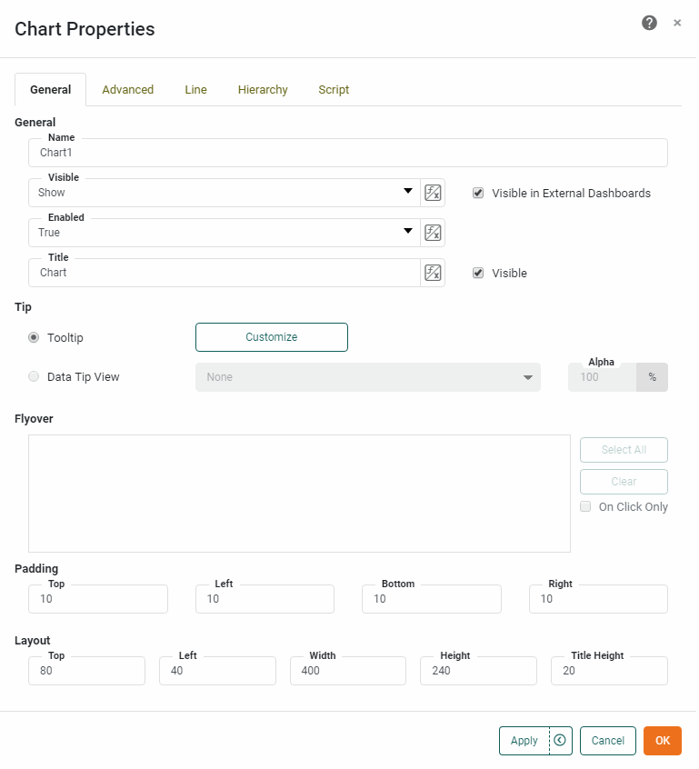
General Tab
The General tab in the ‘Chart Properties’ panel provides the following Chart-specific properties.
Properties that offer the ‘Value Type’ button  can also be set by the user (‘Variable’) or by scripted logic (‘Expression’). See Dynamically Set Properties for more information. can also be set by the user (‘Variable’) or by scripted logic (‘Expression’). See Dynamically Set Properties for more information.
|
- Tip
-
-
Tooltip: Value is displayed as a tooltip when the mouse hovers over the corresponding chart area. To display custom HTML in the tooltip, see Add Tips to a Chart.
-
Data Tip View: A Dashboard component is displayed when the mouse hovers over the chart area. The component is filtered based on the hover region. See Add Tips to a Chart for more details.
-
Flyover Views: Allows you to select a set of Dashboard components which will be adaptively filtered as the user hovers the mouse or clicks on the chart area. (Select ‘On Click Only’ if you want the filtered components to update when the user clicks.) See Drill Down into Data for more details.
-
Advanced Tab
The Advanced tab in the ‘Chart Properties’ panel provides the following properties. The available properties depend on the Chart type; some properties are not available for certain chart types. (See Basic Charting Steps for information on how to select the Chart type.)
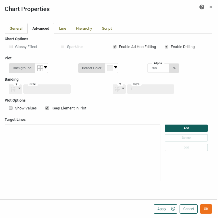
Chart Options
- Glossy Effect
-
Applies a 3D effect to the Chart as a whole. (Not available for all Chart styles.)
- Sparkline
-
Hides all axes and legends. For a line chart, the ‘Sparkline’ also adds a point to the end of the line, and for a bar chart, displays negative values in red.
- Enable Ad Hoc Editing
-
Allow end users to access the Chart Editor and edit the chart.
- Enable Date Comparison
-
Enables the Date Comparison feature for the Chart. See Compare Data by Date for more details.
- Enable Drilling
-
Allows the user to drill up and down in date or dimension fields. See Drill Down into Data for more information.
- Sort Others Last
-
Available when ‘Group all others together’ is enabled for Top/Bottom ranking in the ‘Edit Dimension’ panel of the Chart Editor. (See Filter Top or Bottom Groups for information about dimension ranking). When enabled, this property places the ‘Others’ group after all of the ranked groups, regardless of the specified dimension sorting.
- Top N For Each {…}
-
When enabled, specifies that the top-N filter for a dimension (see Filter Top or Bottom Groups) should be relative to the parent dimension in a dimension hierarchy. (See Hierarchy Tab for explicit hierarchy.)
Plot
- Background
-
The fill color of the plot area on the Chart.
To make the Chart background fully transparent (so that the Dashboard background is visible through the Chart), you should make the plot ‘Background’ transparent here, and also make the component background transparent. See Add Visual Format for more information. - Border Color
-
For Circle Packing Chart, sets the border color for the circles.
- Pareto Line Color
-
The color of the cumulative total line when a field is bound in the ‘Color’ region. If there is no ‘Color’ binding, the Pareto line is the same color as the bars.
- Alpha
-
Sets transparency for the Chart elements. If disabled, the default transparency for the particular chart type is used.
Banding
- Banding
-
Adds alternating colored bands to a specified categorical or timescale axis. Select the desired band color from the color picker. The band ‘Size’ setting is an integer indicating the number of category groups (for a categorical axis) or the number of date groups (for a timescale axis) to be spanned by each band.
Plot Options (General)
The following plot options are typically available for all Chart types.
- Show Values
-
Displays the aggregate measure values on the chart. If the chart also possesses a ‘Text’ binding, then the values displayed by ‘Show Values’ and those displayed by the ‘Text’ binding appear on different lines. Use a ‘Text’ format to individually format the values. For example, if the top value represents a date and the bottom value represents a number, you can apply the following text format, using
\nto separate lines:Date: {0,date,yyyy}\nAmount: {1,number,$#}For a Map-type chart, ‘Show Values’ displays the geographic labels for all regions if there is no ‘Text’ binding.
By default, measure values are also displayed as a tooltip when the user hovers the mouse over the chart. Tooltips are visible when the Dashboard is previewed or viewed in the Portal. See General Tab to customize the tooltip. - Show Reference Line
-
Displays horizontal and vertical reference lines when the user moves the mouse over a data point.
- Stack Value
-
Displays a single aggregate value for each primary (X-axis) grouping, rather than for each individual subseries grouping.
- Keep Element in Plot
-
Automatically extend the chart boundaries to display chart elements (including target lines) that exceed the specified axis maximum.
- Fill Time-Series Gaps
-
When the ‘As time series’ option is set for a dimension, the ‘Fill Time-Series Gaps’ option specifies how missing data should be represented on the chart. (See Basic Charting Steps for information on how to edit a dimension.) When the option is disabled, plotted lines simply ignore the missing data and connect adjacent points. When the option is enabled, you can choose to represent gaps with either ‘Null’, which leaves an empty space at the location, or with ‘Zero’, which inserts a numerical value of 0 at the location.
- Stack Measures
-
Stacks multiple chart measures together. This may be desirable when the individual measures are fractions of some total. (Example: Component fees on a shipment, such as documentation, packaging, handling, etc.) This option is available only when there are multiple measures on the chart, the ‘Stack’ option is enabled from the ‘Select Chart Style’ button
 , and single-graph mode has been activated from the ‘Switch to Single Graph’ button
  .
.
Plot Options (Pie Chart)
The following plot options are available for Pie Chart types.
- Explode Pie
-
Displays a pie chart with small gaps between the slices.
- Pie Ratio
-
A value in the range [0.1,1] that determines the proportion of the plot area occupied by the pie. Similarly-sized Pie charts with the same ‘Pie Ratio’ setting will display pies having the same radius, which allows you to enforce consistency across multiple charts.
Large ‘Pie Ratio’ settings may leave less space for the display of values on the Chart.
Plot Options (Network/Tree Chart)
The following plot option is available for Network Chart, Circular Network Chart and Tree Chart types.
- Apply Aesthetics to Source Nodes
-
Specifies that node ‘Color’ and ‘Size’ determined by ‘Target’ value should also be applied to source nodes that are not also target nodes.
Plot Options (Circle Packing/ Treemap)
The following plot option is available for Circle Packing Chart and Tree Chart types.
- Include Parent Labels
-
This includes the parent category names in the circle labels.
Plot Options (Word Cloud Chart)
The following plot option is available for Word Cloud Chart types.
- Font Scale
-
Multiplies the specified ‘Size’ setting to increase the maximum font size of words in the cloud.
Plot Options (Line Chart)
The following plot options are available for Line Chart and Radar Chart types.
- Show Points
-
Adds markers at the locations of the individual data points.
- Fill Missing Data with Dashed Line
-
Linearly interpolates missing data using a dashed line.
Plot Options (Point Chart)
The following plot options are available for Point Chart types.
- Show Lines
-
Displays line segments connecting the points on the chart. To display a fitted line, use the ‘Trend Line’ option instead. (See Line Tab.)
- As One Line
-
When a dimension is set in the Color, Shape, Size, or Text regions, connects the points with a single line rather than using separate lines for the different dimension values. Requires ‘Show Lines’ to be enabled.
- Fill Missing Data with Dashed Line
-
When ‘Show Lines’ is enabled, linearly interpolates missing data using a dashed line.
Plot Options (Map Chart)
The following plot options are available for Map Chart types.
- Map Default Color
-
Sets the color for map regions that are not assigned a color based on data.
- Always Show Color in Map
-
When a column is bound to the ‘Color’ field of the Visual panel in the Chart Editor, this setting ensures that the color is always used to fill the map regions. Otherwise, if another column is simultaneously bound to the ‘Shape’, ‘Size’, or ‘Text’ fields of the Visual panel, the color generated for the ‘Color’ binding will be applied to the plotted points rather than to the map regions.
Plot Options (Contour Map/Scatter Contour)
The following plot options are available for Contour Map Chart and Scatter Contour Chart types.
- Levels
-
Specifies the number of contours used to represent each region. A larger number produces a smoother transition of colors.
- Bandwidth
-
Specifies the area over which to calculate density. A larger number produces contours that span larger areas.
- Edge Alpha
-
Specifies the transparency of the contour edge. The transparency of the contour center is determined by the Chart ‘Alpha’ property. A higher value makes the edges more visible.
- Cell Size
-
Specifies the size of the cells that make up the grid on which contour weights are computed. Higher values specify larger cells, and hence broader clusters. Lower values specify smaller cells, and hence smaller clusters.
Plot Options (Bar Chart)
The following plot options are available for Bar Chart types.
- Bar Corner Radius
-
Sets the radius for rounding the bar corners. The range is 0.0 (no rounding) to 0.5 (maximum rounding). The default is 0.3.
- Round All Corners
-
Specifies (when enabled) that the ‘Bar Corner Radius’ should be applied to all four corners of the bar. When disabled (default), only the corners furthest from the axis are rounded.
Target Lines
Specify marker lines, bands, or statistical regions to be placed in the plot area. See Trend and Compare Data for more information.
Line Tab
The Line tab in the ‘Chart Properties’ panel provides the following chart-specific properties. The properties shown depend on the chart style. See Basic Charting Steps for information on how to set the Chart style.
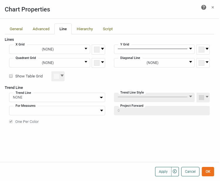
- X Grid
-
The line style and color of the X-axis grid.
- Y Grid
-
The line style and color of the Y-axis grid.
- Quadrant Grid
-
The style and color for a set of perpendicular line segments which divide the plot area into quadrants.
- Diagonal Line
-
The style and color for a line segment which originates in the lower-left corner of the plot area and terminates in the upper-right corner of the plot area.
- Show Table Grid
-
For a facet-type chart (i.e., a chart with both a measure and dimension on the same axis or with multiple dimensions on the same axis), displays a solid line around the entire plot area and displays a solid axis line to separate the dimension and measure axis labels. See Hybrid Table Chart for an example of this kind of Chart.
What is a measure? What is a dimension?
A measure is generally used for aggregation, for example summation, averaging, correlation, etc., within a Crosstab, Chart, Text component, or Gauge. Adding a measure to the ‘Y’ region in a chart displays the computed aggregates by using locations on the Y-axis. Adding a measure to the ‘X’ region displays the computed aggregates by using locations on the X-axis. You can also display aggregates by using color, shape, size, or label.
A dimension is used to break-down the dataset into multiple groups, often within a Crosstab, Chart, or Selection List. Adding a dimension to the ‘X’ region of a Chart distinguishes the different dimension groups by location on the X-axis. Adding a dimension to the ‘Y’ region distinguishes the different dimension groups by location on the Y-axis. You can add multiple dimensions into the ‘X’ or ‘Y’ regions of a Chart, or into the ‘Rows’ or ‘Columns’ regions of a Crosstab, to create multiple grouping levels. You can also distinguish groups in a dimension by using color, shape, size, or label in a Chart.
Use the adjacent color chip to select the color for the line surrounding the plot area. To set the color of the axis separator line, right-click on the line and select ‘Axis Properties’ from the context menu. See Axis Properties for details about setting the axis color.
- Trend Line
-
Specifies whether an interpolated trend line is displayed, and the method by which the trend line should be fit to the data (linear, quadratic, etc.). The ‘Trend Line Style’ menu and color chip specify the trend line style and color. The ‘Default’ option indicates that the style should match the corresponding measure line. If there are multiple measures or if there is a dimension associated with the chart’s ‘Color’ binding, select the ‘One Per Color’ option to create an independent trend line for each color group. (The trend line colors are matched to the corresponding data colors unless you explicitly specify a trend line color.)
What is a measure? What is a dimension?
A measure is generally used for aggregation, for example summation, averaging, correlation, etc., within a Crosstab, Chart, Text component, or Gauge. Adding a measure to the ‘Y’ region in a chart displays the computed aggregates by using locations on the Y-axis. Adding a measure to the ‘X’ region displays the computed aggregates by using locations on the X-axis. You can also display aggregates by using color, shape, size, or label.
A dimension is used to break-down the dataset into multiple groups, often within a Crosstab, Chart, or Selection List. Adding a dimension to the ‘X’ region of a Chart distinguishes the different dimension groups by location on the X-axis. Adding a dimension to the ‘Y’ region distinguishes the different dimension groups by location on the Y-axis. You can add multiple dimensions into the ‘X’ or ‘Y’ regions of a Chart, or into the ‘Rows’ or ‘Columns’ regions of a Crosstab, to create multiple grouping levels. You can also distinguish groups in a dimension by using color, shape, size, or label in a Chart.
Use the ‘For Measures’ menu to select a subset of measures for which to display trend lines.
- Project Forward
-
Specifies the number of axis units that the trend line should extend beyond the final data point. Projection requires that axis values be a linear and complete series of either numbers or dates.
-
Not available for the following chart types: Waterfall, Pie, 3D Pie, Radar, Filled Radar, Map.
-
Not available for the following data types: String, Boolean.
-
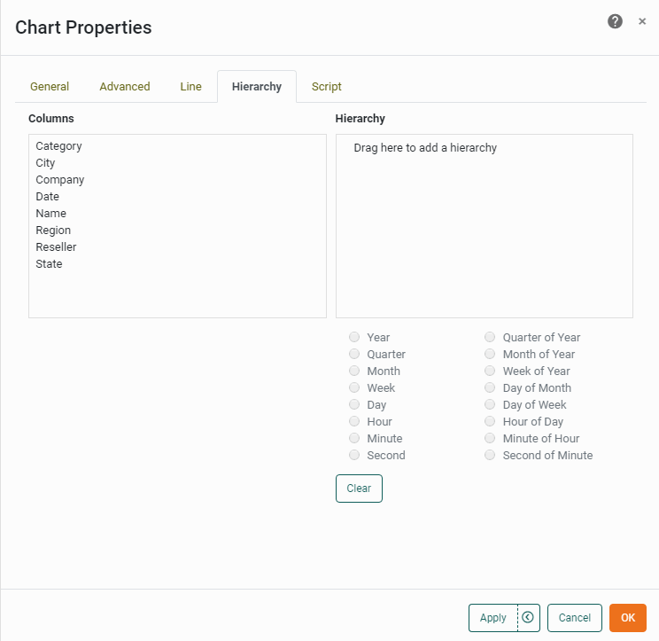
Hierarchy Tab
Watch Video: Grouping Data in a Dashboard (Add Hierarchy to a Chart)
This video might show an earlier version of the feature or operation that differs in minor ways from the current version.
|
Drill Down into Data, for information on using default drill-down features. |
The Hierarchy tab in the ‘Chart Properties’ dialog box allows you to specify the hierarchy for a custom drill-down. To create a custom drill-down hierarchy, follow the steps below:
-
Right-click the Chart, and select ‘Properties’ from the context menu. Note: You can also access menu options from the ‘More’ button (
) in the mini-toolbar. This opens the ‘Chart Properties’ panel. -
Select the Hierarchy tab. The ‘Columns’ panel displays the fields available in the Chart’s binding.
-
Click on a field that you want to include in the hierarchy, and drag the field to the ‘Hierarchy’ panel.
-
Optional: If the added field is a date field, select the desired date representation from options below the ‘Hierarchy’ panel.
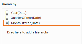
Drilling on date fields is enabled by default. Use the Hierarchy tab to customize the drill sequence, as shown below. 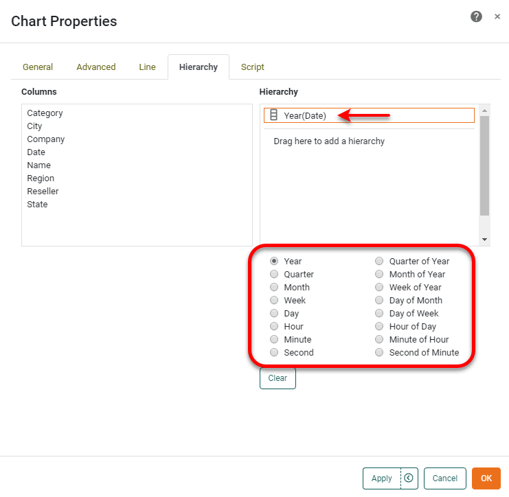
After you add a date field to the ‘Hierarchy’ panel, the date field still remains available in the ‘Columns’ panel. This allows you to add the same date field to the hierarchy at multiple levels, giving each level a different date representation. In this way, you can control the date-drilling sequence. For example, the following hierarchy produces the drill-down sequence .
-
Click on another field that you want to include in the hierarchy, and drag it over the existing fields in the ‘Hierarchy’ panel. Drop the field into the desired position in the hierarchy.
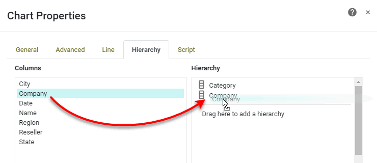
-
Repeat the previous step to add additional fields to the hierarchy, as desired.
-
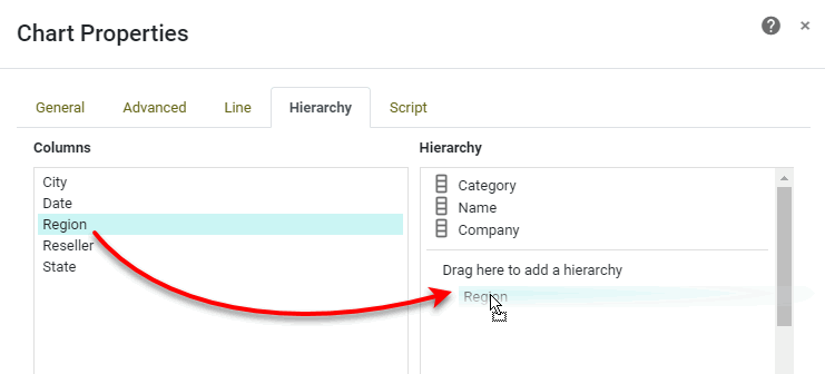
To remove a specific field from the hierarchy, simply drag the field from the ‘Hierarchy’ panel back to the ‘Columns’ panel. To remove all fields from the hierarchy, press the Clear button.
-
Optional: To create an additional independent hierarchy, drag a field from the ‘Columns’ panel to the region labeled ‘Drag here to add a hierarchy’. Then repeat the previous steps to add additional fields to this independent hierarchy.
-
Press OK to close the panel.
Note that there may not be any immediate change to the Chart. However, by configuring a hierarchy as described above, when you (or the end user) adds a field listed on the hierarchy to the ‘X’ or ‘Y’ region of the Chart Editor, the Chart will automatically implement an appropriate drill-down feature based on the specified hierarchy.
Script Tab
The Script tab is common to all components. (See Script Tab.) However, Charts provide many special scripting properties. See Chart Script Tutorial and Chart Script Reference for more details on Chart scripting.