Use Filter Components
| These features are available to both designers and end-users. |
The following sections explain how to use filter components to dynamically explore your data. See Add Filter Components for information on how to design a Dashboard using these components.
Use a Selection List
A Selection List filters the data displayed by data view components (Tables, Charts, etc.) and output components (Gauges, Text). A Selection List can provide either single-selection or multiple-selection capability, and can be configured to submit selections immediately when you make the selection or on-demand when you press the ‘Apply’ button  .
.
To filter data using a Selection List, select the desired item(s) in the list. If an ‘Apply’ button is visible in the title bar, press the ‘Apply’ button to submit your selections.
| If you want to make only a single selection (all selections being mutually exclusive), hold down the Alt key on the keyboard and make your selection. This changes the Selection List to “single-selection” mode. Alt-click again to return to multiple-selection mode. |
If there is no ‘Apply’ button in the title bar, each selection you make is submitted immediately. To make multiple selections before submitting, hold the Ctrl key while making your selections.
|
Example: Filter a Dashboard for an illustration of how to use Selection Lists in a sample Dashboard. |
The list below explains the five icons used in Selection Lists and Selection Trees:
- Selected

-
Data selected and included. You have explicitly selected this item, and the corresponding records are included in the returned data set.
- Not included

-
Data selected but not included. You have explicitly selected this item, but more recent explicit selections in other Selection Lists have now made this selection incompatible. The corresponding data is therefore not included in the returned data set.
- Included

-
Data included but not selected. You have not explicitly selected this item, but have made other selections that implicitly select this item as well. The corresponding records are included in the returned data set (as a result of those other selections). To explicitly select all of the “included” items, right-click on the Selection List and choose ‘Select All’ from the context menu. Note: You can also access menu options from the ‘More’ button (
 ) in the mini-toolbar.
 - Unselected

-
Data compatible but not included. You have not explicitly selected this item, and the item remains compatible with existing user selections. This item can therefore be selected to add additional records to the returned data set.
- Excluded

-
Data incompatible. You have not explicitly selected this item, and this item is incompatible with existing selections. (It appears listed under ‘Others’). Selecting this clears all other selections and starts fresh.
Selection List and Selection Tree provide a mini-toolbar that allows you make convenient modifications to the current selection. Move the mouse over the Selection List or Selection Tree to see the mini-toolbar. The following functions are available.
|
If the Selection List or Tree is not wide enough for the full mini-toolbar to display, some buttons may be hidden. In this case, press the ‘More’ button () to access the hidden functions.
|
- ‘Hide MiniToolbar’ button
-
Press to hide the mini-toolbar temporarily. This is useful if the toolbar is obscuring some of the component data. To reactivate the toolbar, move the mouse away from the component.
- ‘Show Enlarged’ button

-
Press to display the Selection component full screen. Press the ‘Show Actual Size’ button
 to return the component to its original size.
 - ‘Search’ button

-
Press to enter a search term in the text field. As you type, the Selection component updates to display only items having a match for your search text (appearing anywhere in the item). Press the ‘Close’ button
button in the text field to close the Search feature. - ‘Sort’ button

-
Press once to sort the items in ascending numerical or alphabetical order. Press the button again to sort in descending numerical or reverse alphabetical order. Press the button a third time to reset the original order.
- ‘Reverse’ button

-
Press to deselect all currently selected items and select all currently unselected items.
- ‘Unselect’ button

-
Press to deselect all items.
- ‘Apply’ button
-
Press to submit the current selection. If the ‘Apply’ button
is not visible, this means that your selections are submitted automatically.
Use a Selection Tree
A Selection Tree operates the same way as a Selection List but displays values in a hierarchical tree view. See Use a Selection List above for a description of the selection symbols and mini-toolbar.
Press the ‘Expand’ button  next to an item on the tree to expand the tree and view items at the next level in the hierarchy. To select all items under a given parent item in the tree, right-click the parent item and choose ‘Select Subtree’ from the context menu. Note: You can also access menu options from the ‘More’ button () in the mini-toolbar.
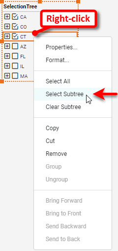
To clear all items under a given parent item in the tree, right-click the parent item and choose ‘Clear Subtree’ from the context menu.
Use a Range Slider
A Range Slider component allows you to select a date range or numerical range, as shown below.
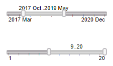
Adjust the selection range by dragging the slider end-handles. (You can also click on an end-handle and press < or > on the keyboard.)
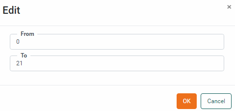
To enter precise values for the start-point or end-point, right-click on the Range Slider and select ‘Edit’ from the context menu. In the ‘Edit’ dialog box, enter the desired values and press OK.
To quickly set the right side of the range to its maximum, double-click on the right end-handle. To quickly set the left side of the range to its minimum, double-click on the left end-handle. To quickly set the entire range to its full extent, double-click on the slider body.
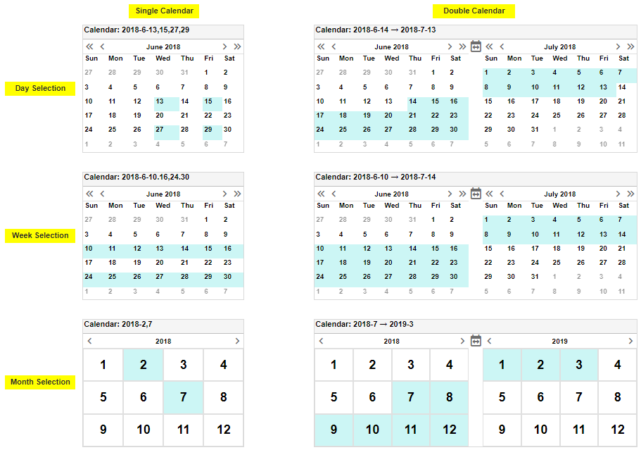
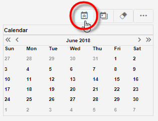
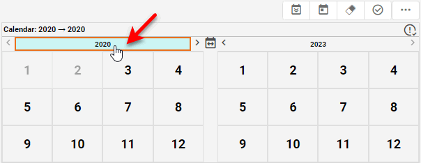
Use a Calendar
You can use a Calendar to select dates at the year, month, week, or day level. Note that the Calendar title bar indicates the selected range. The range that you select is used to filter all Data View and Output components that are based on the same data block as the Calendar component.
To filter a range of dates using the Calendar component, follow the steps below:
-
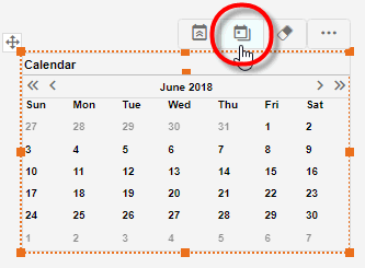
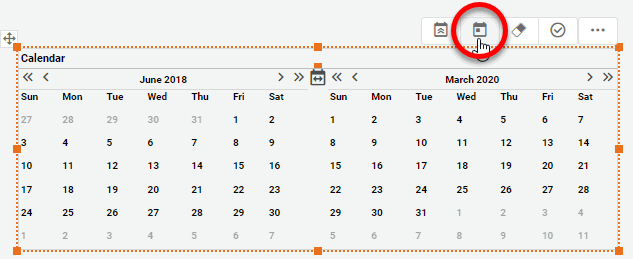
To switch the Calendar from single-page to double-page display, press the ‘Switch to Range’ button
 .
.
To switch the Calendar from double-page to single-page display, press the ‘Switch to Simple View’ button
 .
.
-
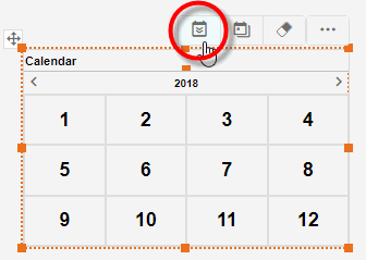
To switch the Calendar from displaying a single month to displaying the entire year, press the ‘Switch to Year View’ button
 .
.
To switch the Calendar from displaying the entire year to displaying a single month, press the ‘Switch to Month View’ button
 .
.
-
Press the buttons below the title bar (‘Last Month’
 , ‘Last Year’
  , ‘Next Month’
  , ‘Next Year’
  ) to display the appropriate calendar pages.
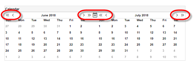
-
Click a date on the Calendar to select the start date of the range. You can select a day, week, or month, depending on how the Calendar has been configured.
To select a column of days (e.g., all Thursdays in a month), click the name of the desired day. (This is only available if “day selection” is enabled for the Calendar. See Calendar Properties for more details.)
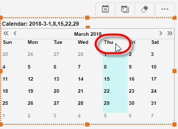
In a ‘Month View’ calendar, click to select a day or week, or click the name of the month at the top of the calendar to select the entire month. In a ‘Year View’ calendar, click to select a month, or click the name of the year at the top of the calendar to select the entire year.
-
Click another date on the Calendar to select the end date of the range, or hold the Ctrl key and click to select discontiguous dates.
-
If the Calendar is in double-page view, press the ‘Apply’ button
to submit your selection. (If the Calendar is in single-page view, the selection is applied automatically.)
A summary of the buttons in the mini-toolbar is shown below. (Move the mouse over the Calendar to see the mini-toolbar.)
- ‘Switch to Year View’ button and ‘Switch to Month View’ button
-
Press to alternate between year and month styles.
- ‘Switch to Simple View’ button and ‘Switch to Range’ button
-
Press to alternate between single- and double- calendar modes. In single-calendar mode, selections are applied immediately. In double-calendar mode, press the ‘Apply’ button
to submit your selections. - ‘Clear Calender’ button
-
Press to remove the specified date information.
- ‘Apply’ button
-
Press to submit the selection. If the ‘Apply’ button
does not appear, this means that your selection is submitted automatically.
Bundle Filters in a Selection Container
You can add new Filter components into an existing Selection Container if the ‘Allow User to Add/Remove Selections’ property has been enabled. See Selection Container Properties for more information.
| Note: A Selection Container will also display the current values of all Dashboard filters if the ‘Show Current Selections’ option is enabled. See Selection Container Properties for more information. |
There are several ways to add filters to a Selection Container:
Add Filter by Dragging Column from Table
To add a new filter to a Selection Container, locate the column that you want to filter within an existing Table or Crosstab. Drag the column into the Selection Container.
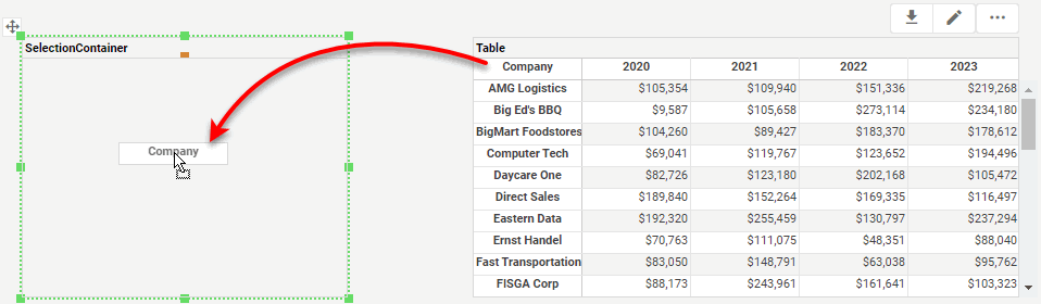
String-type fields are added to the Selection Container as Selection Lists, while numerical-type and date-type fields are added to the Selection Container as Range Sliders.
Add Filter with ‘Add Filter’ Button
Press the ‘Add Filter’ button  in the mini-toolbar of the Selection Container.
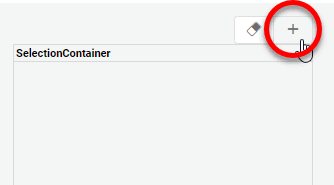
This opens the ‘Add Filter’ dialog box, where you can select the field to add as a filter to the Selection Container.
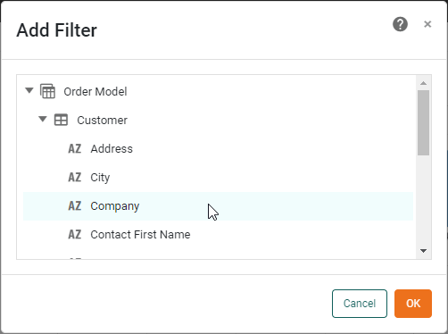
String-type fields are added to the Selection Container as Selection Lists, while numerical-type and date-type fields are added to the Selection Container as Range Sliders.
Add a Post-Aggregate Filter
Add a post-aggregate filter into the Selection Container by right-clicking on a field in a Chart or Table and selecting the ‘Filter’ option. See Ad Hoc Filter Post-Aggregate Crosstab Data and Ad Hoc Filter Post-Aggregate Chart Data for more information.
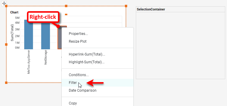
String-type fields are added to the Selection Container as Selection Lists, while numerical-type and date-type fields are added to the Selection Container as Range Sliders.
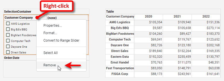
Remove a Filter from Selection Container
To remove a Filter component from the Selection Container, right-click the component and select ‘Remove’. Note: You can also access menu options from the ‘More’ button () in the mini-toolbar.
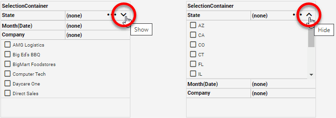
Hide or Show a Filter in Selection Container
To collapse a Filter component in a Selection Container, press the ‘Hide’ button  in the selection component title bar. To expand a Filter component in a Selection Container, press the ‘Show’ button
  .
.
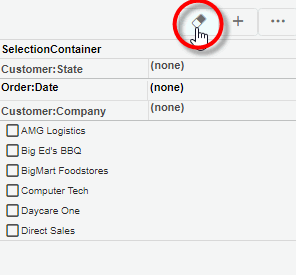
Clear Filters in Selection Container
To clear the filters on all Filter components in the Selection Container, press the ‘Unselect All’ button in the Selection Container title bar.
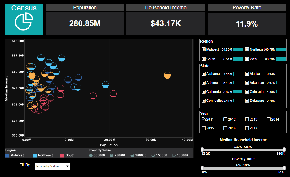
The following example illustrates how to use the Selection Lists in the sample Census Dashboard (in the ‘Examples’ folder).
| If you don’t see the Dashboard in the Repository, download and import the Census Dashboard into your environment. (This requires access to Enterprise Manager.) See Import and Export Assets for instructions on how to import. |
-
Open the sample ‘Census’ Dashboard (in the ‘Examples’ folder).
-
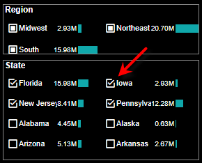
Select a few states (e.g., ‘New Jersey’, ‘Pennsylvania’, ‘Florida’) in the ‘State’ Selection List.
Notice that the ‘Region’ selection list now shows two items with filled squares (Included
), ‘Northeast’ and ‘South’. This indicates that the result set includes only data from these two regions (because the states that you selected are in the Northeast and South regions.) The remaining regions are listed under ‘Others’.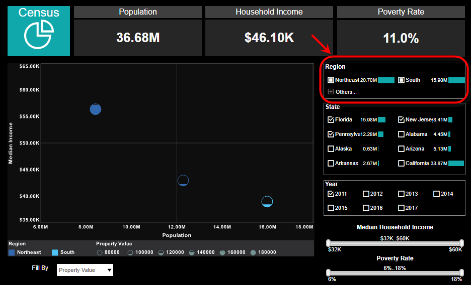
Some Selection Lists submit automatically when you make a selection. To make multiple selections, hold the Ctrl key and click to make selections. -
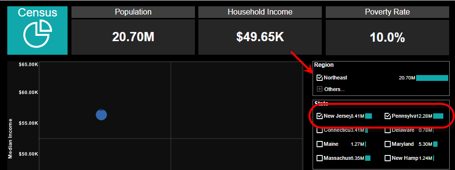
You can now filter the results further based on region. Select ‘Northeast’ in the ‘Region’ list. When you make this selection in the ‘Region’ selection list, the ‘State’ selection list automatically updates.
Notice the following things about the updated ‘State’ selection list:
-
New Jersey and Pennsylvania are shown with check marks (Selected
). This indicates that you explicitly selected ‘New Jersey’ and ‘Pennsylvania,’ and the records for New Jersey and Pennsylvania are returned in the result set. -
Florida is shown with a gray check mark (Not included
). This indicates that you explicitly selected Florida, but the records for Florida are not included because of an incompatible choice in another Selection List. In this case, you explicitly selected the ‘Northeast’ region, so only records for Northeast states (i.e., New Jersey and Pennsylvania ) are actually included. -
Several states are shown with empty boxes (Unselected
), such as Delaware, Maine, Maryland, etc. This indicates that records for these states are not included, but these choices remain compatible with your other selections. You can select these choices to widen your result set. -
All other states are listed under ‘Others’. This indicates that these records are not included in the result set, and moreover those choices are not compatible with your other selections.
-
-
Expand the ‘Others’ node in the ‘State’ selection list. Notice that all incompatible states have a gray ‘X’ icon (Excluded
). -
Select ‘Iowa’.
This clears the ‘Northeast’ selection from the ‘Region’ list. In general, when you select an option from the ‘Others’ list, this will clear any incompatible selections that you previously have made in other Selections Lists. The divisions listed are now those compatible with the five currently selected states.