Circular Network Chart
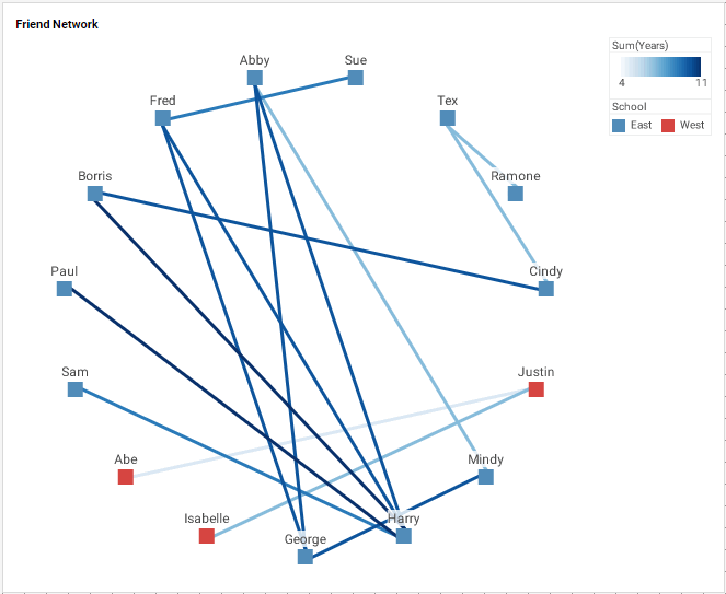
A circular network chart displays a network structure defined by pairwise peer relationships, and arranged with the nodes spaced along the circumference of a circle. It is an alternative representation of a Network Chart.
To create a circular network chart, follow the basic steps below:
|
Configure your data
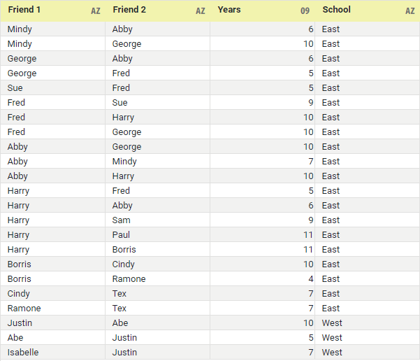
The chart should be based on a data set containing peer relationships such as that below, with optional relationship weighting (e.g., ‘Years’ below). See Prepare Your Data for information on how to manipulate your data, if it is not currently in this form.
|
|
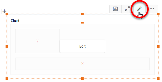
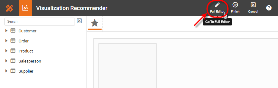
If you are new to charting, see the following section: Open a Chart for Editing…Watch Video: Create a Chart (Open the Chart Editor)This video might show an earlier version of the feature or operation that differs in minor ways from the current version. Follow the steps below to get started with a new Chart. See Basic Charting Steps for more details.
|

-
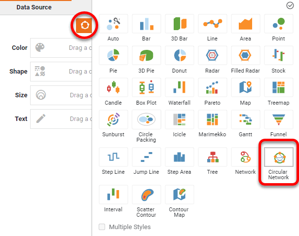
Press the ‘Select Chart Style’ button
 . Choose the ‘Circular Network’ style. Press the ‘Apply’ button
  .
.
-
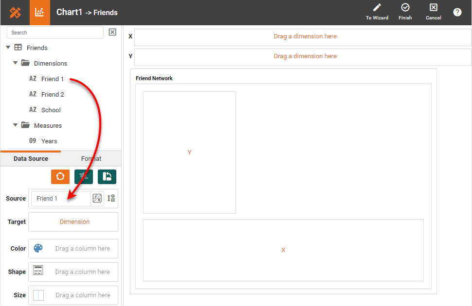
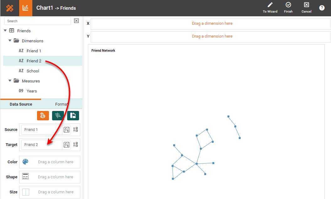
From the ‘Dimensions’ folder of the Data Source panel, drag the first peer dimension to the ‘Source’ region.
What is a dimension?
A dimension is used to break-down the dataset into multiple groups, often within a Crosstab, Chart, or Selection List. Adding a dimension to the ‘X’ region of a Chart distinguishes the different dimension groups by location on the X-axis. Adding a dimension to the ‘Y’ region distinguishes the different dimension groups by location on the Y-axis. You can add multiple dimensions into the ‘X’ or ‘Y’ regions of a Chart, or into the ‘Rows’ or ‘Columns’ regions of a Crosstab, to create multiple grouping levels. You can also distinguish groups in a dimension by using color, shape, size, or label in a Chart.
To convert a measure to a dimension, right-click the measure in the data source and select ‘Convert to Dimension’. -
From the ‘Dimensions’ folder of the Data Source panel, drag the second peer dimension to the ‘Target’ region.
-
Optional: From the ‘Dimensions’ folder of the Data Source panel, drag a desired dimension to the ‘X’ or ‘Y’ region to break out the diagram along this dimension.
This will create a disconnected graph for each dimension value, which may not be desirable. -
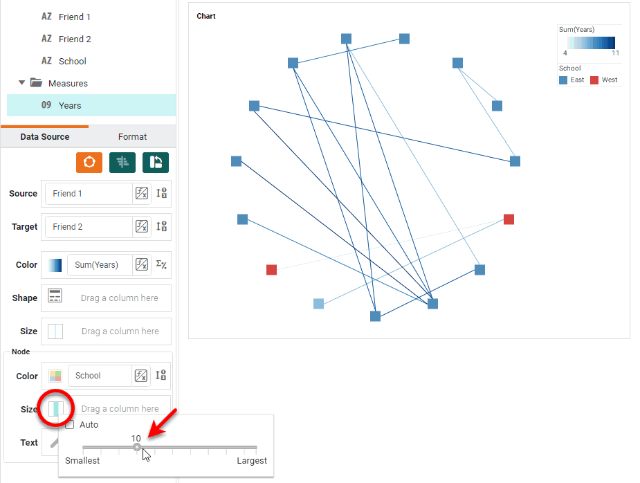
Optional: To distinguish the nodes along a dimension by using color, drag a dimension from the Data Source panel to the ‘Color’ region in the ‘Node’ panel. Press the ‘Edit Color’ button to choose the dimension colors.
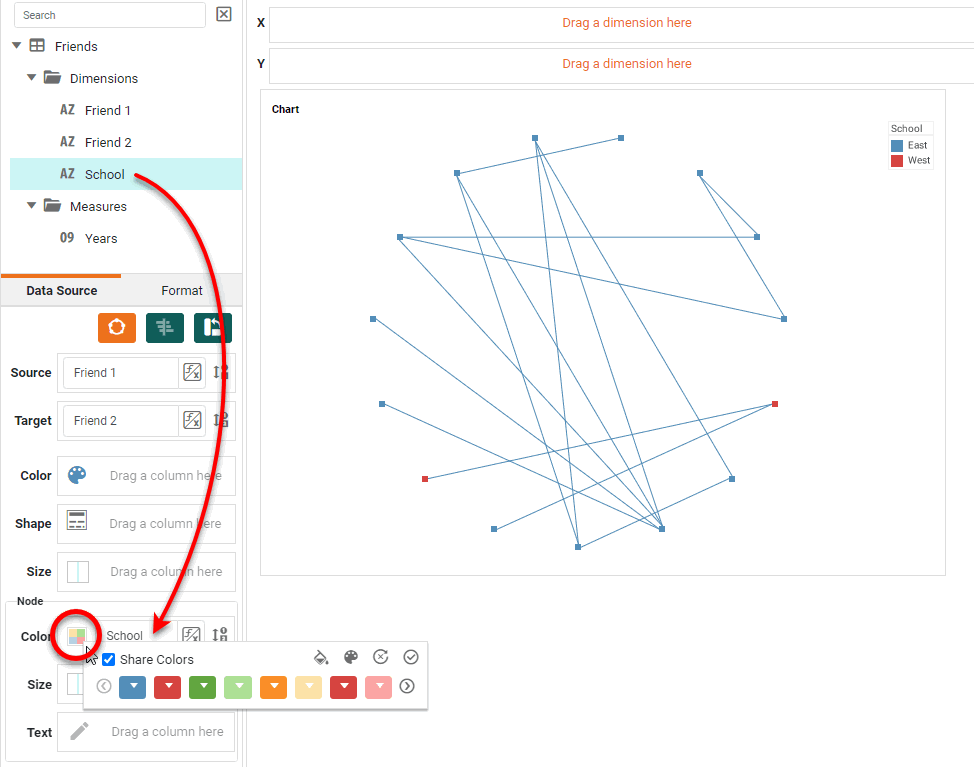
The applied node style is based on the values in the ‘Target’ field. If some nodes are only ‘Source’ nodes and not also ‘Target’ nodes, these nodes will inherit the edge color. To force such source nodes to adopt the color of their first target in the data set instead, enable ‘Apply Aesthetics to Source Nodes’ in the ‘Chart Properties’ dialog box. See Chart Properties for more information about these properties. -
Optional: For a date dimension, press the ‘Edit Dimension’ button
 next to the field name in the Chart Editor, and set the ‘Level’ to the desired date grouping. Then press the ‘Apply’ button .
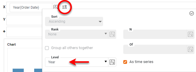
-
Optional: You can add additional dimensions to the Chart if desired. See Trellis Chart (Grid) for information about adding multiple dimensions to a chart axis.
-
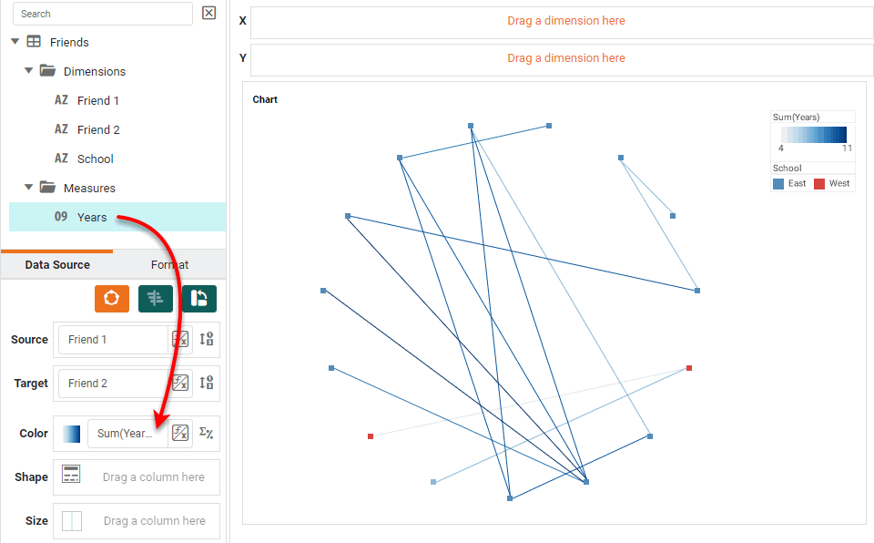
To represent an aggregate on the chart nodes, from the ‘Measures’ folder of the Data Source panel, drag a measure to the ‘Color’ or ‘Size’ region of the ‘Node’ panel.
What is a measure?
A measure is generally used for aggregation, for example summation, averaging, correlation, etc., within a Crosstab, Chart, Text component, or Gauge. Adding a measure to the ‘Y’ region in a chart displays the computed aggregates by using locations on the Y-axis. Adding a measure to the ‘X’ region displays the computed aggregates by using locations on the X-axis. You can also display aggregates by using color, shape, size, or label.
-
To represent the weight or strength of the connection between nodes, drag a weight field (e.g., ‘Years’) to the ‘Color’ or ‘Size’ region.
-
Press the ‘Edit Measure’ button
 next to the measure, and select the desired aggregation method for the measure.
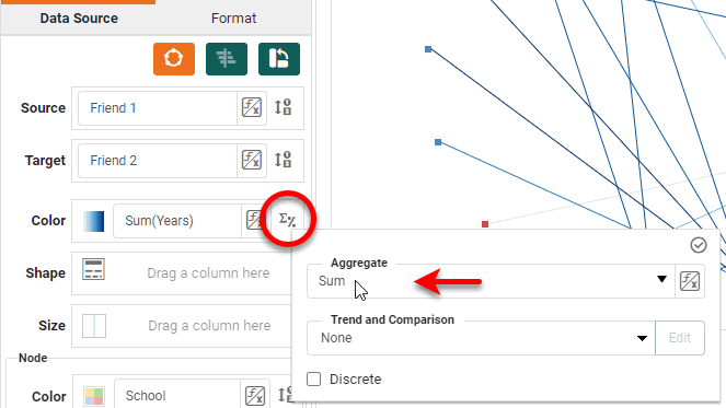
-
To set a fixed size or color for the nodes (if not being used to represent dimension or measure), press the ‘Edit Size’ or ‘Edit Color’ button and set the desired value in the ‘Node’ panel.
-
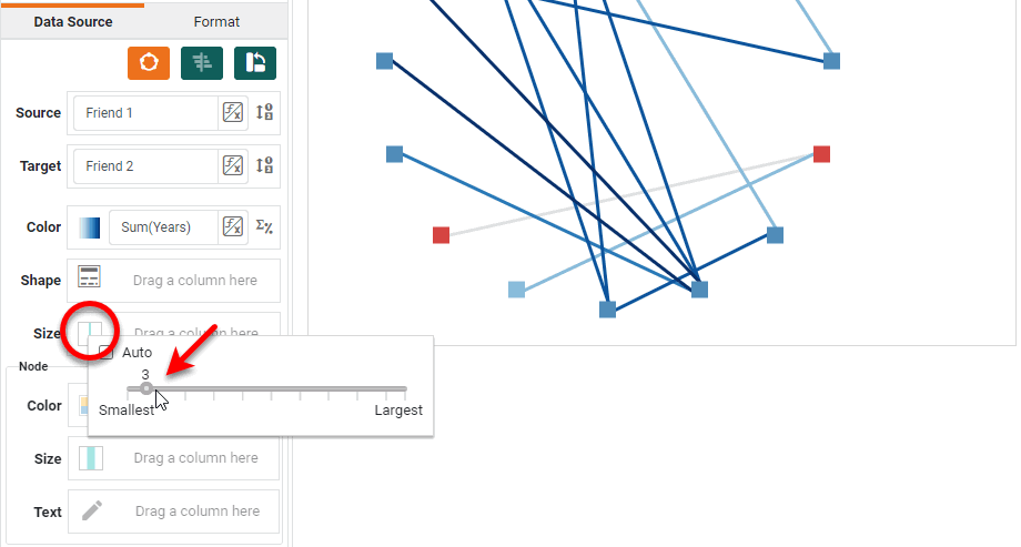
To set a fixed size or color for the lines (if not being used to represent dimension or measure), press the ‘Edit Size’ or ‘Edit Color’ button and set the desired value.
-
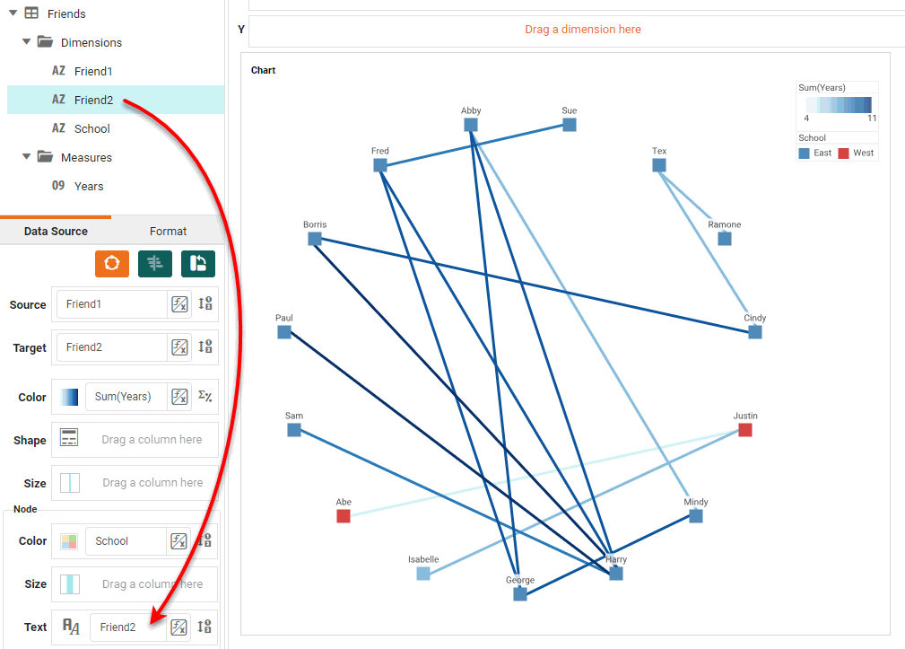
To add labels to the nodes, drag a dimension to the ‘Text’ region.
-
Press the ‘Finish’ button
to close the Editor.
You can proceed to edit the titles, legend, etc. See Basic Charting Steps and Chart Properties for more information. See Add Data Format for information on how to format text on a Chart.