Selection List Properties
|
The Selection List component’s ‘Properties’ dialog box provides General, Data, and Script tabs. The next sections discuss the component-specific properties available under these tabs.
General Tab
The General tab in the ‘Selection List Properties’ dialog box provides the following Selection List-specific properties.
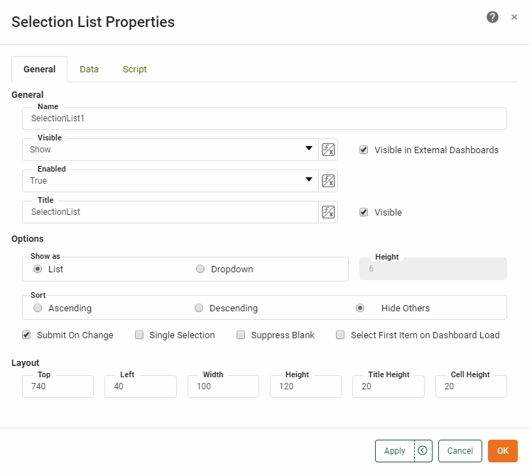
- Show as
-
The appearance of the Selection List:
-
List: A scrollable list
-
Dropdown: An expandible dropdown box. The ‘List Height’ sub-option sets the number of rows to which the box should expand.
-
- Sort
-
The sort order for the values in the Selection List:
-
Ascending: Display all values in alphabetical or increasing order, including incompatible selections.
-
Descending: Display all values in reverse-alphabetical or decreasing order, including incompatible selections.
-
Hide Others: Display values in alphabetical or increasing order, but hide incompatible selections under the label ‘Others’.
-
- Action
-
-
Submit on Change: Immediately update data in the Dashboard when any selection is made. If ‘Submit on Change’ is disabled, the Selection List only updates data in the Dashboard when the user clicks ‘Apply’.
-
Single Selection: Allows only one item to be selected at a given time (mutually-exclusive choices). See Selection Tree Properties for information on how to select hierarchy levels.
-
Suppress Blank: Removes empty values (caused by nulls in the data set) from the Selection List.
-
Select First Item: Selects the first item when the Dashboard loads (if no items are preselected).
-
Data Tab
The Data tab in the ‘Selection List Properties’ dialog box provides the following Selection List-specific properties.
Properties that offer the ‘Value Type’ button  can also be set by the user (‘Variable’) or by scripted logic (‘Expression’). See Dynamically Set Properties for more information. can also be set by the user (‘Variable’) or by scripted logic (‘Expression’). See Dynamically Set Properties for more information.
|
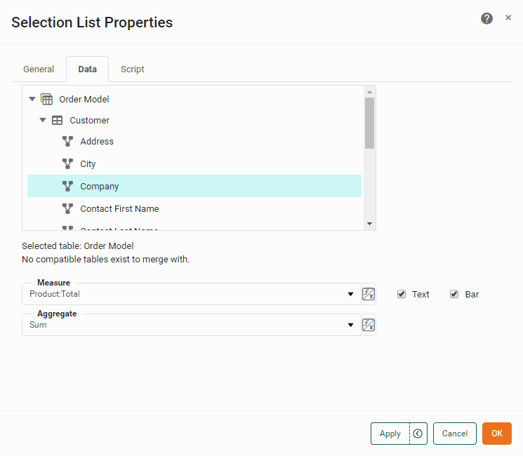
- Table
-
The column or dimension that should be used to populate the Selection List.
- Measure
-
The field to aggregate and display next to the Selection List values.
- Aggregate
-
The method of aggregation to be used for the ‘Measure’ field.
- Text
-
Specifies that the aggregated measure is displayed as plain text.
- Bar
-
Specifies that the aggregate measure is displayed graphically as a proportional bar.
What is a measure? What is a dimension?
A measure is generally used for aggregation, for example summation, averaging, correlation, etc., within a Crosstab, Chart, Text component, or Gauge. Adding a measure to the ‘Y’ region in a chart displays the computed aggregates by using locations on the Y-axis. Adding a measure to the ‘X’ region displays the computed aggregates by using locations on the X-axis. You can also display aggregates by using color, shape, size, or label.
A dimension is used to break-down the dataset into multiple groups, often within a Crosstab, Chart, or Selection List. Adding a dimension to the ‘X’ region of a Chart distinguishes the different dimension groups by location on the X-axis. Adding a dimension to the ‘Y’ region distinguishes the different dimension groups by location on the Y-axis. You can add multiple dimensions into the ‘X’ or ‘Y’ regions of a Chart, or into the ‘Rows’ or ‘Columns’ regions of a Crosstab, to create multiple grouping levels. You can also distinguish groups in a dimension by using color, shape, size, or label in a Chart.
Script Tab
See Script Tab for information about this common tab.