Add Filter Components
|
You can add a variety of different Filter components to a Dashboard. These user-adjustable components filter the data received from the underlying data source, and so affect any components in the Dashboard that display data from the data source. (To attach a fixed filter to a specific component, see Add Conditions.)
The following sections explain how to add these components.
Filter with a Selection List
Watch Video: Filtering a Dashboard (Filter Categorical Data)
This video might show an earlier version of the feature or operation that differs in minor ways from the current version.
The most common way to filter the values of a dimension in a Dashboard is with a Selection List. You can also use a Selection List to filter a measure, although this is generally useful only for measures with a limited number of discrete values.
What is a measure? What is a dimension?A measure is generally used for aggregation, for example summation, averaging, correlation, etc., within a Crosstab, Chart, Text component, or Gauge. Adding a measure to the ‘Y’ region in a chart displays the computed aggregates by using locations on the Y-axis. Adding a measure to the ‘X’ region displays the computed aggregates by using locations on the X-axis. You can also display aggregates by using color, shape, size, or label. A dimension is used to break-down the dataset into multiple groups, often within a Crosstab, Chart, or Selection List. Adding a dimension to the ‘X’ region of a Chart distinguishes the different dimension groups by location on the X-axis. Adding a dimension to the ‘Y’ region distinguishes the different dimension groups by location on the Y-axis. You can add multiple dimensions into the ‘X’ or ‘Y’ regions of a Chart, or into the ‘Rows’ or ‘Columns’ regions of a Crosstab, to create multiple grouping levels. You can also distinguish groups in a dimension by using color, shape, size, or label in a Chart. |
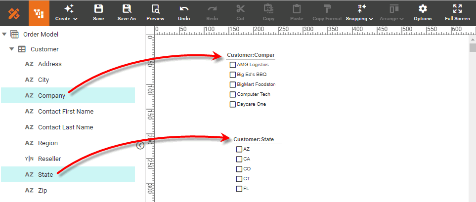
A Selection List filters the data in all Tables, Charts, and Output components that are based on the same data block as the Selection List. To add a Selection List, follow the steps below:
-
If necessary, create a new Dashboard. (See Create a New Dashboard.)
-
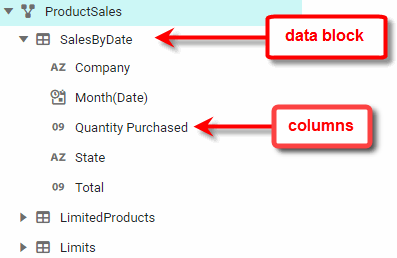
At the top of the Toolbox panel, expand the data block that contains the field you want to filter.
-
Drag the dimension that you want to filter to an empty region in the Dashboard. For a string-type field, this creates a Selection List.
To filter a measure with a Selection List, drag a Selection List component from the Toolbox into the Dashboard, and then drag the measure into the blank Selection List. (This works for dimensions as well.) -
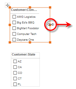
Resize the Selection List as desired.
-
To display multiple columns in a Selection List, click any data cell to select it. Then drag the handle on the right side of the cell to change the cell size.
If there is a scroll bar, the handle will appear slightly to the right of the scroll bar. 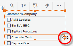
See Use Filter Components for information on how to use a Selection List to filter a Dashboard.
Filter Hierarchical Data with Selection Tree
Watch Video: Filtering a Dashboard (Filter Hierarchical Data)
This video might show an earlier version of the feature or operation that differs in minor ways from the current version.
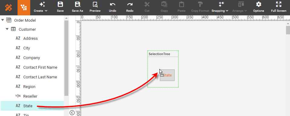
Like a Selection List, a Selection Tree filters the data in all Tables, Charts, and Output components that are based on the same data block as the Selection Tree. To add a Selection Tree, follow the steps below:
-
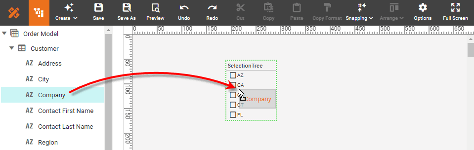
Drag a Selection Tree component from the Toolbox tree onto the Dashboard. This creates an empty Selection Tree.
-
Add hierarchical fields to the Selection Tree using one of the following approaches:
See Use Filter Components for information on how to use a Selection Tree to filter a Dashboard.
Create Hierarchy by Dragging Fields
To create a hierarchy by dragging fields from the data source, follow the steps below:
-
Drag a dimension field from the data block in the Toolbox panel onto the Selection Tree. The values of this dimension provide the outer level of the hierarchy.
What is a dimension?
A dimension is used to break-down the dataset into multiple groups, often within a Crosstab, Chart, or Selection List. Adding a dimension to the ‘X’ region of a Chart distinguishes the different dimension groups by location on the X-axis. Adding a dimension to the ‘Y’ region distinguishes the different dimension groups by location on the Y-axis. You can add multiple dimensions into the ‘X’ or ‘Y’ regions of a Chart, or into the ‘Rows’ or ‘Columns’ regions of a Crosstab, to create multiple grouping levels. You can also distinguish groups in a dimension by using color, shape, size, or label in a Chart.
-
Drag another dimension from the data block onto the Selection Tree. The values of this dimension provide the inner level of the hierarchy.
-
Repeat the above step to add additional levels. Each new field you add is placed at the innermost level of the hierarchy.
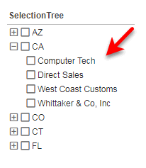
The inner levels of the hierarchy show only the unique items compatible with corresponding outer level data. For example, the companies nested within the outer-level ‘CA’ node are only those companies whose corresponding state is CA.
-
To change the hierarchy ordering, use the ‘Selection Tree Properties’ dialog box, as described in Create Hierarchy in the ‘Properties’ Dialog Box below.
Create Hierarchy in the ‘Properties’ Dialog Box
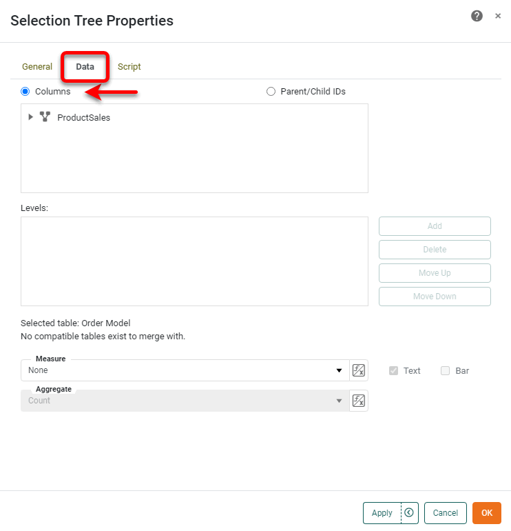
To define a hierarchy by selecting columns on the Hierarchy tab of the ‘Selection Tree Properties’ dialog box, follow the steps below:
-
Right-click the Selection Tree, and select ‘Properties’ from the context menu. Note: You can also access menu options from the ‘More’ button (
 ) in the mini-toolbar. This opens the ‘Selection Tree Properties’ panel.
 -
Select the Data tab.
-
At the top of the dialog box, select the ‘Columns’ option.
-
In the ‘Table’ menu, expand the desired data block to reveal its columns, or expand a cube dimension to reveal its levels.
-
Select the column or level that you want to be the outer-most level of the Selection Tree hierarchy, and press Add. This adds the column or level to the ‘Level’ list.
-
Repeat to add all desired levels of the hierarchy. To change the hierarchy ordering, use the Move Down and Move Up buttons. The order from top to bottom represents the nesting order of the Selection Tree, from outer to inner.
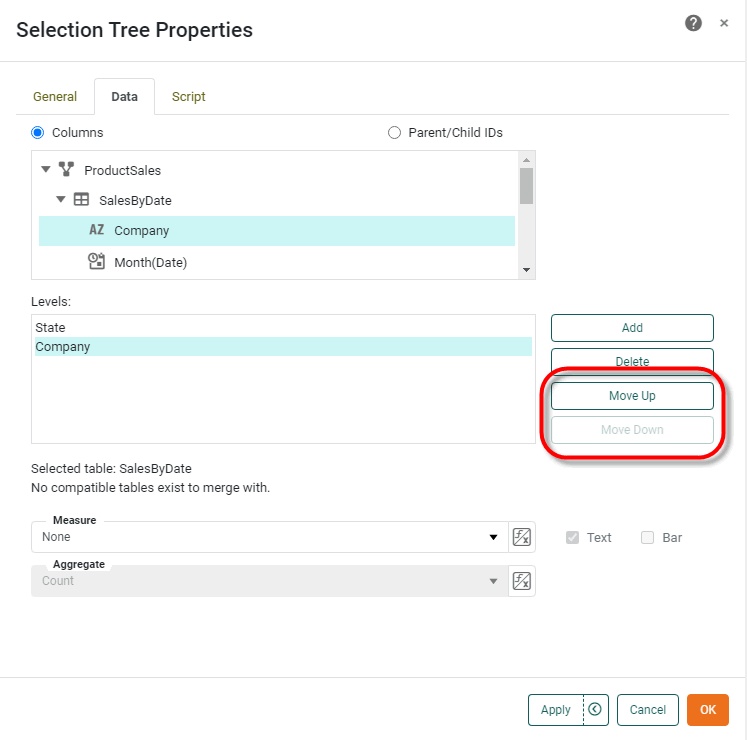
-
Press OK to close the dialog box.
The inner levels of the hierarchy show only the unique items compatible with corresponding outer level data. For example, the companies nested within the outer-level ‘CA’ node are only those companies whose corresponding state is CA.
Create Recursive Parent-Child Hierarchy
To define a recursive hierarchy in a Selection Tree by selecting fields containing parent and child indexes, follow the steps below.
-
Configure your data appropriately: For example, consider the following data:
The “Child ID” is the ID of the node itself, while the “Parent ID” is the ID of the node’s immediate parent. Nodes that lack a “Parent ID” are at the root level of the hierarchy.
Parent ID Child ID Label 1
Northeast
2
Midwest
3
South
4
West
1
5
New England
1
6
Mid-Atlantic
2
7
East North Central
2
8
West North Central
3
9
South Atlantic
3
10
East South Central
3
11
West South Central
4
12
Mountain
4
13
Pacific
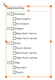
The data above represent the following tree structure.
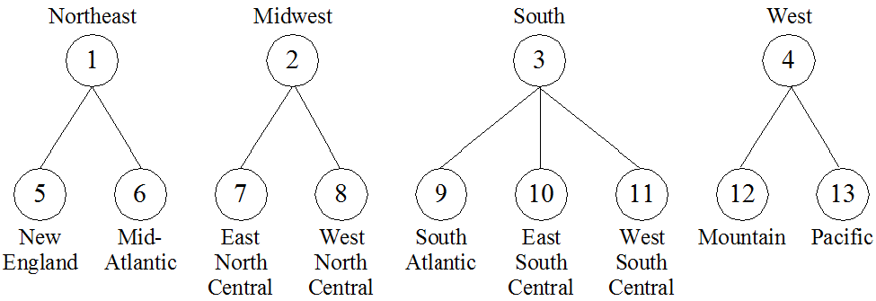
The “Parent ID” and “Child ID” columns indicate that nodes 5 and 6 share node 1 as parent, nodes 7 and 8 share node 2 as parent, nodes 9, 10, and 11 share node 3 as parent, and nodes 12 and 13 share node 4 as parent.
-
At the top of the ‘Selection Tree Properties’ dialog box, select the ‘Parent/Child IDs’ option.
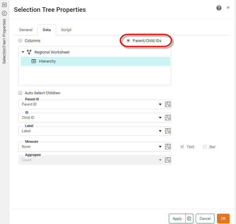
-
In the ‘Table’ menu, expand the desired data block to reveal its columns.
-
In the ‘Parent ID’ field, select the column that contains the parent node IDs.
-
In the ‘ID’ field, select the column that contains the child node IDs.
-
In the ‘Label’ column select the column that contains the labels corresponding to the child node IDs.
-
Optional: Enable ‘Auto Select Children’ if you want the selection of a parent to automatically select the parent’s children.
-
Press OK to close the dialog box.
The Selection Tree is now populated based on the selected “Parent ID” and “Child ID” columns.
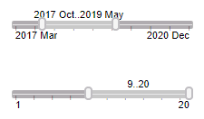
Filter Date/Numerical Data with Range Slider
Watch Video: Filtering a Dashboard (Filter Dates with a Slider)
This video might show an earlier version of the feature or operation that differs in minor ways from the current version.
A Range Slider component allows you to select a date range or numerical range from a measure, as shown below.
| You can also filter a discrete measure using a Selection List. See Filter with a Selection List. |
To add a Range Slider follow the steps below:
-
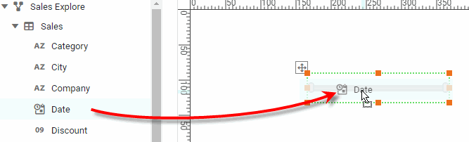
Drag a Range Slider element from the Toolbox panel into the Dashboard.
-
Drag a measure field from a data block in the Toolbox panel (or from a Dashboard Table) onto the Range Slider element. This binds the Range Slider to the selected column.
What is a measure?
A measure is generally used for aggregation, for example summation, averaging, correlation, etc., within a Crosstab, Chart, Text component, or Gauge. Adding a measure to the ‘Y’ region in a chart displays the computed aggregates by using locations on the Y-axis. Adding a measure to the ‘X’ region displays the computed aggregates by using locations on the X-axis. You can also display aggregates by using color, shape, size, or label.
You can also drag a measure from the Toolbox panel into an empty region of the Dashboard. This will automatically create a Range Slider. -
Adjust the selection range by dragging the slider end-handles. (You can also click on an end-handle and press < or > on the keyboard.)
-
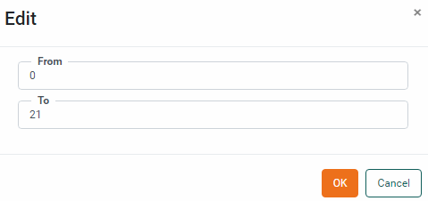
To enter precise values for the start-point or end-point, right-click on the Range Slider and select ‘Edit’ from the context menu. In the ‘Edit’ dialog box, enter the desired values and press OK.
-
To quickly set the right side of the range to its maximum, double-click on the right end-handle. To quickly set the left side of the range to its minimum, double-click on the left end-handle. To quickly set the entire range to its full extent, double-click on the slider body.
Filter Dates with a Calendar
Watch Video: Filtering a Dashboard (Filter Dates with a Calendar)
This video might show an earlier version of the feature or operation that differs in minor ways from the current version.
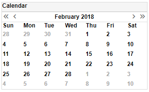
A Calendar allows you to restrict data to a particular range of dates, either continuous or non-continuous. A Calendar is similar in purpose to a Range Slider (see Filter Date/Numerical Data with Range Slider), but provides functionality beyond simple range selection. For example, a Calendar also allows you to compare date ranges in a Chart or Crosstab.
To add a Calendar, follow the steps below.
-
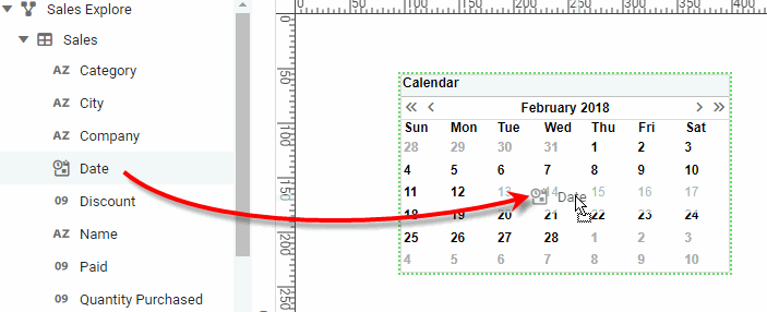
Drag a ‘Calendar’ element from the Toolbox panel onto the Dashboard. This creates a new Calendar component.
-
Drag a date field from a data source in the Toolbox panel onto the Calendar. This links the Calendar to the data represented by the selected date field.
-
To format the dates displayed in the Calendar, click on a date, and then select the Format tab in the left panel. (Or right-click the component and select ‘Format’ from the context menu.) For example, when the Calendar is in ‘Year View’, you can format the months to display the month name (format
MMMorMMMM) rather than the month number. See Add Data Format for more information about date formats.
See Use Filter Components for information on how to use a Calendar to select different date ranges.
Combine Multiple Filters into a Selection Container
Watch Video: Filtering a Dashboard (Selection Container)
This video might show an earlier version of the feature or operation that differs in minor ways from the current version.
A Selection Container can display a variety of filter components such as Selection Lists and Range Sliders in a single region of the Dashboard.
To add filter components to a Selection Container, follow the steps below:
-
Drag a Selection Container component from the Toolbox panel onto the Dashboard. This creates an empty Selection Container element.
-
Drag a data field from the data source at the top of the Toolbox panel onto the Selection Container. (Use the green highlight to place the field as desired.)
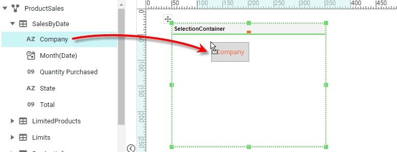
This adds the chosen field to the Selection Container as a Selection List (string field) or a Range Slider (numerical or date field).
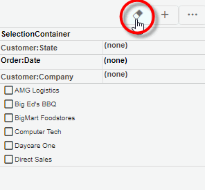
You can also press the ‘Add Filter’ button  in the mini-toolbar to select the field to add.
-
Optional: Right-click on the Selection Container, and select ‘Properties’ from the context menu. Note: You can also access menu options from the ‘More’ button (
) in the mini-toolbar. This opens the ‘Selection Container Properties’ panel.To permit the end-user to drag new fields from the Chart Editor to the Selection Container, enable ‘Allow User to Add/Remove Selections’. See Selection Container Properties for more information.
To display a selection component in a Selection Container, press the ‘Show’ button  in the selection component title bar. This expands the selection component and its toolbar. (See Use Filter Components for information on how to use these selection components.) To collapse a selection component in a Selection Container, press the ‘Hide’ button
  .
.
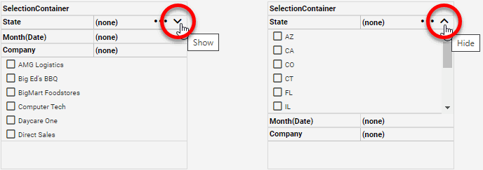
To clear the filters on all selection components in the Selection Container, press the ‘Unselect All’ button  in the Selection Container title bar.
Display Aggregates in Filter Component
To display summarized data next to the dimension values in a Selection List or Selection Tree, follow the steps below:
What is a dimension?A dimension is used to break-down the dataset into multiple groups, often within a Crosstab, Chart, or Selection List. Adding a dimension to the ‘X’ region of a Chart distinguishes the different dimension groups by location on the X-axis. Adding a dimension to the ‘Y’ region distinguishes the different dimension groups by location on the Y-axis. You can add multiple dimensions into the ‘X’ or ‘Y’ regions of a Chart, or into the ‘Rows’ or ‘Columns’ regions of a Crosstab, to create multiple grouping levels. You can also distinguish groups in a dimension by using color, shape, size, or label in a Chart. |
-
Create the Selection List or Selection Tree as desired. See Filter with a Selection List or Filter Hierarchical Data with Selection Tree for more information.
-
Right-click the component, and select ‘Properties’ from the context menu. Note: You can also access menu options from the ‘More’ button (
) in the mini-toolbar. This opens the ‘Properties’ dialog box.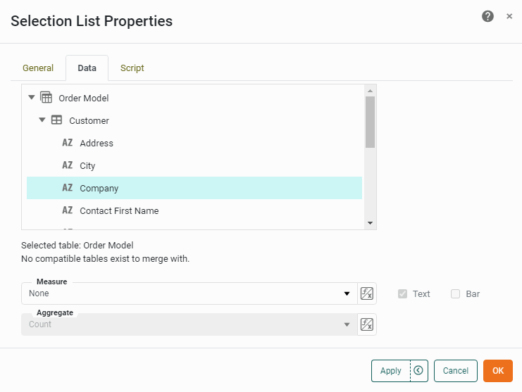
-
From the ‘Measure’ menu, select the field that you wish to summarize.
-
From the ‘Aggregate’ menu, select the method of summarization.
Read about the available aggregation methods…
-
Optional: Enable the ‘Text’ option to display the aggregate values as plain text next to the corresponding dimension values.
-
Optional: Enable the ‘Bar’ option to graphically display the aggregate values as proportional bars next to the corresponding dimension values.
-
Press OK to close the dialog box. The summarized values are now displayed next to the Selection component dimension values.
-
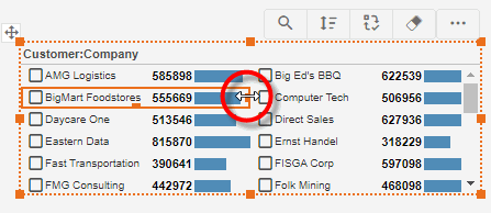
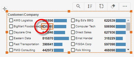
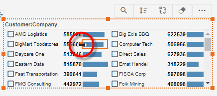
Optional: Improve the appearance of the Selection component by making the following adjustments to the layout:
-
Adjust the column layout to provide the needed space by dragging the handle at the right side of column.
-
Adjust the width of the aggregate text region by dragging the handle at the left side of the text.
-
Adjust the width of the aggregate bar region by dragging the handle at the left side of the bar.
-
-
Optional: To format the aggregate text, click on the aggregate text to select it, and then select the Format tab in the left panel of Visual Composer. (See Add Data Format for more information about the available options.)
-
Optional: To format the aggregate bar, click on the aggregate bar to select it, and then select the Format tab in the left panel of Visual Composer. (See Add Visual Format for more information about the available options.)
Filter Multiple Data Blocks
By default, a Filter component operates on only a single data block. However, you can configure a Filter component to operate on multiple data blocks simultaneously.
| To synchronize Filters across multiple Dashboards, see Modularize a Dashboard. |
To do this, follow the steps below:
-
Add a Filter component as described in the sections above.
-
Right-click on the component and select ‘Properties’ from the context menu. Note: You can also access menu options from the ‘More’ button (
) in the mini-toolbar. This opens the component’s ‘Properties’ dialog box. -
Select the Data tab. Data blocks with compatible columns are listed in the ‘Compatible Tables’ panel.
Compatibility requires that the data block have a column with the same name as the column bound to the filter component. The data type of this column must be mergeable with the column bound to the Filter component (e.g., both String, both Integer, Integer and Double, etc.). If the column bound to the Filter component is drawn from a cube data source, the ‘compatible data block’ must also be drawn from a cube.
-
Press the ‘Add’ button
 to add the data block to the ‘Additional Tables’ panel.
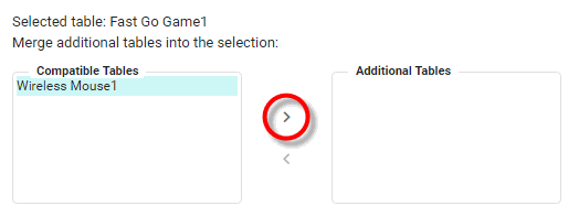
-
Repeat the above steps to merge any additional data block columns.
-
Press OK.
Data values from the compatible columns in the added data blocks are merged into the existing Filter component, and the Filter component will filter all the specified compatible data blocks (in addition to the data block bound to the Filter).
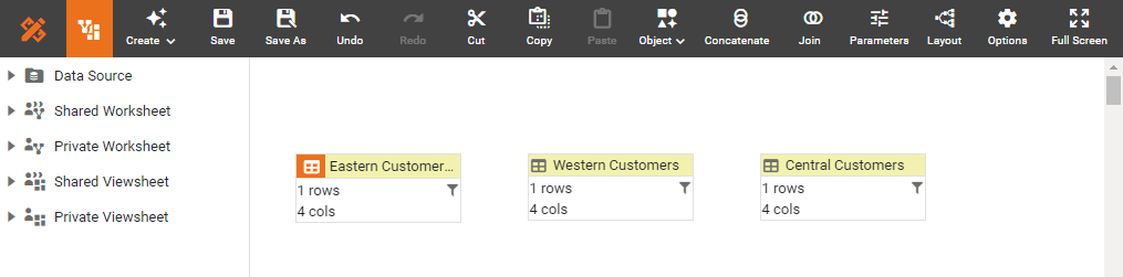
In the example below, a Dashboard is based on a Data Worksheet with three data blocks, containing data for companies in different regions: Eastern, Western, and Central.
To use a single Selection List to filter all three data blocks, follow the steps below:
-
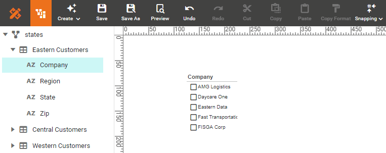
In the Dashboard, drag the ‘Company’ field from the ‘Eastern Customers’ data block into the Dashboard canvas.
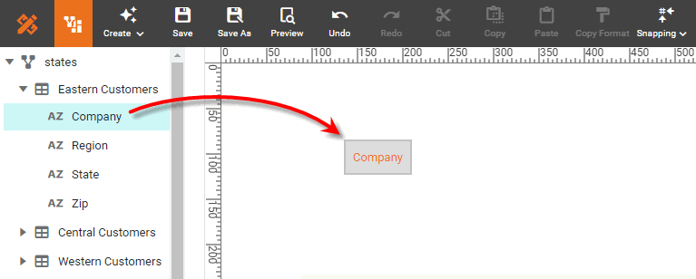
This creates a Selection List that filters the ‘Eastern Customers’ data block based on ‘Company’.
-
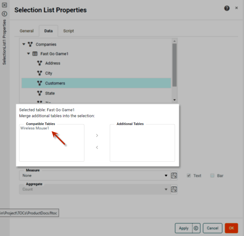
Right-click the Selection List and select ‘Properties’ from the context menu. Note: You can also access menu options from the ‘More’ button (
) in the mini-toolbar. This opens the ‘Selection List Properties’ dialog box. -
Select the Data tab.
-
Hold down the Ctrl key and click in the ‘Compatible Tables’ list to select both the ‘Western Customers’ and ‘Central Customers’ data blocks. Press the ‘Add’ button
to add them to the ‘Additional Tables’ list.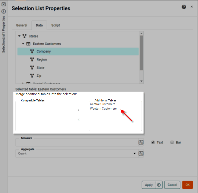
These are “compatible” data blocks because they have a column of the same name (‘Company’) as the ‘Eastern Customers’ data block, and the corresponding columns have mergeable data types (identical data types, in this case).
-
Press OK.
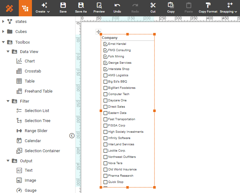
The Selection List now displays the merged data from the ‘Company’ field of all three data blocks, and filtering selections that you make in the Selection List will filter all three data blocks simultaneously.
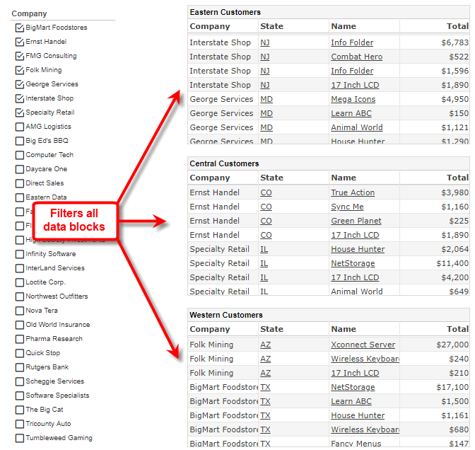
To verify this, add a Table to the Dashboard for each of the three data blocks (see Create a Table or Create a Crosstab). Note how the Selection List filters the data in each table even though each table draws data from an independent data block.
Submit Filters in Batch
To submit settings from all Filter components in batch by using a Submit button, follow the steps below:
-
Drag a Submit button from the Toolbox to the Dashboard. (See Submit Button Properties for more information.)
-
Right-click a Filter component in the Dashboard, and select ‘Properties’ from the context menu. Note: You can also access menu options from the ‘More’ button (
) in the mini-toolbar. In the ‘Properties’ dialog box, disable the ‘Submit on Change’ option located in the Advanced or General tab. -
Repeat the previous step for each Filter component in the Dashboard.
The Submit button will now batch-submit all Filter selections, as well as selections made in any Form components that similarly have the ‘Submit on Change’ option disabled.