Add a KPI
Watch Video: Creating a Dashboard (Add a KPI)
This video might show an earlier version of the feature or operation that differs in minor ways from the current version.
The most common way to represent a Key Performance indicator (KPI) is by using a Gauge component for graphical representation or a Text component for digital representation. The following sections explain how to do this.
Add a Gauge KPI
A Gauge component allows you to display a single aggregated value (for example, a grand total) in a visually prominent manner.
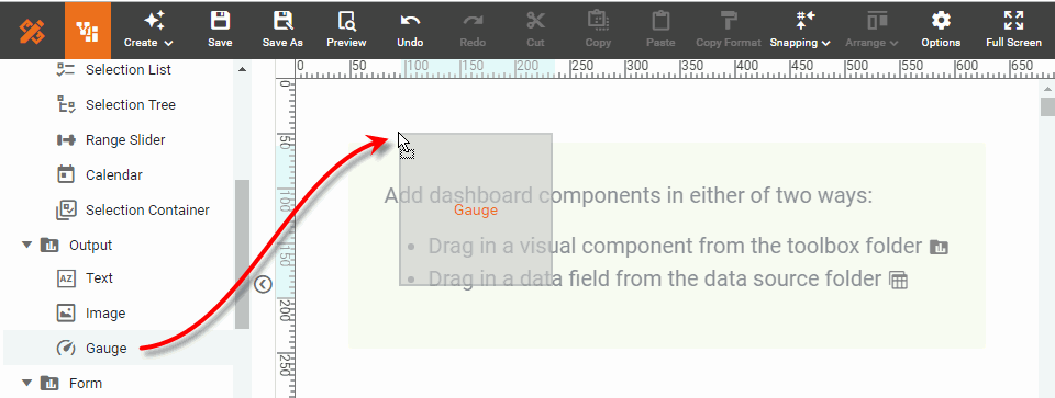
Add the Gauge Component
To add a Gauge component, follow the steps below:
-
If necessary, create a new Dashboard. (See Create a New Dashboard.)
-
From the Toolbox panel, drag the Gauge component onto the Dashboard.
-
From the data source at the top of the Toolbox panel, drag a measure onto the Gauge component. (A green highlight informs you when you can drop the field.)
What is a measure?
A measure is generally used for aggregation, for example summation, averaging, correlation, etc., within a Crosstab, Chart, Text component, or Gauge. Adding a measure to the ‘Y’ region in a chart displays the computed aggregates by using locations on the Y-axis. Adding a measure to the ‘X’ region displays the computed aggregates by using locations on the X-axis. You can also display aggregates by using color, shape, size, or label.
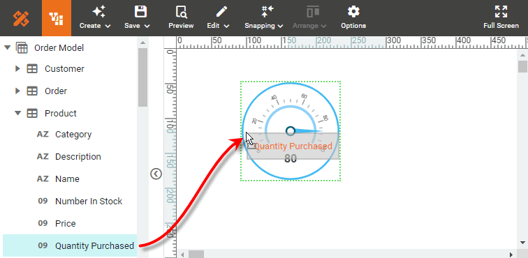
This binds the measure to the Gauge component so that the component displays the aggregated value of the measure.
-
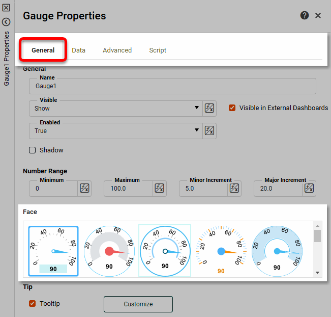
Right-click on the Gauge component, and select ‘Properties’ from the context menu. This opens the ‘Gauge Properties’ panel.
-
Select the General tab of the ‘Gauge Properties’ panel, and choose a desired gauge face.
-
Select the Data tab. From the 'Aggregate' menu, select the desired aggregation method. Optional: To make the aggregate dynamic so that a user can change it, use the ‘Value Type’ button
 . (See Dynamically Set Properties for more details.)
 -
Press OK to close the panel.
-
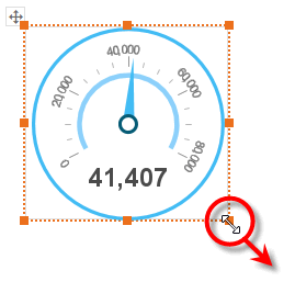
Enlarge the component as desired by dragging on any of the component borders.
Set Gauge Ranges (Optional)
To set multiple ranges for a Gauge, follow the steps below:
-
Right-click on the Gauge component, and select ‘Properties’ from the context menu. This opens the ‘Gauge Properties’ panel.
-
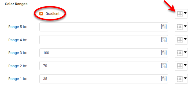
Open the Advanced tab. In the ‘Range’ panel you will see three editable drop-down lists.
-
Enter a value for ‘Range 1 to’ and choose a color from the pop-up menu. This sets the region from the minimum value on the scale to the specified value.
-
Enter a value into ‘Range 2 to’ and choose a color from the pop-up menu. This sets the region from the end of ‘Range 1’ to the specified value.
-
Repeat the above steps to add any additional thresholds.
-
Optional: Select ‘Gradient’ to smoothly blend the zone colors. You can choose a color for the final blend as well.
-
Press OK to apply the ranges.
Add a Text KPI
In addition to displaying static text (see Add Text or HTML), a Text component allows you to display a single aggregated value (for example, a grand total). To use a Text component to display aggregate data, follow the steps below:
-
If necessary, create a new Dashboard. (See Create a New Dashboard.)
-
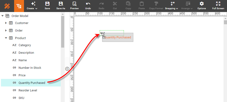
From the Toolbox panel, drag a Text component onto the Dashboard. This creates a new Text component.
-
From the data source at the top of the Toolbox panel, drag a measure onto the Text component. (A green outline informs you when you can drop the field.)
What is a measure?
A measure is generally used for aggregation, for example summation, averaging, correlation, etc., within a Crosstab, Chart, Text component, or Gauge. Adding a measure to the ‘Y’ region in a chart displays the computed aggregates by using locations on the Y-axis. Adding a measure to the ‘X’ region displays the computed aggregates by using locations on the X-axis. You can also display aggregates by using color, shape, size, or label.
This binds the measure to the Text component so that the component displays the aggregated value of the measure.
-
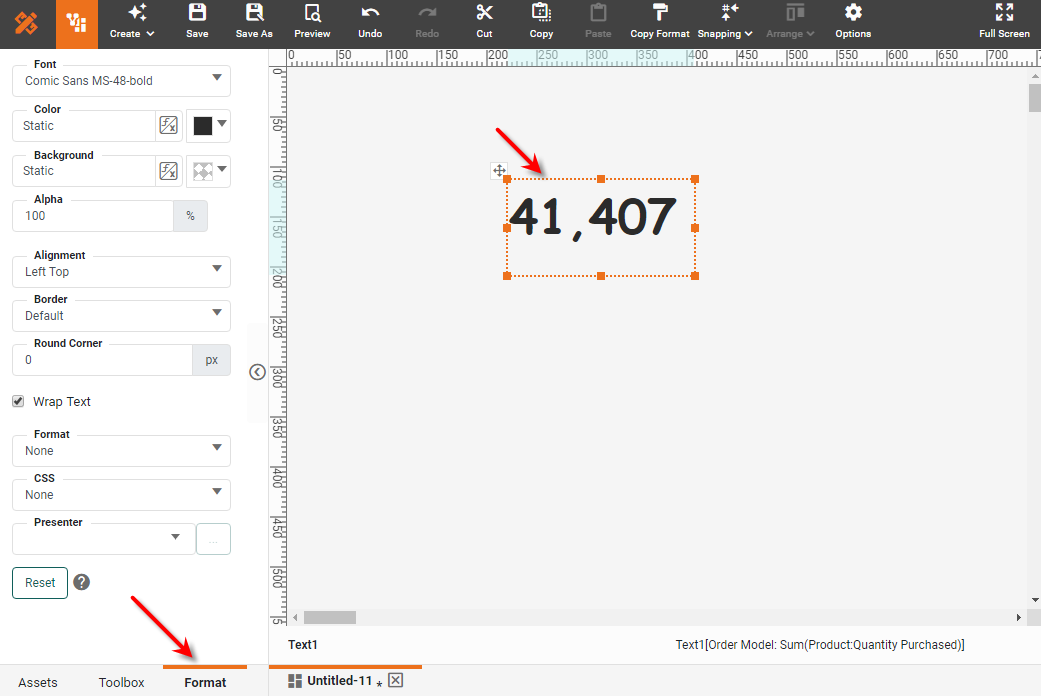
Optional: Enlarge the Text component by dragging on any of the component borders.
-
Optional: Click the Text component to select it, and select the Format tab in the left panel. Style the text as desired. (See Add Visual Format and Add Data Format for more details.)
-
Right-click the Text element, and select 'Properties' form the context menu. This opens the 'Text Properties' panel.
-
Select the Data tab. From the 'Aggregate' menu, select the desired aggregation method. To make the aggregate dynamic so that a user can change it, use the ‘Value Type’ button
. See Dynamically Set Properties for more details.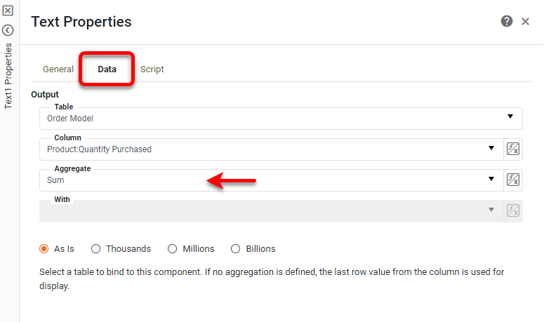
-
Press OK.
-
Optional: To filter the aggregate data displayed in the KPI, right-click the Text component and select ‘Condition’ from the context menu. This opens the ‘Condition’ panel. Enter the desired condition and press OK. To filter out null values, you can use a condition such as
[Company][is not][equal to][null]. See Add Conditions for more information about conditions.It is generally preferable to use Filter components for filtering purposes. See Filter a Dashboard. 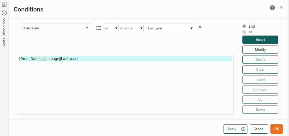
Compute a KPI with Script
The easiest way to use a Gauge or Text component to display a KPI is to bind the Gauge or Text to an existing data field as described above. However, you can also compute a KPI using script.
There are several ways to do this:
- Text or Gauge
-
Create a calculated field (see Create a New Data Field), and bind the calculated field to the Gauge or Text in the usual way (see above).
- Text Only
-
Enter an expression for the ‘Text’ property on the General tab of the ‘Text Properties’ panel to aggregate the desired data. See Text Properties for more information.
- Text or Gauge
-
Enter an expression on the Script tab of the ‘Gauge Properties’ or ‘Text Properties’ panel to compute a desired value. Assign the computed value to keyword
value. For example:value = sum(Sales['Total'])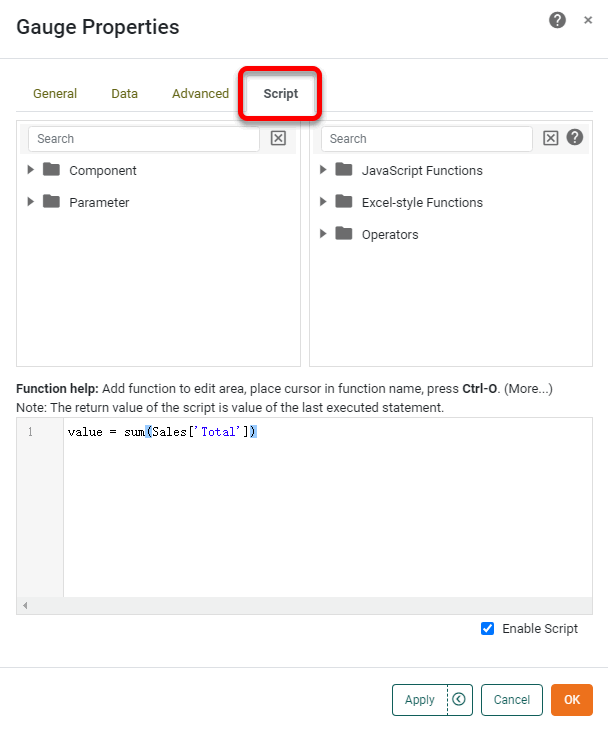
For complete details on component scripting, see Advanced Dashboard Scripting. Scripts to compute values for Gauge and Text components often use array-type functions similar to Microsoft Excel®. For example:
- CALC.sum(array)
-
Sum the values in a data column.
CALC.sum(SalesByDate['Total']) - CALC.sumif(array1, conditionString, array2)
-
Sum values in column
array1when a specific condition is met by corresponding values inarray2.CALC.sumif(Sales['Total'],'>50',Sales['Quantity Purchased']) - CALC.max(array)
-
Return the maximum value in a data column.
CALC.max(SalesByDate['Total']) - CALC.counta(array)
-
Return the number of non-null values in a data column.
CALC.counta(SalesByDate['City'])
See Reference Datasource Data for more information on the syntax for accessing data columns. See CALC Object Functions for additional script functions.
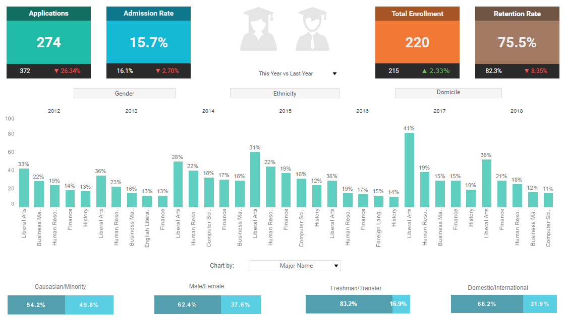
The sample Enrollment Dashboard provides an example of using Text KPIs.
To explore this sample Dashboard, download and import the Enrollment Dashboard into your environment. (This requires access to Enterprise Manager.) See Import and Export Assets for instructions on how to import.