Create a Crosstab
The following sections explain how to add a Crosstab, which allows you to display aggregated data in tabular form. To create a crosstab, follow the steps below:
Watch Video: Grouping Data in a Dashboard (Add a Crosstab)
This video might show an earlier version of the feature or operation that differs in minor ways from the current version.
-
If necessary, create a new Dashboard. (See Create a New Dashboard.)
-
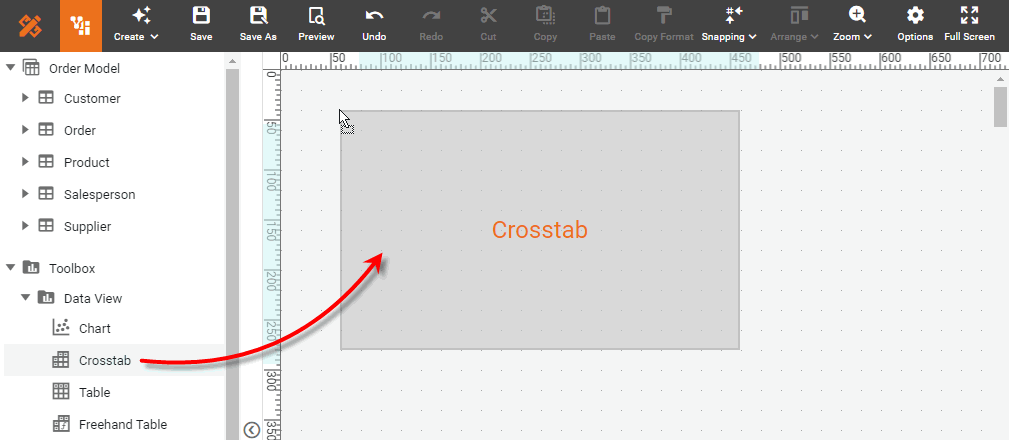
Drag the Crosstab element from the Toolbox panel into the Dashboard.
-
Press the ‘Edit’ button
 at the top-right corner of the Crosstab to open the Crosstab Editor.
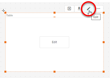
-
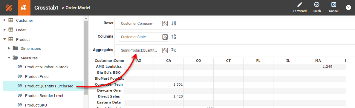
From the Data Source panel, drag the desired columns or cube dimensions into the ‘Columns’ and ‘Rows’ regions.
The panel displays all OLAP cubes defined on the data source. 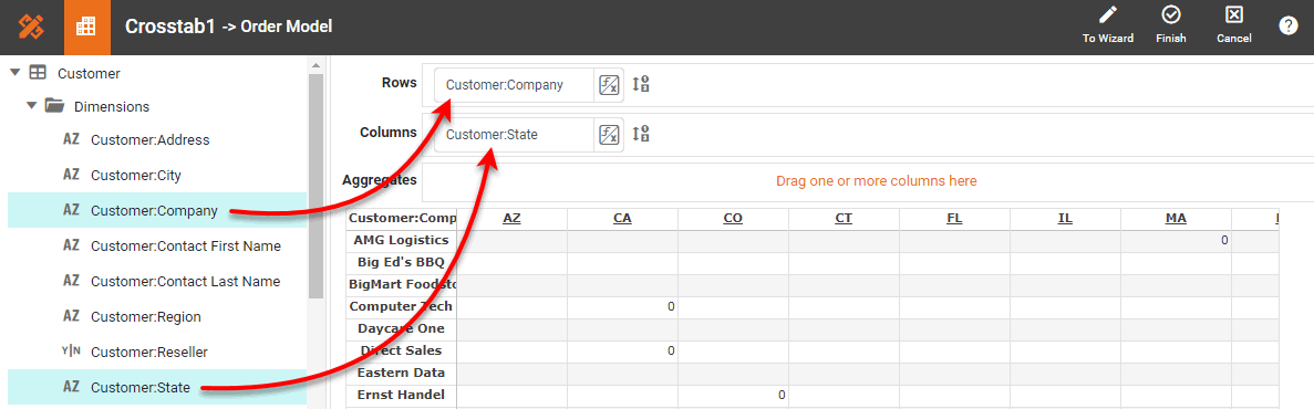
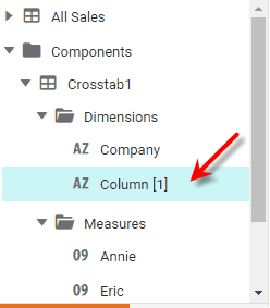
If the Dashboard contains other Tables or Crosstabs, you can use the data in those components as the data source. Simply expand the ‘Components’ folder, and select the desired fields.
There are two restrictions on binding a component to another component’s data:
-
This option is not available in meta-data mode. See Dashboard Options for information about meta-data mode.
-
You will not be able to filter the component using a Selection List or Range Slider. However, you can still filter the component by using a condition (see Add Conditions).
-
-
Drag the desired columns or cube measures into the ‘Aggregates’ region.
You can change the order of multiple dimensions or measures by dragging them left or right in the Editor. -
Optional: To make the row, column, and aggregate fields dynamic so that a user can change them, see Dynamically Set Properties.
If you want to use a single Form component (e.g., ComboBox) to dynamically set both the measure field and aggregation method, you can enter strings such as Ave('Total')orSum('Total')as the values in the Form element, and then use the Form element as a ‘Variable’ to set the measure in the ‘Aggregates’ panel. (See Dynamically Set Properties for information on how to do this.) With this approach, you also need to press the ‘Edit Measure’ button next to the Variable-based measure in the ‘Aggregates’ panel, and set the ‘Aggregate’ property to ‘None’.
-
Optional: To hide a particular column, right-click the column in the Crosstab Editor, and select ‘Hide Column’. To show all hidden columns, right-click any column in the Crosstab Editor, and select ‘Show Columns’.
-
Optional: Specify group sorting and ranking. Follow the steps below:
Sort and RankWatch Video: Grouping Data in a Dashboard (Sort and Rank)
This video might show an earlier version of the feature or operation that differs in minor ways from the current version.
-
Press the ‘Edit Dimension’ button
 next to a row header or column header.
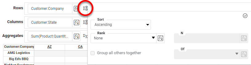
-
In the ‘Sort’ menu, specify how the values in the field should be ordered. ‘Ascending’ and ‘Descending’ sort the values in alphabetical or reverse-alphabetical order. ‘By Value (Asc)’ and ‘By Value (Desc)’ sort the values according to the aggregate measure selected in the adjacent menu.
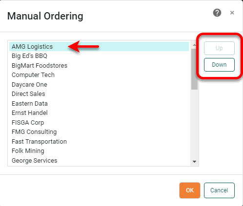
To specify an arbitrary sort order, select the ‘Manual’ option in the ‘Sort’ menu, and press the to open the ‘Manual Ordering’ dialog box. To reorder an item in the ‘Manual Ordering’ dialog box, select the item and press the Up or Down buttons. Press OK to close the dialog box.
-
For a Date-type field, select the desired level of date grouping (‘Year’, ‘Month’, etc.) from the ‘Level’ menu. Optional: Select ‘As time series’ to force the display of date groups even when the group has no data. In this case the cell is filled either with a null value or with a zero (if the 'Fill Blank Cell With Zero' option is enabled on the Advanced tab of the ‘Table Properties’ dialog box).
Watch Video: Grouping Data in a Dashboard (Set Date Grouping Level)
This video might show an earlier version of the feature or operation that differs in minor ways from the current version.
To group dates using a fiscal calendar, create Calculated Fields for the desired date ranges (fiscal week, month, etc.) by using the corresponding fiscal functions, such as CALC_fiscalweek and CALC_fiscalmonth, and then use those Calculated Fields in the ‘Columns’ and ‘Rows’ regions of the Crosstab. See Create a Calculated Field in a Dashboard for more details. -
In the ‘Rank’ menu, select the ‘Top’ or ‘Bottom’ filter, and specify the (integer) number of top or bottom groups to select. In the adjacent menu, specify the measure by which groups should be ranked.
What is a measure?
A measure is generally used for aggregation, for example summation, averaging, correlation, etc., within a Crosstab, Chart, Text component, or Gauge. Adding a measure to the ‘Y’ region in a chart displays the computed aggregates by using locations on the Y-axis. Adding a measure to the ‘X’ region displays the computed aggregates by using locations on the X-axis. You can also display aggregates by using color, shape, size, or label.
Select ‘Group all others together’ to create an “Others” category which represents (in aggregate) all the groups excluded by the Top/Bottom ranking filter.
-
In the ‘Summarize’ menu (available for parent groups), specify whether group totals should be shown.
-
Press the ‘Apply’ button
 to close the panel.
-
-
Press the ‘Edit Measure’ button
next to a measure, and select the desired method from the ‘Aggregate’ menu.Watch Video: Grouping Data in a Dashboard (Aggregate in Crosstab)
This video might show an earlier version of the feature or operation that differs in minor ways from the current version.
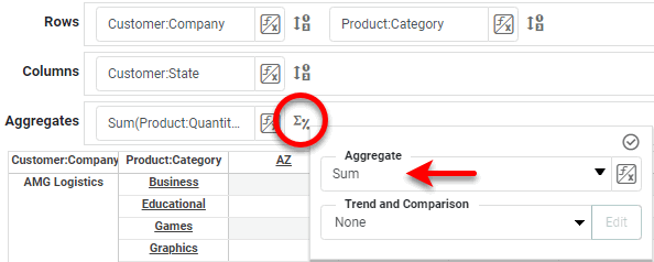
To display a bivariate aggregation measure (e.g., ‘Correlation’, ‘Weighted Average’, etc.), select the second operand (column) from the ‘with’ menu. To display a univariate measure (‘Sum’, ‘Count’, etc.) as a percentage, select the basis for percentage in the ‘Percentage of’ menu. Press the ‘Apply’ button
to close the panel.If you choose a percentage representation, press the Edit button to select the dimension along which the percentage is computed (‘Rows’ or ‘Columns’). Percentage by rows uses the row totals, and by columns uses the column totals. -
Press the ‘Finish’ button
to close the Editor. -
If desired, expand the crosstab horizontally so that all of the column headers are visible.
-
Optional: Merge column headers or row headers together to agglomerate data into larger categories called named groups. For example, you can combine column header labels designating individual states MA, CT, NY, NJ, etc., into larger groups such as ‘New England’ and ‘Mid-Atlantic’. Follow the steps below:
Named groups cannot be defined for date fields. Create Named GroupsWatch Video: Grouping Data in a Dashboard (Combine Groups in Crosstab)
This video might show an earlier version of the feature or operation that differs in minor ways from the current version.
-
Hold the Ctrl and click to select the individual crosstab header labels (from the same heading level) that you want to combine into a single group.
-
Right-click on one of the selected labels, and select ‘Group’ from the context menu. Note: You can also access menu options from the ‘More’ button (
 ) in the mini-toolbar. This opens the ‘Group Name’ dialog box.
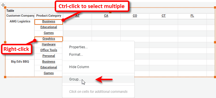
You can group existing groups to make larger groups. -
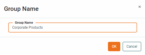
Enter a name for the new group in the ‘Group Name’ dialog box, and press OK.
 This replaces the selected labels with the label for the named grouping, and agglomerates the data corresponding to the original labels under the new label.
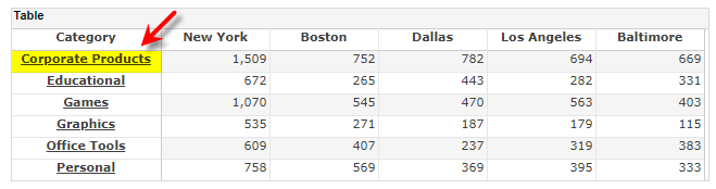
-
Repeat the above steps to add additional named groups.
To decompose an existing name group, right-click on the header label and select ‘Ungroup’ from the context menu. Note: You can also access menu options from the ‘More’ button (
) in the mini-toolbar.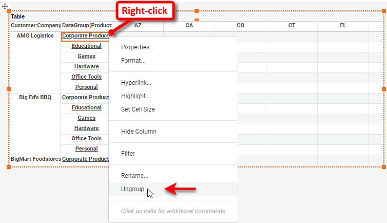
-
-
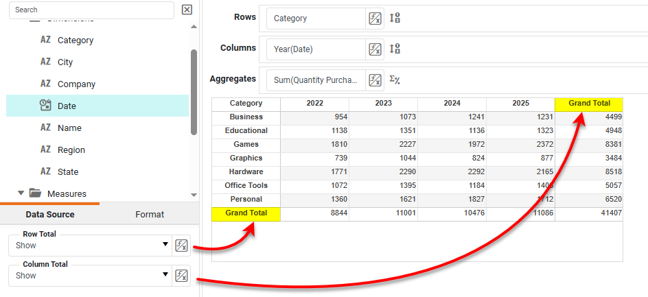
Optional: To display a grand total for rows or columns, select ‘Show’ for the desired ‘Row Total’ or ‘Column Total’ option in the left panel.
Proceed to format and style the Crosstab as you would for any Table. See Configure Table Appearance for more information about how to apply styles.