Represent Multiple Measure
|
Represent Data with Shape, Color, Size to visually break out data as sub-series. |
To represent multiple measures on a single chart, simply define a GraphElement object for each measure, and add the GraphElement to the Chart.
Consider the following script.
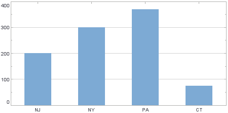
dataset = [["State", "Quantity 1", "Quantity 2"],["NJ",200,500], ["NY",300,1000],["PA",370,440], ["CT",75,20]];
graph = new EGraph();
var elem1 = new IntervalElement("State", "Quantity 1");
graph.addElement(elem1);
This creates a basic Bar Chart displaying the dimensions ‘State’ and ‘Quantity 1’.
To add the measure ‘Quantity 2’ to the chart as line element, follow the steps below:
-
Create a new LineElement to represent the graph of ‘Quantity 2’ vs. ‘State’.
var elem2 = new LineElement("State", "Quantity 2"); -
Assign this new element to the
EGraphobject.graph.addElement(elem2);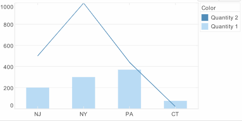
A legend is created automatically. To modify the legend, make changes to the VisualFrame’s LegendSpec property. See Change Legend Properties.