Change Chart Coordinates
There are several different Coordinate objects, each of which creates a different kind of chart. The following sections discuss the different types of chart coordinate systems.
Rectangular Coordinates
The default coordinate set is rectangular coordinates, as defined by the RectCoord object. Rectangular coordinates represent two-dimensional data on horizontal (X) and vertical (Y) axes. A RectCoord object is created automatically when you create a new Chart object. Therefore, if you plan to use rectangular coordinates on the chart, you do not need to explicitly specify a RectCoord object. You only need to explicitly create or reference the RectCoord object when you want to define other types of coordinate systems. (See Polar Coordinates, Parallel Coordinates, and Facet Coordinates for examples.)
Assign Rectangular Coordinates Automatically
The following example illustrates automatic creation of rectangular coordinates:
dataset = [["Direction", "Score"],[(Math.PI/2),20],[(Math.PI/4),30],[(Math.PI),35]];
graph = new EGraph();
var elem = new PointElement("Direction", "Score");
var xscale = new LinearScale("Direction");
var yscale = new LinearScale("Score");
yscale.setMin(0);
yscale.setMax(40);
var yaxis = new AxisSpec();
yaxis.setGridStyle(Chart.DOT_LINE);
yscale.setAxisSpec(yaxis);
xscale.setMin(0);
xscale.setMax(1.95*Math.PI);
xscale.setIncrement(Math.PI/8);
var xaxis = new AxisSpec();
var tspec = new TextSpec();
tspec.setFormat(new java.text.DecimalFormat("0.0"));
xaxis.setTextSpec(tspec);
xaxis.setGridStyle(Chart.DOT_LINE);
xscale.setAxisSpec(xaxis);
graph.setScale("Direction",xscale);
graph.setScale("Score",yscale);
graph.addElement(elem);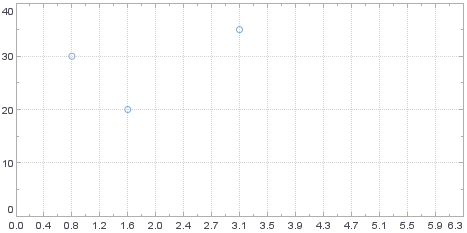
Script that modifies the graph or dataset properties should be placed on the Chart component itself. See Add Component Script for more information. This script has access to the Chart data and Chart API methods. Scripted Charts are not good candidates for user-modification, so you should deselect ‘Enable Ad Hoc Editing’ in the Chart Properties dialog box.
|
The script defines a PointElement style (scatter plot), and specifies a LinearScale for the ‘Direction’ field and ‘Score’ field. Note that the script does not explicitly create a RectCoord object. A rectangular coordinate system is created automatically, and this allows you to assign the specified scales directly to the Graph, as shown:
graph.setScale("Direction",xscale);
graph.setScale("Score",yscale);|
If needed, you can obtain a handle to the existing RectCoord object by using EGraph.getCoordinate(): |
Assign Rectangular Coordinates Explicitly
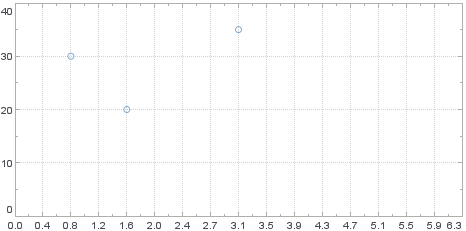
You can explicitly define the RectCoord object, if needed. The script below is the same as the script in Assign Rectangular Coordinates Automatically, but uses two scales to explicitly define a set of rectangular coordinates. These coordinates are then explicitly assigned to the chart using EGraph.setCoordinate(coord).
dataset = [["Direction", "Score"],[(Math.PI/2),20],[(Math.PI/4),30],[(Math.PI),35]];
graph = new EGraph();
var elem = new PointElement("Direction", "Score");
var xscale = new LinearScale("Direction");
var yscale = new LinearScale("Score");
yscale.setMin(0);
yscale.setMax(40);
var yaxis = new AxisSpec();
yaxis.setGridStyle(Chart.DOT_LINE);
yscale.setAxisSpec(yaxis);
xscale.setMin(0);
xscale.setMax(1.95*Math.PI);
xscale.setIncrement(Math.PI/8);
var xaxis = new AxisSpec();
var tspec = new TextSpec();
tspec.setFormat(new java.text.DecimalFormat("0.0"));
xaxis.setTextSpec(tspec);
xaxis.setGridStyle(Chart.DOT_LINE);
xscale.setAxisSpec(xaxis);
graph.setScale("Direction",xscale);
graph.setScale("Score",yscale);
var rect = new RectCoord(xscale,yscale); (1)
graph.setCoordinate(rect); (2)
graph.addElement(elem);| 1 | Explicitly create rectangular coordinates |
| 2 | Assign coordinates to graph |
Script that modifies the graph or dataset properties should be placed on the Chart component itself. See Add Component Script for more information. This script has access to the Chart data and Chart API methods. Scripted Charts are not good candidates for user-modification, so you should deselect ‘Enable Ad Hoc Editing’ in the Chart Properties dialog box.
|
Polar Coordinates
Polar coordinates represent data in terms of an angle and magnitude (radius). They are defined by the PolarCoord object, which accepts a RectCoord object as input. The following sections explain how to create and modify polar coordinates. They also demonstrate a common use of polar coordinates, the pie chart.
Convert Rectangular to Polar Coordinates
To create polar coordinates, you first need to create a set of rectangular coordinates with the RectCoord constructor or access existing rectangular coordinates with EGraph.getCoordinate(). Consider the script from the previous section, Assign Rectangular Coordinates Automatically.
dataset = [["Direction", "Score"],[(Math.PI/2),20],[(Math.PI/4),30],[(Math.PI),35]];
graph = new EGraph();
var elem = new PointElement("Direction", "Score");
var xscale = new LinearScale("Direction");
var yscale = new LinearScale("Score");
yscale.setMin(0);
yscale.setMax(40);
var yaxis = new AxisSpec();
yaxis.setGridStyle(Chart.DOT_LINE);
yscale.setAxisSpec(yaxis);
xscale.setMin(0);
xscale.setMax(1.95*Math.PI);
xscale.setIncrement(Math.PI/8);
var xaxis = new AxisSpec();
var tspec = new TextSpec();
tspec.setFormat(new java.text.DecimalFormat("0.0"));
xaxis.setTextSpec(tspec);
xaxis.setGridStyle(Chart.DOT_LINE);
xscale.setAxisSpec(xaxis);
graph.setScale("Direction",xscale);
graph.setScale("Score",yscale);
var rect = new RectCoord(xscale,yscale); (1)
graph.setCoordinate(rect); (2)
graph.addElement(elem);| 1 | Explicitly create rectangular coordinates |
| 2 | Assign coordinates to graph |
Script that modifies the graph or dataset properties should be placed on the Chart component itself. See Add Component Script for more information. This script has access to the Chart data and Chart API methods. Scripted Charts are not good candidates for user-modification, so you should deselect ‘Enable Ad Hoc Editing’ in the Chart Properties dialog box.
|
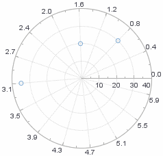
Note that this script explicitly creates a set of rectangular coordinates by calling the RectCoord constructor. To convert the Chart to a polar coordinate system, use the RectCoord object named rect to create a new PolarCoord object:
var polar = new PolarCoord(rect);Assign this new coordinate set to the Chart to obtain the desired polar representation. The modified script is shown below:
dataset = [["Direction", "Score"],[(Math.PI/2),20],[(Math.PI/4),30],[(Math.PI),35]];
graph = new EGraph();
var elem = new PointElement("Direction", "Score");
var xscale = new LinearScale("Direction");
var yscale = new LinearScale("Score");
yscale.setMin(0);
yscale.setMax(40);
var yaxis = new AxisSpec();
yaxis.setGridStyle(Chart.DOT_LINE);
yscale.setAxisSpec(yaxis);
xscale.setMin(0);
xscale.setMax(1.95*Math.PI);
xscale.setIncrement(Math.PI/8);
var xaxis = new AxisSpec();
var tspec = new TextSpec();
tspec.setFormat(new java.text.DecimalFormat("0.0"));
xaxis.setTextSpec(tspec);
xaxis.setGridStyle(Chart.DOT_LINE);
xscale.setAxisSpec(xaxis);
graph.setScale("Direction",xscale);
graph.setScale("Score",yscale);
var rect = new RectCoord(xscale,yscale); (1)
var polar = new PolarCoord(rect); (2)
graph.setCoordinate(polar); (3)
graph.addElement(elem);| 1 | Create rectangular coordinates |
| 2 | Convert rectangular coordinates to polar coordinates |
| 3 | Assign polar coordinates to graph |
By default, the rectangular coordinate’s X-axis is mapped to the polar coordinate’s angle, and the rectangular coordinate’s Y-axis is mapped to the polar coordinate’s magnitude (radius). To reverse a mapping, use the Coordinate.transpose() method.
Tailor Polar Coordinate Mapping
When converting rectangular to polar coordinates, you can choose to map only one of the dimensions. Use the PolarCoord.setType(value) property to do this.
| Mapping just a single dimension is useful for pie charts. See Polar Coordinates Example: Pie Chart. |
The example below is the same as that in Convert Rectangular to Polar Coordinates, except that here only the angle dimension is mapped:
dataset = [["Direction", "Score"],[(Math.PI/2),20],[(Math.PI/4),30],[(Math.PI),35]];
graph = new EGraph();
var elem = new PointElement("Direction", "Score");
var xscale = new LinearScale("Direction");
var yscale = new LinearScale("Score");
yscale.setMin(0);
yscale.setMax(40);
var yaxis = new AxisSpec();
yaxis.setGridStyle(Chart.DOT_LINE);
yscale.setAxisSpec(yaxis);
xscale.setMin(0);
xscale.setMax(1.95*Math.PI);
xscale.setIncrement(Math.PI/8);
var xaxis = new AxisSpec();
var tspec = new TextSpec();
tspec.setFormat(new java.text.DecimalFormat("0.0"));
xaxis.setTextSpec(tspec);
xaxis.setGridStyle(Chart.DOT_LINE);
xscale.setAxisSpec(xaxis);
graph.setScale("Direction",xscale);
graph.setScale("Score",yscale);
var rect = new RectCoord(xscale,yscale);
var polar = new PolarCoord(rect); (1)
polar.setType(PolarCoord.THETA); (2)
graph.setCoordinate(polar);
graph.addElement(elem);| 1 | Create the polar coordinates |
| 2 | Set THETA to map only the angle dimension |
Script that modifies the graph or dataset properties should be placed on the Chart component itself. See Add Component Script for more information. This script has access to the Chart data and Chart API methods. Scripted Charts are not good candidates for user-modification, so you should deselect ‘Enable Ad Hoc Editing’ in the Chart Properties dialog box.
|
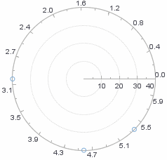
The result is that all points have the same magnitude, with variation only along the angle dimension. (All points therefore appear on the perimeter of the circle.) To reverse a mapping, use the Coordinate.transpose() method.
Polar Coordinates Example: Pie Chart
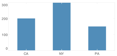
A pie chart is essentially a stacked bar chart (with just one bar), displayed in polar coordinates. To see this, consider the script below, which creates a simple bar chart.
dataset = [["State", "Revenue"], ["CA", 200],["NY",300],["PA",150]];
graph = new EGraph();
var elem = new IntervalElement("State","Revenue");
var xscale = new CategoricalScale("State");
var yscale = new LinearScale("Revenue");
var rect = new RectCoord(xscale, yscale);
graph.setCoordinate(rect);
graph.addElement(elem);
Script that modifies the graph or dataset properties should be placed on the Chart component itself. See Add Component Script for more information. This script has access to the Chart data and Chart API methods. Scripted Charts are not good candidates for user-modification, so you should deselect ‘Enable Ad Hoc Editing’ in the Chart Properties dialog box.
|
To create a pie chart from this data, just convert the Chart to a stacked bar, and then convert to polar coordinates. Follow the steps below:
-
Instead of using different X-axis positions to distinguish the ‘State’ data, distinguish the states using a ColorFrame object.
dataset = [["State", "Revenue"], ["CA", 200],["NY",300],["PA",150]];
graph = new EGraph();
var elem = new IntervalElement(null,"Revenue");
var xscale = new CategoricalScale("State");
var yscale = new LinearScale("Revenue");
var rect = new RectCoord(null, yscale);
var cframe = new CategoricalColorFrame("State"); (1)
elem.setColorFrame(cframe); (2)
graph.setCoordinate(rect);
graph.addElement(elem);
1 Creat the ColorFramefor ‘State’2 Assign the ColorFrameto theIntervalElement(bars)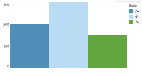
Note that a
nullvalue is assigned for the (unused) X-dimension when creating the IntervalElement and RectCoord objects. -
Convert the Chart into a Stacked Bar Chart with just one bar by using the GraphElement.setCollisionModifier(value) property. Create a StackRange object to make sure there is enough room for the stacked elements.
elem.setCollisionModifier(GraphElement.STACK_SYMMETRIC);
yscale.setScaleRange(new StackRange());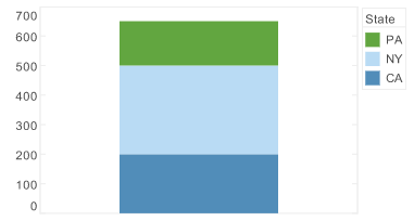
-
Create polar coordinates from the existing rectangular coordinates. By default, this maps the non-null coordinate (Y-axis) to the polar coordinate’s magnitude dimension. Specify that it should be mapped to the angle dimension instead by using the
THETAoption.var polar = new PolarCoord(rect); polar.setType(PolarCoord.THETA); -
Use the Chart’s EGraph.setCoordinate(coord) method to apply the new polar coordinates.
graph.setCoordinate(polar);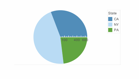
-
Remove the axis lines and labels. To do this, create an AxisSpec object, and assign it to the Scale.
var yspec = new AxisSpec();
yspec.setLabelVisible(false);
yspec.setLineVisible(false);
yspec.setTickVisible(false);
yscale.setAxisSpec(yspec);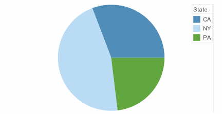
-
Add the state names to the individual slices and hide the legend. To do this, create a new TextFrame object based on the “State” field, and assign it to the GraphElement. To hide the legend, create a new LegendSpec object, and assign it to the ColorFrame.
var tframe = new DefaultTextFrame("State"); elem.setTextFrame(tframe); var legend = new LegendSpec(); legend.setVisible(false); cframe.setLegendSpec(legend); -
Explode the slices for better appearance.
elem.setHint(GraphElement.HINT_EXPLODED,'true');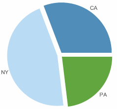
Parallel Coordinates
Parallel coordinates display multiple dimensions as parallel axes, rather than orthogonal axes (rectangular coordinates). Parallel coordinates are defined by the ParallelCoord object, which accepts a set of Scale objects as input.
To understand parallel coordinates, consider the following data set, which contains scores for three students over three consecutive tests.
| Test 1 | Test 2 | Test 3 | Name |
|---|---|---|---|
200 |
175 |
50 |
Joe |
800 |
1000 |
300 |
Jane |
10 |
15 |
20 |
Fred |
By plotting this data on three parallel coordinates (‘Test 1’, ‘Test 2’, ‘Test 3’), you can visualize trends across the different tests. To create this chart, follow the steps below:
Script that modifies the graph or dataset properties should be placed on the Chart component itself. See Add Component Script for more information. This script has access to the Chart data and Chart API methods. Scripted Charts are not good candidates for user-modification, so you should deselect ‘Enable Ad Hoc Editing’ in the Chart Properties dialog box.
|
-
Define the data set and chart objects.
dataset = [["Test1","Test2","Test3","Name"],[100,80,20,'Joe'],[75,50,40,'Jane'],[50,30,80,'Fred']]; graph = new EGraph(); -
Create a new LineElement object to define a line-style chart, and assign its dimensions.
var elem = new LineElement(); elem.addDim("Test1"); elem.addDim("Test2"); elem.addDim("Test3"); -
Define the scales used for the three axes. (In this case the scales are the same for all three.)
var scale1 = new LinearScale("Test1"); var scale2 = new LinearScale("Test2"); var scale3 = new LinearScale("Test3"); scale1.setMax(100); scale2.setMax(100); scale3.setMax(100); scale1.setMin(0); scale2.setMin(0); scale3.setMin(0); -
Create the new
ParallelCoordobject using the defined scales.var coord = new ParallelCoord(scale1,scale2,scale3); -
Use a CategoricalColorFrame to distinguish the three students. Assign the frame to the line element.
var frame = new CategoricalColorFrame("Name"); elem.setColorFrame(frame); -
Assign the parallel coordinate system to the chart.
graph.addElement(elem);
graph.setCoordinate(coord);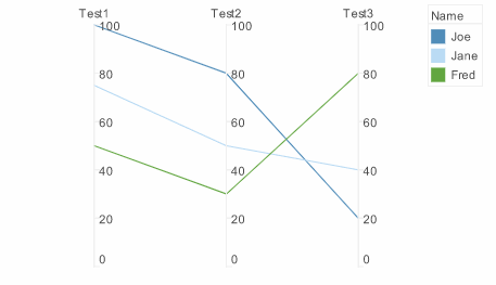
Facet Coordinates
The FacetCoord object contains a set of inner and outer coordinates on which multidimensional data can be represented as nested charts. To create a FacetCoord object, pass a pair of RectCoord objects to the FacetCoord constructor:
var rect = new FacetCoord(outerCoord,innerCoord);To understand facet coordinates, consider the following data set.
| State | Product | Name | Priority |
|---|---|---|---|
NJ |
P1 |
Joe |
2 |
NJ |
P2 |
Sam |
3 |
NY |
P1 |
Jane |
4 |
NJ |
P1 |
Sam |
1 |
NJ |
P2 |
Joe |
10 |
NY |
P1 |
Sam |
10 |
Because there are four different dimensions, there are several ways to look at the data. For example, you may want to plot ‘Priority’ vs. ‘Name’, and also break this down by ‘Product’ and ‘State’. To construct a facet chart to do this, follow the steps below:
Script that modifies the graph or dataset properties should be placed on the Chart component itself. See Add Component Script for more information. This script has access to the Chart data and Chart API methods. Scripted Charts are not good candidates for user-modification, so you should deselect ‘Enable Ad Hoc Editing’ in the Chart Properties dialog box.
|
-
Define the data and the Chart objects, and create a new IntervalElement (bar chart).
dataset = [["State", "Product", "Name", "Priority"],["NJ", "P1", "Joe", 2],["NJ", "P2", "Sam", 3],["NY", "P1", "Jane", 4],["NJ", "P1", "Sam", 1],["NJ", "P2", "Joe", 10],["NY", "P1", "Sam", 10]]; graph = new EGraph(); var elem = new IntervalElement("Name", "Priority"); -
Create a Scale for each of the dimensions. All dimensions are categorical except for ‘Priority’.
var state = new CategoricalScale("State"); var name = new CategoricalScale("Name"); var product = new CategoricalScale("Product"); var priority = new LinearScale("Priority"); -
Define two sets of rectangular coordinates, one for the outer coordinates (‘Product’ vs. ‘State’) and one for the inner coordinates (‘Priority’ vs. ‘Name’).
var inner = new RectCoord(name, priority); var outer = new RectCoord(state, product); -
Create the facet coordinates based on the outer and inner rectangular coordinates defined above.
var coord = new FacetCoord(outer,inner); -
Assign the coordinates and the bar elements to the chart.
graph.setCoordinate(coord);
graph.addElement(elem);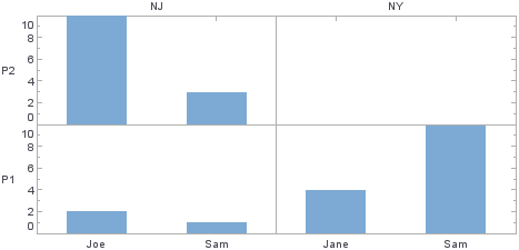
The resulting chart displays an outer grid based on the outer coordinates (‘State’ and ‘Product’). Within each cell of the outer grid, the chart displays the corresponding inner coordinates (‘Name’ and ‘Priority’).
Set Coordinate Background
You can assign a background color or background image to the coordinate area (plot area) of a chart by defining a PlotSpec object.
Set Background Color
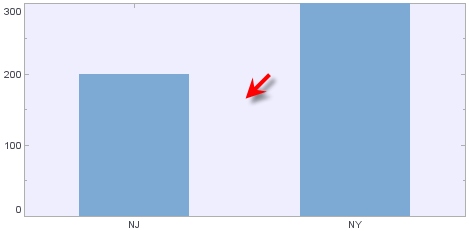
The following example illustrates how to set a blue background for a chart:
dataset = [["State", "Quantity"], ["NJ", 200], ["NY", 300]];
graph = new EGraph();
var elem = new IntervalElement("State", "Quantity");
var sscale = new CategoricalScale("State");
var qscale = new LinearScale("Quantity");
var coord = new RectCoord(sscale,qscale);
var spec = new PlotSpec();
spec.setBackground(java.awt.Color(0xEEEEFF));
coord.setPlotSpec(spec);graph.setCoordinate(coord);
graph.addElement(elem);
Script that modifies the graph or dataset properties should be placed on the Chart component itself. See Add Component Script for more information. This script has access to the Chart data and Chart API methods. Scripted Charts are not good candidates for user-modification, so you should deselect ‘Enable Ad Hoc Editing’ in the Chart Properties dialog box.
|
Set Background Image
Use the PlotSpec.setBackgroundImage(value) function to display an image as the plot background. The following example uses a static Google map image as a background by aligning the map coordinates with the chart coordinates.
|
This example is provided to illustrate how to configure an image background. The image in this example is a map. However, note that there are simpler ways to synchronize a map background with a chart:
|
// Define latitude and longitude values for landmarks:
dataset = [["Latitude","Longitude","PlaceName"],[40.8516051126306,-73.95223617553711,' GW Bridge '],[40.76292614285948,-74.00982856750488,' Lincoln Tunnel '],[40.72755146730012,-74.02107238769531,' Holland Tunnel ']];
graph = new EGraph();

// Define chart elements and basic point appearance:
var elem = new PointElement("Longitude","Latitude");
var tframe = new DefaultTextFrame("PlaceName");
var sframe = new StaticShapeFrame();
var cframe = new StaticColorFrame();
cframe.setColor(java.awt.Color(0x0000000));
sframe.setShape(GShape.FILLED_CIRCLE);

// Define appearance of text labels:
var tspec = new TextSpec();
tspec.setBackground(java.awt.Color(0x0000000));
tspec.setFont(java.awt.Font('Trebuchet',java.awt.Font.BOLD, 11));
tspec.setColor(java.awt.Color(0xffff00));

// Configure a background image using PlotSpec:
var pspec = new PlotSpec();
pspec.setLockAspect(true);
var logo = getImage("https://maps.google.com/maps/api/staticmap?center=40.7857,-73.9819&zoom=11&size=400x400&sensor=false");
pspec.setBackgroundImage(logo);
pspec.setYMax(40.8902)   // YMax = high latitude
pspec.setYMin(40.6822)   // YMin = low latitude
pspec.setXMax(-73.84529) // XMax = high longitude
pspec.setXMin(-74.1206)  // XMin = low longitude

// Set chart scales to match image coordinates:
var latscale = new LinearScale("Latitude");
var lonscale = new LinearScale("Longitude");
var aspec = new AxisSpec();
aspec.setLabelVisible(false);
latscale.setAxisSpec(aspec);
lonscale.setAxisSpec(aspec);
latscale.setScaleOption(0);
lonscale.setScaleOption(0);
latscale.setMax(pspec.getYMax()); // match YMax
latscale.setMin(pspec.getYMin()); // match YMin
lonscale.setMax(pspec.getXMax()); // match XMax
lonscale.setMin(pspec.getXMin()); // match XMin
var coord = new RectCoord(lonscale,latscale);
coord.setPlotSpec(pspec);

// Assign visual frames to chart elements:
elem.setTextFrame(tframe);
elem.setTextSpec(tspec);
elem.setShapeFrame(sframe);
elem.setColorFrame(cframe);
elem.setHint(GraphElement.HINT_ALPHA,1);

// Assign coordinates:
graph.setCoordinate(coord);
graph.addElement(elem);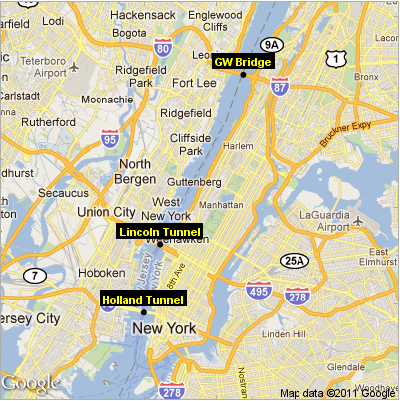
Note that the limits of the chart scales (latscale.setMax, latscale.setMin, lonscale.setMax, lonscale.setMin) have been set to match the geographical boundaries of the map image. This allows the image to align correctly with the chart axes.