Presentation
This section discusses the various features that are available for tailoring the appearance of the User Portal.
Presentation for Multi-Tenancy
| This feature is available only in Enterprise Edition. |
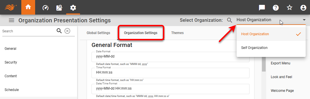
If you have multi-tenancy enabled (see Enable Multi-Tenancy), you can choose to make the settings described in the sections below either globally or for a particular organization.
To make global settings, select the Global Settings tab, and then proceed as described in the sections below.
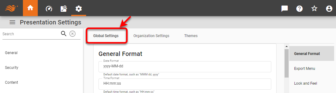
To make settings for a particular organization, select the Organization Settings tab, and use the Select Organization menu to choose the desired organization. Then proceed as described in the sections below.
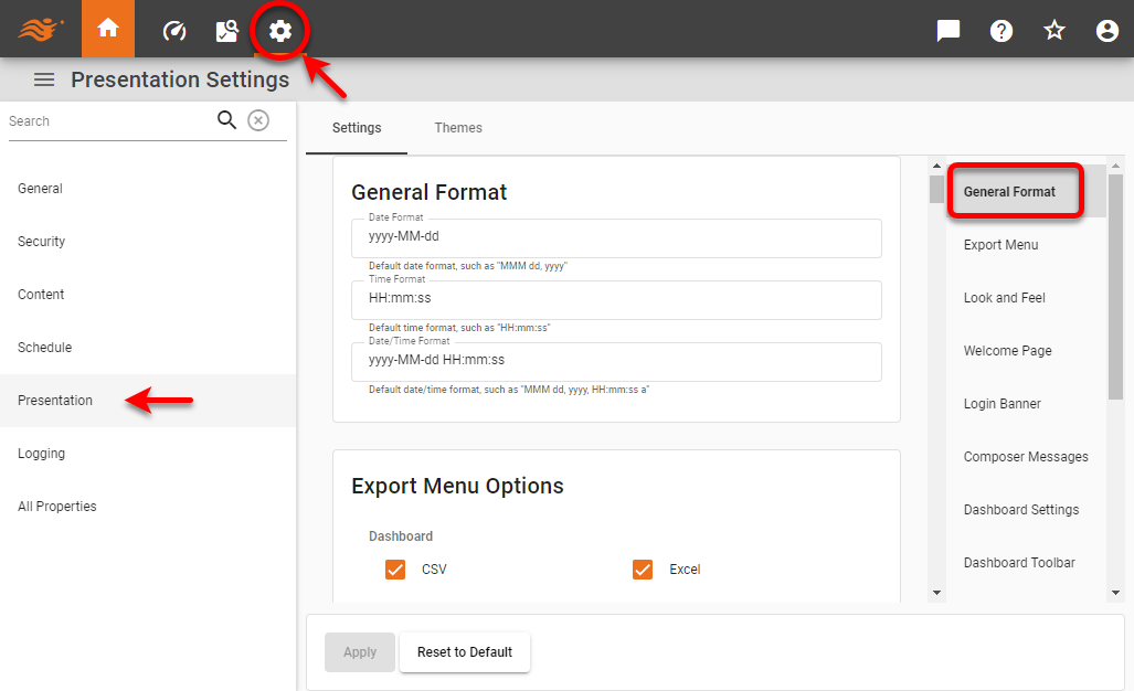
General Format
To format date/time representation and set default image format, follow the steps below.
-
Press the ‘Settings’ button
 at the top of Enterprise Manager.
 -
Select the Presentation page in the left panel.
-
Optional: If you have multi-tenancy enabled, see Presentation for Multi-Tenancy above.
-
Select the General Format page in the right panel.
-
Set the desired date and time formats.
To allow Scheduler condition ‘Start Time’ to be set using a 12-hour (AM/PM) clock, enter a ‘Time Format’ string that ends with the “a” specification (e.g., HH:mm:ss a). To allow the Scheduler condition ‘Start Time’ to be set using a 24-hour clock, enter a ‘Time Format’ that does not include the “a” specification (e.g.,HH:mm:ss).
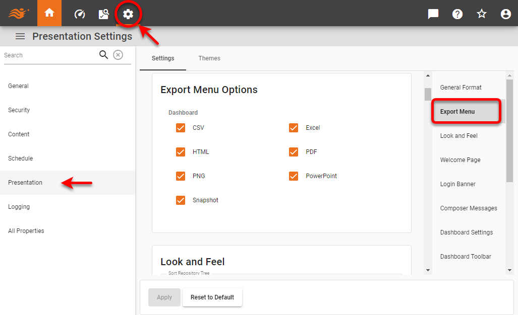
Export Menu
To set the export options available for Dashboards, follow the steps below:
-
Press the ‘Settings’ button
at the top of Enterprise Manager. -
Select the Presentation page in the left panel.
-
Optional: If you have multi-tenancy enabled, see Presentation for Multi-Tenancy above.
-
Select the Export Menu page in the right panel.
-
Enable the desired export formats for Dashboards.
-
Press Apply.
Look and Feel
To set the global look-and-feel for the User Portal follow the steps below:
-
Press the ‘Settings’ button
at the top of Enterprise Manager. -
Select the Presentation page in the left panel.
-
Optional: If you have multi-tenancy enabled, see Presentation for Multi-Tenancy above.
-
Select the Look and Feel page in the right panel.
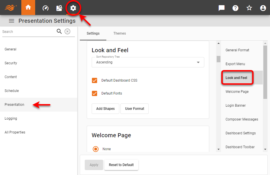
The following properties are available:
- Sort Repository Tree
-
Specifies the sort order of items in the Repository listing.
- Default Dashboard CSS
-
Allows you to specify a custom CSS file to use for Dashboard component styles. To use custom CSS, uncheck the ‘Default Dashboard CSS’ option and click in the ‘Custom Dashboard CSS File’ field to specify the file. The CSS file can specify styles for alignment, font, border, and color. See Style with CSS for more information.
- Default Fonts
-
Allows you to upload custom fonts. To add custom fonts, uncheck the ‘Default Font’ option and press the ‘Edit Fonts’ button. In the ‘User Fonts’ dialog box, press Add to open the ‘Add/Edit Font Face’ dialog box and load a new font by specifying the locations of the font’s TTF, EOT, SVG, and WOFF files, as well as the desired weight and style.
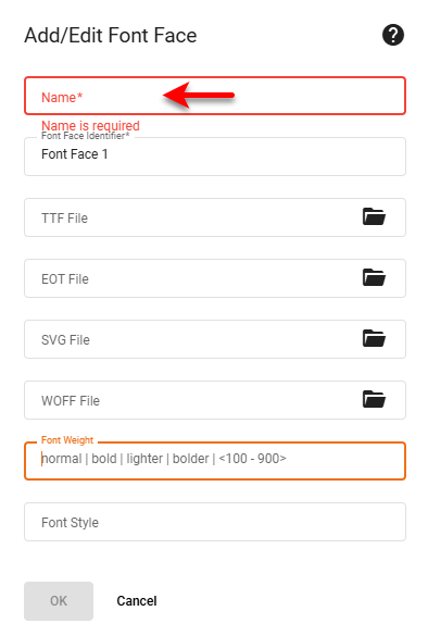
You can add multiple font variations under the same name so that, for example, a bold or italic version of the font will be available when the user applies bold or italic formatting. Verify that each parent folder for the desired fonts is listed in the ‘CID Font Path’ (see PDF Settings). Note that fonts for asset exports will not be available unless the font file is located in a ‘CID Font Path’ directory.
You do not need to restart the app after adding fonts, but you should advise users to clear their browser cache in order to see the new fonts. - Default Favicon
-
This option is available only when the
portal.customLogo.enabledis set totrue. See All Properties for information on how to set properties. Uncheck the ‘Default Favicon’ property to upload a custom favicon in PNG format. - Custom Shapes
-
To upload custom images for use with a Chart (see Basic Charting Steps), press the Custom Shapes button to open the ‘Custom Shapes’ dialog box. To upload a Zip file containing images, first enable the ‘Extract archive files’ option. Press Select, and choose an image file (png, gif, jpg, svg) or archive. Press Upload to upload the image or archive to the portal/shapes directory. (See Storage for information about managing uploads.)
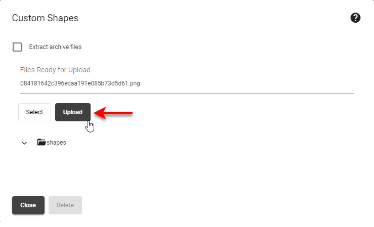
In the Chart Editor, the icons are sorted alphabetically by file name. Custom shape images can be any size, and are scaled according to the ‘Size’ setting in the Chart Editor.
- User Format
-
To upload custom number formats (custom symbols and multipliers), press User Format and supply a userformat.xml file. See Define Number Formats for information about the contents of this file.
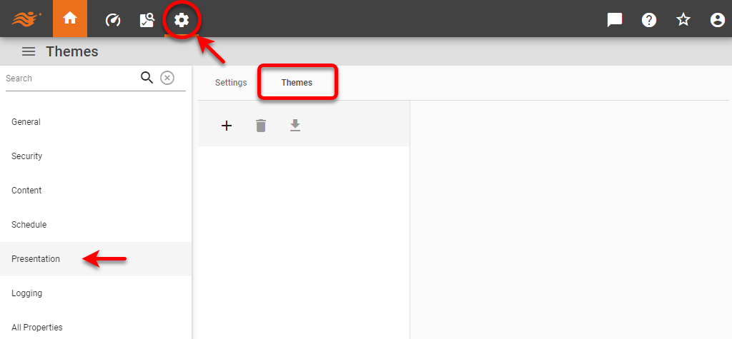
Themes
| This feature is available only in Enterprise Edition. |
A theme is a set of CSS properties that define the appearance (color and fonts) of the User Portal and Enterprise Manager. To create and manage themes, follow the steps below:
-
Press the ‘Settings’ button
at the top of Enterprise Manager. -
Select the Presentation page in the left panel.
-
Optional: If you have multi-tenancy enabled, see Presentation for Multi-Tenancy above.
-
Select the Themes tab at the top.
-
See the sections below to perform the desired functions:
Create a New Theme
-
Press the ‘New’ button
 to create a new theme.
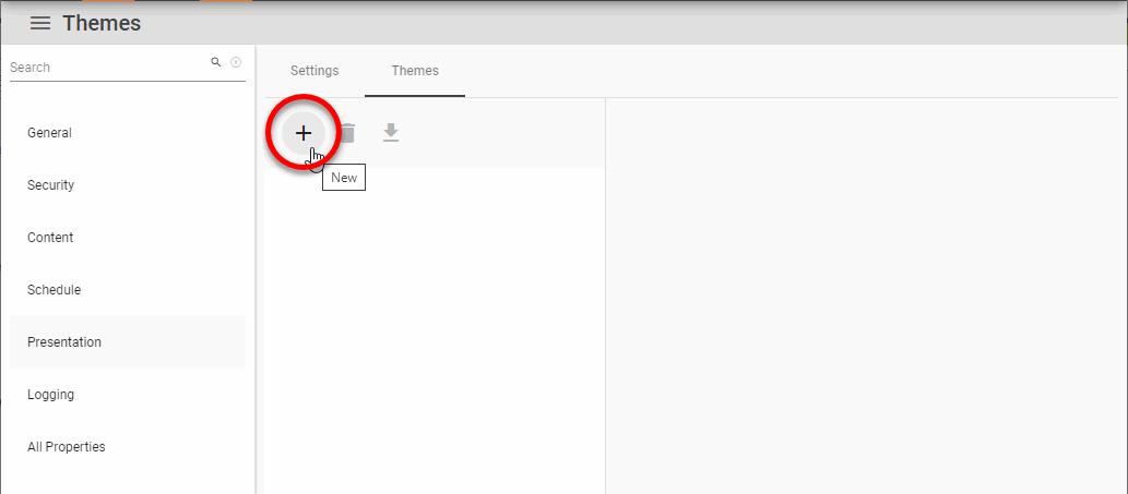
-
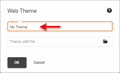
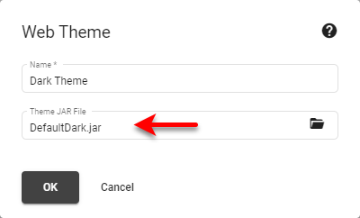
Enter the name for the new theme. (Do not click in the ‘Theme JAR File’ field.) Press OK.
-
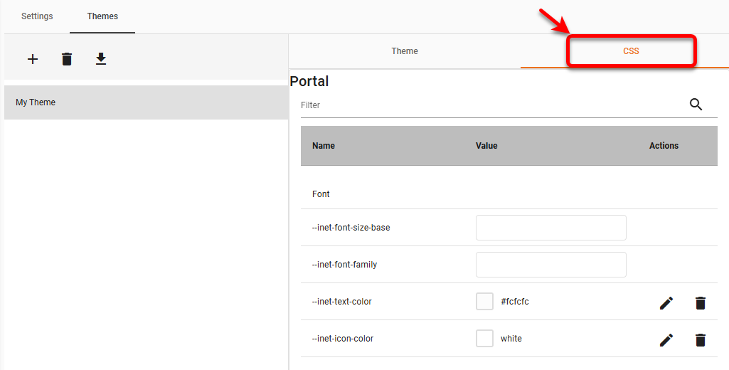
Optional: On the Theme tab, select the ‘Default’ option to use the theme as the default Portal appearance. Press Apply.
-
Select the CSS tab.
-
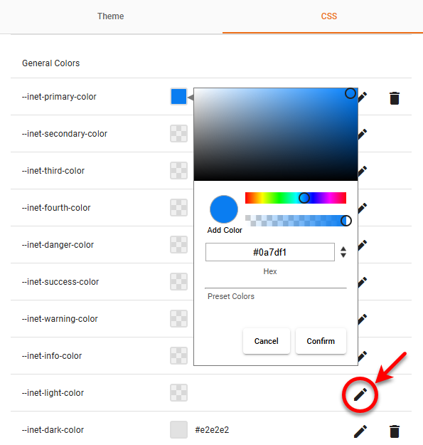
Edit the desired CSS property. (To find a property, type some of the property’s name in the ‘Filter’ field above the property list.) For colors, you can click the color chip to enter a color using a color picker, or press the ‘Edit’ button
 to enter a hex color code.
See Available Portal CSS Properties…
See Available Enterprise Manager CSS Properties…
-
Press Apply to make the changes to the theme.
-
Optional: Press Clear All to remove all the current CSS settings. Press Reset to reverse any recent changes you made (before you press Apply).
Import a Theme
To import a theme from a JAR file, follow the steps below:
-
Press the ‘New’ button
to create a new theme. -
Enter the name for the new theme. Click in the ‘Theme JAR File’ to upload the JAR file containing the theme, and press OK.
-
On the Theme tab, select the ‘Default’ option to use the theme as the default Portal appearance. Press Apply.
-
If you wish to modify the imported theme, select the CSS tab.
-
Edit the desired CSS property. For colors, you can click the color chip to enter a color using a color picker, or press the to enter a hex color code. (See Available Portal CSS Properties… and See Available Enterprise Manager CSS Properties… for information about where the different styles are applied.)
-
Press Apply to make the changes to the theme.
-
Optional: Press Clear All to remove all the current CSS settings. Press Reset to reverse any recent changes you made (before you press Apply).
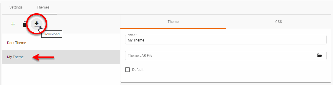
Export a Theme
To export a theme to a JAR file, select the theme that you want to export, and press the ‘Download’ button  to save the theme into a JAR file.
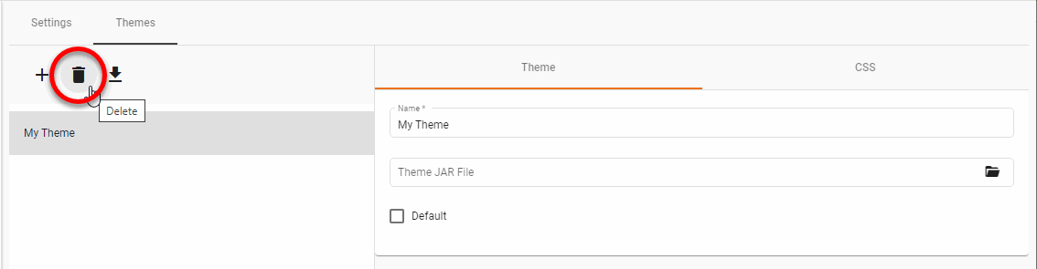
Delete a Theme
To delete a theme, select the theme that you want to delete, and press the ‘Delete’ button  .
.
Assign a Theme to a User, Group, or Role
To assign a theme to a user, group, or role, use the ‘Theme’ menu on the Users tab of the Security page. See Create a User, Create a Group, or Create a Role for more information about configuring users, groups, or roles.
| The multi-tenant feature in Enterprise Edition must be disabled. If enabled, themes are defined on an organization basis rather than a user basis. See Enable Multi-Tenancy for more information. |
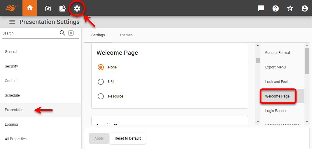
Welcome Page
To set a home page that appears when the user selects the Repository tab of the User Portal, follow the steps below:
-
Press the ‘Settings’ button
at the top of Enterprise Manager. -
Select the Presentation page in the left panel.
-
Optional: If you have multi-tenancy enabled, see Presentation for Multi-Tenancy above.
-
Select the Welcome Page page in the right panel.
-
You can specify a ‘URI’ (same domain as InetSoft server) or a specific ‘Resource’ file such as an HTML or JSP file, which must be placed in the /usr/local/inetsoft/classes/ directory. HTML content can be localized by using the following tag:
$(text to be localized)#(inter)
-
Restart the server.
If you do not specify a custom welcome page, the Portal will display a generic welcome page.
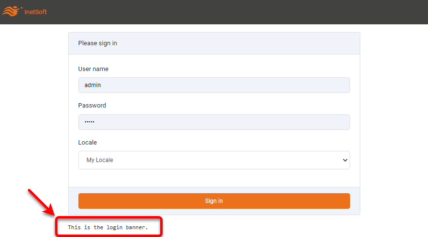
Login Banner
To create a message to be displayed to the user on the login screen, follow the steps below:
-
Press the ‘Settings’ button
at the top of Enterprise Manager. -
Select the Presentation page in the left panel.
-
Optional: If you have multi-tenancy enabled, see Presentation for Multi-Tenancy above.
-
Select the Login Banner page in the right panel.
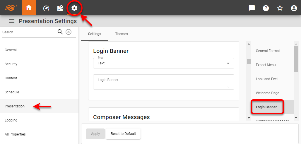
-
Select ‘Text’ or ‘HTML’ from the ‘Type’ menu.
-
Enter the text or HTML to be displayed to the user.
-
Press Apply.
The text or HTML you specify is displayed below the password field of the Portal login page.
Composer Messages
When a user opens Visual Composer, the right panel displays four help messages about how to create and edit Data Worksheets and Dashboards.
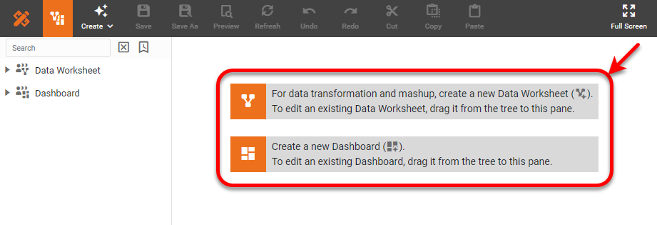
To customize these four messages, follow the steps below:
-
Press the ‘Settings’ button
at the top of Enterprise Manager. -
Select the Presentation page in the left panel.
-
Optional: If you have multi-tenancy enabled, see Presentation for Multi-Tenancy above.
-
Select the Composer Messages page in the right panel.
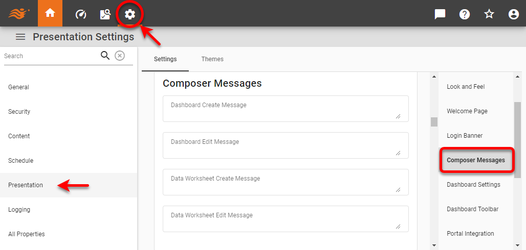
-
Enter the desired text for the ‘Dashboard Create Message’, ‘Dashboard Edit Message’, ‘Data Worksheet Create Message’, and ‘Data Worksheet Edit Message’.
-
Press the Apply button to save the settings.
If you do not specify custom text for any of the messages, the corresponding default message will be displayed.
Dashboard Settings
To enable Dashboards for users, follow these steps:
-
Press the ‘Settings’ button
at the top of Enterprise Manager. -
Select the Presentation page in the left panel.
-
Optional: If you have multi-tenancy enabled, see Presentation for Multi-Tenancy above.
-
Select the Dashboard Settings page in the right panel.
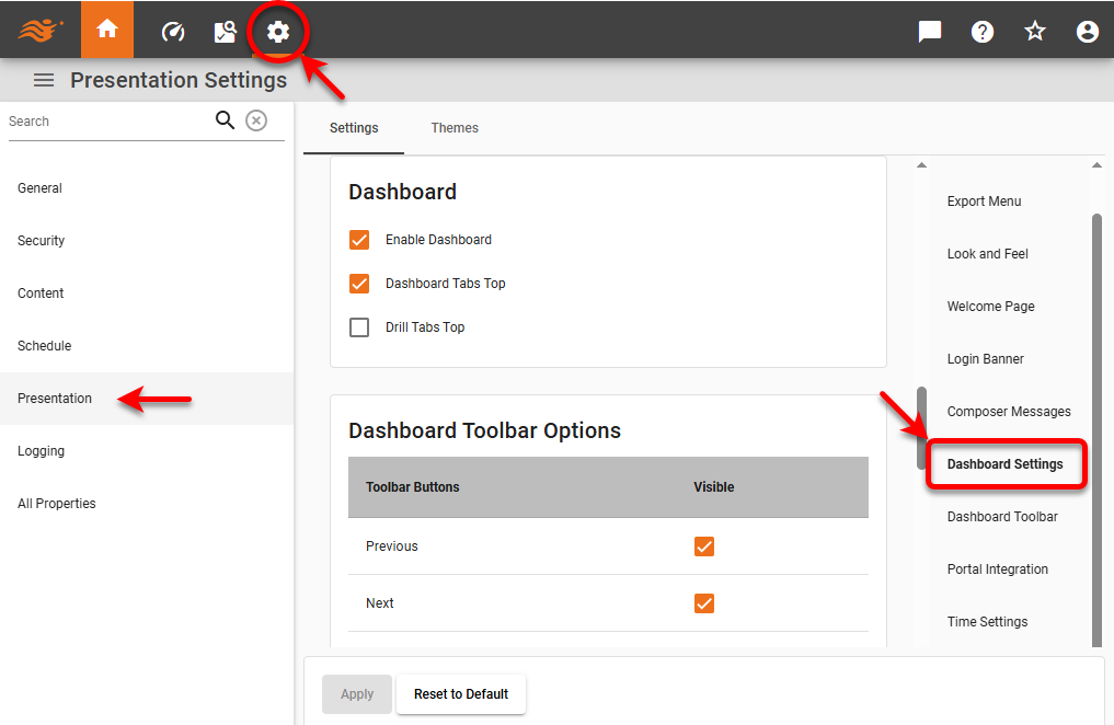
-
Select ‘Enable Dashboards’ to enable the ‘Dashboard’ button
 in the User Portal.
 -
Optional: Uncheck ‘Dashboard Tabs Top’ to display the tabs for multiple Dashboards at the bottom of the screen rather than at the top (default).
-
Optional: Select ‘Drill Tabs Top’ to display tabs of drill-down Dashboards at the top of the screen. (See Drill with Chart Hyperlinks for more details on drill-down features.)
-
Press Apply to enter the settings.
Dashboard Toolbar
To set the options available on a Dashboard toolbar, follow the steps below:
-
Press the ‘Settings’ button
at the top of Enterprise Manager. -
Select the Presentation page in the left panel.
-
Optional: If you have multi-tenancy enabled, see Presentation for Multi-Tenancy above.
-
Select the Dashboard Toolbar page in the right panel.
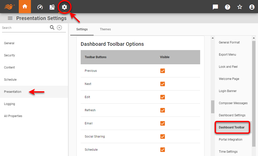
-
To hide a toolbar button, deselect the corresponding box in the ‘Visible’ column.
-
Press Apply.
Portal Integration
| Advanced Server Integration for more advanced approaches to web integration. |
To customize the tabs and links at the top of the User Portal, follow the steps below:
-
Press the ‘Settings’ button
at the top of Enterprise Manager. -
Select the Presentation page in the left panel.
-
Optional: If you have multi-tenancy enabled, see Presentation for Multi-Tenancy above.
-
Select the Portal Integration page in the right panel.
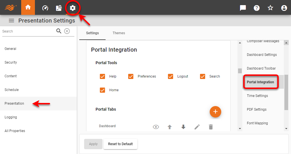
-
To add a new tab, press the Add Tab button and specify the tab name and the URI for the corresponding page. The specified URI must have the same host name and port as the InetSoft server.
-
Enable or disable the desired options: The ‘Help’, ‘Preferences’, ‘Logout’, ‘Home’, and ‘Search’ options determine which of these features are available in the User Portal. The ‘Logout’ option is only in effect when security is enabled.
-
Optional: Enter ‘Custom Loading Text’ to specify text to display on the loading screen when the user logs into the User Portal. The message is displayed under the “Please wait, the application is loading” message and logo.
-
Optional: Enter a ‘Home Link’ to set the URL of the ‘Home’ button
 in the User Portal. (The default is the
 index.htmllanding page). This can be an absolute URL such as https://www.google.com, or a path relative to/app/such ascomposer.
Time Settings
Set time-related system properties. In a multi-tenant environment, these can be set both under the Global Settings and Organization Settings tabs.
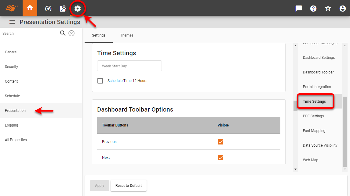
- Week Start Day
-
The start day of the week for date components such as Calendars. If not specified, the locale setting for the user determines the start day. (Equivalent property:
week.start.) - Schedule Time 12 Hours
-
Enable to use a 12-hour clock for scheduled task conditions. Disable to use 24-hour clock. (Equivalent property:
schedule.time.12hours.)
PDF Settings
To set properties of PDF generation, follow these steps:
-
Press the ‘Settings’ button
at the top of Enterprise Manager. -
Select the Presentation page in the left panel.
-
Optional: If you have multi-tenancy enabled, see Presentation for Multi-Tenancy above.
-
Select the PDF Settings page in the right panel.
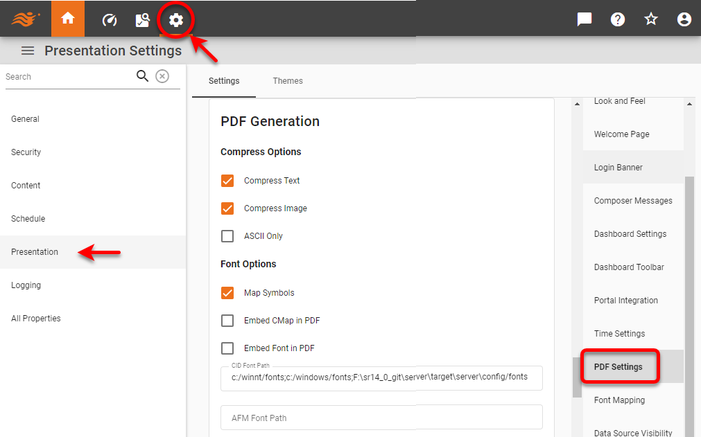
-
Set the desired options (see below).
-
Press Apply.
PDF Options
- Compress Options
-
-
Compress Text: Compress all text data.
-
Compress Image: Compress all image data.
-
ASCII Only: Generate only ASCII output in the PDF file. No ASCII data is encoded to seven bit data.
-
- Font Options
-
-
Map Symbols: Map symbol characters to symbol fonts. This is required if symbol characters are used in Dashboards.
-
Embed CMap in PDF: Embed the CMap in the generated PDF file.
-
Embed Font in PDF: Embed the font in the generated PDF file. Enable this option if fonts are not rendering correctly.
-
CID Font Path: Path for CID fonts.
-
AFM Font Path: Path for TrueType/AFM fonts, a semicolon-separated list of directories. PDF generation will use only TrueType fonts on this path. On Windows NT, TrueType fonts are stored in the c:\winnt\fonts directory. On UNIX platforms, the JRE obtains information about available TrueType fonts from the fontconfig.properties file. The fontconfig.properties file can be found in JRE_HOME/lib for a JRE installation and JDK_HOME/jre/lib for a JDK installation. Add any custom TrueType fonts to the fontconfig.properties file. See the Java documentation for more information about the fontconfig.properties file.
-
- Other Options
-
-
Open Bookmark First: Specifies that all the generated PDFs will have bookmarks displayed immediately upon opening them in Adobe Acrobat.
-
Open Thumbnail First: Specifies that all the generated PDFs will have thumbnails displayed immediately upon opening them in Adobe Acrobat.
-
None: Specifies that bookmarks and thumbnails should not be displayed.
-
Embed PDF in Browser: Specifies that when the user exports a Dashboard to PDF format from within the User Portal, the PDF file will be immediately displayed by the browser (if Adobe Reader is installed), and the ‘Open/Save’ download dialog box will not be displayed.
-
Keep Hyperlinks in PDF: Specifies that hyperlinks will be created in the PDF file. Disabling this option will turn off hyperlink generation and speed up the PDF generation process.
-
PDF Security
To add security encryption to a PDF file exported by StyleBI, use the following script in the onRefresh handler.
docInfo.pdf.password.owner = '{owner_password}';
// owner_password provides owner access to document
docInfo.pdf.password.user = '{user_password}';
// user_password provides user access to document
docInfo.pdf.permission.print = true/false;
// provides the ability to print
docInfo.pdf.permission.copy = true/false;
// provides the ability to copy from the document
To use encryption, you must have an implementation of the Java Cryptography Extension on your classpath. Sun provides a default implementation with the JRE. To use this, add the {JAVA_HOME}/jre/lib/security folder to your classpath.
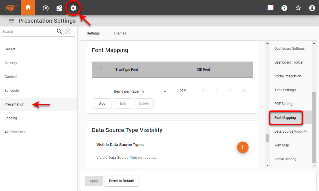
Font Mapping
The PDF generator is capable of handling CJK (Chinese, Japanese, Korean) characters in generated PDF files.
View a sample of currently supported CJK fonts…
To support CJK characters, follow the steps below:
-
Specify the ‘CID Font Path’ in the PDF Settings page. Enable the ‘Embed CMap in PDF’ and ‘Embed Font in PDF’ options as well. See PDF Settings above.
-
Specify the font mapping from the CJK-TrueType font to the CJK-CID font. Follow the steps below:
-
Press the ‘Settings’ button
at the top of Enterprise Manager. -
Select the Presentation page in the left panel.
-
Select the Font Mapping page in the right panel.
-
Press the Add button.
-
Enter the desired font mapping, and press Apply.
CJK fonts often use separate font files for the plain and bold versions of the font. It is therefore possible to map a CJK font to a different file depending on its weight. For example, the following setting maps all plain MS Mincho instances to a normal-weight version of the KozMin font-family, and maps all bold MS Mincho instances to a bold-weight version of the same font-family:
pdf.font.mapping=MS Mincho-plain\:KozMinProVI-Regular;MS Mincho-bold\:KozMinStd-Bold;If the font weight is omitted, the default is ‘-plain’.
-
To support CJK fonts not listed above, do the following:
-
Place the font files in the folder specified under TrueType/CID Font Path.
-
Extract the cjkmap.properties file from your build JAR file (inetsoft-core.jar).
-
Place the cjkmap.properties file within your classpath under /inetsoft/reports/pdf.
-
Make an entry for the CJK font as
{font name}={encoding}, e.g.,DFKMincho\ Std\ W5=kor. (Escape white space using a backslash).In many cases the actual font name may not be the same as the font file name. To make sure you enter the right name in the properties file. Use the utility TTFontInfo. The correct name will appear under the
fontnames[3]heading.java -cp inetsoft-core.jar inetsoft.report.pdf.TTFontInfo {FontFileName With Absolute Path} Example: java -cp inetsoft-core.jar inetsoft.report.pdf.TTFontInfo c:/CID/DFKMinchoStd-W5.otfSample Output:
Getting font names:[c:/CID/DFKMinchoStd-W5.otf]
fontnames[0]=DFKMincho Std W5
fontnames[1]=DFKMincho Std W5
fontnames[2]=DFKMinchoStd-W5
fontnames[3]=DFKMincho Std W5
Notice how
fontnames[3]yields the right font name to enter into the cjkmap.properties file.
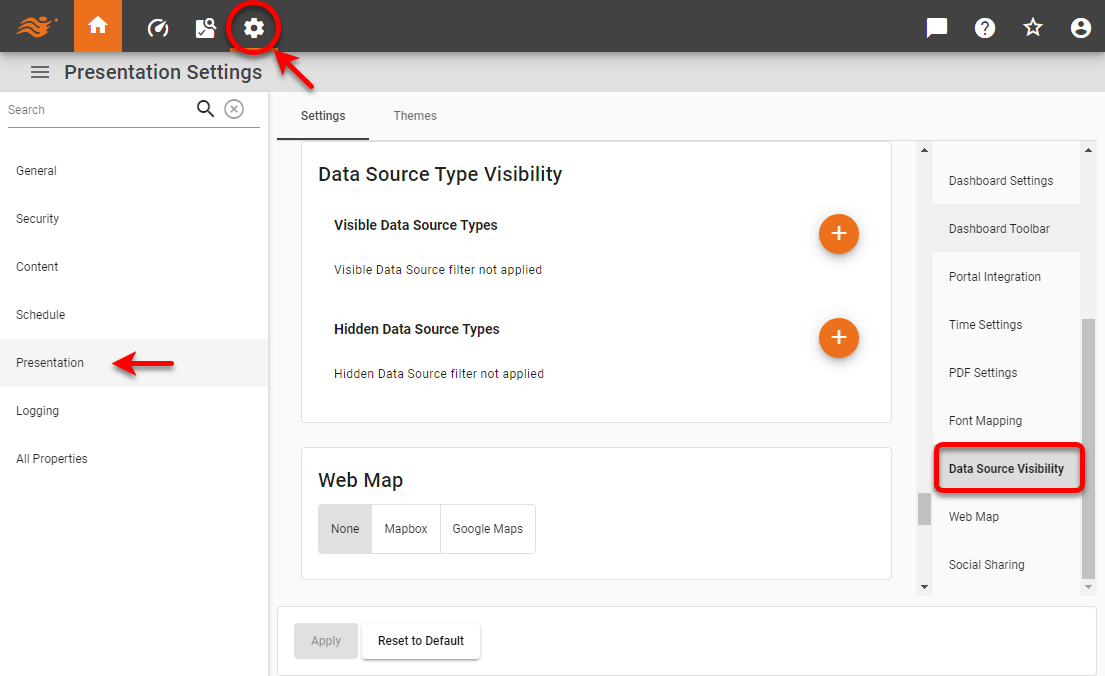
Data Source Visibility
To set specific data source types to visible or hidden in the User Portal datasource catalog, follow the steps below:
-
Press the ‘Settings’ button
at the top of Enterprise Manager. -
Select the Presentation page in the left panel.
-
Optional: If you have multi-tenancy enabled, see Presentation for Multi-Tenancy above.
-
Select the Data Source Visibility page in the right panel.
-
To explicitly make a data source visible, press the ‘Add Data Source’ button
next to ‘Visible Data Source Types’ and then select the data source to make accessible.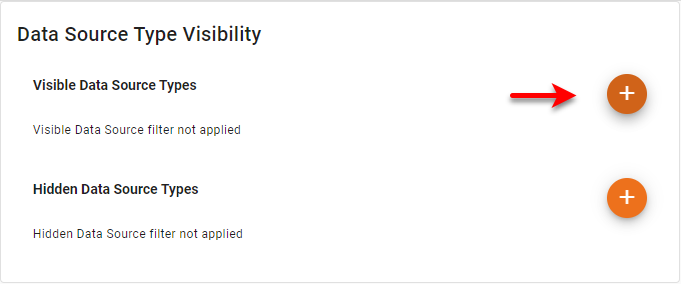
-
To explicitly hide a data source, press the ‘Add Data Source’ button
next to ‘Hidden Data Source Types’ and then select the data source to make inaccessible.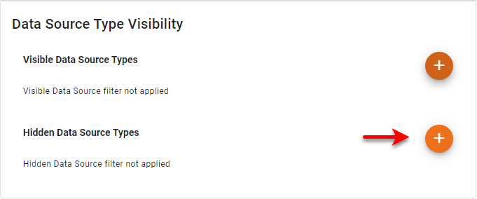
If the same data source type is included in both the visible and hidden lists, it will be hidden. The equivalent proprties are visible.datasource.types and hidden.datasource.types.
|
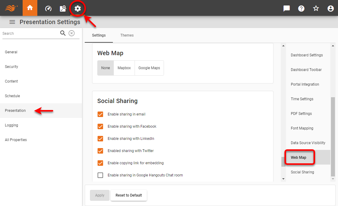
Web Map
Map-type charts can display a background map provided by either Google Maps or Mapbox. To configure map charts to use these web-based map backgrounds, follow the steps below:
-
Press the ‘Settings’ button
at the top of Enterprise Manager. -
Select the Presentation page in the left panel.
-
Optional: If you have multi-tenancy enabled, see Presentation for Multi-Tenancy above.
-
Select the Web Map page in the right panel.
-
To use the built-in (plain) map background, select ‘None’. Press the Apply button.
-
To use Mapbox map backgrounds, follow the steps below:
-
Select the ‘Mapbox’ option.
-
Enter the ‘User’ and ‘Token’. You can create a token from the Mapbox Account page. When you create the token, you must enable the Secret Scope STYLES:LIST.
-
Select the ‘Mapbox Style’. You must also have at least one map style defined in Mapbox. (You can define styles in Mapbox Studio.)
-
Press the Apply button.
To use Google Map backgrounds, follow the steps below:
-
Select the ‘Google Maps’ option.
-
Enter the ‘API Key’. You can create an API key from the Google Cloud Platform site. You must enable the Maps Static API and the Geocoding API on that site or the user will see an error such as the following: “This API project is not authorized to use this API.”
-
Press the Apply button.
-
-
Optional: For the ‘Mapbox’ and ‘Google Maps’ options, select ‘Use Web Map By Default’ to enable the ‘Use Web Map as Background’ property for all Charts by default. (This property is found in the ‘Chart Properties’ dialog box of each Chart.) Press the Apply button.
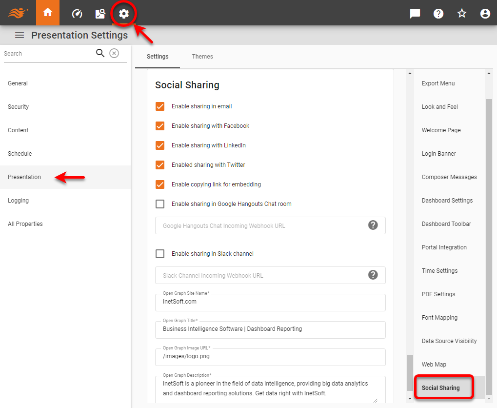
Social Sharing
To customize the Social Sharing feature available for Dashboards, follow the steps below:
-
Press the ‘Settings’ button
at the top of Enterprise Manager. -
Select the Presentation page in the left panel.
-
Optional: If you have multi-tenancy enabled, see Presentation for Multi-Tenancy above.
-
Select the Social Sharing page in the right panel.
-
Check the boxes to select the sharing options (Email, Facebook, LinkedIn, etc.) that should be available globally to users.
To control the available options for individual users, groups, or roles, see Set Security Actions. To disable the ‘Social Sharing’ button  entirely, see Dashboard Toolbar above.
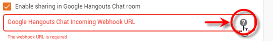
For Google Hangouts Chat and Slack, you will need to specify the webhook URL. Press the ‘Help’ button  next to the webhook field for more information.
Optional: Use the ‘Open Graph Site Name’, ‘Open Graph Title’, ‘Open Graph Description’, and ‘Open Graph Image URL’ fields to specify og:site_name, og:title, og:description, and og:image, respectively. Open Graph tags determine how the shared link is displayed in Facebook and LinkedIn, and are shared for the entire application. See the Facebook developer documentation for more information about Open Graph tags.
The ‘Open Graph Image URL’ can be relative to the application root (e.g., /images/logo.png) or can be an absolute URL (e.g., http://example.com/.../logo.png).
|
The ‘Open Graph Title’ and ‘Open Graph Description’ are used as the default og:title and og:description for a Dashboard that is accessed via direct URL and does not include a title/alias or description. If a directly accessed Dashboard does include a title/alias or description, then the title/alias or description is used to set og:title and og:description.