Group and Aggregate Data
Grouping and aggregation, also known as summarization, is an essential part of presenting information to business audiences. By use of effective grouping and aggregation, you can reduce massive datasets to a handful of key trends and indicators, facilitating business insight and action. The sections below explain how to effectively aggregate your data.
Where to Group and Aggregate
You can group and aggregate data at the data pipeline level (Data Worksheet) or presentation level (Dashboard).
- Data Worksheet Level
-
To group and aggregate data at the Data Worksheet level, see the sections below.
When you perform grouping and aggregation in a Data Worksheet, only the aggregated data will be available for further manipulation and presentation. This approach may be most efficient when you want to use the aggregated data across many Dashboards.
- Dashboard Level
-
To group and aggregate data at the Dashboard level, see the following sections in Visualize Your Data. This provides the user with the greatest flexibility to adjust the grouping and aggregation to suit their needs.
-
To group and aggregate data in Chart, see Group Data by Dimension.
-
To group and aggregate data in a crosstab, see Create a Crosstab.
-
To group and aggregate data as a KPI, see Add a KPI.
-
Group and Aggregate in a Regular Data Block
Watch Video: Group and Aggregate Data
This video might show an earlier version of the feature or operation that differs in minor ways from the current version.
To group and aggregate data in a regular data block, follow the steps below:
-
Create the data block you want to group. See Create a Data Worksheet for information on how to create a data block.
-
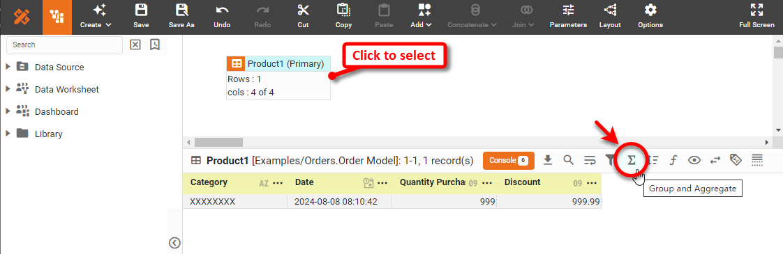
Click on the data block to select it.
-
In the bottom panel, press the ‘Group and Aggregate’ button
 . This opens the Group and Aggregate panel.
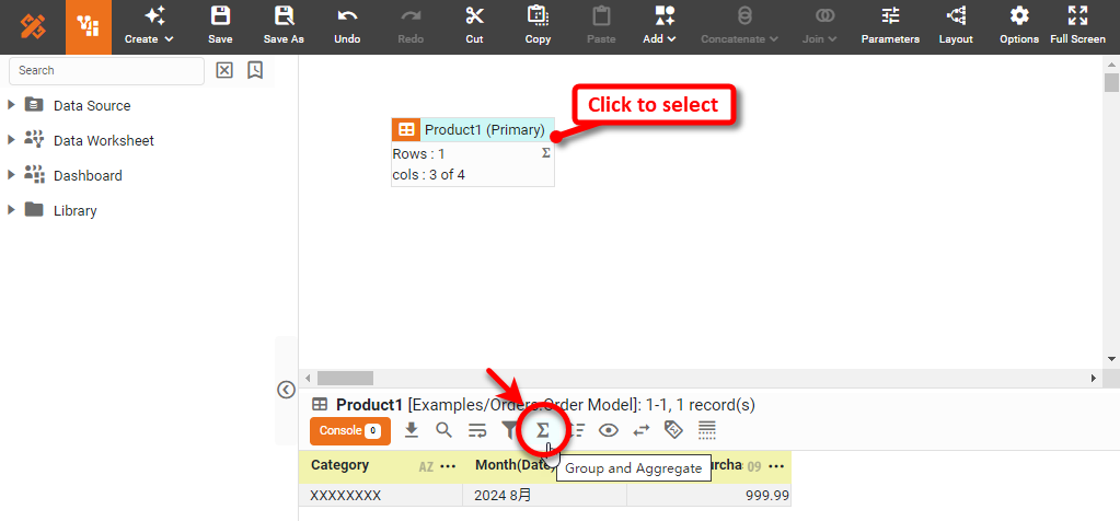
-
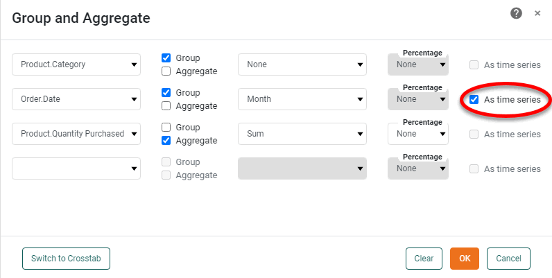
Use the menus to select grouping fields and summary fields. For summary fields, select the desired method of aggregation (‘Sum’, ‘Average’, etc.). For date-type fields, select the desired level of date grouping (‘Year’, ‘Month’, etc.). Optional: Select ‘As time series’ to force the display of date groups even when the group has no data (null).
Read more about the available aggregation methods…
The list below describes the available Data Block, Crosstab, and Chart aggregation measures. You can choose to display univariate aggregations (e.g., ‘Sum’, ‘Count’) as a percentage value by selecting the percentage basis (e.g., ‘Group’, ‘GrandTotal’) from the accompanying ‘Percentage’ or ‘Percentage of’ menu. For the bivariate aggregation methods (e.g., ‘Correlation’, ‘Weighted Average’), you will need to select a variable (column) to use as the second operand in the computation. Make this selection in the menu labeled ‘with’.
- Sum
-
Displays the sum of the measure values for the given group.
- Average
-
Displays the average of the measure values for the given group.
- Max
-
Displays the maximum of the measure values for the given group. For dates, this will return the latest date.
- Min
-
Displays the minimum of the measure values for the given group. For dates, this will return the earliest date.
- Count
-
Displays the total count of measure values for the given group. This represents the total number of records corresponding to the given group, and is the same value for any selected measure.
- Distinct Count
-
Displays the count of unique measure values for the given group.
- First
-
Displays the first value for the measure (for the given group) when sorted based on the values in a second column, specified by the menu labeled ‘by’.
- Last
-
Displays the last value for the measure (for the given group) when sorted based on the values in a second column, specified by the menu labeled ‘by’.
- Correlation
-
Displays the Pearson correlation coefficient for the correlation between the measure values (for the given group) and the corresponding values in a second column, specified by the menu labeled ‘with’.
- Covariance
-
Displays the covariance between the measure values (for the given group) and the corresponding values in a second column, specified by the menu labeled ‘with’.
- Variance
-
Displays the (sample) variance of the measure values for the given group.
- Std Deviation
-
Displays the (sample) standard deviation of the measure values for the given group.
- Variance (Pop)
-
Displays the (population) variance of the measure values for the given group.
- Std Deviation (Pop)
-
Displays the (population) standard deviation of the measure values for the given group.
- Weighted Average
-
Displays the weighted average of the measure values for the given group. The weights are given by the corresponding values in a second column, which is specified by the menu labeled ‘with’.
- Median
-
Displays the median (middle) of the measure values for the given group.
- Mode
-
Displays the mode (most common) of the measure values for the given group.
- Product
-
Displays the product (multiplication) of the measure values for the given group.
- Concat
-
Displays the concatenation into a comma-separated list of the measure values for the given group.
- NthLargest
-
Displays the Nth largest of the measure values for the given group.
- NthSmallest
-
Displays the Nth smallest of the measure values for the given group.
- NthMostFrequent
-
Displays the Nth most common of the measure values for the given group.
- PthPercentile
-
Displays the value of the Pth percentile for the measure values for the given group.
To group dates using a fiscal calendar, create Expression Columns for the desired date ranges (fiscal week, month, etc.) by using the corresponding fiscal functions, such as CALC_fiscalweek and CALC_fiscalmonth, and then use those Expression Columns as the grouping fields. See Create an Expression Column in a Data Worksheet for more details. -
Optional: To display the measure as a percentage, use the ‘Percentage’ menu to specify either ‘Grand Total’ or ‘Subtotal’, to compute the percentages based on global total or group totals, respectively.
-
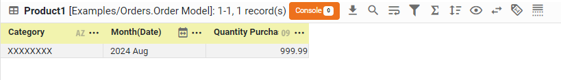
Press OK to close the dialog box. The data block is now grouped, and only the grouping and summary columns are returned in the result set.
-
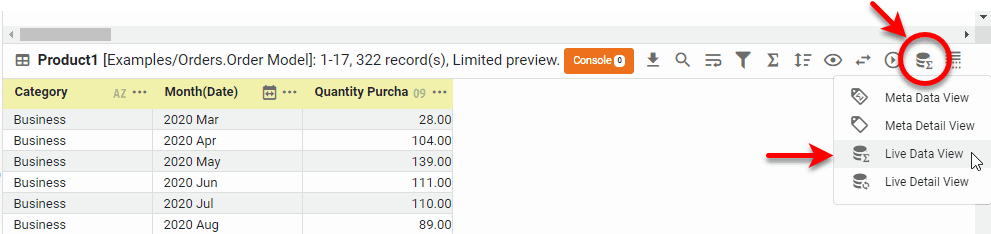
To view the grouped and aggregated data, press the ‘Change View’ button
 in bottom panel, and choose ‘Live Data View’
  .
.
-
Save the Data Worksheet by pressing the ‘Save’ button
 in the toolbar or press Ctrl+S on the keyboard.
You can now use this Data Worksheet to supply the dataset for a Dashboard. See Visualize Your Data to create a Dashboard.
Group and Aggregate in a Crosstab Data Block
Watch Video: Group and Aggregate Data in a Crosstab
This video might show an earlier version of the feature or operation that differs in minor ways from the current version.
A crosstab (pivot table) in a Data Worksheet can have one column header, one or more row headers, and one measure. The values at the row-column intersections of the crosstab table represent (aggregates) of the measure.
| You can also create a crosstab (with more than one column header) in a Dashboard. See Create a Table in Visualize Your Data. |
To create a crosstab from an existing data block, follow these steps.
-
Create the data block you want to group. See Create a Data Worksheet for information on how to create a data block.
-
Click on the data block to select it.
-
In the bottom panel, press the ‘Group and Aggregate’ button
.
This opens the Group and Aggregate panel.
-
In the ‘Group and Aggregate’ panel, press Switch to Crosstab.
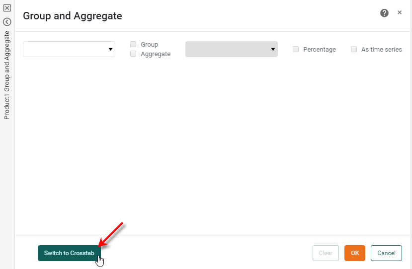
The ‘Group and Aggregate’ panel changes to the crosstab view.
-
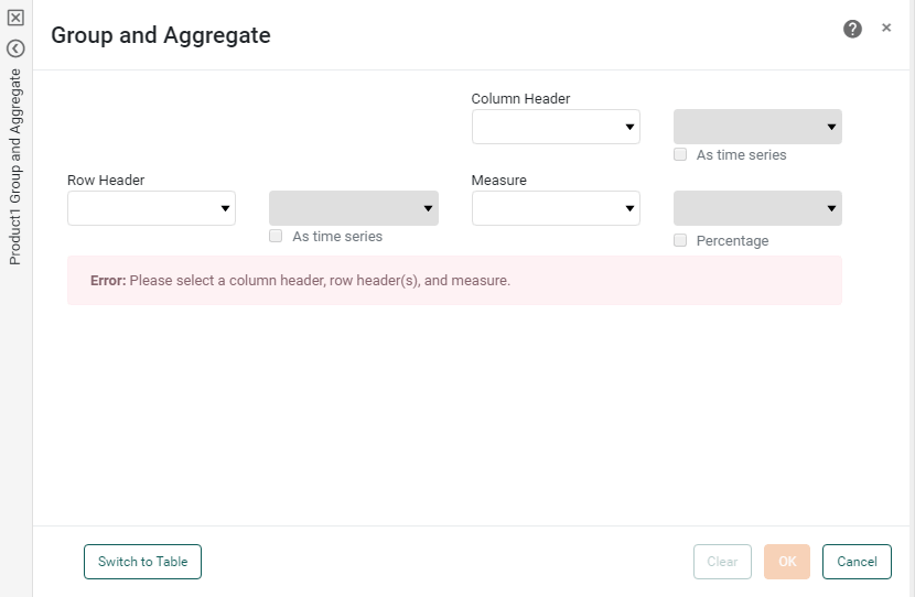
In the ‘Row Header’ panel, select one or more fields from the left menus. For date-type fields, select the desired level of date grouping (‘Year’, ‘Month’, etc.). Optional: Select ‘As time series’ to force the display of date groups even when the group has no data (null).
-
In the ‘Column Header’ panel, select a field from the left menu. For date-type fields, select the desired level of date grouping (‘Year’, ‘Month’, etc.). Optional: Select ‘As time series’ to force the display of date groups even when the group has no data (null).
-
Optional: For each selected field in the ‘Row Header’ and ‘Column Header’ panels, select a named grouping (user-defined grouping) from the corresponding right menu. See Create a Named Grouping for information on how to create a new named grouping.
-
In the ‘Aggregate’ panel, select a measure column from the left menu. This is the column whose values will be summarized. Select the aggregation method from the right menu.
If you select a bivariate aggregation measure (e.g., ‘Correlation’, ‘Weighted Average’, etc.), select the second operand (column) from the ‘with’ menu.
-
Optional: To display the measure as a percentage of the grand total, select the ‘Percentage’ option. Press OK to create the crosstab.
-
Save the Data Worksheet by pressing the ‘Save’ button
in the toolbar or press Ctrl+S on the keyboard.
You can now use this Data Worksheet to supply the dataset for a Dashboard. See Visualize Your Data to create a Dashboard.
Unpivot a Crosstab
In some cases it is useful to unpivot a data block from crosstab form into normal “flat” table form. This operation converts the column headers into an additional ‘Dimension’ column.
| See Upload Data for information on how to unpivot a crosstab table during import. |
To unpivot a crosstab, follow the steps below:
-
Right-click the crosstab data block, and select ‘Unpivot’ from the context menu. Note: You can also access menu options from the ‘More’ button (
 ) in the mini-toolbar. This opens the ‘Unpivot Data’ panel.
 -
In the ‘Levels of Row Headers’ field, enter the number of columns containing row headers.
-
Press OK to close the panel.
This creates a new data block that contains the same data from the original crosstab but in flat form (i.e., with column headers converted to an independent ‘Dimension’ column). The unpivoted data block remains linked to the original crosstab so that changes to data in the crosstab are automatically propagated to the new data block.
To change the level of row headers at a later time, right-click the data block, and select ‘Edit Pivot Level’ from the context menu. To set the data type of a column, press the ‘Actions’ button in the column header and select ‘Column Type’. See Enter Data for more information about ‘Column Type’ settings.
To understand how to unpivot a crosstab, first create a crosstab by following the steps below:
-
Create a new Data Worksheet. For information on how to create a new Data Worksheet, see Create a Data Worksheet.
-
From the left panel, drag the ‘Sales Explore’ Data Worksheet onto an empty region in the right panel. This creates the data block ‘Sales1’.
The 'Sales Explore' Data Worksheet can be found in . You may need to download the examples.zip file from GitHub into your environment. (This requires access to Enterprise Manager.) See Import and Export Assets for instructions on how to import. 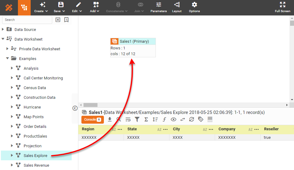
You will use this table to create a crosstab.
-
Press the ‘Group and Aggregate’ button
in the bottom panel. This opens the ‘Group and Aggregate’ panel.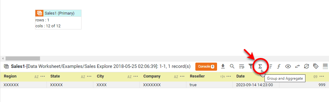
-
Press the Switch to Crosstab button at the bottom of the panel.
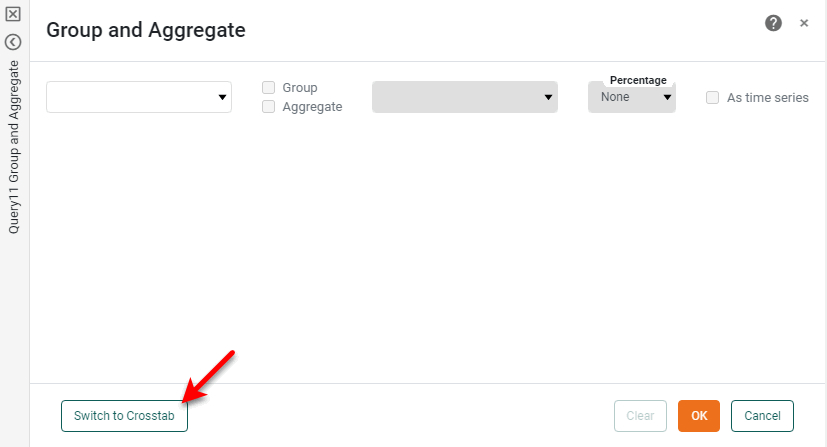
This displays the crosstab binding interface.
-
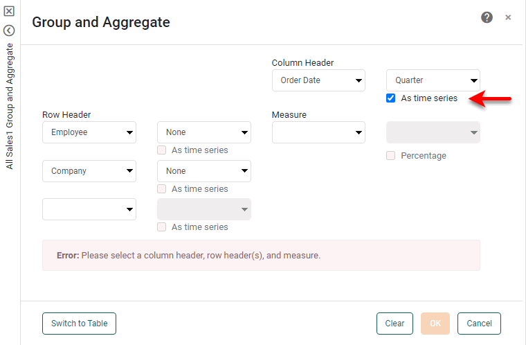
In the ‘Row Header’ region, select the following two fields: ‘Category’ and ‘Company’.
-
In the ‘Column Header’ region, select the ‘Date’ field.
-
In the menu next to the ‘Date’ field, select ‘Year’.
-
In the ‘Measure’ region, select the ‘Total’ field.
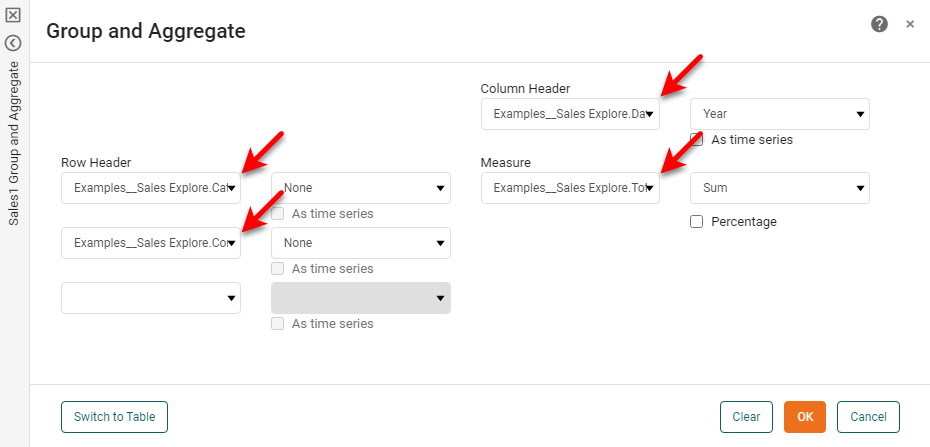
-
Press OK. This converts the data block to a crosstab.
-
In the bottom panel, press the ‘Change View’ button
and select ‘Live Data View’ from the menu. (See Preview Data.)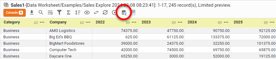
This crosstab has two levels of row headers (‘Category’ and ‘Company’), and one level of column headers (‘Order Date’, broken out by year).
You will now unpivot the crosstab to create a flat table that contains the same data. Follow the steps below:
-
Right-click the data block and select ‘Unpivot’ from the context menu. Note: You can also access menu options from the ‘More’ button (
) in the mini-toolbar. This opens the ‘Unpivot Data’ dialog box.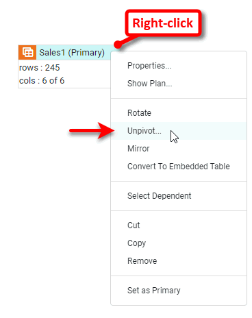
-
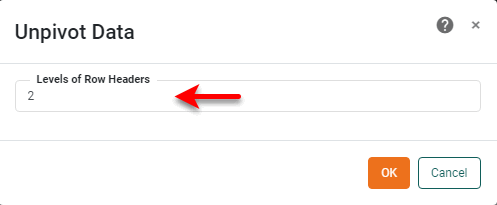
In the ‘Unpivot Data’ dialog box, enter a value of “2” for the ‘Levels of row headers’ value. (The two levels are ‘Category’ and ‘Company’.)
-
Press OK. This creates a new data block containing the unpivoted (flattened) data.
-
In the bottom panel, press the ‘Change View’ button
and select ‘Live Data View’ from the menu. (See Preview Data.)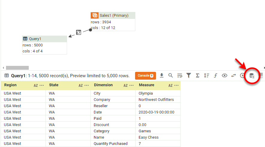
Observe that the unpivoting operation transforms the values of the column header in the crosstab (‘Date’) into a new column called ‘Dimension’. The new unpivoted table retains the row headers of the original crosstab in the first two columns (‘Category’ and ‘Company’), but now repeats each combination of ‘Category’ and ‘Company’ for each value of ‘Date’.
The data presented in the unpivoted table is the same as the data presented in the original crosstab. However, the flattened version may be more conducive to certain data operations such as trending.
Group Data by Numeric Range
You can group numerical data (without aggregating) by applying common labels to a specified numeric range using a numeric range column. A numeric range column groups numeric data into a predefined set of bins or ranges, for example:
You can create a range column for any numeric column in a data block. To create a numeric range column, follow these steps:
-
Click the data block in the top panel to select it.
-
In the bottom panel, right-click the header of the column (numeric-type column only) for which you want to create a range column, and select the ‘New Range Column’ option from the context menu. Note: You can also access menu options from the ‘More’ button (
) in the mini-toolbar.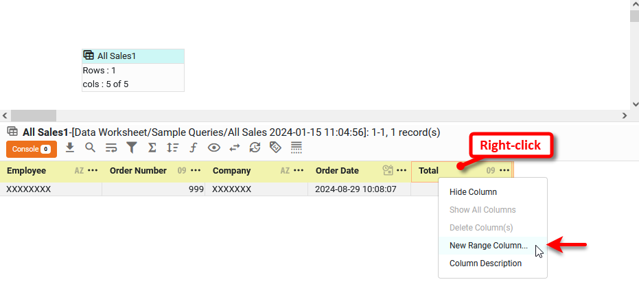
This opens the ‘Numeric Range Option’ panel. Here you can specify the different benchmarks defining the range.
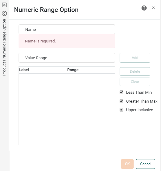
-
Enter a name for the new range column.
Names must be unique without respect to case (e.g., "num1" is the same name as "Num1"). -
Enter a benchmark value into the ‘Value Range’ field, and press the ‘Add’ button. Repeat until all desired benchmarks have been entered.
-
Select the ‘Less Than Min’ checkbox to create a bin for all values that fall below the minimum benchmark. If you do not select this option, those values are classified as “Others.”
-
Select the ‘Greater Than Max’ checkbox to create a bin for all values that fall above the maximum benchmark. If you do not select this option, those values are classified as “Others.”
-
Select the ‘Upper Inclusive’ checkbox to include the specified upper boundary of each range within the range. (Otherwise, the upper boundary is included in the adjacent range.)
-
Press OK to close the dialog box.
This creates a new column with values representing the specified ranges.
Consider the sample ‘ProductSales’ Data Worksheet, which contains a data block ‘SalesByDate’ that returns month-by-month sales. You can define a range column for the ‘Total’ field that places each amount into a predefined range or bin.
-
Open the ‘ProductSales’ Data Worksheet in Visual Composer.
The 'ProductSales' Data Worksheet can be found in . You may need to download the examples.zip file from GitHub into your environment. (This requires access to Enterprise Manager.) See Import and Export Assets for instructions on how to import. For information on how to open a Data Worksheet, see Edit a Data Worksheet.
-
Right-click the ‘SalesByDate’ data block and select ‘Set as Primary’ from the context menu. Note: You can also access menu options from the ‘More’ button (
) in the mini-toolbar. This makes the ‘SalesByDate’ data block visible to other Data Worksheets. -
Press the ‘Save’ button
to save the ‘ProductSales’ Data Worksheet. -
Create a new Data Worksheet. For information on how to create a new Data Worksheet, see Create a Data Worksheet.
-
Select the ‘ProductSales’ Data Worksheet in the left panel, and drag it into the new Data Worksheet. This adds the ‘SalesByDate’ data block to the new Data Worksheet, and renames it to ‘SalesByDate1’.
-
Click on the ‘SalesByDate1’ data block to select it.
-
In the bottom panel, right-click the ‘Total’ column, and select ‘New Range Column’. Note: You can also access menu options from the ‘More’ button (
) in the mini-toolbar. This opens the ‘Numeric Range Option’ dialog box, which allows you to specify the desired thresholds.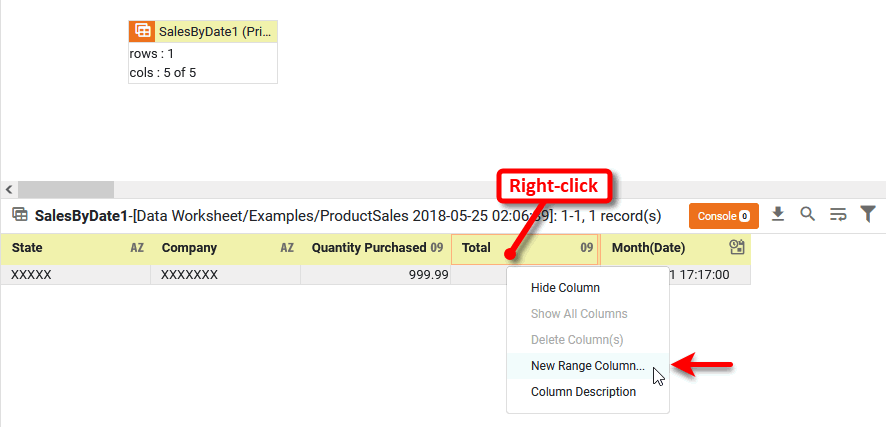
-
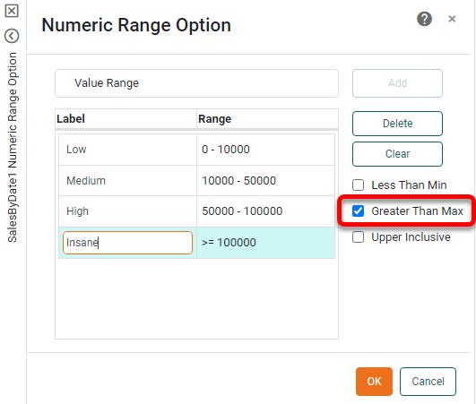
Enter the name “Revenue Range”.
-
Deselect the ‘Less Than Min’ and ‘Greater Than Max’ options.
-
Enter the first threshold, 0, into the ‘Value Range’ field and press Add.
-
Enter the next three thresholds, pressing Add after each one: 10000, 50000, 100000.
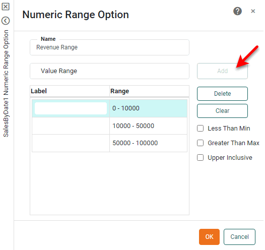
This creates the three ranges: 0-10,000, 10,000-50,000, and 50,000-100,000.
-
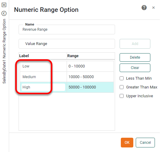
In the field to the left of the ‘0-10,000’ range, enter the new label “Low”. Repeat to relabel the 10,000-50,000 range as “Medium” and the 50,000-100,000 range as “High”.
-
Press OK to close the panel.
-
Press the ‘Change View’ button
and select ‘Live Data View’ to preview the data block. (See Preview Data for instructions.) Note that each cell in the ‘Total’ column has a corresponding range in the ‘Revenue Range’ column. The values that lie outside the specified ranges are labeled ‘Others’.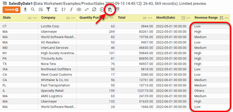
-
Optional: Instead of defining a fixed minimum and maximum value (750,000-10,000,000), you can keep the numeric range open-ended. Follow the steps below:
-
Open the ‘Numeric Range Option’ dialog box by pressing the ‘Numeric Range’ button
 in the range column header in the bottom panel.
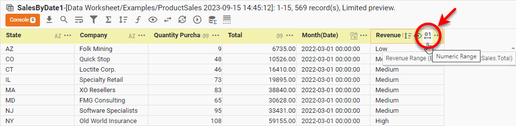
-
Select the ‘Greater than Max’ option, enter a label, and press OK.
-
Preview the data block and note that the values outside the specified range (formerly labeled ‘Others’) are now labeled ‘Insane’.
-
Group Data by Date Range
You can group date data (without aggregating) by applying common labels to a specified date range using a date range column. A date range column groups dates into a fixed set of date bins. You can create a range column for any date column in a data block.
To create a date range column, follow these steps:
-
Click the data block in the top panel to select it.
-
In the bottom panel, right-click the header of the column (date-type column only) for which you want to create a range column, and select the ‘New Range Column’ option from the context menu. Note: You can also access menu options from the ‘More’ button (
) in the mini-toolbar.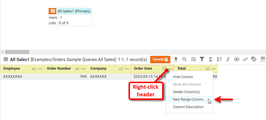
This opens the ‘Date Range Option’ panel. Here you can specify the date grouping.
-
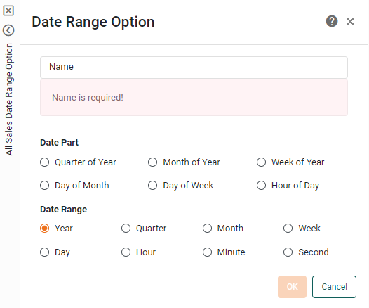
Enter a name for the new range column.
Names must be unique without respect to case (e.g., "num1" is the same name as "Num1"). -
Select the desired partitioning. There are five date ranges available for the date range column:
-
Press OK.
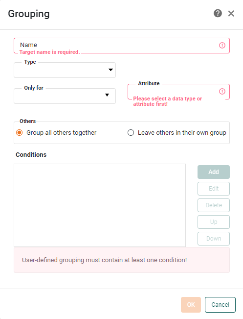
Create a Named Grouping
The default grouping procedure simply partitions a column based on its distinct values. For example, if a column contains state abbreviations CA, NY, and WA, then the default grouping produces one group for CA, one group for NY, and one group for WA. To create a different partition, use a named grouping. A named grouping is a user-defined grouping that partitions the data into the desired groups according to a reusable set of custom conditions (i.e., rules).
| You can also create a custom grouping in a Chart or Crosstab at the Dashboard level. See Group Data by Dimension and Create a Table in Visualize Your Data. |
To create a named grouping, follow these steps:
-
Press the ‘Add’ button
 in the toolbar, and select ‘Grouping’
  .
This opens the ‘Grouping’ dialog box.
.
This opens the ‘Grouping’ dialog box.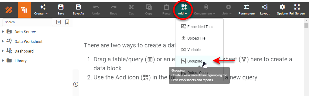
-
In the ‘Name’ field, enter a name for the grouping assembly. This is the title of the grouping object in the Data Worksheet.
Names must be unique without respect to case (e.g., "num1" is the same name as "Num1"). -
If you want the grouping to be accessible to all columns of a certain data type, select the desired data type from the ‘Type’ menu.
For example, you could use the ‘starting with’ operator to define a grouping based on initial letter (i.e., A, B, C, etc.). If you specified type ‘String’ for this grouping, you could apply the grouping to any column of that type in a Data Worksheet. This would allow you to reuse the same alphabetical grouping for customer names, company names, product descriptions, and any other column that has ‘String’ type data.
-
If you want the grouping to be applicable only to a particular column or attribute of a particular data source, select the desired data source from the ‘Only for’ menu. Select the desired column from the ‘Attribute’ menu.
You can select a column or attribute from any accessible data source, not restricted to those in the current Data Worksheet. The grouping defined for this column or attribute will then be available wherever the column or attribute is used in a Data Worksheet.
-
Specify the conditions that define membership in each group of the User defined Grouping:
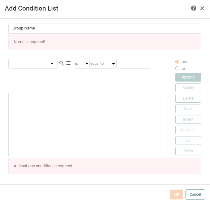
Press the Add button to add a new group. This opens the ‘Add Condition List’ dialog box. (This is the same as the dialog box used for adding advanced conditions to data blocks. See Filter Data for information on how to construct a filter.)
-
In the ‘Group Name’ field, enter the name of the group you wish to define. (For example, “East Coast states”.)
-
Enter the conditions that define membership in this particular group, and press OK.
-
Repeat the above three steps for each group you want to add to the grouping.
-
In the ‘Grouping’ dialog box, choose ‘Group all others together’ to create a default group called “Others” that will contain all column values that do not satisfy any of the specified group conditions. Otherwise, select ‘Leave others in their own group’.
-
Press OK to exit the ‘Grouping’ dialog box. This creates a new Named Grouping object in the Data Worksheet.
-
Save the Data Worksheet by pressing the ‘Save’ button
in the toolbar or press Ctrl+S on the keyboard.
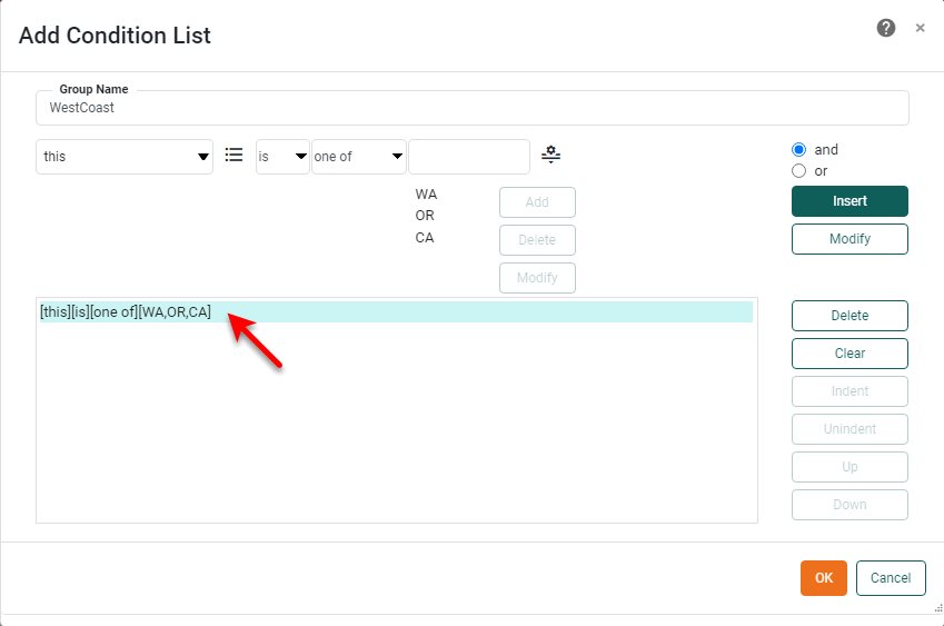
Suppose you want to create a group for all the states on the west coast, so that every time the customer data is displayed in a table or chart, customers from the west coast states are grouped together.
Follow these steps to create the ‘WestCoast’ group.
-
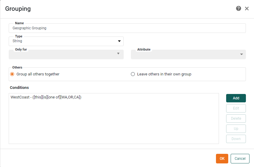
Create a new Data Worksheet. For information on how to create a new Data Worksheet, see Create a Data Worksheet.
-
Press the ‘Add’ button
in the toolbar, and select ‘Grouping’ .This opens the ‘Grouping’ dialog box.
-
Enter “Geographic Grouping” in the ‘Name’ field.
-
For the ‘Type’, select ‘String’.
-
Press the Add button to specify the group conditions. This opens the ‘Add Condition List’ dialog box.
-
Specify ‘WestCoast’ as the Group Name.
-
Specify the following condition, and press Append.
[this][is][one of][WA,OR,CA]
-
Press OK to exit the ‘Add Condition List’ dialog box and return to the ‘Grouping’ dialog.
-
Press OK.
-
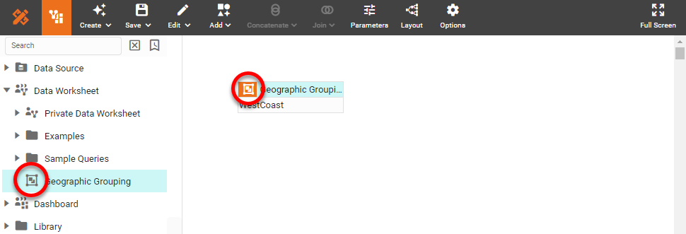
Right-click on the ‘Geographic Grouping’ group and select ‘Set as Primary’. Note: You can also access menu options from the ‘More’ button (
) in the mini-toolbar.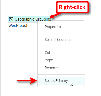
-
Press the ‘Save’ button
in the toolbar or press Ctrl+S on the keyboard. This opens the ‘Save as Data Worksheet’ dialog box. -
Specify “Geographic Grouping” as the name of the asset.
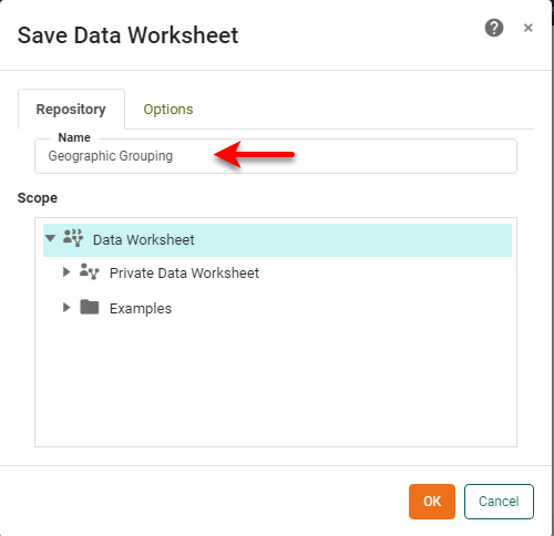
-
Press OK to save the newly created user-defined grouping. Notice that the grouping is shown in the left panel with a ‘Group’ icon
, indicating that the asset a named group.