Image Properties
|
The ‘Image Properties’ panel provides the following tabs: General, Advanced, Data, Script. The next sections discuss the Image-specific properties available under these tabs.
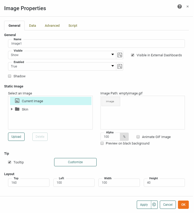
General Tab
The General tab in the ‘Image Properties’ dialog box provides the following image-specific properties.
Properties that offer the ‘Value Type’ button  can also be set by the user (‘Variable’) or by scripted logic (‘Expression’). See Dynamically Set Properties for more information. can also be set by the user (‘Variable’) or by scripted logic (‘Expression’). See Dynamically Set Properties for more information.
|
- Static Image
-
Select an existing server image, or press Upload to upload an image to the server. The ‘Skins’ folder provides a few predefined images which are useful as backgrounds. The ‘Theme Background’ has the special property of automatically adapting to match the prevailing color scheme of the User Portal.
All images uploaded to the Image component will be sent to the client browser and held in memory, even if they are not being displayed. ‘Alpha’ sets the transparency of image. An ‘Alpha’ value of 100% indicates complete opacity. An ‘Alpha’ value of less that 100% allows underlying components to be partially visible through the image.
- Tooltip
-
Value of bound data aggregate is displayed as tooltip when mouse hovers over the component. To display custom HTML in the tooltip, see Add Tips to a Chart.
- Shadow
-
Adds a drop shadow to the component.
Data Tab
See Data Tab for information about this common tab. The ‘Aggregate’ value that you specify here is used as the value for the Image highlight condition. (See Add Conditional Format (Highlight) for more information about highlights.)
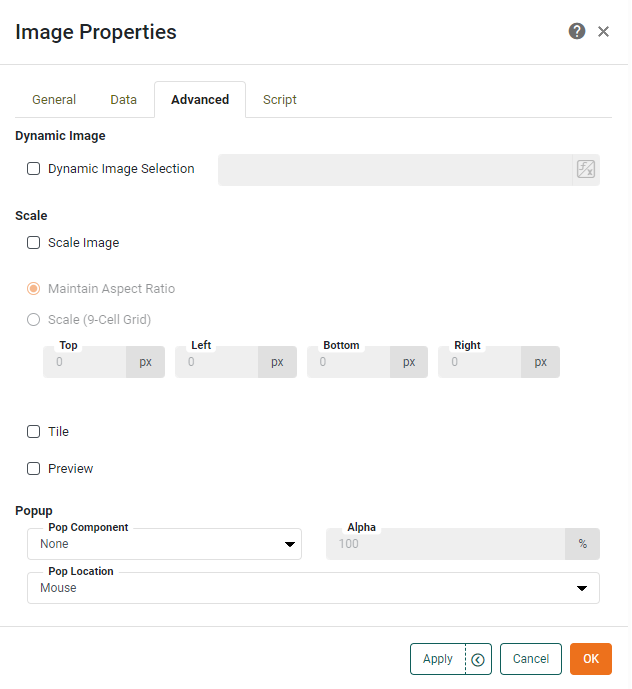
Advanced Tab
The Advanced tab in the ‘Image Properties’ dialog box provides the following Image-specific properties.
- Dynamic Image Selection
-
Specifies a method for dynamically setting the image. See Change Images with Script in Advanced Dashboard Scripting , for more information.
- Scale Image
-
When selected, specifies that images should be scaled to the containing component boundary. The following options are available:
-
Maintain Aspect Ratio: The image’s width to height ratio is preserved when the image is resized, preventing the image from being distorted.
-
Scale (9-Cell Grid): The image is divided into nine regions, which scale independently. See Add Background for more information about 9-cell scaling.
-
- Tile
-
Tiles (repeats) the image horizontally and vertically within the component boundaries.
- Preview
-
Displays a thumbnail of the image as it will appear with the applied scaling.
- Pop Component
-
Select an individual component or group Container to display as a pop-up interface when the user clicks the image. (See ‘Pop Location’ below to set the location.) Otherwise, the selected component is not visible in the Dashboard.
‘Alpha’ sets the transparency of the pop-up component or group. An ‘Alpha’ value of 100% indicates complete opacity. An ‘Alpha’ value of less that 100% allows underlying components to be partially visible through the popped-up component or group.
- Pop Location
-
The location where the pop component appears, either where the mouse was clicked or at the center of the screen.
Script Tab
See Script Tab for information about this common tab.