Sort Data
| These features are available to both designers and end-users. |
The following sections explain how to sort data in a Table and a Chart. (To sort at the Data Worksheet level, see Sort Data in Prepare Your Data.)
Sort Data in a Table
| Sorting actions for certain tables may be administratively restricted. |
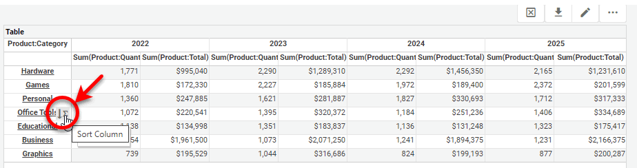
To sort a Table column or Crosstab column, hover the mouse over the right side of header or data cell and press the ‘Sort’ button  .
.
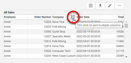
Press the button once to sort in ascending (alphabetical) order. Press the button a second time to sort in descending (reverse-alphabetical) order. Press the button a third time to restore the original order.
For a Crosstab, hover the mouse over a cell to display the current sort order for the field. This may show an ascending-sort arrow  , a descending-sort arrow
  , an ascending-by-value arrow
  , or a descending-by-value arrow
  . See Create a Crosstab for more information about setting sorting in a Crosstab.
Sort Data in Chart
To sort Chart dimension groups based on a measure, hover the mouse over the desired measure axis. This displays the ‘Sort’ button next to the axis. Press the button once to sort the groups in ascending order by measure value, press a second time to sort in descending order by measure value, and press a third time to restore the original order.
What is a measure? What is a dimension?A measure is generally used for aggregation, for example summation, averaging, correlation, etc., within a Crosstab, Chart, Text component, or Gauge. Adding a measure to the ‘Y’ region in a chart displays the computed aggregates by using locations on the Y-axis. Adding a measure to the ‘X’ region displays the computed aggregates by using locations on the X-axis. You can also display aggregates by using color, shape, size, or label. A dimension is used to break-down the dataset into multiple groups, often within a Crosstab, Chart, or Selection List. Adding a dimension to the ‘X’ region of a Chart distinguishes the different dimension groups by location on the X-axis. Adding a dimension to the ‘Y’ region distinguishes the different dimension groups by location on the Y-axis. You can add multiple dimensions into the ‘X’ or ‘Y’ regions of a Chart, or into the ‘Rows’ or ‘Columns’ regions of a Crosstab, to create multiple grouping levels. You can also distinguish groups in a dimension by using color, shape, size, or label in a Chart. |
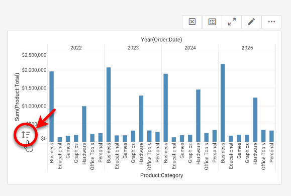
When multiple dimensions are represented on the chart (as in the image above), the ‘Sort’ button operates on the innermost dimension.