Text Properties
|
The Text component’s ‘Properties’ panel provides General, Data, and Script tabs. The next sections discuss the component-specific properties available under these tabs.
General Tab
In addition to the common properties, the General tab in the ‘Text Properties’ panel provides the following properties.
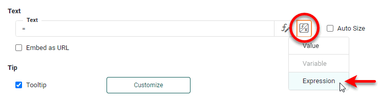
Properties that offer the ‘Value Type’ button  can also be set by the user (‘Variable’) or by scripted logic (‘Expression’). See Dynamically Set Properties for more information. can also be set by the user (‘Variable’) or by scripted logic (‘Expression’). See Dynamically Set Properties for more information.
|
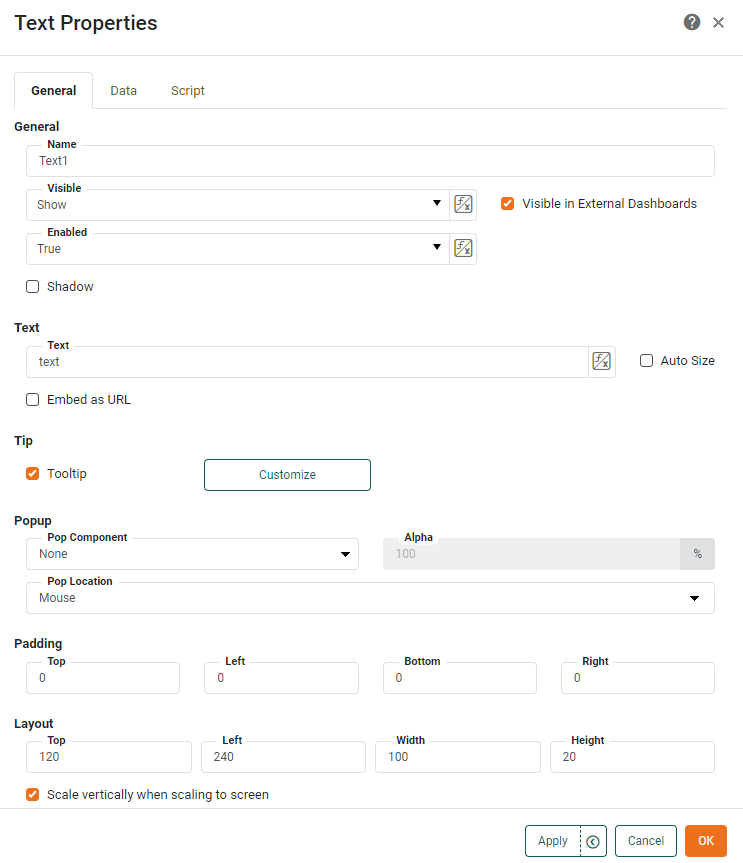
- Text
-
Display a label, or specify a single calculated value. To use an Excel-style aggregation function, press the and select the ‘Expression’. See Add Property Script for more information on using the ‘Expression’ option.
- Tooltip
-
Value of bound data aggregate is displayed as tooltip when mouse hovers over the component. To display custom HTML in the tooltip, see Custom Tooltip in Add Tips to a Chart.
- Shadow
-
Adds a drop shadow to the component. (Drop shadow for a Text component is not preserved on export.)
- Pop Component
-
Select an individual component or Container to display as a pop-up interface When the user clicks the Text. (See ‘Pop Location’ below to set the location.) Otherwise, the selected component is not visible in the Dashboard.
- Pop Location
-
The location where the pop component appears, either where the mouse was clicked or at the center of the screen.
- Alpha
-
Sets the transparency of the pop-up component or group. An ‘Alpha’ value of 100% indicates complete opacity. An ‘Alpha’ value of less that 100% allows underlying components to be partially visible through the popped-up component or group.
- Embed as URL
-
Specifies that the value in the ‘Text’ field is a URL whose contents should be displayed within the boundaries of the Text component.
Certain websites do not permit embedding, and the use of such URLs will cause a “Refused to connect” message to be displayed within the Text component. - Auto Size
-
Allows the bottom border of the Text component to expand vertically so that all the text in the component is visible. If ‘Auto Size’ is disabled, text that exceeds the component boundaries is cropped. However, if the text contains HTML tags, the text is always displayed in its entirety. (See Add Text or HTML for information about using HTML in a Text component.)
- Scale vertically when scaling to screen
-
When enabled, allows the text to scale when the Dashboard is automatically scaled to screen. (See Arrange Components for more information about automatic Dashboard sizing.) Disable this option to prevent the text from scaling, which may be appropriate when the text is used as a label for components that do not scale, such as Radio Button.
Data Tab
Only the standard properties are provided. See Data Tab for information about this common tab.
Script Tab
See Script Tab for information about this common tab.