Change Chart Scaling
A Scale object determines how abstract data values are mapped to physical Chart representations such as position, color, shape, etc. The EGraph object and the VisualFrame object both map data values to physical representations, so both of these objects require a Scale.
| Some objects, such as IntervalElement, create an implicit Scale. |
Change Chart Axis Scaling
| Change Axis Properties, for examples of other axis modifications. |
To change the scaling of chart axes, simply assign a new Scale to the Chart object. For example, consider the following Chart:
dataset = [["State","Quantity"], ["CA",200], ["NY",3000]];
graph = new EGraph();
var elem = new IntervalElement("State", "Quantity");
graph.addElement(elem);
Script that modifies the graph or dataset properties should be placed on the Chart component itself. See Add Component Script for more information. This script has access to the Chart data and Chart API methods. Scripted Charts are not good candidates for user-modification, so you should deselect ‘Enable Ad Hoc Editing’ in the Chart Properties dialog box.
|
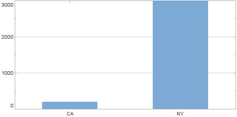
Note that in this Chart the IntervalElement object implicitly defines a linear Y-axis scale. However, the data values on the Chart are widely different in magnitude, which suggests that a log scale might be more appropriate. To change the Y-axis to use a log scale, follow these steps:
-
Define the desired Scale object explicitly. In this case, create a LogScale based on the ‘Quantity’ field.
var scale = new LogScale("Quantity"); -
Assign the new Scale to the Y-axis of the Chart object using the EGraph.setScale(field, scale) method.
graph.setScale("Quantity",scale);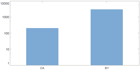
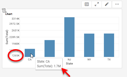
In this example, you will dynamically modify the axis range to match the data displayed on the chart. In particular, you will adapt the lower limit on the Y-axis so that it is always 75% of the lowest data value shown on the chart.
Follow the steps below:
-
Create a new Dashboard based on the ‘Sales Explore’ Data Worksheet. (See Create a New Dashboard.)
The 'Sales Explore' Data Worksheet can be found in . You may need to download the examples.zip file from GitHub into your environment. (This requires access to Enterprise Manager.) See Import and Export Assets for instructions on how to import. -
Add a Chart component to the Dashboard, and press the ‘Edit’ button
 to open the Chart Editor.
 -
From the ‘Dimensions’ node of the Data Source panel, drag the ‘State’ field to the ‘X’ region.
-
From the ‘Measures’ node of the Data Source panel, drag the ‘Total’ field to the ‘Y’ region.
-
Press the ‘Edit Dimension’ button
 next to the ‘State’ field in the ‘Data’ panel.
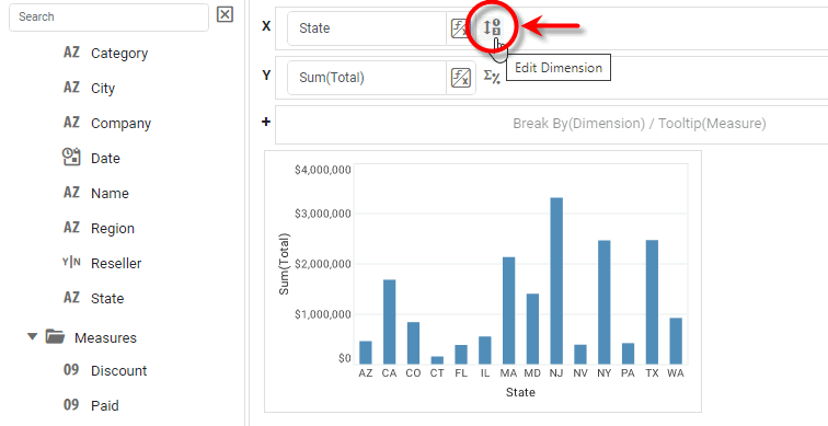
-
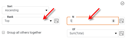
From the ‘Ranking’ option in the ‘Edit Dimension’ panel, specify ‘Top 5 of Sum(Total)’. Press the ‘Apply’ button
 .
.
-
Right-click the Chart component on the Dashboard, and select ‘Properties’ from the context menu. This opens the ‘Chart Properties’ panel.
-
Select the Script tab, and enter the following script:
var dMin = 10000000; // Default minimum // Get a handle to the chart's Y-axis Scale: var yScale = graph.getCoordinate().getYScale(); // Find the minimum Y-value in the chart data: for (var i=0; i < dataset.getRowCount(); i++) { yVal = dataset.getData('Sum(Total)',i); if(yVal < dMin) { dMin = yVal; } } // Set Y-axis lower limit to .75 of minimum value: yScale.setMin(.75*dMin); -
Press OK to close the ‘Chart Properties’ panel. Observe how the chart Y-axis updates so that the lower limit is 75% of the smallest chart value.
-
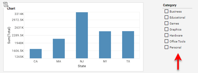
From the Data Source panel of the Chart Editor, drag the ‘Category’ field onto the Dashboard. This creates a ‘Category’ Selection List.
-
Select different combinations of categories from the ‘Category’ Selection List, and observe how the Chart axis updates.
Change VisualFrame Scaling
A VisualFrame object contains information about how data values are mapped to physical properties of Chart elements. For example, a BrightnessColorFrame contains information about how data values in a field map to the brightness of corresponding Chart elements. Mappings of this type require a Scale.
To change the scaling of a VisualFrame object, simply assign a new Scale to the VisualFrame. For example, consider the following chart:
var dataset = [["State","Quantity","Total"],["NJ",200,2500],["NY",300,1500]];
graph = new EGraph();
var elem = new IntervalElement("State", "Quantity");
var frame = new BrightnessColorFrame();
frame.setField("Total");
frame.setColor(java.awt.Color(0xff0000));
elem.setColorFrame(frame);
graph.addElement(elem);
Script that modifies the graph or dataset properties should be placed on the Chart component itself. See Add Component Script for more information. This script has access to the Chart data and Chart API methods. Scripted Charts are not good candidates for user-modification, so you should deselect ‘Enable Ad Hoc Editing’ in the Chart Properties dialog box.
|
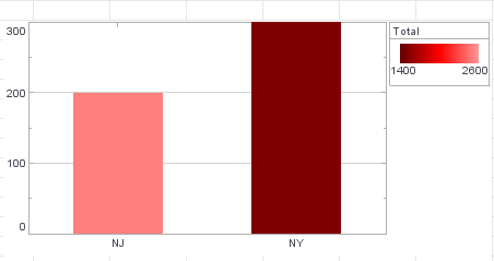
Note that in this Chart a linear scale is defined implicitly by the BrightnessColorFrame object. The legend indicates that this default scale runs from 1400 to 2600. To change the scaling to run from 500 to 3000 instead, you must explicitly define a new Scale object. Follow these steps:
-
Define the desired
Scaleobject explicitly. In this case, create a LinearScale based on the ‘Total’ field.var scale = new LinearScale("Total"); scale.setFields("Total"); -
Set the minimum and maximum values of the new Scale object.
scale.setMax(3000); scale.setMin(500); -
Assign the new scale to the existing VisualFrame object.
frame.setScale(scale);