End-User Chart Control
In addition to using basic chart tools to explore a chart (see Drill Down into Data), users can also dynamically modify a chart by changing the fields displayed on the X and Y axes, changing aggregation methods, adding target lines, and so on.
There are two difference ways that users can make modifications to charts: By using the Ad Hoc Editor, or by using dynamic properties. These approaches are described below.
Modify a chart by using the Ad Hoc Editor
Watch Video: Filtering a Dashboard (User-Dessdigned Filter)
This video might show an earlier version of the feature or operation that differs in minor ways from the current version.
Users can access an Ad Hoc Chart Editor that gives them complete flexibility to edit charts. The Editor is the same as the Chart Editor available to designers. See Create a Chart for more information about using the Editor.
To provide end users with access to the Ad Hoc Chart Editor, follow the steps below:
-
Right-click the desired chart or crosstab and select ‘Properties’ from the context menu. Note: You can also access menu options from the ‘More’ button (
 ) in the mini-toolbar. This opens the ‘Chart Properties’ or ‘Crosstab Properties’ dialog box.
 -
Select the Advanced tab in the dialog box.
-
Select the ‘Enable Ad Hoc Editing’ option.
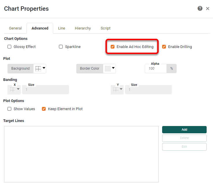
If this option is not selected, users will not have access to the Chart Editor. However, other features (brushing, show details, export, zooming, etc.) will remain available.
Modify a chart using dynamic properties
Watch Video: Grouping Data in a Dashboard (User-Controlled Chart Measure)
This video might show an earlier version of the feature or operation that differs in minor ways from the current version.
You can allow a user to modify a chart using dynamic properties. To do this, use Form components to set chart properties by choosing the ‘Variable’ or Expression’ option in the ‘Change Value Type’ button  . See Dynamically Set Properties for more information.
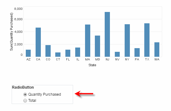
In this example, you will add a RadioButton that allows the user to set the Y-axis field of a chart to either ‘Quantity Purchased’ or ‘Total Revenue’.
-
Create a new Dashboard based on the ‘ProductSales’ Data Worksheet. (See Create a New Dashboard.)
The 'ProductSales' Data Worksheet can be found in . You may need to download the examples.zip file from GitHub into your environment. (This requires access to Enterprise Manager.) See Import and Export Assets for instructions on how to import. -
Add a Radio Button to the Dashboard, with two embedded values (‘Quantity Purchased’ and ‘Total’).Add a Chart to the Dashboard, and open the Chart Editor. (See Create a Chart.) Add the ‘State’ field from the ‘SalesByDate’ data block to the X-axis and the ‘Quantity Purchased’ field as the Y-axis.
-
Press the ‘Change Value Type’ button
next to ‘Quantity Purchased’, and choose the ‘Variable’ option. The menu displays the available variable names.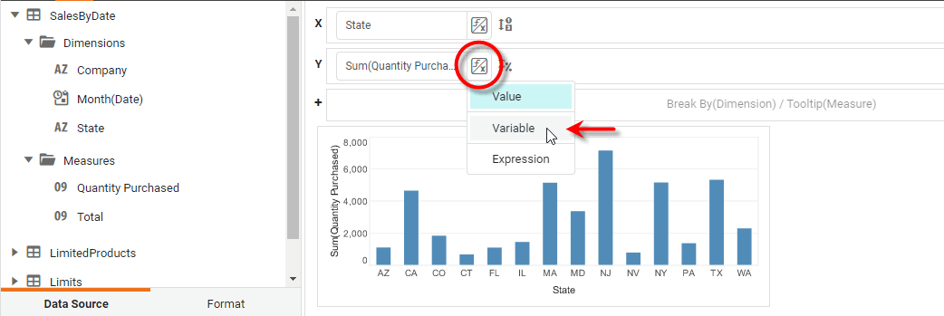
-
From the list of variables, choose
$(RadioButton). -
Now press the radio buttons. Note that the chart displays the Y-axis field that you choose using the radio button control.