Legend Properties
|
Plot Properties in Dashboard Object Reference to set these properties dynamically using script. |
To edit a legend, right-click the legend, and select ‘Legend Properties’ from the context menu. Note: You can also access menu options from the ‘More’ button ( ) in the mini-toolbar. This opens the ‘Legend Properties’ panel, which provides the following tabs: General, Scale.adoc, Alias.
|
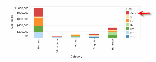
To hide a legend, right-click the legend and choose ‘Hide Legend’ from the context menu. Note: You can also access menu options from the ‘More’ button () in the mini-toolbar. To show all legends, right-click the chart and select ‘Show Legend’ from the context menu.
|
General Tab
The General tab offers the following options.
Properties that offer the ‘Value Type’ button  can also be set by the user (‘Variable’) or by scripted logic (‘Expression’). See Dynamically Set Properties for more information. can also be set by the user (‘Variable’) or by scripted logic (‘Expression’). See Dynamically Set Properties for more information.
|
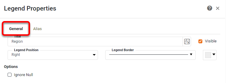
- Title
-
The text to display in the legend title bar.
- Visible
-
Sets the visibility of the legend title bar.
- Legend Border
-
The line style and color of the legend boundary.
- Legend Position
-
Sets the position of the legend on the plot. Legend position can also be changed by dragging with the mouse.
- Ignore Null
-
Ignore null values when generating the legend.
Scale Tab
The Scale tab offers the following options for measure (numerical) legends.
What is a measure?A measure is generally used for aggregation, for example summation, averaging, correlation, etc., within a Crosstab, Chart, Text component, or Gauge. Adding a measure to the ‘Y’ region in a chart displays the computed aggregates by using locations on the Y-axis. Adding a measure to the ‘X’ region displays the computed aggregates by using locations on the X-axis. You can also display aggregates by using color, shape, size, or label. |
- Logarithmic Scale
-
Set logarithmic scaling for the legend scale. (The logarithm base is selected automatically.)
- Reverse
-
Orient the scale with maximum at left, minimum at right (or maximum represented by smallest, minimum represented by largest, etc.).
- Include Zero
-
For a ‘Size’ legend, specifies that zero should be included in the scaling such that the (hypothetical) minimum element size corresponds to a value of zero rather than the actual minimum data value.
Alias Tab
The Alias tab is available for dimension (categorical) legends, and displays a table containing the mapping between original legend labels and new legend labels.
What is a dimension?A dimension is used to break-down the dataset into multiple groups, often within a Crosstab, Chart, or Selection List. Adding a dimension to the ‘X’ region of a Chart distinguishes the different dimension groups by location on the X-axis. Adding a dimension to the ‘Y’ region distinguishes the different dimension groups by location on the Y-axis. You can add multiple dimensions into the ‘X’ or ‘Y’ regions of a Chart, or into the ‘Rows’ or ‘Columns’ regions of a Crosstab, to create multiple grouping levels. You can also distinguish groups in a dimension by using color, shape, size, or label in a Chart. |
To modify the labels of a legend, double-click the cells in the ‘Alias’ column that correspond to the legend labels that you wish to rename, and enter the desired replacement text. Press OK to close the panel.
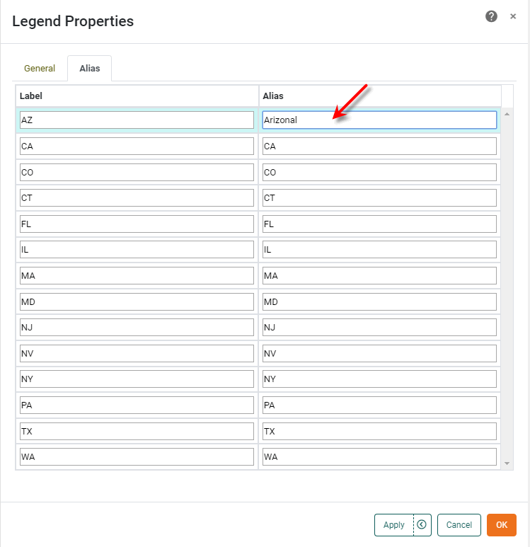
This updates the legend labels with the specified replacement text.