Trend and Compare Data
There are many different ways to represent an aggregated measure in a Chart or Crosstab. For example, you can represent the aggregated measure in terms of its percentage of a total, or by its difference from a preceding group, or by a moving average based on adjacent groups, etc.
What is a measure?A measure is generally used for aggregation, for example summation, averaging, correlation, etc., within a Crosstab, Chart, Text component, or Gauge. Adding a measure to the ‘Y’ region in a chart displays the computed aggregates by using locations on the Y-axis. Adding a measure to the ‘X’ region displays the computed aggregates by using locations on the X-axis. You can also display aggregates by using color, shape, size, or label. |
The following sections explain the different options, and how to implement them in a Chart or Crosstab.
Choose a Trend or Comparison Method
To use one of these representations, set the appropriate ‘Trend and Comparison’ method in your Chart or Crosstab. Follow the steps below:
-
Open the Chart Editor or Crosstab Editor. (Press the ‘Edit’ button
 at the top-right corner of the Chart or Crosstab. If this opens the Wizard, press the ‘Full Editor’ button to open the Editor.)
 -
Press the ‘Edit Measure’ button
 next to a measure.
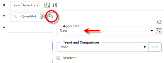
-
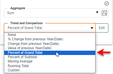
Select one of the calculation methods from the ‘Trend and Comparison’ menu in the pop-up panel.
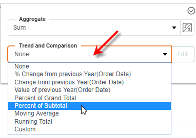
Select ‘None’ (default) to use the raw aggregate. Select ‘Custom’ to create a new calculation method. -
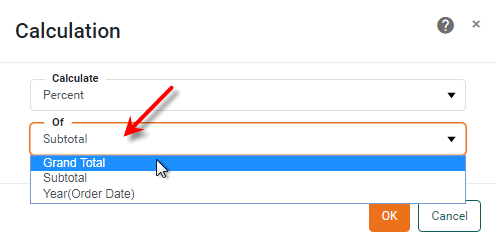
Press the Edit button. This opens the ‘Calculation’ panel, which allows you to modify the properties of the calculation method.
-
From the ‘Calculate’ menu, select a type of calculation: ‘Percent’, ‘Change’, ‘Running’, ‘Sliding’, ‘Value of’, or ‘Compound Growth’.
-
Select any additional options to fully specify the calculation method. The options vary for the different methods. See below for details:
-
Press OK to close the dialog box. This adds the new method to the ‘Trend and Comparison’ menu.
-
Press the ‘Apply’ button
 .
.
The aggregated measure will now be displayed on the Chart or Crosstab using the particular representation that you have specified.
Percent Calculation
The ‘Percent’ calculation allows you to express the measure based on ‘Grand Total’, ‘Subtotal’, or a particular dimensional group.
- Dimension
-
Expresses the value of the aggregated measure for each group as a percentage of the measure aggregated across the selected dimension.
What is a dimension?
A dimension is used to break-down the dataset into multiple groups, often within a Crosstab, Chart, or Selection List. Adding a dimension to the ‘X’ region of a Chart distinguishes the different dimension groups by location on the X-axis. Adding a dimension to the ‘Y’ region distinguishes the different dimension groups by location on the Y-axis. You can add multiple dimensions into the ‘X’ or ‘Y’ regions of a Chart, or into the ‘Rows’ or ‘Columns’ regions of a Crosstab, to create multiple grouping levels. You can also distinguish groups in a dimension by using color, shape, size, or label in a Chart.
- Grand Total
-
Expresses the value of the aggregated measure for each group as a percentage of the measure aggregated across all groups.
- Subtotal
-
For a facet-type chart (i.e., a chart with both a measure and dimension on the same axis or with multiple dimensions on the same axis), this expresses the value of the aggregated measure for each group as a percentage of the measure aggregated across all groups on the same sub-chart.
Example: Percent Calculation
In this example, you will create a chart that displays the quantity of products sold for different categories, regions, and states. You will display the aggregated measure for each subgroup as a percentage of the total aggregate for the category. Follow the steps below:
-
Create a new Dashboard based on the ‘Sales Explore’ Data Worksheet. For information on how to create a new Data Worksheet, see Create a Data Worksheet.
The 'Sales Explore' Data Worksheet can be found in . You may need to download the examples.zip file from GitHub into your environment. (This requires access to Enterprise Manager.) See Import and Export Assets for instructions on how to import. -
Drag a Chart component from the Toolbox onto the Dashboard.
-
Press the ‘Edit’ button
at the top-right of the Chart to open the Visualization Recommender. Bypass the Recommender by pressing the ‘Full Editor’ button at the top right. This opens the Chart Editor.
Add Data to Chart
-
In the Chart Editor, make the following selections:
-
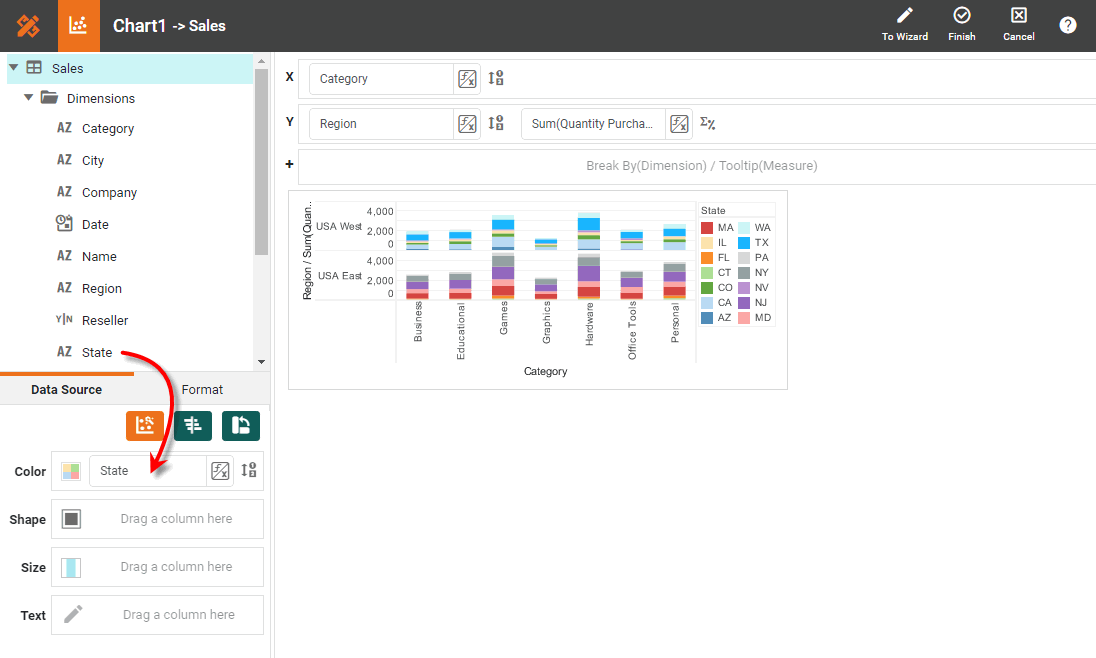
From the ‘Dimensions’ node in the data source, drag the ‘Category’ dimension to the ‘X’ region.
-
From the ‘Measures’ node in the data source, drag the ‘Quantity Purchased’ measure to the ‘Y’ region.
-
From the ‘Dimensions’ node in the data source, drag the ‘Region’ dimension to the ‘Y’ region, and drop it above the ‘Quantity Purchased’ measure. (This creates a facet chart containing multiple sub-graphs.)
-
From the ‘Dimensions’ node in the data source, drag the ‘State’ dimension to the ‘Color’ region. This creates a subseries based on the ‘State’ field.
-
Press the ‘Finish’ button
to close the Editor.
-
-
Drag the Chart handles to enlarge the Chart as desired.
Add Filter
-
From the data source, drag the ‘State’ dimension onto the Dashboard. This creates a ‘State’ Selection List.
-
Select the following states in the ‘State’ selection list: ‘AZ’, ‘CA’, ‘NJ’, ‘NY’.
Show Values on Chart
-
Right-click the plot area of the chart, and select ‘Properties’ from the context menu. This opens the ‘Chart Properties’ panel.
-
Under the Advanced tab, enable the ‘Show Values’ option, and press OK.
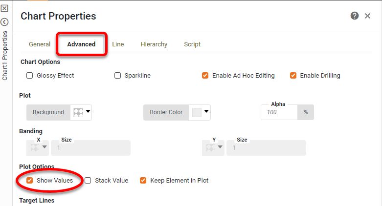
This displays the aggregated measure value for each group on the chart.
-
Open the Chart Editor again.
Add Percent Trend and Comparison
-
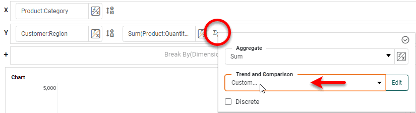
Press the ‘Edit Measure’ button
next to the ‘Quantity Purchased’ measure. -
In the ‘Trend and Comparison’ menu of the pop-up panel, select the ‘Custom’ option.
-
Press the Edit button to open the ‘Calculation’ dialog box.
-
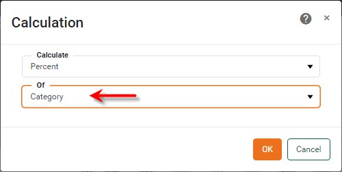
In the ‘Calculation’ dialog box, select ‘Percent’ from the ‘Calculate’ menu. Press the ‘Apply’ button
. -
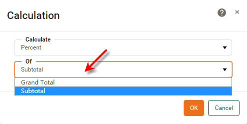
Select ‘Category’ from the ‘Of’ menu, and press OK to close the dialog box.
-
Press the ‘Finish’ button
to close the Editor.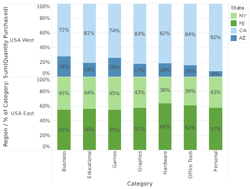
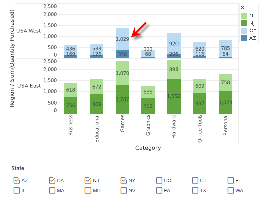
The aggregated measure for each group is now represented as its percentage of the total aggregate for the corresponding category.
Experiment with the other available representations for the group aggregates:
- Grand Total
-
The aggregated measure for each group is represented as its percentage with respect to the entirety of chart data.
- Subtotal
-
The aggregated measure for each group is represented as its percentage with respect to the entirety of data on the same sub-graph (i.e., the region, ‘USA East’ or ‘USA West’).
- Region
-
The aggregated measure for each group is represented as its percentage with respect to its entire region (same as ‘Subtotal’ for this example).
- State
-
The aggregated measure for each group is represented as its percentage with respect to its entire state.
Change Calculation
|
Percent Change Chart, for an example of change calculation on a Chart. |
The ‘Change’ calculation allows you to express the group aggregate in terms of its deviation (or percent deviation, if ‘As percent’ is selected) from the preceding, succeeding, first, or last group in the series. The ‘From’ menu specifies the baseline value.
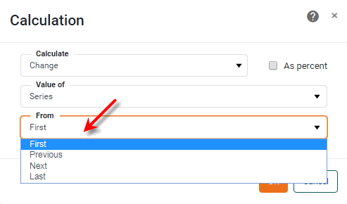
- First
-
Expresses the value of the aggregated measure for each group as a difference from the corresponding first value for the parent group selected in the ‘Value of’ menu.
What is a measure?
A measure is generally used for aggregation, for example summation, averaging, correlation, etc., within a Crosstab, Chart, Text component, or Gauge. Adding a measure to the ‘Y’ region in a chart displays the computed aggregates by using locations on the Y-axis. Adding a measure to the ‘X’ region displays the computed aggregates by using locations on the X-axis. You can also display aggregates by using color, shape, size, or label.
- Previous
-
Expresses the value of the aggregated measure for each group as a difference from the corresponding previous value for the parent group selected in the ‘Value of’ menu.
- Next
-
Expresses the value of the aggregated measure for each group as a difference from the corresponding next value for the parent group selected in the ‘Value of’ menu.
- Last
-
Expresses the value of the aggregated measure for each group as a difference from the corresponding last value for the parent group selected in the ‘Value of’ menu.
Running Calculation
|
Running Total Chart, for an example of a running calculation. |
The ‘Running’ calculation allows you to express each group aggregate as an accumulation of previous aggregate values in the series. The method of accumulation is specified by the ‘Aggregate’ menu in the ‘Calculation’ dialog box.
The ‘Reset at’ option, available for date fields, allows you to specify the date interval (e.g., year, quarter, week, etc.) at which the accumulation should be cleared.
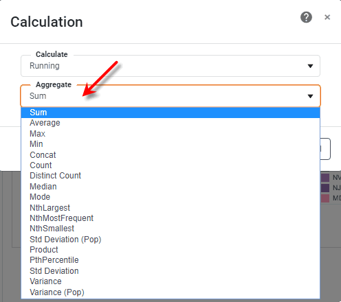
Expand to see the available aggregation methods…
The list below describes the available Data Block, Crosstab, and Chart aggregation measures. You can choose to display univariate aggregations (e.g., ‘Sum’, ‘Count’) as a percentage value by selecting the percentage basis (e.g., ‘Group’, ‘GrandTotal’) from the accompanying ‘Percentage’ or ‘Percentage of’ menu. For the bivariate aggregation methods (e.g., ‘Correlation’, ‘Weighted Average’), you will need to select a variable (column) to use as the second operand in the computation. Make this selection in the menu labeled ‘with’.
- Sum
-
Displays the sum of the measure values for the given group.
- Average
-
Displays the average of the measure values for the given group.
- Max
-
Displays the maximum of the measure values for the given group. For dates, this will return the latest date.
- Min
-
Displays the minimum of the measure values for the given group. For dates, this will return the earliest date.
- Count
-
Displays the total count of measure values for the given group. This represents the total number of records corresponding to the given group, and is the same value for any selected measure.
- Distinct Count
-
Displays the count of unique measure values for the given group.
- First
-
Displays the first value for the measure (for the given group) when sorted based on the values in a second column, specified by the menu labeled ‘by’.
- Last
-
Displays the last value for the measure (for the given group) when sorted based on the values in a second column, specified by the menu labeled ‘by’.
- Correlation
-
Displays the Pearson correlation coefficient for the correlation between the measure values (for the given group) and the corresponding values in a second column, specified by the menu labeled ‘with’.
- Covariance
-
Displays the covariance between the measure values (for the given group) and the corresponding values in a second column, specified by the menu labeled ‘with’.
- Variance
-
Displays the (sample) variance of the measure values for the given group.
- Std Deviation
-
Displays the (sample) standard deviation of the measure values for the given group.
- Variance (Pop)
-
Displays the (population) variance of the measure values for the given group.
- Std Deviation (Pop)
-
Displays the (population) standard deviation of the measure values for the given group.
- Weighted Average
-
Displays the weighted average of the measure values for the given group. The weights are given by the corresponding values in a second column, which is specified by the menu labeled ‘with’.
- Median
-
Displays the median (middle) of the measure values for the given group.
- Mode
-
Displays the mode (most common) of the measure values for the given group.
- Product
-
Displays the product (multiplication) of the measure values for the given group.
- Concat
-
Displays the concatenation into a comma-separated list of the measure values for the given group.
- NthLargest
-
Displays the Nth largest of the measure values for the given group.
- NthSmallest
-
Displays the Nth smallest of the measure values for the given group.
- NthMostFrequent
-
Displays the Nth most common of the measure values for the given group.
- PthPercentile
-
Displays the value of the Pth percentile for the measure values for the given group.
Example: Running Average
In this example, you will create a chart that computes total quantities sold by month, and displays these values as a running average. The running average will be reset on a yearly basis. Follow the steps below:
-
Create a new Dashboard based on the ‘Sales Explore’ Data Worksheet. For information on how to create a new Data Worksheet, see Create a Data Worksheet.
The 'Sales Explore' Data Worksheet can be found in . You may need to download the examples.zip file from GitHub into your environment. (This requires access to Enterprise Manager.) See Import and Export Assets for instructions on how to import. -
Drag a Chart component from the Toolbox onto the Dashboard, and enlarge the Chart as desired by dragging the handles.
-
Press the ‘Edit’ button
at the top-right of the Chart to open the Visualization Recommender. Bypass the Recommender by pressing the ‘Full Editor’ button at the top right. This opens the Chart Editor. -
In the Chart Editor, from the ‘Dimensions’ node in the data source, drag the ‘Date’ dimension to the ‘X’ region.
-
From the ‘Measures’ node in the data source, drag the ‘Quantity Purchased’ measure to the ‘Y’ region.
-
Press the ‘Edit Dimension’ button
 next to the ‘Date’ measure.
 -
From the ‘Level’ menu select ‘Month’, and press the ‘Apply’ button
. This groups the date data (i.e., X-axis labels) by month.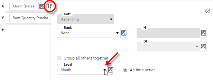
-
Press the ‘Edit Measure’ button
next to the ‘Quantity Purchased’ measure. -
In the ‘Trend and Comparison’ menu of the pop-up panel, select the ‘Custom’ option.
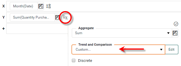
Leave the ‘Aggregate’ option in the pop-up panel set to the default ‘Sum’. -
Press the Edit button to open the ‘Calculation’ dialog box. Make the following settings:
-
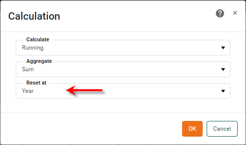
From the ‘Calculate’ menu, select ‘Running’.
-
From the ‘Aggregate’ menu, select ‘Sum’.
-
From the ‘Reset at’ menu, select ‘Year’.
-
Press OK to close the dialog box.
-
-
Press the ‘Apply’ button
. -
Press the ‘Finish’ button
to close the Editor.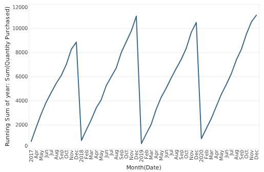
The time series now shows a running total for the summed quantity purchase, re-initialized at each new year.
Sliding Calculation
|
Sliding Window Chart, for an example of a sliding calculation. |
The ‘Sliding’ calculation allows you to express each group’s value as an accumulation of neighboring aggregate values in the series, specified by a rectangular sliding window. This generally has the effect of smoothing (low-pass filtering) the displayed data.
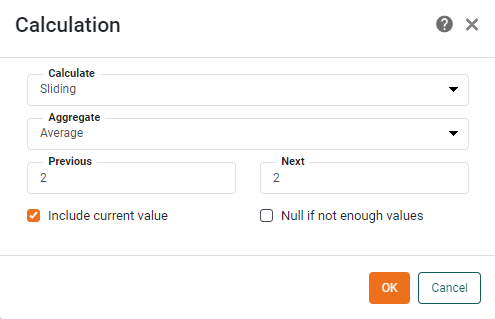
The method of accumulation is specified by the ‘Aggregate’ menu in the ‘Calculation’ dialog box. The ‘Previous’ and ‘Next’ values specify the span of the sliding window as the number of preceding and succeeding groups, respectively, to include in the calculation. All included groups have equal weight in the calculation.
Expand to see the available aggregation methods…
The list below describes the available Data Block, Crosstab, and Chart aggregation measures. You can choose to display univariate aggregations (e.g., ‘Sum’, ‘Count’) as a percentage value by selecting the percentage basis (e.g., ‘Group’, ‘GrandTotal’) from the accompanying ‘Percentage’ or ‘Percentage of’ menu. For the bivariate aggregation methods (e.g., ‘Correlation’, ‘Weighted Average’), you will need to select a variable (column) to use as the second operand in the computation. Make this selection in the menu labeled ‘with’.
- Sum
-
Displays the sum of the measure values for the given group.
- Average
-
Displays the average of the measure values for the given group.
- Max
-
Displays the maximum of the measure values for the given group. For dates, this will return the latest date.
- Min
-
Displays the minimum of the measure values for the given group. For dates, this will return the earliest date.
- Count
-
Displays the total count of measure values for the given group. This represents the total number of records corresponding to the given group, and is the same value for any selected measure.
- Distinct Count
-
Displays the count of unique measure values for the given group.
- First
-
Displays the first value for the measure (for the given group) when sorted based on the values in a second column, specified by the menu labeled ‘by’.
- Last
-
Displays the last value for the measure (for the given group) when sorted based on the values in a second column, specified by the menu labeled ‘by’.
- Correlation
-
Displays the Pearson correlation coefficient for the correlation between the measure values (for the given group) and the corresponding values in a second column, specified by the menu labeled ‘with’.
- Covariance
-
Displays the covariance between the measure values (for the given group) and the corresponding values in a second column, specified by the menu labeled ‘with’.
- Variance
-
Displays the (sample) variance of the measure values for the given group.
- Std Deviation
-
Displays the (sample) standard deviation of the measure values for the given group.
- Variance (Pop)
-
Displays the (population) variance of the measure values for the given group.
- Std Deviation (Pop)
-
Displays the (population) standard deviation of the measure values for the given group.
- Weighted Average
-
Displays the weighted average of the measure values for the given group. The weights are given by the corresponding values in a second column, which is specified by the menu labeled ‘with’.
- Median
-
Displays the median (middle) of the measure values for the given group.
- Mode
-
Displays the mode (most common) of the measure values for the given group.
- Product
-
Displays the product (multiplication) of the measure values for the given group.
- Concat
-
Displays the concatenation into a comma-separated list of the measure values for the given group.
- NthLargest
-
Displays the Nth largest of the measure values for the given group.
- NthSmallest
-
Displays the Nth smallest of the measure values for the given group.
- NthMostFrequent
-
Displays the Nth most common of the measure values for the given group.
- PthPercentile
-
Displays the value of the Pth percentile for the measure values for the given group.
The ‘Include current value’ option incorporates each group’s aggregate value into its own calculation. When this option is not enabled, the calculation for a group uses only its neighboring groups’ values.
Assume the chart displays sales totals for March, April, May, June, and July, and the sliding window is 3 units wide (‘Previous’=1 and ‘Next’ =1). If ‘Include current value’ is enabled, the displayed value for May is aggregated from three months’ data: April, May, and June. However, if ‘Include current value’ is not enabled, the displayed value for May is aggregated from two months’ data: April and June.
The ‘Null if not enough values’ option suppresses chart points for which the sliding window does not obtain the required span.
Value Of Calculation
The ‘Value of’ option is similar to the Change Calculation option, but does not perform any calculation, merely returning the referenced value (previous, first, next, or last). The ‘From’ menu specifies the reference value.
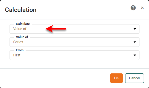
- First
-
The corresponding first value for the parent group selected in the ‘Value of’ menu.
- Previous
-
The corresponding previous value for the parent group selected in the ‘Value of’ menu.
- Next
-
The corresponding next value for the parent group selected in the ‘Value of’ menu.
- Last
-
The corresponding last value for the parent group selected in the ‘Value of’ menu.
Compound Growth Calculation
The ‘Compound Growth’ calculation is similar to the Running Calculation and allows you to express each group aggregate as an accumulation of previous aggregate values in the series, but with added compounding. It is therefore intended to be used only with percentage values. The method of aggregation should typically ‘Min’, ‘Max’, or ‘Average’ in the case of percentages.
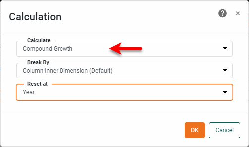
The ‘Reset at’ option, available for date fields, allows you to specify the date interval (e.g., year, quarter, week, etc.) at which the accumulation should be cleared.
The sample Sales Revenue/Profit Analysis Dashboard (in the ‘Examples’ folder) provides an example of using a chart calculation (Change from First).
To explore this sample Dashboard, download and import the Sales Revenue/Profit Analysis Dashboard into your environment. (This requires access to Enterprise Manager.) See Import and Export Assets for instructions on how to import.