Add Background
Watch Video: Creating a Dashboard (Add Background)
This video might show an earlier version of the feature or operation that differs in minor ways from the current version.
There are two basic ways to create a Dashboard background.
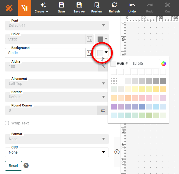
Assign Dashboard Background Color
To assign a uniform background to the entire Dashboard, follow the steps below:
-
Click in an empty area of the Dashboard.
-
Select the Format tab in the left panel.
-
Use the ‘Background’ property to specify the desired background color for the entire Dashboard.
When you apply a custom background, some components may display with white borders. Use the Format tab (see Add Visual Format) or border-color property (see CSS Properties) to assign the desired border color.
|
Use Shape or Image as Background
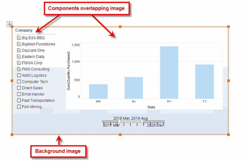
You can use an Image or a Shape component as a background for any portion of a Dashboard. For example, you can place an Image behind a set of components to provide the appearance of a frame or panel.
To use an Image or a Shape as a background, follow the steps below:
-
Add an Image or a Shape component to the Dashboard.
-
For an Image component, follow the steps below:
-
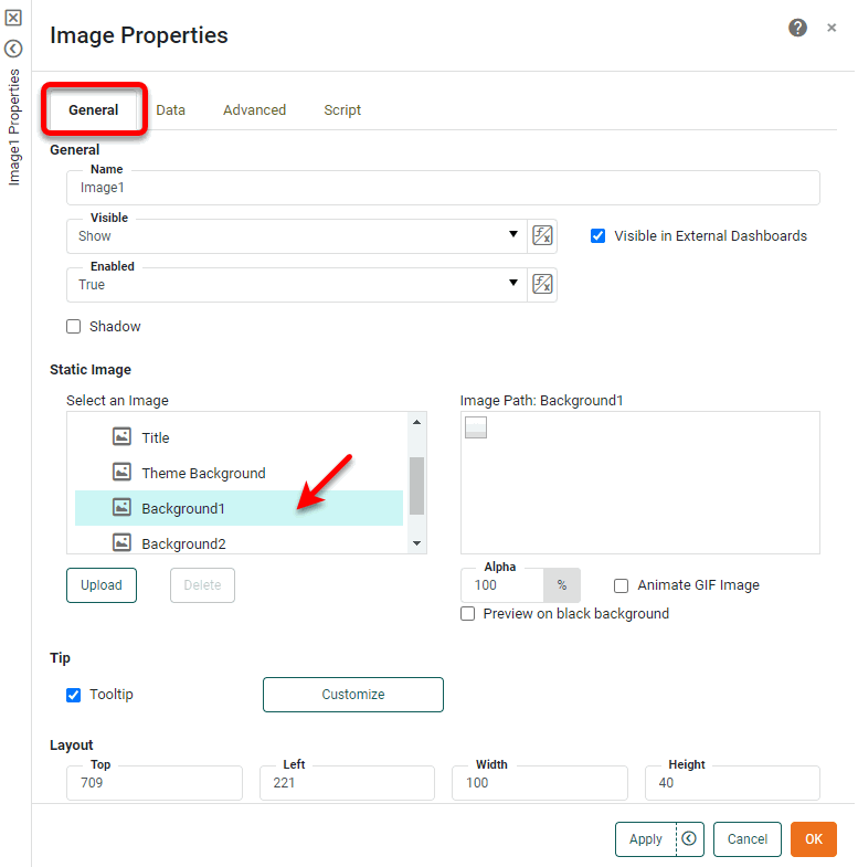
Right-click the Image component, and select ‘Properties’ from the context menu. Note: You can also access menu options from the ‘More’ button (
 ) in the mini-toolbar. This opens the ‘Properties’ dialog box.
 -
Under the General tab, expand the ‘Skin’ folder and select the desired skin, or press ‘Upload’ to upload your own image file to the server (JPEG, GIF, SVG, PNG, TIFF).
-
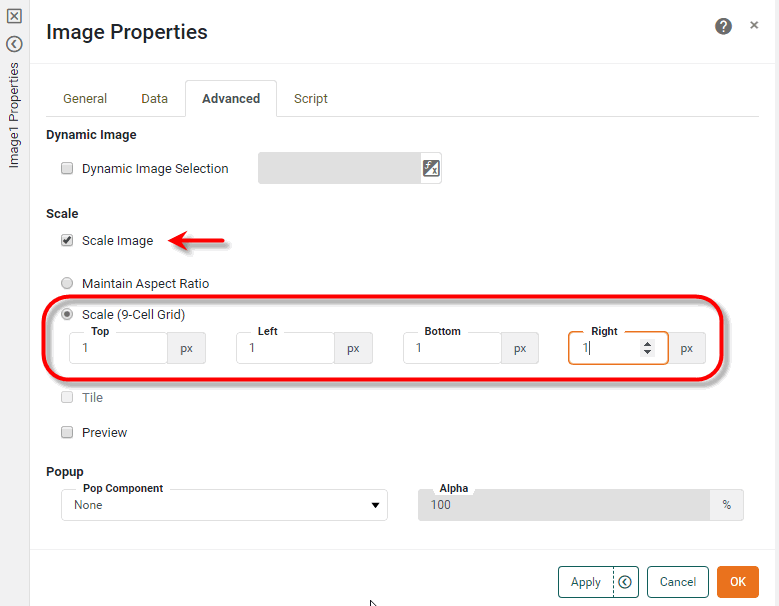
Optional: Select the Advanced tab. Check the ‘Scale Image’ box, and select either ‘Maintain Aspect Ratio’ or ‘Scale (9-Cell Grid)’ option. The ‘Maintain Aspect Ratio’ option keeps the original image proportions as the image is scaled. The ‘Scale (9-Cell Grid)’ allows the interior of the image to scale without scaling the border around the image.
When using the default skins, select ‘Scale (9-Cell Grid)’ and enter “1” in each of the ‘Top’, ‘Right’, ‘Bottom’, and ‘Left’ fields.
-
Press OK to exit the dialog box.
-
-
For a Shape component, follow the steps below:
-
Right-click the Shape component, and select ‘Properties’ from the context menu. Note: You can also access menu options from the ‘More’ button (
) in the mini-toolbar. This opens the ‘Properties’ panel. -
Select the Shape tab. Make the desired ‘Line’ and ‘Fill’ settings.
To create a gradient fill, select the ‘Gradient’ option next to the ‘Fill’ property. Press the gradient chip to open the Gradient Editor.
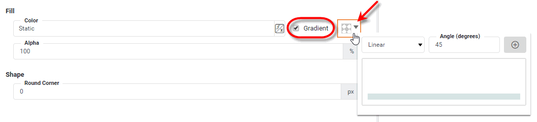
Select the type of gradient (‘Linear’ or ‘Radial’), and for a linear gradient also set the ‘Angle’. Press the ‘Add’ button
 to add a new color to the gradient.
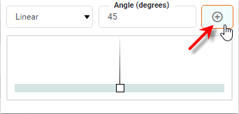
Click the color chip and select the color for that region of the gradient.
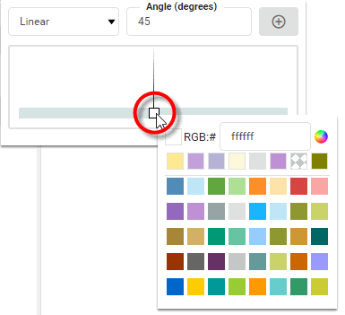
Repeat the above steps to add additional colors. Drag the gradient color chips to adjust the distribution of color in the gradient.
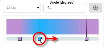
To delete a color from the gradient, right-click the color chip and select ‘Delete’. Click away from the Gradient Editor to close the Editor and save the gradient.
-
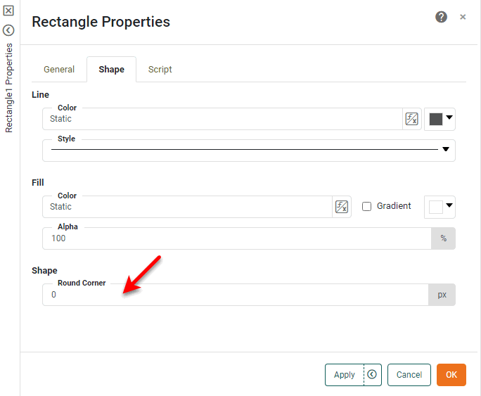
For a Rectangle component, set the ‘Round Corner’ property to soften the corners of the rectangle if desired. (Larger values indicate softer corners.)
-
Press OK to exit the dialog box.
-
-
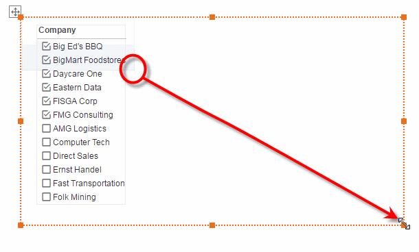
Right-click the Image or a Shape component, and select ‘Send to Back’ or ‘Send Backward’ from the context menu. Note: You can also access menu options from the ‘More’ button (
) in the mini-toolbar. -
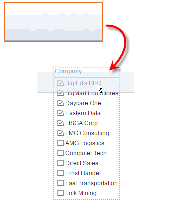
Drag the Image or Shape into the desired position (usually behind another component or components).
-
Resize the Image or Shape as desired.
-
Optional: Right-click on the Image or Shape and select ‘Lock’ to prevent the component from being selected or moved. Note: You can also access menu options from the ‘More’ button (
) in the mini-toolbar.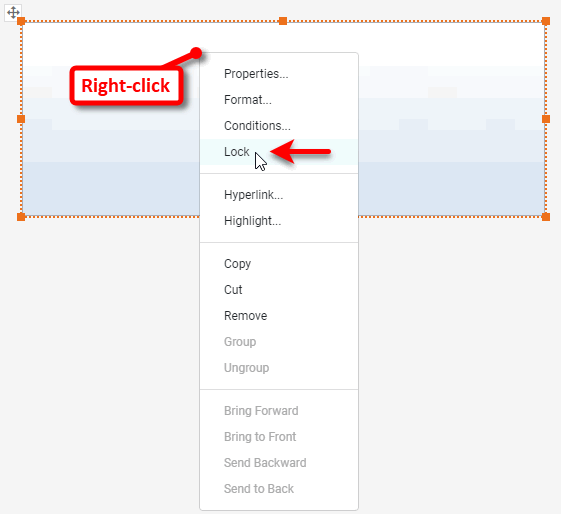
Locking the component is useful when you are laying out other components on top of the Image or Shape. When the background Image or Shape is locked, you can easily move the top components without disturbing the position of the background. To unlock the component, right-click and select ‘Unlock’. Note: You can also access menu options from the ‘More’ button ( ) in the mini-toolbar.
You can continue to place other components on top of this background image.