Create a New Dashboard
To create a new Dashboard, follow the steps below:
Create a Dashboard from User Portal
-
Log into the User Portal. (See Use the Portal.)
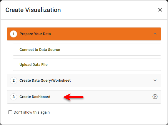
If you see the ‘Create Visualization’ dialog box instead of the User Portal, press Create Dashboard to proceed to the ‘New Dashboard’ dialog box shown in the following steps.
-
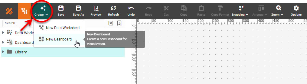
In the User Portal, press the ‘Create’ button
 and select the ‘Dashboard’
  option.
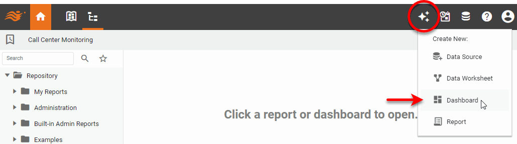
This opens the ‘New Dashboard’ dialog box.
-
In the ‘New Dashboard’ dialog box, select the desired Data Worksheet, data model, or database table. (A query is represented by a Data Worksheet. See Query a Specific Data Source for more information.) Note that database tables are only visible if ‘Physical Table’ permission is granted. See Set Security Actions for more details.
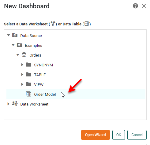
If you select a data model or table as the data source, your Dashboard will have access to all the fields in the selected data source. If you select a Data Worksheet as the data source, the Dashboard will have access to all the data blocks in the selected Data Worksheet. To add a derived data field to the fields already available in the selected data source, see Create a New Data Field.
If you do not want to use the Dashboard Wizard (see below), you do not need to specify a data source at this time. (See Dashboard Options to choose a data source at a later time.) -
Choose how you want to start building your Dashboard, by using the Dashboard Wizard or the Visual Composer.
The Dashboard Wizard helps you set up your Dashboard by suggesting appropriate ways to visualize your data. If you do not want to use the Wizard, you can proceed to Visual Composer and build your Dashboard there.
Use the Dashboard Wizard
Watch Video: Creating a Dashboard (Visualization Recommender)
This video might show an earlier version of the feature or operation that differs in minor ways from the current version.
Follow these steps:
-
Follow the initial steps in Create a New Dashboard above to open the ‘New Dashboard’ dialog box.
-
Press ‘Open Wizard’ in the ‘New Dashboard’ dialog box. This opens the “Visualization Recommender” screen.
-
Select the data that you want to visualize in the left panel.
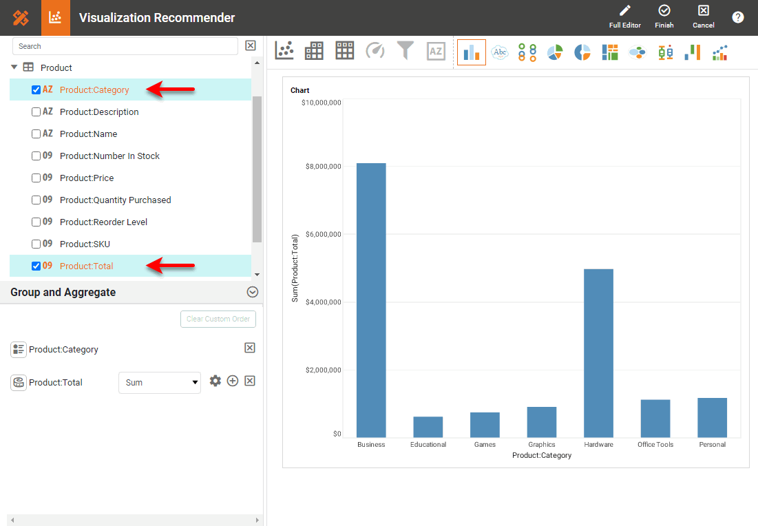
The top panel suggests various visualizations, such as charts, crosstabs, and tables.
-
Select the desired visualization, and set the desired options. See Wizard Options for the available options.
-
Press the ‘Finish’ button
 in the top toolbar to open the layout view, where you can add more components.
 -
To add a component, move the pointer to the location where you want to insert the component, and press the large ‘Add’ button
 .
.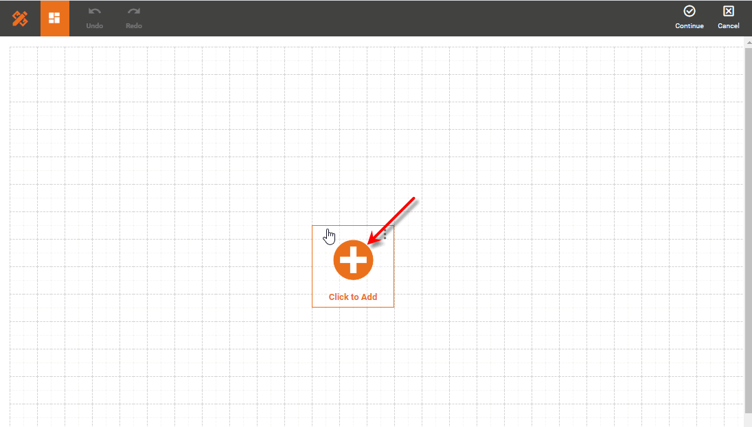
This opens the “Visualization Recommender” screen again. Follow the previous steps to configure your component.
-
To add titles or labels to the Dashboard, press the ‘Insert Text/Image’ button
 , and select ‘Insert Text’. To edit the inserted text, double-click the text or press the ‘Edit’ button
  . You can make more detailed modifications to the Text component after you exit the Wizard. (See Add Text or HTML and Text Properties for more information about Text.)
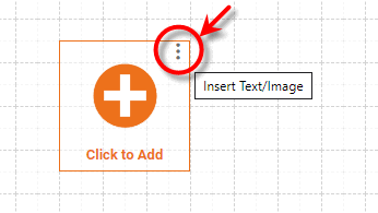
-
Optional: To add an image to the Dashboard, press the ‘Insert Text/Image’ button
(see above), and select ‘Insert Image’. This prompts you to select an image. You can make more detailed modifications to the Image component after you exit the Wizard. (See Add Background and Image Properties for more information about Images.)
When you have added all desired components using the Wizard, press the top ‘Finish’ button . This will open your Dashboard for editing in Visual Composer, where you can continue to add and modify components. See the section below for more information about building a Dashboard in Visual Composer.
Wizard Options
The Wizard provides the following options for creating a component:
Chart Visualization
-
Press the ‘Chart’ button
 in the top panel.
 -
Choose the chart type from the top panel.
-
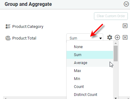
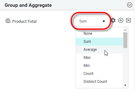
In the ‘Group and Aggregate’ panel, use the menu to select the desired aggregation method for the selected measure(s).
-
To display an existing measure using an additional aggregation method, press the ‘More’ button
and then specify the additional aggregation method using the added menu.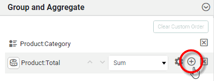
-
To change a selected dimension to a measure, or a measure to a dimension, press the ‘Convert to Measure ’ button
 or ‘Convert to Dimension’ button
  in the ‘Group and Aggregate’ panel, respectively.
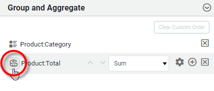
What is a measure? What is a dimension?
A measure is generally used for aggregation, for example summation, averaging, correlation, etc., within a Crosstab, Chart, Text component, or Gauge. Adding a measure to the ‘Y’ region in a chart displays the computed aggregates by using locations on the Y-axis. Adding a measure to the ‘X’ region displays the computed aggregates by using locations on the X-axis. You can also display aggregates by using color, shape, size, or label.
A dimension is used to break-down the dataset into multiple groups, often within a Crosstab, Chart, or Selection List. Adding a dimension to the ‘X’ region of a Chart distinguishes the different dimension groups by location on the X-axis. Adding a dimension to the ‘Y’ region distinguishes the different dimension groups by location on the Y-axis. You can add multiple dimensions into the ‘X’ or ‘Y’ regions of a Chart, or into the ‘Rows’ or ‘Columns’ regions of a Crosstab, to create multiple grouping levels. You can also distinguish groups in a dimension by using color, shape, size, or label in a Chart.
-
To change the formatting for a numerical-type field or a date-type field, press the ‘Format’ button
 and select the desired format. (See Add Data Format for more information about the available format options.)
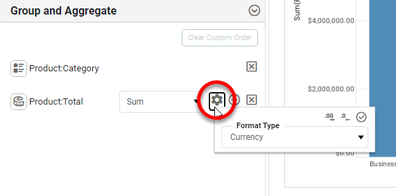
-
To delete a selected field, press the ‘Delete’ button
 next to the field.
 -
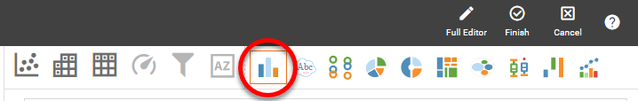
Optional: To make more detailed adjustments to the component, press the ‘Full Editor’ button
in the top toolbar. See Basic Charting Steps for more information about how to use the Chart Editor.After you make modifications to the chart using the full Chart Editor, you should press the ‘Finish’ button in the top toolbar. You can also return to the Wizard by pressing the ‘To Wizard’ button , but you will lose any changes that you made in the Chart Editor.
Crosstab Visualization
-
Press the ‘Crosstab’ button
 in the top panel.
 -
In the ‘Group and Aggregate panel, use the menu to select the desired aggregation method for the selected measure(s).
-
To display an existing measure using an additional aggregation method, press the ‘More’ button
and then specify the additional aggregation method using the added menu. -
To change a selected dimension to a measure, or a measure to a dimension, press the ‘Convert to Measure ’ button
or ‘Convert to Dimension’ button in the ‘Group and Aggregate’ panel, respectively.What is a measure? What is a dimension?
A measure is generally used for aggregation, for example summation, averaging, correlation, etc., within a Crosstab, Chart, Text component, or Gauge. Adding a measure to the ‘Y’ region in a chart displays the computed aggregates by using locations on the Y-axis. Adding a measure to the ‘X’ region displays the computed aggregates by using locations on the X-axis. You can also display aggregates by using color, shape, size, or label.
A dimension is used to break-down the dataset into multiple groups, often within a Crosstab, Chart, or Selection List. Adding a dimension to the ‘X’ region of a Chart distinguishes the different dimension groups by location on the X-axis. Adding a dimension to the ‘Y’ region distinguishes the different dimension groups by location on the Y-axis. You can add multiple dimensions into the ‘X’ or ‘Y’ regions of a Chart, or into the ‘Rows’ or ‘Columns’ regions of a Crosstab, to create multiple grouping levels. You can also distinguish groups in a dimension by using color, shape, size, or label in a Chart.
-
To change the formatting for a numerical-type field or a date-type field, press the ‘Format’ button
and select the desired format. (See Add Data Format for more information about the available format options.) -
To delete a selected field, press the ‘Delete’ button
next to the field. -
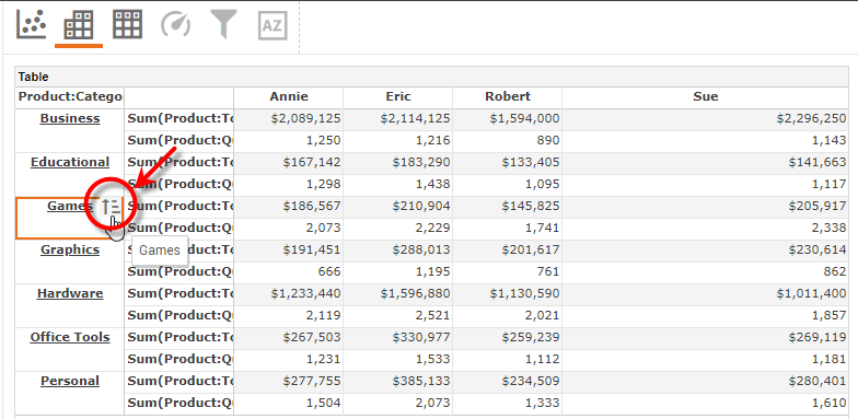
To change the sort order of a row or column header, move the pointer over the header and press the ‘Sort’ button
 .
.
-
Optional: To make more detailed adjustments to the component, press the ‘Full Editor’ button
in the top toolbar. See Create a Table for more information about how to use the Crosstab Editor.After you make modifications to the crosstab using the full Crosstab Editor, you should press the ‘Finish’ button in the top toolbar. You can also return to the Wizard by pressing the ‘To Wizard’ button , but you will lose any changes that you made in the Crosstab Editor.
Table Visualization
-
Press the ‘Table’ button
 in the top panel.
 -
To change a selected dimension to a measure, or a measure to a dimension, press the ‘Convert to Dimension’ button
or ‘Convert to Measure ’ button in the ‘Details’ panel, respectively.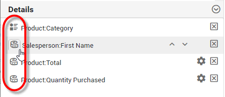
What is a measure? What is a dimension?
A measure is generally used for aggregation, for example summation, averaging, correlation, etc., within a Crosstab, Chart, Text component, or Gauge. Adding a measure to the ‘Y’ region in a chart displays the computed aggregates by using locations on the Y-axis. Adding a measure to the ‘X’ region displays the computed aggregates by using locations on the X-axis. You can also display aggregates by using color, shape, size, or label.
A dimension is used to break-down the dataset into multiple groups, often within a Crosstab, Chart, or Selection List. Adding a dimension to the ‘X’ region of a Chart distinguishes the different dimension groups by location on the X-axis. Adding a dimension to the ‘Y’ region distinguishes the different dimension groups by location on the Y-axis. You can add multiple dimensions into the ‘X’ or ‘Y’ regions of a Chart, or into the ‘Rows’ or ‘Columns’ regions of a Crosstab, to create multiple grouping levels. You can also distinguish groups in a dimension by using color, shape, size, or label in a Chart.
-
To change the formatting for a numerical-type field or a date-type field, press the ‘Format’ button
and select the desired format. (See Add Data Format for more information about the available format options.)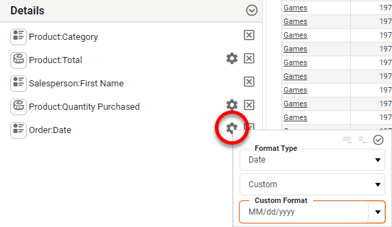
-
To delete a selected field, press the ‘Delete’ button
next to the field. -
To change the sort order of a column, move the pointer over the header and press the ‘Sort’ button
. -
Optional: To make more detailed adjustments to the component, press the ‘Full Editor’ button
in the top toolbar. See Create a Table for more information about how to use the Table Editor.After you make modifications to the crosstab using the full Table Editor, you should press the ‘Finish’ button in the top toolbar. You can also return to the Wizard by pressing the ‘To Wizard’ button , but you will lose any changes that you made in the Table Editor.
Gauge Visualization
-
Press the ‘Gauge’ button
 in the top panel.
 -
Choose the Gauge type from the top panel.
-
Optional: Enter a ‘Description’ for the Gauge.
-
In the ‘Group and Aggregate panel, use the menu to select the desired aggregation method for the selected measure.
What is a measure?
A measure is generally used for aggregation, for example summation, averaging, correlation, etc., within a Crosstab, Chart, Text component, or Gauge. Adding a measure to the ‘Y’ region in a chart displays the computed aggregates by using locations on the Y-axis. Adding a measure to the ‘X’ region displays the computed aggregates by using locations on the X-axis. You can also display aggregates by using color, shape, size, or label.
-
To change the formatting for a numerical-type field or a date-type, press the ‘Format’ button
and select the desired format. (See Add Data Format for more information about the available format options.)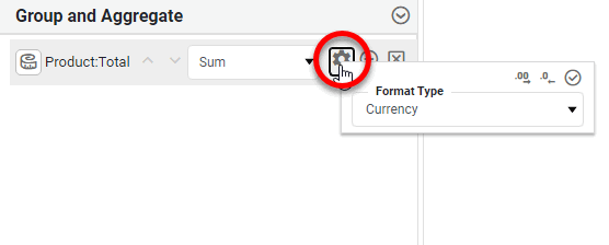
-
To delete a selected field, press the ‘Delete’ button
next to the field. -
Optional: You can make more detailed adjustments to the Gauge after you exit the Wizard. (See Add a KPI and Gauge Properties for more information about Gauges.)
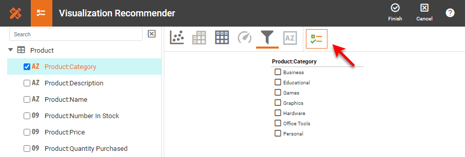
Filter Visualization
-
Press the ‘Filter’ button
 in the top panel.
 -
If you have selected a single dimension or measure in the left panel, choose the Filter type from the top panel: Selection List or Range Slider. (If you have selected multiple dimensions, the only option is a Selection Tree.)
What is a measure? What is a dimension?
A measure is generally used for aggregation, for example summation, averaging, correlation, etc., within a Crosstab, Chart, Text component, or Gauge. Adding a measure to the ‘Y’ region in a chart displays the computed aggregates by using locations on the Y-axis. Adding a measure to the ‘X’ region displays the computed aggregates by using locations on the X-axis. You can also display aggregates by using color, shape, size, or label.
A dimension is used to break-down the dataset into multiple groups, often within a Crosstab, Chart, or Selection List. Adding a dimension to the ‘X’ region of a Chart distinguishes the different dimension groups by location on the X-axis. Adding a dimension to the ‘Y’ region distinguishes the different dimension groups by location on the Y-axis. You can add multiple dimensions into the ‘X’ or ‘Y’ regions of a Chart, or into the ‘Rows’ or ‘Columns’ regions of a Crosstab, to create multiple grouping levels. You can also distinguish groups in a dimension by using color, shape, size, or label in a Chart.
-
Optional: For a Slider-type filter, enter a ‘Description’. For the Selection List or Selection Tree-type filter, double-click the header to edit the label.
-
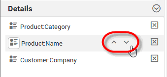
Optional: To change the order of the fields in a Selection Tree, press the arrows next to the fields in the ‘Details’ panel.
-
To change the formatting for a numerical-type field or a date-type, press the ‘Format’ button
and select the desired format. (See Add Data Format for more information about the available format options.)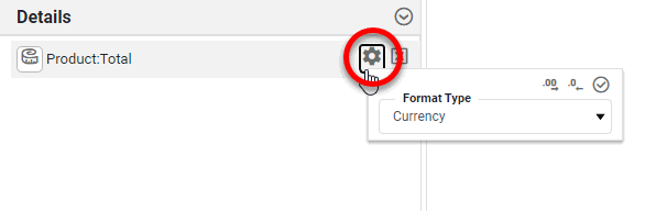
-
To delete a selected field, press the ‘Delete’ button
next to the field. -
Optional: You can make more detailed adjustments to the Filter after you exit the Wizard. (See Add Filter Components, Selection List Properties, Selection Tree Properties, and Range Slider Properties for more information about Filter components.)
Text Visualization
-
Press the ‘Text’ button
 in the top panel.
 -
Optional: Enter a ‘Description’ for the Text.
-
In the ‘Group and Aggregate panel, use the menu to select the desired aggregation method for the selected measure.
What is a measure?
A measure is generally used for aggregation, for example summation, averaging, correlation, etc., within a Crosstab, Chart, Text component, or Gauge. Adding a measure to the ‘Y’ region in a chart displays the computed aggregates by using locations on the Y-axis. Adding a measure to the ‘X’ region displays the computed aggregates by using locations on the X-axis. You can also display aggregates by using color, shape, size, or label.
-
To change the formatting for a numerical-type field or a date-type, press the ‘Format’ button
and select the desired format. (See Add Data Format for more information about the available format options.) -
To delete a selected field, press the ‘Delete’ button
next to the field. -
Optional: You can make more detailed adjustments to the Text after you exit the Wizard. (See Add a KPI and Text Properties more information about Text components.)
Use Visual Composer
Watch Video: Creating a Dashboard (Use Visual Composer)
This video might show an earlier version of the feature or operation that differs in minor ways from the current version.
Follow these steps:
-
Follow the initial steps in Create a New Dashboard above to open the ‘New Dashboard’ dialog box.
-
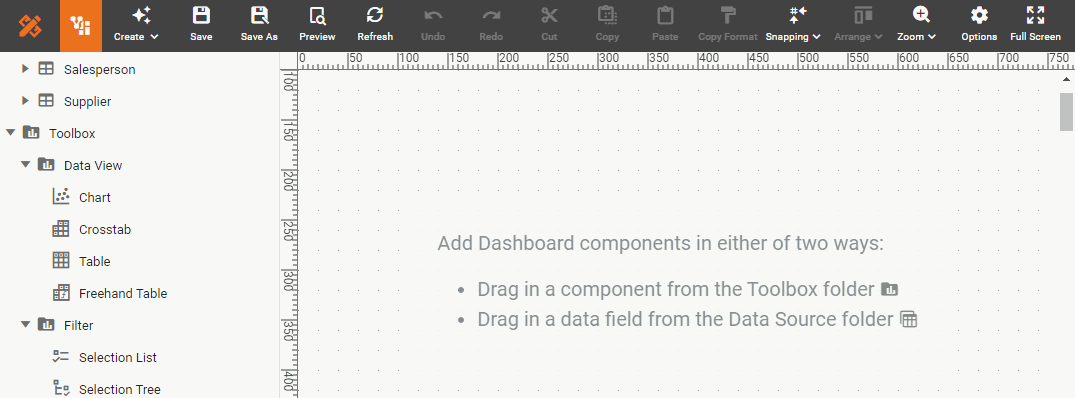
Press OK in the ‘New Dashboard’ dialog box. This displays an empty Dashboard in Visual Composer. (Visual Composer is the tool you will use for creating both Dashboards and Data Worksheets.)
-
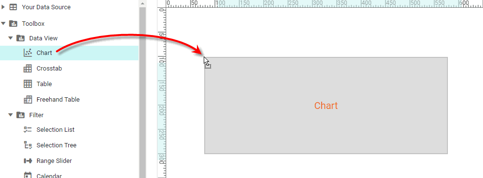
Build the Dashboard by adding components from the left Toolbox panel. See Add Components for more details.
-
Press the ‘Save’ button
 in the toolbar to save the Dashboard.
If you close the browser (or let the session expire) without saving the Dashboard, you will be prompted to restore the Dashboard the next time you open Visual Composer.
Create a Dashboard from Visual Composer
If you are already in Visual Composer, you can create a new Dashboard by pressing the ‘Create’ button and selecting ‘New Dashboard’ button  . Then follow the steps in Use Visual Composer.