Access Component Data
|
You can access component data and filter selections using script. The following sections explain how to do this. For information on how to detect the most recent user interaction, see Access User-Modified Data in Write Back to Storage.
Form Components
You can access the state of common Form components within the Dashboard by using the selectedObject, selectedObjects, selectedLabel, and selectedLabels properties.
- selectedObject, selectedLabel
-
The selected value or label of the component: Applies to single-value input elements (Slider, Spinner, RadioButton, ComboBox) and the tabs of co-located components in a Tabbed Interface. For example, if RadioButton1 has a value ‘NY’ with corresponding label ‘New York’, you can choose this value and display the label as follows:
Example: selectedObject, selectedLabelRadioButton1.selectedObject = 'NY' alert('You selected: ' + RadioButton1.selectedLabel);Tabbed Interface also has a property
selectedIndexwhich returns the numeric representation of the active tab. - selectedObjects, selectedLabels
-
The selected values or labels of the component, as an array: Applies to multiple-value input elements (CheckBox).
Example: selectedObjects, selectedLabelsvar firstChoice = CheckBox1.selectedObjects[0]; var firstLabel = CheckBox1.selectedLabels[0];
You can manually type these references into your script, or enter them automatically by clicking the appropriate node on the ‘Component’ tree of the Script Editor.
The less-commonly used TextInput provides a value property to return the current text.
This example uses a RadioButton to give the user a choice of two input options, a Selection List, and a Range Slider. Follow the steps below:
-
Create a new Dashboard based on the ‘ProductSales’ Data Worksheet. (See Create a New Dashboard.)
The 'ProductSales' Data Worksheet can be found in . You may need to download the examples.zip file from GitHub into your environment. (This requires access to Enterprise Manager.) See Import and Export Assets for instructions on how to import. -
Add a Table, Selection List, and Range Slider. To do this, follow the steps below:
-
Drag the ‘SalesByDate’ data block into the Dashboard. This creates a new table called ‘SalesByDate’. Resize the table as desired.
-
From the ‘SalesByDate’ data block in the Toolbox panel, drag the ‘State’ column to an empty region on the Dashboard. This creates a new Selection List named ‘State’.
-
From the Toolbox panel, drag a Range Slider into the Dashboard. This creates a new Range Slider.
-
From the ‘SalesByDate’ data block in the Component tree, drag the ‘Date’ column onto the Range Slider. This binds the Range Slider to the ‘Date’ field.
-
-
Add a Form component to allow the user to select the input method. Follow the steps below:
-
From the Toolbox panel, drag a RadioButton into the Dashboard. This creates a new Radio Button.
-
Right-click the RadioButton, and select ‘Properties’ from the context menu. This opens the ‘RadioButton Properties’ panel.
-
In the ‘RadioButton Properties’ panel, enter the text “DateOrState” in the ‘Name’ field. Enter the text ‘Selection’ in the ‘Title’ field.
-
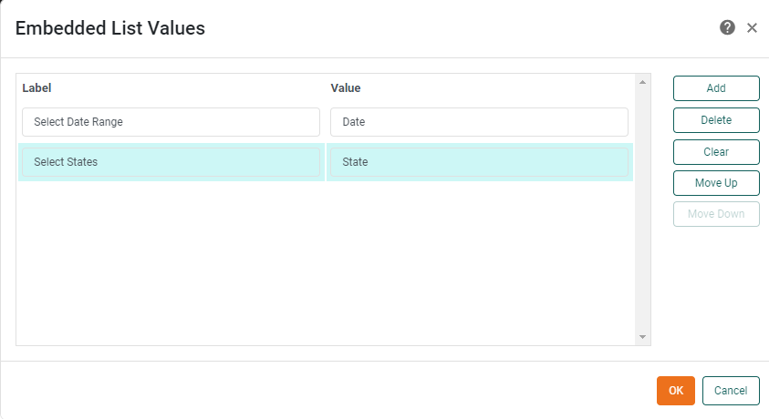
In the ‘List Values’ panel of the ‘Properties’ dialog box, select ‘Embedded’ and press the ‘Edit’ button. This opens the ‘Embedded List Values’ dialog box.
-
Press Add. For the first ‘Label’ enter the text “Select Date Range.” For the corresponding ‘Value’, enter the text “Date”.
-
Press Add again. For the second ‘Label’ enter the text “Select States.” For the corresponding ‘Value’, enter the text “State”.
-
Press OK in both dialog boxes. This creates a RadioButton with two choices from which the user can select the input method.
-
-
Add expression scripts to the Selection List and the Range Slider so that the appropriate control is enabled for the given user selection. Follow the steps below:
-
Right-click the Selection List, and select ‘Properties’ from the context menu to open the ‘Selection List Properties’ panel. Note: You can also access menu options from the ‘More’ button (
 ) in the mini-toolbar.
 -
For the ‘Enabled’ option, press the ‘Value Type’ button
 , and select ‘Expression’. Then press the ‘Edit Formula’ button
  to open the Formula Editor.
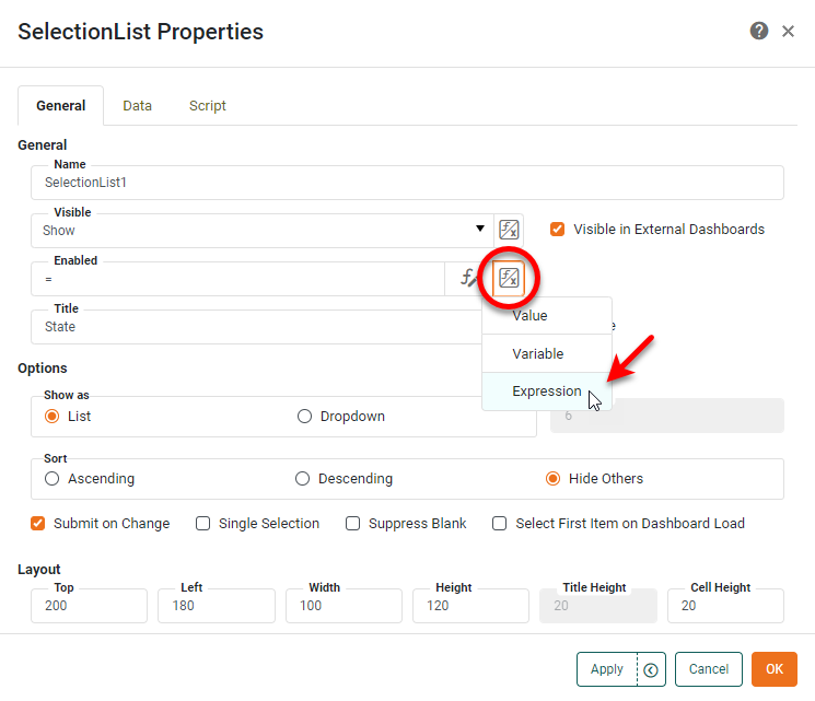
-
In the Formula Editor for the Selection List, enter the following script:
if (DateOrState.selectedObject=='Date') {
  false
}
else {
  true
}
This indicates that the Selection List component should be disabled whenever ‘Date’ is selected in the “DateOrState” RadioButton, and enabled otherwise.
You can hide the component completely by adding a similar expression script (returning values ‘Show’ and ‘Hide’) to the ‘Visibility’ property. -
Press OK twice to exit the Formula Editor and the ‘Selection List Properties’ panel.
-
Repeat the above steps for the Range Slider, and set the ‘Enabled’ script as follows:
if (DateOrState.selectedObject=='Date') { true } else { false } -
Press OK twice to exit the Formula Editor and the ‘Range Slider Properties’ panel.
-
-
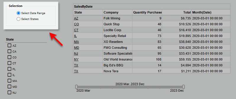
Preview the Dashboard, and experiment with the controls.
Note that when you choose ‘Select Date Range’, only the Range Slider is enabled, and when you choose ‘Select States’, only the Selection List is enabled.
Filter Components
You can access the state of Filter components within the Dashboard by using the selectedObjects, selectedLabels, and drillMember keywords.
- selectedObjects, selectedLabels
-
An array of values or labels selected in a component: Applies to Selection List, Selection Tree, Range Slider, Calendar. (Range Slider and Calendar provide
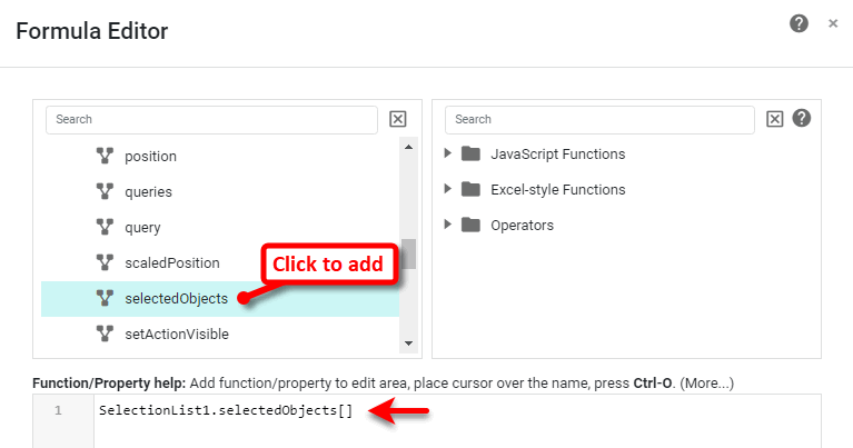
selectedObjectsonly). For example, to return the first selected item or label in a Selection List:Example: selectedObjects, selectedLabelsSelectionList1.selectedObjects[0]; SelectionList1.selectedLabels[0]; - drillMember
-
For Selection Trees, the name of the field that resides one level in the hierarchy below the user’s lowest selected level:
Example: drillMemberSelectionTree1.drillMember;
You can manually type these references into your script, or enter them automatically by clicking the appropriate node on the ‘Component’ tree of the Script Editor.
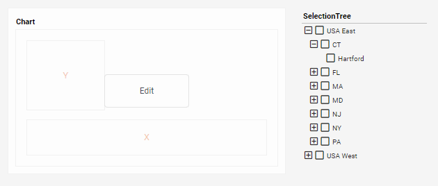
In this example, you will create a Selection Tree that filters the geographical regions displayed on a Chart. You will use the drillMember property of the Selection Tree to dynamically adapt the Chart X-axis to display the appropriate geographical level (Region, State, or City), based on user selections. Follow the steps below:
-
Create a new Dashboard based on the ‘Sales Explore’ Data Worksheet. (See Create a New Dashboard.)
| The 'Sales Explore' Data Worksheet can be found in . You may need to download the examples.zip file from GitHub into your environment. (This requires access to Enterprise Manager.) See Import and Export Assets for instructions on how to import. |
-
From the Toolbox panel, drag a Chart component into the Dashboard. Resize the Chart as desired.
-
From the Toolbox panel, drag a Selection Tree component into the Dashboard.
-
Add a three-level geographical hierarchy to the Selection Tree. Follow the steps below:
-
Expand the ‘Sales’ data block at the top of the Toolbox panel.
-
Drag the ‘Region’ field from the data block onto the Selection Tree. This adds the ‘Region’ data to the tree.
-
Drag the ‘State’ field from the data block onto the Selection Tree. This adds the ‘State’ data to the tree.
-
Drag the ‘City’ field from the data block onto the Selection Tree. This adds the ‘City’ data to the tree.
-
Resize the Selection Tree so that it can display a reasonable number of rows.
-
-
Press the ‘Edit’ button
 on the Chart to open the Visualization Recommender. Press the ‘Full Editor’ button at the top right of the Recommender to bypass the Recommender and open the Chart Editor.
 -
From the Data Source panel, drag the ‘Total’ field (Under ‘Measures’) to the ‘Y’ region.
-
From the Data Source panel, drag the ‘Region’ field (Under ‘Dimensions’) to the ‘X’ region.
-
Configure the Chart to adapt the X-axis binding based on the user’s selection in the Selection Tree. To do this, follow the steps below:
-
Press the ‘Value Type’ button
next to the ‘Region’ dimension in the top panel, and select the ‘Expression’ option.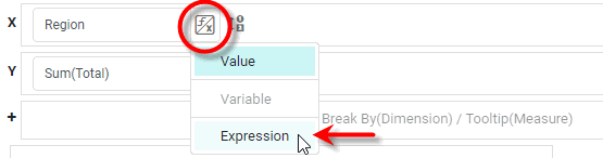
-
Press the ‘Edit Formula’ button
to open the Script Editor.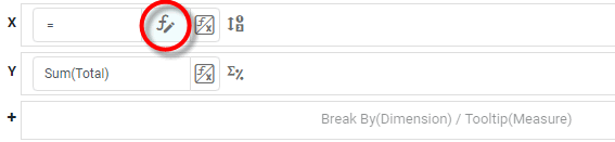
-
In the top-left panel of the Script Editor, expand the ‘SelectionTree1’ node, and click ‘drillMember’. This adds the
SelectionTree1.drillMemberproperty in the editing area.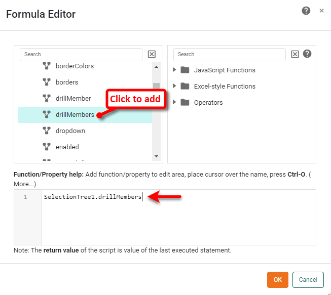
Instead of using the ‘Expression’ option from the ‘Value Type’ button
button, you can select the ‘Variable’ option.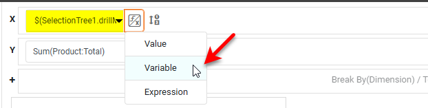
Then select
SelectionTree1.drillMemberfrom the menu. This produces the same result as the ‘Expression’ described above.The drillMember property returns the name of the field that resides one level (in the Selection Tree hierarchy) below the lowest level that the user has selected. Thus, if the user has selected one or more states in the Selection Tree,
SelectionTree1.drillMemberreturns the string ‘City’. -
Press OK to close the Formula Editor. The output of
SelectionTree1.drillMemberis now assigned to the Chart X-axis binding.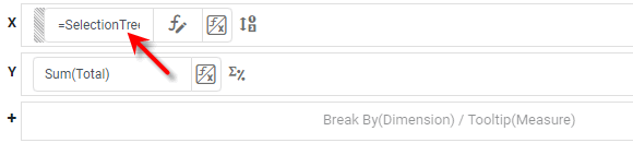
-
-
Press the ‘Finish’ button
 to close the Editor.
 -
Verify that the X-axis binding adapts to the user’s selections:
-
Press the ‘Unselect’ button
 in the Selection Tree to remove any existing selections. Observe that the Chart X-axis now represents the ‘Region’ dimension, the top level of the Selection Tree hierarchy.
 -
Select the ‘USA East’ option in the Selection Tree. Observe that the Selection Tree now filters the Chart to display only data from the ‘USA East’ region. In addition, the Selection Tree
drillMemberproperty changes the X-axis binding to represent the ‘State’ dimension, which is one level below ‘Region’ in the Selection Tree hierarchy. -
Select the ‘CT’ and ‘MA’ options in the Selection Tree. Observe that the Selection Tree now filters the Chart to display only data from the states of ‘CT’ and ‘MA’. In addition, the Selection Tree
drillMemberproperty changes the X-axis binding to represent the ‘City’ dimension, which is one level below ‘State’ in the Selection Tree hierarchy.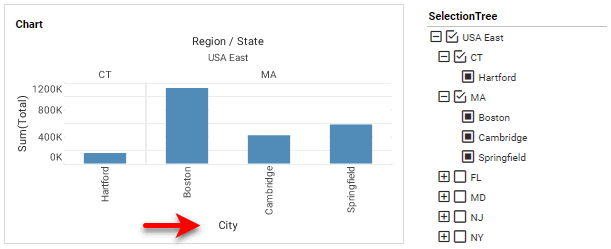
-
Output Components
You can access the data in Output components within the Dashboard using the value keyword, for example, Gauge1.value, Text1.value, Image1.value.
Chart Components
You can access Chart data in scripts by referencing the Chart’s data or table properties. See Access Chart Data in Chart Script Tutorial for full details.
Table/Crosstab Components
| Access User-Modified Data in Write Back to Storage information on how to access an Editable Table. |
- table[rowIx][colIx]
-
A two-dimensional array containing the table data as displayed. The array includes header rows as well as data rows. For example,
Table1.table[0][0]provides the value in first row, first column, whileTable1.table[2][4]provides the value in third row, fifth column. Indices may use keywordsrowandcolto create relative references. See Access data in a different row or column (‘row’/‘col’) below. - data[rowIx][colIx]
-
A two-dimensional array containing the raw table data (prior to grouping and summarization). It does not include header rows. Indices may use keywords
rowandcolto create relative references. See Access data in a different row or column (‘row’/‘col’) below.
Two sub-properties that are especially useful when looping through the rows or columns of tables are length and size:
- table.length/table.size
-
The number of rows and columns (respectively) in the table, as displayed, including column header row.
- data.length/data.size
-
The number of rows and columns (respectively) in the original table (prior to grouping and summarization), including column header row.
A table that returns no data still displays the column header row. Therefore, table.length is 1 in the no-data case.
|
The following properties are useful when creating expression scripts on Tables:
You can type these keywords manually into your script, or you can click the appropriate node on the ‘Component’ tree in the Script Editor.
The sections below provide examples of different ways to access table values.
Access Arbitrary Table Cell
The following table script iterates through all data rows (beginning with row index 1, the first data row) and columns of a table, and cumulatively sums these values into variable tot. See Add Component Script for information on where to place such a Table script.
var tot = 0;
for(var thisRow = 1; thisRow < table.length; thisRow ++) {
   for(var thisCol= 0; thisCol < table.size; thisCol++) {
      tot = tot + table[thisRow][thisCol];
   }
}
When a property such as table is used within a component script, it is not necessary to qualify the property with the component name (e.g., Table1). In component script, table and Table1.table both refer to the same property.
|
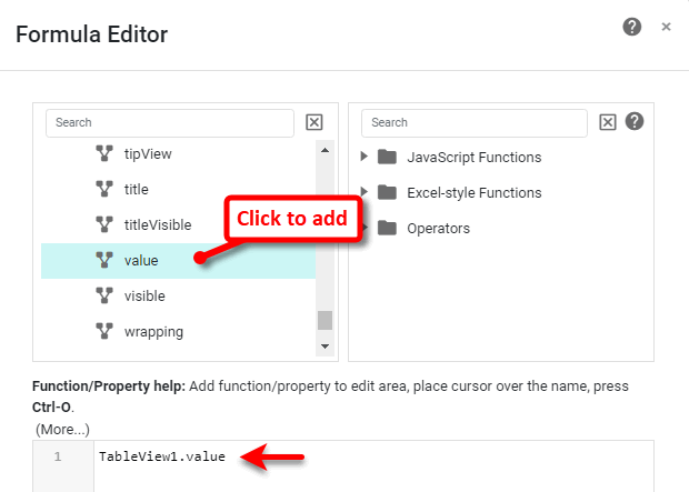
Access Data in Current Cell (‘value’)
The value keyword refers to the value in the current cell. The value keyword is the equivalent of the index expression table[row][col].
This example sets the text colors and fill colors of table cells based on data values within the table. If a price is greater than $1000, the price displays in red text, otherwise, in blue text.
| You can apply conditional formatting without using script. See Add Conditional Format (Highlight) in the Visualize Your Data. |
-
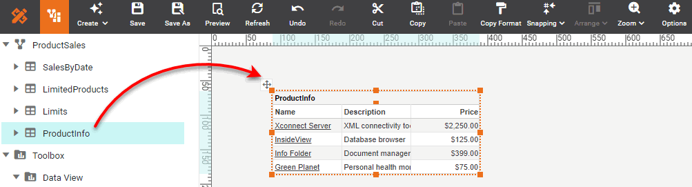
Create a new Dashboard based on the ‘ProductSales’ Data Worksheet. (See Create a New Dashboard.)
| The 'ProductSales' Data Worksheet can be found in . You may need to download the examples.zip file from GitHub into your environment. (This requires access to Enterprise Manager.) See Import and Export Assets for instructions on how to import. |
-
Drag and drop the ‘ProductInfo’ data block from the left panel into the Dashboard.
-
Click to select any data cell in the ‘Price’ column. Then select the Format tab at the bottom of the left panel.
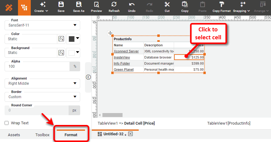
-
Press the ‘Value Type’ button
next to the ‘Color’ property, and select ‘Expression’ option.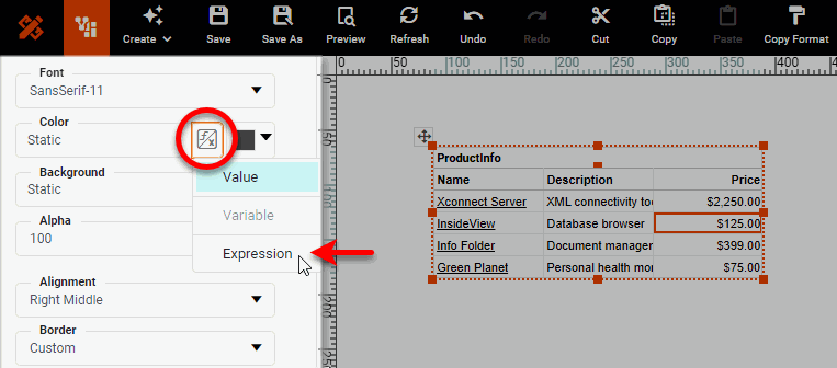
-
Press the ‘Edit Formula’ button
next to the ‘Color’ property to open the Formula Editor. -
Enter the following script in the Formula Editor:
if (value > 1000) {
  [255,0,0];  // red
}
else {
  0x0000FF;   // blue
}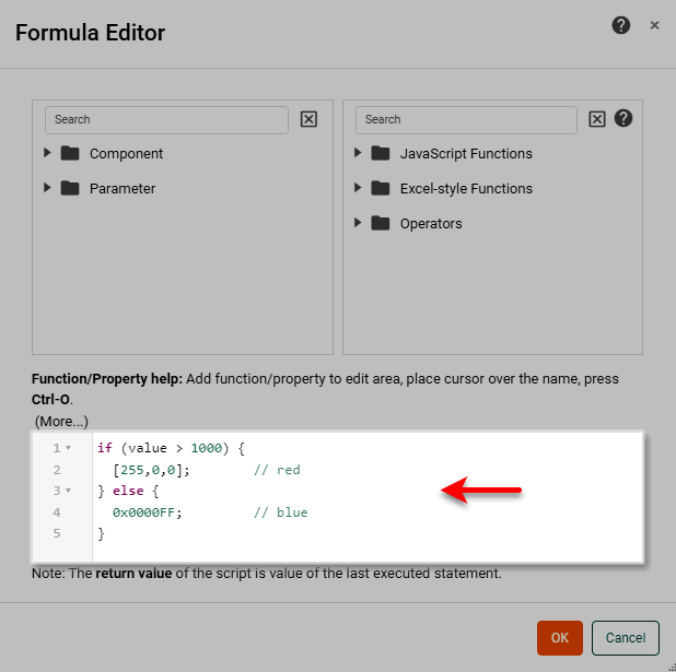
A color can be specified as an ordered triple, or as a hexadecimal number. -
Press OK to exit the Formula Editor.
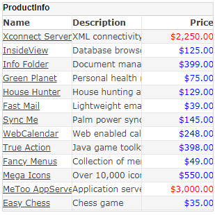
Notice that the cells in the ‘Price’ column are colored red if the value is greater than 1000 and blue otherwise. The script affects the entire ‘Price’ column, and can be edited from the Format panel for any cell in the column. This example continues in Access Data in the Same Row (‘field’).
Access Data in the Same Row (‘field’)
You can access the value in the current row of another column by using field, which refers to the value in the current row of a column named “col_name.”
This example continues from Access Data in Current Cell (‘value’). It will set the color of the ‘Name’ column based on the value of the ‘Price’ column:
-
Click to select a cell in the ‘Name’ column. Then select the Format tab at the bottom of the left panel.
-
Press the ‘Value Type’ button
next to the ‘Color’ property and select ‘Expression’. Then press the ‘Edit Formula’ button . This opens the Formula Editor. -
In the Formula Editor, enter the following expression:
if (field['Price'] > 1000) { [255,0,0]; } else { [0,0,255]; } -
Press OK to exit the Formula Editor.
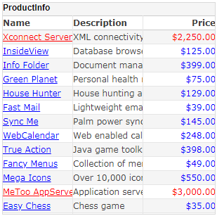
The values in the ‘Name’ column are now highlighted based on the corresponding values in the ‘Price’ column. This example continues in Access data in a different row or column (‘row’/‘col’).
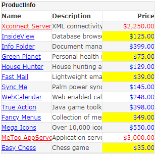
Access data in a different row or column (‘row’/‘col’)
To access any cell in a table by relative reference, use the indexing expression table[rowIx][colIx] or data[rowIx][colIx]. Predefined variables row and col allow you to refer to the row and column of the current cell, that is, the cell whose format is being modified.
You can use these variables to construct the desired offsets from the current cell.
table[row][col]   // Value in current cell (same as 'value' keyword)
table[row][col-1] // Value in current row, one column to left
table[row-1][col] // Value in current column, one row above
table[row+1][col] // Value in current column, one row below
The data and table constructs yield the same results for tables, but may produce different results when used in charts/crosstab tables. The data syntax references the data prior to summarization, while the table syntax references the tabular data as displayed.
This examples continues from Access Data in the Same Row (‘field’). It highlights every price that is less than the price immediately above it in the table, and uses the row and col variables to create relative references:
-
Select any data cell under the ‘Price’ column. Then select the Format tab at the bottom of the left panel.
-
Press the ‘Value Type’ button
next to the ‘Background’ property and select ‘Expression’. Then press the ‘Edit Formula’ button . This opens the Formula Editor. -
In the Formula Editor, enter the following script:
if (row > 1) { if (value < table[row-1][col]) { [255,255,0]; } } -
Press OK to exit the Formula Editor.
The cells in which the value is less than the previous row’s price are now highlighted in yellow.
This example continues from the previous example. It will set the header cell of the ‘Price’ column to show a red background if there exists a price exceeding $2000, and will otherwise show a green background. This requires a loop structure, as well as mixed absolute and relative references:
-
Select the header cell in the ‘Price’ column. Then select the Format tab at the bottom of the left panel.
-
Press the ‘Value Type’ button
next to the ‘Background’ property select ‘Expression’ option, and press the ‘Edit Formula’ button . This opens the Formula Editor. -
Add the following script in the Formula Editor.
for (i=1; i<table.length; i++) { if (table[i][col] > 2000) { [255,0,0]; break; } else { [0,255,0]; } } -
Press OK to exit the Formula Editor.
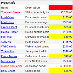
The header cell is red because a price exists that exceeds $2000. To test the header cell script, add a Range Slider to filter the values in the table. Follow these steps:
-
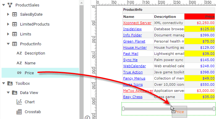
Drag a Range Slider from the Toolbox panel into the Dashboard. This creates a new Range Slider.
-
From the ‘ProductInfo’ data block at the top of the Toolbox panel , drag the ‘Price’ field onto the Range Slider. This binds the Range Slider to the ‘Price’ field.
-
Drag the right side of the Range Slider to vary the prices included in the dataset. Observe the color of the header cell as the dataset changes.