Slider/Spinner Properties
|
The ‘Properties’ panels for Slider and Spinner components provides the following tabs: General, Data, Advanced, Script. The next sections discuss the form-specific properties available under these tabs.
General Tab
The General tab in the Slider and Spinner ‘Properties’ panel provides the following unique properties.
Properties that offer the ‘Value Type’ button  can also be set by the user (‘Variable’) or by scripted logic (‘Expression’). See Dynamically Set Properties for more information. can also be set by the user (‘Variable’) or by scripted logic (‘Expression’). See Dynamically Set Properties for more information.
|
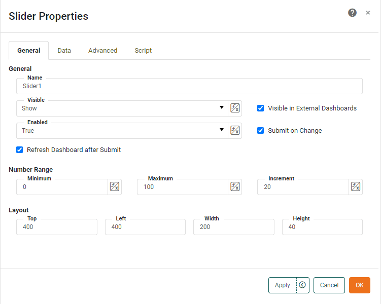
- Submit on Change
-
When enabled (default), submits the selected value immediately upon selection. Otherwise, a separate ‘Submit’ button is required.
- Refresh Dashboard after Submit
-
Force the dashboard to refresh when the user submits a value from the Form component.
- Number Range
-
-
Minimum: The starting value.
-
Maximum: The ending value.
-
Increment: The points at which the values are displayed.
-
Data Tab
The Data tab in the ‘Properties’ panel for Slider and Spinner components provides the following component-specific properties. See Dynamically Set Properties for details on setting and using these properties.
- Target
-
An Embedded Table or Variable in the Data Worksheet. The ‘Browse’ button to the right allows you to interactively select the row and column of the Embedded Table.
- Column
-
The column of the Data Worksheet Embedded Table into which the form value should be passed.
- Row
-
The row of the Data Worksheet Embedded Table into which the form value should be passed. (The ‘Row’ menu displays the format “row: row value.”)
- Write Back to Storage
-
Allows user-modified data in a Data Worksheet Embedded Table linked to the Slider or Spinner to persist across sessions by saving the modified data together with the underlying Data Worksheet. See Write Back to Storage for additional information.
Advanced Tab
The Advanced tab in the ‘Slider Properties’ and ‘Spinner Properties’ panel provides the following specific properties.
- Show Labels
-
The labels to display on the Slider:
-
Tick: Show tick marks along the slider scale.
-
Current Value: Display the current value above the slider when dragging.
-
Labels: Show value labels along the slider scale. (‘Tick’ must be enabled.)
-
Minimum: Show the minimum slider value at the left of the slider. (Enabled by default when ‘Labels’ is enabled.)
-
Maximum: Show the maximum slider value at the right of the slider. (Enabled by default when ‘Labels’ is enabled.)
-
- Snap to Increment
-
Specifies that the Slider handle should snap to the increment specified on the General tab.
Label Tab
The Label tab in the ‘Properties’ panel provides the following unique properties for Slider and Spinner.
- Show Label
-
Displays a label for the component when selected.
- Label Text
-
The contents of the label. You can enter static text, or use Form components or script to set the contents by pressing the ‘Value Type’ button
and selecting the ‘Variable’ or Expression’ option. See Dynamically Set Properties for more information. - Label Position
-
The position of the label relative to the component.
- Gap
-
The gap in pixels between the component and the label.
Script Tab
See Script Tab for information about this common tab.