Add Visual Format
|
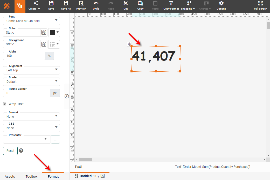
The Format panel provides options for changing the visual appearance of elements and how they display data. To format a component, click on a component to select it, and select the Format tab in the left panel. (Or right-click the component and select ‘Format’ from the context menu.)
Certain components have multiple regions that can be selected and formatted independently. See Format Data with CSS below for a list of regions that can be independently formatted.
-
To format a particular region of a component, click on the desired region.
-
To format the whole component, first make sure the component is entirely deselected. (Click away from the component.) Then click the component once to select the entire component.
After you have selected the desired component or component region, proceed to adjust the settings in the Format panel, as described in the sections below.
|
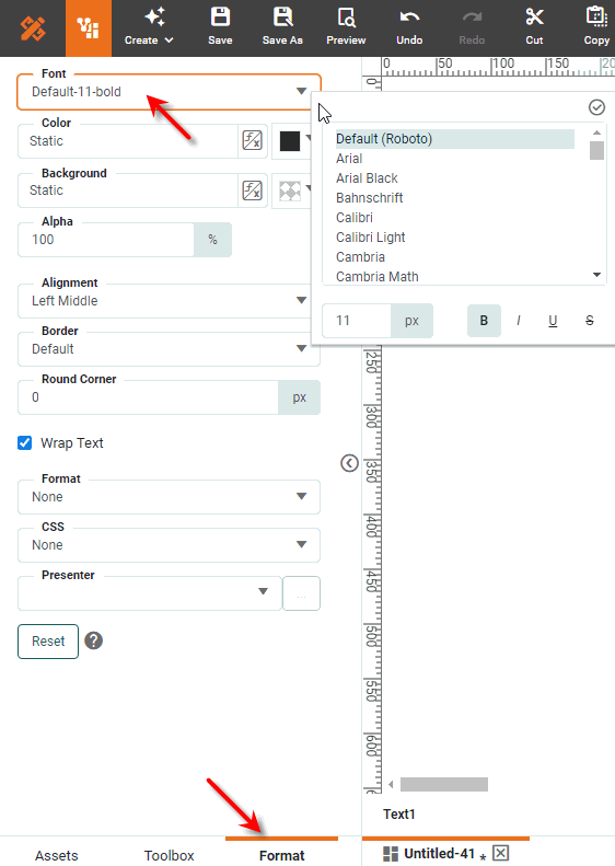
Set Font
The ‘Font’ property of the Format panel allows you to specify the font face (Arial, Serif etc.), the style (bold, italic), and the size of the font used for component text.
Use the @font-face rule to embed fonts on the server and automatically download the fonts to the client machine.
|
The text affected by the font setting varies by component, as shown below:
| Component | Font Target |
|---|---|
Chart |
Font setting affects all the text, including axis labels, titles, legends, and text binding. |
Crosstab |
Same as Table. |
Table |
Font can be set independently for title text, column header text, and data row text. Select the title bar, column header, or data cell, and then select ‘Format’ from the context menu to set the corresponding font. |
Freehand Table |
Same as Table. |
Embedded Table |
Same as Table. |
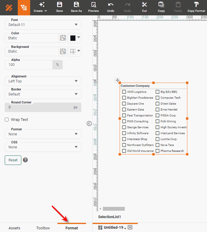
Selection List |
Font can be set independently for title text and choice text. Select either the title bar or a choice cell, then select ‘Format’ from the context menu to set the corresponding font. |
Selection Tree |
Same as Selection List. Font can be set independently for each level of the hierarchy. |
Selection Container |
Same as Selection List and Range Slider. |
Range Slider |
Font setting affects all text displayed on the slider (range display and endpoints). |
Calendar |
Font setting affects the title text. |
Text |
Font setting affects the text. |
Gauge |
Font setting affects labels and value (if present). |
Slider |
Font setting affects the labels. |
Spinner |
Font setting affects the spinner text. |
Checkbox |
Font setting affects the choice labels. Select a choice cell, and then select ‘Format’ from the context menu to set the corresponding font. |
Radio Button |
Same as Checkbox. |
Combo Box |
Font setting affects the choice text. |
Set Color
The ‘Color’ options allow you to set text color, background color, and transparency for components.
To set a static foreground color, background color, and transparency (alpha) for a component, follow the steps below:
-
Click the element to select it, and select the Format tab in the left panel. This opens the Format panel.
Optional: For a Table component, click on the region of the table to which you want to apply the property:
-
Click a data cell to apply the property to all data cells in the column.
-
Click on the column header cell to apply the property to only the column header.
-
Click the title bar to apply the property to only the title bar.
If you do not select a specific Table region, the property is applied to the whole Table. This global table color or transparency is overridden by the property specified for the individual cell.
-
-
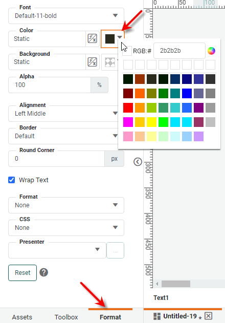
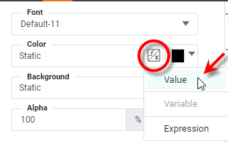
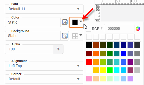
Next to the ‘Color’ field, select ‘Value’ from the ‘Value Type’ button
 .
.
-
Click on the color chip to select the desired foreground (text) color.
-
Repeat the above steps in the ‘Background’ panel to set the background (fill) color.
-
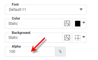
Set the fill transparency by entering a value in the ‘Alpha’ field. A value of 0% indicates complete fill transparency (i.e., fill color not visible), and a value of 100% indicates complete fill opacity.
You can also color dynamically by using a Form control (variable) or an expression. See Dynamically Set Properties for details.
Set Alignment
The ‘Alignment’ settings determine the horizontal and vertical alignment of text in Dashboard components, including labels and titles on Charts.
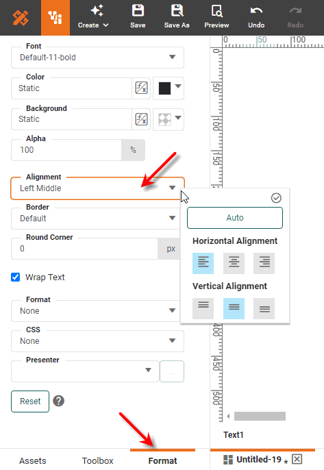
See the instructions for Set Color above to select the component region to align. The text affected by the alignment setting varies for each component, as shown below:
| Component | Alignment Target |
|---|---|
Chart |
Alignment can be set independently for axis titles, Y-axis labels, legend titles, and legend labels. |
Crosstab |
Same as Table. |
Table |
Alignment can be set independently for title text, column header text, and data row text. Select the title bar, column header, or data cell, and then select ‘Format’ from the context menu to set the corresponding alignment. |
Freehand Table |
Same as Table. |
Embedded Table |
Same as Table. |
Selection List |
Alignment can be set independently for title text and choice labels. Select either the title bar or a choice cell, and then select ‘Format’ from the context menu to set the corresponding alignment. |
Selection Tree |
Same as Selection List. Alignment can be set independently for each level of the hierarchy. |
Selection Container |
Alignment can be set on the component, and then overridden on each member selection. |
Range Slider |
Alignment setting affects all text displayed on the slider (range display and endpoints). |
Calendar |
Alignment setting affects the title text. |
Text |
Alignment setting affects the text. |
Slider |
Alignment setting affects the labels. |
Spinner |
Alignment setting affects the spinner text. |
Checkbox |
Alignment can be set independently for title text and choice labels. Select either the title bar or a choice cell, and then select ‘Format’ from the context menu to set the corresponding alignment. |
Radio Button |
Same as Checkbox. |
Combo Box |
Alignment setting affects the choice text. |
Set Border
Watch Video: Creating a Dashboard (Add Borders)
This video might show an earlier version of the feature or operation that differs in minor ways from the current version.
The ‘Border’ settings allow you to set border thickness and color for components.
For most components, the border setting determines the appearance of the component’s boundary. To set borders for a component, follow these steps:
-
Click the element to select it, and select the Format tab in the left panel. This opens the Format panel.
Optional: For a Table component, click on the region of the table to which you want to apply the property:
-
Click a data cell to apply the property to all data cells in the column.
-
Click on the column header cell to apply the property to only the column header.
-
Click the title bar to apply the property to only the title bar.
If you do not select a region, the property is applied to the whole Table. This global table color or transparency is overridden by the property specified for the individual cell.
-
-
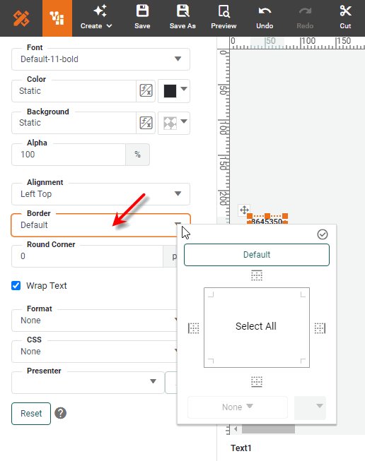
In the ‘Border’ pop-up panel, select the desired line color from the ‘Color’ menu, then the line style and boundary to which you want to apply the line style.
Select the border color before the style. In cases where cells share a border, the following rules determine the border style and color:
-
If either cell is a detail cell, prioritize the other cell’s style
-
If the top cell is a header or a trailer, prioritize its style
-
If the bottom cell is a header or trailer, prioritize its style
-
If both cells are the same type, prioritize the color with the higher RGB value
-
-
Press the ‘Apply’ button
 .
.
To set all borders to the current line style, click the ‘Select All’ button. To remove all borders or return to the default style, click the ‘No Border’ or ‘Default’ button, respectively.
Use the ‘Round Corner’ property to set the radius (in pixels) of the border corners. Larger values create softer corners, while smaller values create sharper corners.
| For the Tabbed Interface component, use the ‘Round Top Corners Only’ option to restrict the ‘Round Corner’ setting to the top of the tab, leaving the bottom corners with no rounding. To apply a unique style to the active (currently selected) tab, click on a tab to make it active, and then apply the desired styling from the Format panel. (See Tabbed Interface Properties for additional information.) |
Wrap Text
The ‘Wrap Text’ option wraps text to multiple lines instead of truncating the text. For a Selection Tree, this setting adjusts the row height automatically to ensure the wrapped text is visible.
Set a Graphical Format (Presenter)
A presenter is a graphical representation of a numeric value. You can assign a presenter to a numerical cell of a Table or to a Text component that displays numerical data.
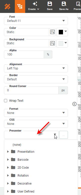
The following table lists some commonly used presenters.
| Presenter | Description |
|---|---|
Basic HTML |
Display strings with embedded tags, such as |
Checkmark |
For a |
Stars(Counter) |
Draws icons (stars) horizontally. The number of icons is determined by value; for example, two icons are drawn for a value of two. Options: ‘Icon’ specifies the image used, and ‘Icon Color’ sets the background color. |
Horizontal Bar +/- |
Same as Horizontal Bar, but handles both positive and negative numbers. Options: ‘Color’ sets the positive bar fill color, ‘Maximum’ sets the value represented by a full-width bar, and ‘Negative Color’ sets the negative bar fill color. |
Horizontal Bar |
Draws a horizontal bar based on the numeric cell value, similar to a bar chart. Options: ‘Color’ sets the positive bar fill color and ‘Maximum’ sets the value represented by a full-width bar. |
Traffic Light |
Represents data ranges using three different colors. Options: ‘Border’ sets the border line style and color, ‘Low’ sets the color for the low range, ‘Low Value’ sets low-middle transition point, ‘Mid’ sets the color for the middle range, ‘High’ sets the color for the high range, ‘High Value’ sets the middle-high transition value, ‘Low at Top/Right’ indicates that the right or top light in the traffic light represents the low range (otherwise, the left or bottom light is the low range), ‘Horizontal’ indicates that the traffic light is displayed horizontally, ‘Single Light’ displays just one light instead of three, and ‘Size’ specifies the size of the traffic light. |
Barcode |
Display various bar codes. Options: ‘Bar Height’ sets the height of the bars in pixels, ‘Bar Width’ sets the width of the bars in pixels, and ‘Resolution’ specifies the code image resolution in pixels/inch. |
2D Code |
Two-dimensional QR Code for alphanumeric data. Options: ‘Width’ sets the width of the code in pixels. |
Clockwise Rotation |
Rotates contents by 90 degrees in clockwise direction. |
Counterclockwise Rotation |
Rotates contents by 90 degrees in counter-clockwise direction. |
Multi-Header |
Displays multiple headers in a single cell for a Freehand Table component. When a cell contains a formula result in array format, separated by commas (for example: |
Button |
Adds a 3D border. Options: ‘Color’ sets the button color, ‘Bezel Width’ sets the width of the button border. |
Shadow |
Adds a shadow. Options: ‘Shading’ sets the background color, ‘Shadow Width’ sets the thickness of the shadow, and ‘Text Color’ sets the font color. |
Image |
Displays the images specified by the URLs in the column cells. |
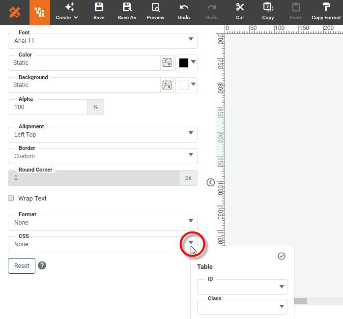
Format Data with CSS
The ‘CSS’ setting allows you to specify a Cascading Style Sheets (CSS) Class or ID to style the visual properties of a component. This allows you to obtain a consistent appearance across all your Dashboards. You can override the CSS formatting as needed by setting manual formats on individual components.
| Before you can apply CSS styles based on ID or Class, an administrator must upload a CSS file containing the ID and Class definitions. See Create a CSS File and Upload a CSS File in Manage the Server for more information. |
The following CSS formatting options are available for styling components:
- CSS Type
-
Every Dashboard component has a fixed CSS Type. Some subcomponents (e.g., component title bar) have a CSS Type as well. CSS Type styles automatically apply to all Dashboards without the need to make modifications to individual Dashboards. See CSS Dashboard Regions for a list of component and subcomponent types.
- CSS ID
-
You can assign a unique CSS ID to each component in a Dashboard. This allows you to target a particular component for styling. The CSS file should contain a CSS ID definition for each component ID you assign.
- CSS Class
-
You can assign one or more CSS Classes to any component in a Dashboard. This allows you to style a group of components (all having the same CSS Class) with a single set of instructions. The CSS file should contain a CSS Class definition for each CSS Class you assign in the Dashboard.
You can combine these selectors as needed. For example, the CSS definition file might define a default “Text” CSS Type to apply to most Text components, and also provide special Text CSS Classes (e.g., ‘Header1’, ‘Header2’, ‘Quoted’, ‘Hyperlink’, etc.) to use on individual Text components. See Create a CSS File in Manage the Server for details on how to create these CSS definitions.
To set a Dashboard component’s style by using CSS Class and ID, follow the steps below:
-
Verify that an administrator has uploaded the CSS file containing the Type, Class, and ID definitions.
-
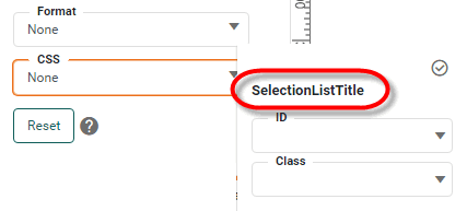
In Visual Composer, click to select the region of the component you want to style, and select the Format tab in the left panel. (See CSS Dashboard Regions for information about which regions can be formatted with CSS.)
-
Expand the ‘CSS’ menu. The label in the CSS panel indicates the CSS Type of the component. The component automatically inherits any styles defined in the CSS file for its Type.
-
Select the CSS ‘ID’ and/or select one or more classes from ‘Class’ to define the component’s style. Multiple components can share the same CSS Class, and a component can be assigned multiple classes. ID is unique to a given component.
CSS styles are overridden by styles you set manually in Visual Composer. The Reset button at the bottom of the Format panel removes the manually-set styles, restoring any CSS defaults. Manually-set transparency will affect the appearance of CSS colors. For Table components, you can select only a TableStyle ‘Class’. Note that Table Styles specified in the General tab of the ‘Table Properties’ dialog box override any table style specified on the CSS tab of the Format panel. You must therefore clear Table Styles from the ‘Table Properties’ dialog box in order to apply styles from the CSS tab.
If you do not see the desired CSS ID or CSS Class listed in the ‘ID’ or ‘Class’ menus, you can manually type a new Class or ID name. However, this will not apply any styles until a corresponding definition is created in the CSS definition file.
CSS properties that have not been assigned explicit values at the component or subcomponent level will be set by the global default (*) if the CSS file specifies one. Otherwise, properties of a subcomponent are inherited from the subcomponent’s parent. See CSS Properties and Create a CSS File in Manage the Server for more information.