Drill Down into Data
| These features are available to both designers and end-users. |
Watch Video: Add Drill Down Hyperlinks (Drill Down Methods)
This video might show an earlier version of the feature or operation that differs in minor ways from the current version.
There are a variety of ways that you can drill down into your data. The following sections explain the basic different approaches.
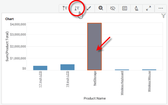
Brush a Chart
Brushing is a powerful tool that helps you to quickly detect and understand relationships your data. To brush a Chart, follow the steps below:
-
Select the data that you want to highlight:
How to select Chart data:You can select contiguous or discontiguous data in a Chart:
-
Drag the mouse across the data you wish to select. Hold the Ctrl key and drag to add additional regions to the selection.
-
Hold the Ctrl key and click the data you wish to select.
-
Hold the Ctrl key and click the X-axis labels to select the corresponding data.
-
Hold the Ctrl key and click the legend labels to select the corresponding data (subseries).
-
-
Press the ‘Brush Chart’ button
 in the Chart mini-toolbar.
Consider the following two charts.
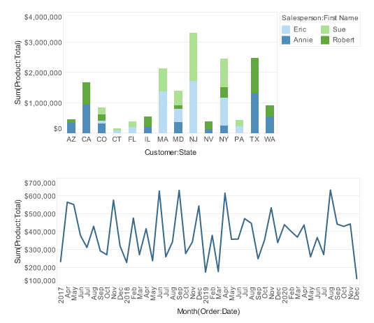
Use brushing to answer the following questions. (Expand the sections to see the answers.)
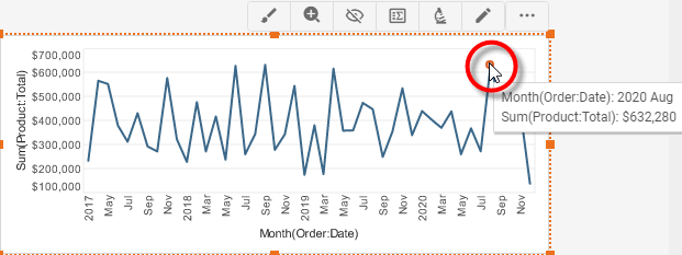
In what month did salesperson Sue Marston have peak sales?
-
Double-click the ‘Sue’ label in the legend to brush Sue Marston’s sales in both charts.
It is now obvious that Sue’s greatest sales month was April of 2019, when she sold almost $277,000.
-
Press the ‘Clear Brushing’ button
 to return to the normal view.
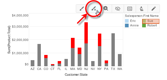
Overall sales were high in August 2020. Which state saw the greatest sales during this month?
-
In the second chart, click to select the data point for August 2020.
-
Press the ‘Brush Chart’ button
on the chart toolbar to highlight all the data corresponding to this month.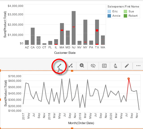
It is clear that Texas had the majority of sales in August 2020.
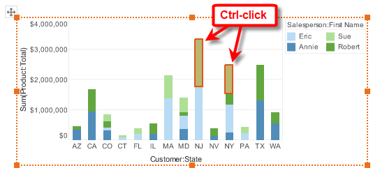
A majority of Sue Marston’s sales are in New Jersey and New York. During which month were Sue’s combined sales in NJ and NY the greatest?
-
In the first chart, hold the Ctrl key and click to select Sue’s sales both in NJ and NY.
-
Press the ‘Brush Chart’ button
on the chart toolbar to highlight all of Sue’s sales corresponding to these states.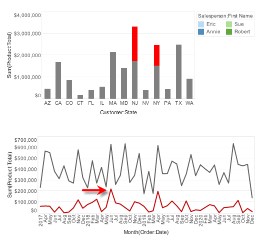
It is clear that Sue’s sales in NJ and NY reached a peak in June 2018.
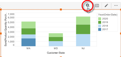
Zoom a Chart
The Zoom feature allows you to focus in on a selected set of groups by specifying the groups to include or exclude from the zoomed view.
Select Groups to Include
To zoom in by selecting the groups you want to view, follow the steps below:
-
Select the data on the chart that you wish to zoom.
How to select Chart data:You can select contiguous or discontiguous data in a Chart:
-
Drag the mouse across the data you wish to select. Hold the Ctrl key and drag to add additional regions to the selection.
-
Hold the Ctrl key and click the data you wish to select.
-
Hold the Ctrl key and click the X-axis labels to select the corresponding data.
-
Hold the Ctrl key and click the legend labels to select the corresponding data (subseries).
-
-
Press the ‘Zoom Chart’ button
 in the mini-toolbar. This zooms the chart to display only the data selected.
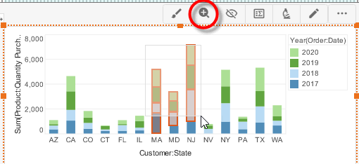
-
Repeat the above steps to zoom in further.
-
To return to the original chart view, press the ‘Clear Zoom’ button
 .
.
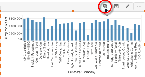
Select Groups to Exclude
In some cases, you might find it easier to create the desired view by specifying particular groups to exclude from the zoomed view.
-
Select the data on the chart that you wish to exclude from the zoomed view.
How to select Chart data:You can select contiguous or discontiguous data in a Chart:
-
Drag the mouse across the data you wish to select. Hold the Ctrl key and drag to add additional regions to the selection.
-
Hold the Ctrl key and click the data you wish to select.
-
Hold the Ctrl key and click the X-axis labels to select the corresponding data.
-
Hold the Ctrl key and click the legend labels to select the corresponding data (subseries).
-
-
Press the ‘Exclude Data’ button
 in the toolbar. This removes the selected data from the chart.
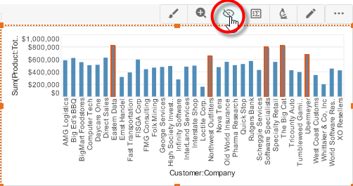
-
Repeat the above steps to exclude further data.
-
To return to the original chart view, press the ‘Clear Zoom’ button
.
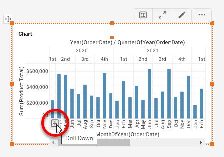
Drill Through a Chart
When a chart axis displays a date field or a cube dimension, the chart automatically provides the user with the ability to drill down to finer levels of resolution of the date or dimension.
To drill down into a date or cube dimension on a chart axis, follow these steps:
-
Hover the mouse over the chart axis that you want to display at greater resolution. For axes that represent date or cube dimension data, this will display a ‘Drill Down’ button
 at the left side of the axis.
The ‘Drill Down’ button is only visible when you hover over the axis.
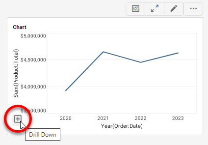
-
Press the ‘Drill Down’ button
to drill down to the next level of the date or dimension. -
Repeat the above steps to drill down to deeper levels of the hierarchy.
-
To drill up to a higher level of the date or dimension hierarchy, hover the mouse over the chart axis that you want to display at reduced resolution. This displays a ‘Drill Up’ button
 at the left side of the axis.
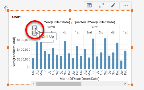
-
Press the ‘Drill Up’ button
to drill up to the higher level of the date or dimension hierarchy.When you drill down into a discretely grouped date axis (e.g., date grouping level set to ‘Quarter of Year’, ‘Month of Year’, etc.), this creates a facet chart by repeatedly adding the date field as an additional dimension with a finer grouping level.
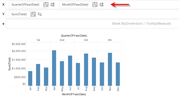
However, when you drill down into a continuously grouped date axis (e.g., date grouping level set to ‘Quarter’, ‘Month’, etc.), this changes the grouping level of the existing dimension rather than adding an additional dimension.
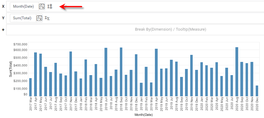
The exception to this rule is the ‘Year’ level, which behaves as a discrete grouping and generates a facet chart upon drill down (as illustrated in the steps above).
To disable the drilling feature for a particular chart, deselect the ‘Enable Drilling’ option in the Advanced tab of the ‘Chart Properties’ panel. To specify a custom drill hierarchy for any set of hierarchical fields, including custom date levels, use the Hierarchy tab. See Chart Properties for more details.
Drill Through a Crosstab
When a Crosstab header displays a date field or a cube dimension, the Crosstab automatically provides the user with the ability to drill down to finer levels of resolution of the date or dimension.
To drill down into a date or cube dimension on a Crosstab header, follow these steps:
-
Hover the mouse over the Crosstab. For headers that represent date or cube dimension data, this will display a ‘Drill Down’ button
at the left side of the header.The ‘Drill Down’ button is only visible when you hover over the Crosstab.
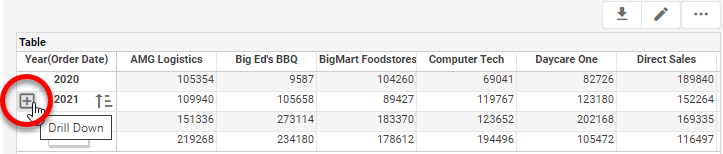
-
Press the ‘Drill Down’ button
to drill down to the next level of the date or dimension. -
Repeat the above steps to drill down to deeper levels of the hierarchy.
-
To drill up to a higher level of the date or dimension hierarchy, hover the mouse over the crosstab. This displays a ‘Drill Up’ button
at the left side of expanded headers.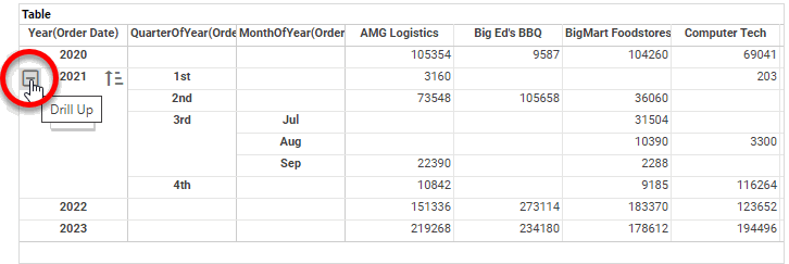
-
Press the ‘Drill Up’ button
to drill up to the higher level of the date or dimension hierarchy. -
To fully expand thfe hierarchy for a dimension value, right-click the value and select the appropriate ‘Expand Hierarchy’ option. To collapse an expanded hierarchy, select ‘Collapse Hierarchy’.
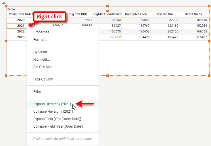
-
To fully expand all the hierarchies for a dimension (column or row header), right-click a value of the dimension and select the appropriate ‘Expand Field’ option. To collapse an expanded hierarchy, select ‘Collapse Field’.
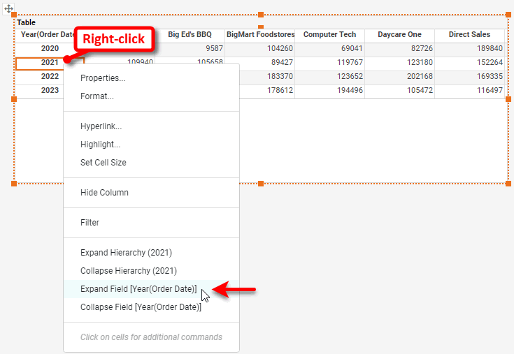
-
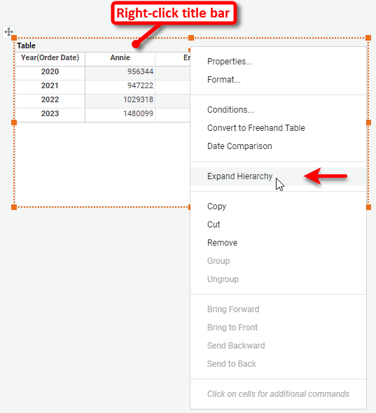
To fully expand all hierarchies in the entire crosstab, right-click the table title and select ‘Expand Hierarchy’. To collapse all hierarchies in an expanded table, select ‘Collapse Hierarchy’.
To disable the drilling feature for a particular Crosstab, deselect the ‘Enable Drilling’ option in the Advanced tab of the ‘Crosstab Properties’ dialog box. To specify a custom drill hierarchy for any set of hierarchical fields, including custom date levels, use the Hierarchy tab. See Crosstab Properties for more details.
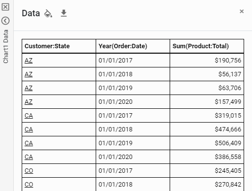
Drill to Chart Detail Data
To reveal the detail records corresponding to a Chart’s summarized data, follow the steps below:
Watch Video: Exporting Data from a Dashboard (Export Detail Data)
This video might show an earlier version of the feature or operation that differs in minor ways from the current version.
-
Select the data to display by clicking the appropriate element(s) in the Chart.
How to select Chart data:You can select contiguous or discontiguous data in a Chart:
-
Drag the mouse across the data you wish to select. Hold the Ctrl key and drag to add additional regions to the selection.
-
Hold the Ctrl key and click the data you wish to select.
-
Hold the Ctrl key and click the X-axis labels to select the corresponding data.
-
Hold the Ctrl key and click the legend labels to select the corresponding data (subseries).
-
-
Press the ‘Show Details’ button
 in the Chart mini-toolbar.
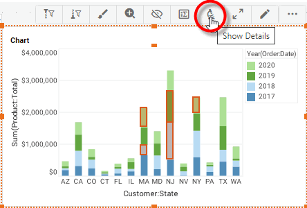
This opens the Data panel, which displays the detail data.
-
Optional: To format values in the Data panel, press the ‘Format’ button
 in the column header that you want to format.
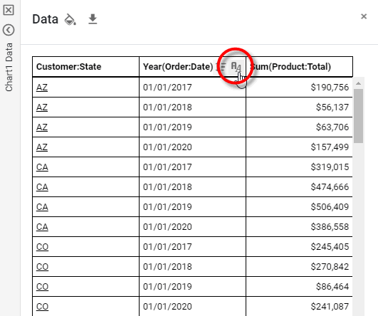
This opens the ‘Format Type’ panel. Select the desired format for the column and press the ‘Apply’ button
 . See Add Data Format for information about the available options.
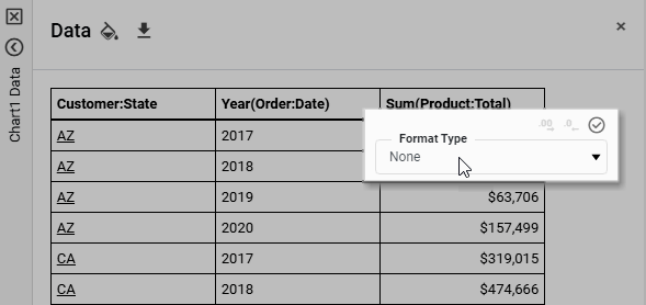
Formatting that you specify is saved with the Dashboard, and is automatically applied to the column whenever the ‘Show Details’ option is used, both in Visual Composer and the User Portal.
-
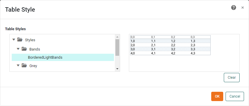
To apply a global table style, press the ‘Table Style’ button
 .
.
This opens the ‘Table Style’ dialog box. Select a table style, and press OK.
-
Optional: To export the data, press the ‘Export’ button
 in the Data panel. See Export a Dashboard for more details about exporting.
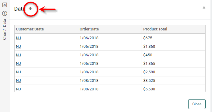
-
Press Close to collapse the Data panel.
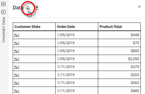
Drill to Crosstab Detail Data
To reveal the detail records corresponding to the aggregates in a Crosstab table, follow the steps below:
-
Select the aggregated data into which you want to drill.
You can select data in a Crosstab in the following ways:
-
Click to select individual cells.
-
Hold down the Shift key and click to select a contiguous ranges of cells.
-
Hold down the Ctrl key and click to select discontiguous ranges of cells.
-
-
Press the ‘Show Details’ button
in the Crosstab mini-toolbar.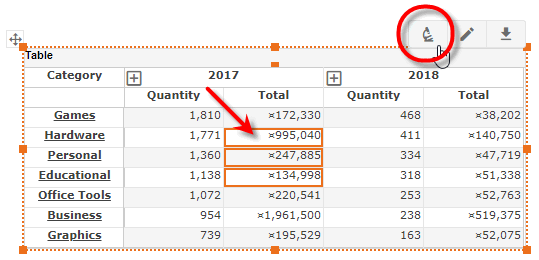
This displays the detail data in the Data panel.
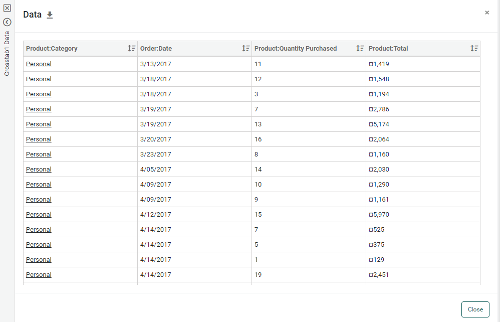
You can continue to select different cells without clicking ‘Show Details’ again. (You may need to collapse the Data panel to resume making selections on the Crosstab.)
-
Optional: To format values in the data panel, press the ‘Format’ button
in the column header that you want to format.This opens the ‘Format Type’ panel, which allows you to set the format for the column. See Add Data Format for information about the available options.
Formatting that you specify is saved with the Dashboard, and is automatically applied to the column whenever the ‘Show Details’ option is used, both in Visual Composer and the User Portal.
-
To apply a global table style, press the ‘Table Style’ button
.This opens the ‘Table Style’ dialog box. Select a table style, and press OK.
-
Optional: To export the data to Excel, press the ‘Export’ button
at the top left. See Export a Dashboard for more details about exporting.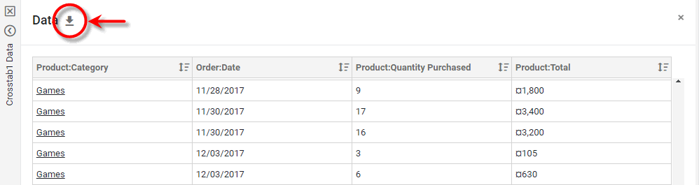
-
Press Close to exit the Data panel.
Drill with Table/Crosstab Hyperlinks
To add hyperlinks to a Table or Crosstab, right-click on a cell and select ‘Hyperlink’. This opens the ‘Hyperlink’ dialog box. To set up the hyperlinks, follow the procedure for the Chart. See Drill with Chart Hyperlinks below.
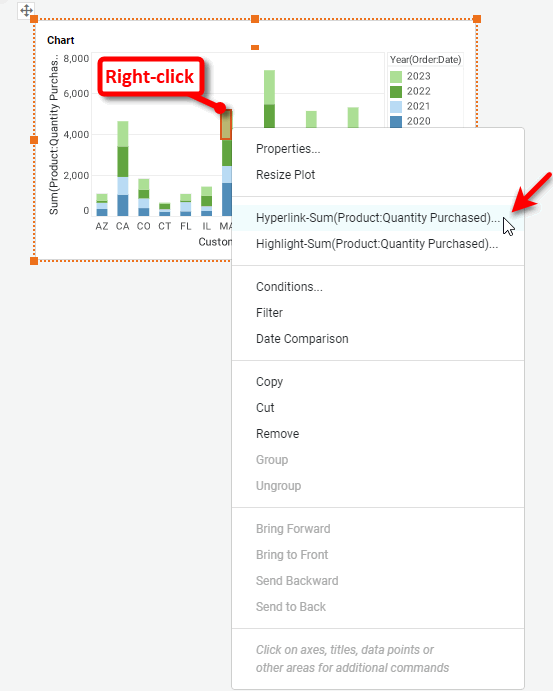
Drill with Chart Hyperlinks
You can attach hyperlinks to Chart graphical elements (e.g., the bars in a bar chart) or labels. To create hyperlinks on a Chart, follow the steps below:
Watch Video: Add Drill-Down Hyperlinks (Add Hyperlinks to a Chart)
This video might show an earlier version of the feature or operation that differs in minor ways from the current version.
| If you have identical filters in the origin dashboard and target (hyperlinked) dashboard, and you want these filters to be synchronized, you should configure shared filters in both dashboards. See Synchronizing Dashboard Filters in Modularize a Dashboard more details. |
-
Right-click on a Chart element to add hyperlinks to the chart elements (e.g., bars), or right-click on a chart dimension label to add hyperlinks to the labels. Note: You can also access menu options from the ‘More’ button (
 ) in the mini-toolbar.
 -
Select ‘Hyperlink’ from the context menu. This opens the ‘Hyperlink’ dialog box.
-
In the ‘Hyperlink’ dialog box, define the desired hyperlink. See the sections below for examples of how to configure hyperlinks for the desired target:
-
Add any desired visual formatting to the hyperlinks (e.g., underlining). See Add Visual Format for more details.
To display hyperlink underlining by default, set property hyperlink.indicator=true. See All Properties for information on how to set properties. -
Press the ‘Save’ button
 button on the toolbar to save the Dashboard.
When the user views this Dashboard in the User Portal, they will now see hyperlinks on the chart elements or labels.
Hyperlink to a Dashboard
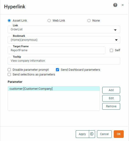
This example shows how Chart hyperlinks can be used to drill to a sample ‘OrderList’ Dashboard.
| You may need to download the Order List Example into your environment. (This requires access to Enterprise Manager.) See Import and Export Assets for instructions on how to import. |
-
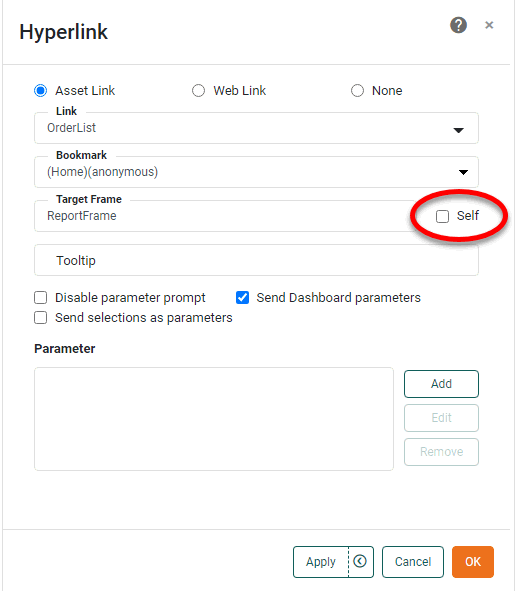
In the ‘Hyperlink’ dialog box, press the ‘Asset Link’ button.
-
Select ‘OrderList’ from the ‘Link’ menu.
The ‘OrderList’ Dashboard is designed to accept a parameter named customerthat is used in a condition to filter the companies displayed in a Table. You will configure the hyperlinks that you add in the steps below to the ‘Customer’ > ‘Company’ attribute in the parent Dashboard to pass the company name into the ‘customer’ parameter of the ‘OrderList’ Dashboard. -
Optional: Enter a tooltip in the ‘Tooltip’ field. (In the example we use “View company information” as the tooltip.)
The tooltip is displayed when the end-user hovers the mouse over a hyperlink. If there are multiple hyperlinks for a given attribute (which may be due to auto-drills added at the data model level), the tooltip is displayed when the end-user hovers the mouse over the name of the hyperlink in the menu of hyperlink options. -
Deselect the ‘Self’ option, and enter the name “NewFrame” in the ‘Target Frame’ field.
The 'Self' setting is not applied during preview in Visual Composer. This will cause the hyperlinked Dashboard to open in a window called “NewFrame” (i.e., this is the browser DOM ‘name’ attribute). If you want the Dashboard to open in the original Dashboard frame, replacing the existing Dashboard, leave the ‘Self’ checkbox selected.
-
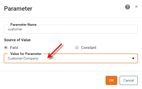
Press the Add button in the bottom panel. This opens the ‘Parameter’ dialog box.
To delete an existing parameter, select the parameter and press Remove. To edit an existing parameter, press Edit. -
Select the ‘customer’ parameter in the ‘Parameter Name’ menu. This is the name of the target parameter in the OrderList Dashboard.
-
Select the ‘Company’ field from the ‘Value for Parameter’ menu. This is the name of the table column whose value should be passed into the Dashboard parameter when the user clicks the hyperlink.
-
Press OK.
-
Optional: Repeat the above steps to add additional parameters.
-
Optional: Enable ‘Send Dashboard parameters’ to pass all existing Dashboard parameters to the target Dashboard, including Form component values. The Dashboard parameter names must exactly match those defined in the target Dashboard. See parameter in Advanced Dashboard Scripting for more information about Dashboard parameters.
Watch Video: Add Drill Down Hyperlinks (Pass Form Values)
This video might show an earlier version of the feature or operation that differs in minor ways from the current version.
-
Optional: Select ‘Disable parameter prompt’ to suppress the parameter dialog box that might ordinarily be produced by a parameterized Dashboard upon launch. (Prompting is automatically suppressed for parameters passed in the hyperlink itself.)
-
Optional: Select ‘Send selections as parameters’ to send the values of any Dashboard Filter components (Selection Lists, Range Sliders, etc.) to the target Dashboard. These values are passed into parameters in the target Dashboard that have the same name as the Filter component, as shown below:
Watch Video: Add Drill Down Hyperlinks (Pass Filter Values)
This video might show an earlier version of the feature or operation that differs in minor ways from the current version.
Example 1. Send selections as parameters-
A Selection List named “SelectionList1” passes selected values into an array called
SelectionList1. -
A Selection Tree named “SelectionTree1” passes the selected values into an array called
SelectionTree1. -
Selections at inner levels of a tree hierarchy are prepended with their parent labels and a caret (^) symbol, e.g.,
Northeast^Massachusetts^Boston. -
A Calendar named “Calendar1” passes a list of starting dates and ending dates into arrays
Calendar1_dateStartandCalendar1_dateEnd. -
A Range Slider named “RangeSlider1” passes the selected start date and end date into variables called
RangeSlider1_startandRangeSlider1_end.
-
-
Optional: For a Table, select ‘Apply to Row’ to hyperlink all the cells in the row, rather than just the selected cell.
-
Press OK to complete the hyperlink configuration.
For this example, clicking one of the hyperlinks will now launch the ‘OrderList’ Dashboard in a new browser window, and the ‘OrderList’ Dashboard will display only the orders for the specific company the user clicked.
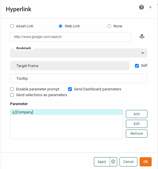
Hyperlink to a Web Page
This example shows how you can use a hyperlink to target a URL, such as www.google.com/search.
-
In the ‘Hyperlink’ dialog box, press the ‘Web Link’ radio button.
-
In the ‘Link’ field, enter the URL of the hyperlink destination with parameters omitted. For example, if you want the hyperlink to pass a value as parameter to the Google search engine, the ‘Link’ field should specify
https://www.google.com/search.You can also specify a table column to provide the URL links by selecting the desired column from the ‘Link’ menu.
You can insert parameters into the URL using the following syntax:
www.link.com/$(param1)/$(param2). These parameters should be defined in the ‘Parameter’ dialog box described below. If you don’t insert the parameters into the URL this way, they will be added as parameter-value pairs (param1=value1¶m2=value2) as described below. -
Optional: Enter a tooltip in the ‘Tooltip’ field. (In the example we use “View company information” as the tooltip.)
The tooltip is displayed when the end-user hovers the mouse over a hyperlink. If there are multiple hyperlinks for a given attribute (which may be due to auto-drills added at the data model level), the tooltip is displayed when the end-user hovers the mouse over the name of the hyperlink in the menu of hyperlink options. -
If you want the target web page to be displayed in a particular browser window, enter the name of the desired window in the ‘Target Frame’ field. (The specified name becomes the DOM ‘name’ attribute.) To open the target web page in the User Portal frame, select the ‘Self’ checkbox.
The 'Self' setting is not applied during preview in Visual Composer. -
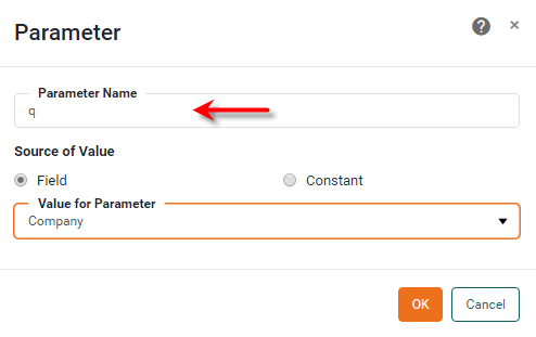
Press the Add button. This opens the ‘Parameter’ dialog box.
-
Enter
qin the ‘Parameter Name’ field. This name will be the parameter name used in the URL that is automatically constructed. (The parameter nameqis the parameter name expected by the Google search engine, which is the target website specified in the ‘Link’ field for this example.) -
Select ‘Company’ from the ‘Value for Parameter’ menu.
-
Press OK to close the ‘Parameter’ dialog box.
-
Repeat the above steps to add additional parameters.
-
The final configuration of the ‘Hyperlink’ dialog box is shown below.
-
Press OK to close the ‘Hyperlink’ dialog box.
The hyperlinks constructed will in general have the form
https://remotehost?param1=value1¶m2=value2¶m3=value3
where param1, param2, param3 are the parameter names specified in the ‘Hyperlink’ window, and value1, value2, value3 are the values of the attributes selected in the ‘Value’ panel.
| To include parameters as part of the URL path, see the Tip about the ‘Link’ field above. |
Drill with a Flyover
Watch Video: Filtering a Dashboard (Flyover Filter)
This video might show an earlier version of the feature or operation that differs in minor ways from the current version.
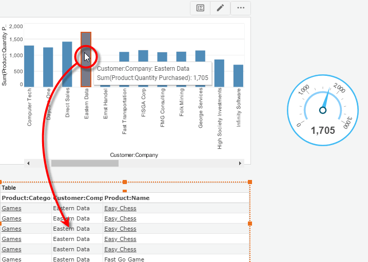
A flyover view filters the information displayed in selected Dashboard components when the user moves the mouse over (or clicks on) particular regions of a chart, table, or crosstab. This effectively allows a Chart, Table, or Crosstab to behave as a selection element. Flyover is similar to a data tip (see Add Tips to a Chart), except that the filtered components remain in their original positions (rather than following the mouse).
For example, you may want the Table below to display sales only for the particular product(s) that the user selects on the Chart. A flyover view allows the user to hover the pointer over the Chart to filter the table as desired.
The filtered flyover component and the component that triggers the flyover can be based on the same data block or on different data blocks. In the latter case, the flyover component is filtered based on any matching fields in the two data blocks.
| To access the current flyover filter condition in script, use dataConditions. |
In this example, you will create a chart that displays quantity purchased by company. When the user hovers over (or clicks) a given company on the chart, this will automatically filter an associated Table and Gauge to display data for only that company.
-
Create a new Dashboard based on the ‘Sales Explore’ Data Worksheet. For information on how to create a new Data Worksheet, see Create a Data Worksheet.
The 'Sales Explore' Data Worksheet can be found in . You may need to download the examples.zip file from GitHub into your environment. (This requires access to Enterprise Manager.) See Import and Export Assets for instructions on how to import. -
Drag a Gauge from the Toolbox panel into the Dashboard. Configure the Gauge to display the average quantity purchased. Follow these steps:
-
From the ‘Sales’ data block (top of the Toolbox panel), drag the ‘Quantity Purchased’ field onto the Gauge. This binds the Gauge to the data block.
-
Right-click the Gauge, and select ‘Properties’ from the context menu. Note: You can also access menu options from the ‘More’ button (
) in the mini-toolbar. This opens the ‘Gauge Properties’ panel. -
Under the General tab, change the ‘Name’ property to “QuantityGauge”.
-
Set the following limits: ‘Maximum’=200, ‘Minor Increment’=10, ‘Major Increment’=25.
-
Under the Data tab, select ‘Count’ from the ‘Aggregate’ menu. This will display the number of records (orders) for each company.
-
Press OK to close the ‘Gauge Properties’ panel.
-
-
Drag a Table component onto the Dashboard. Follow the steps below to configure the Table:
-
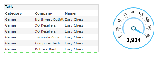
In the ‘Sales’ data block (top of the Toolbox panel), select the following fields: ‘Category’, ‘Company’, ‘Name’.
-
Drag the selected fields onto the Table component. This adds the three columns to the Table. Resize the Table as desired.
-
Right-click the Table, and select ‘Properties’ from the context menu. Note: You can also access menu options from the ‘More’ button (
) in the mini-toolbar. This opens the ‘Table Properties’ panel. -
Under the General tab, change the ‘Name’ property to “CompanyTable”.
-
Under the Advanced tab, select ‘Shrink to Fit’. This automatically sizes the table to the number of records displayed.
-
Press OK to close the dialog box.
-
-
Drag a Chart element onto the Dashboard. Press the ‘Edit’ button
 in the Chart mini-toolbar to open the Visualization Recommender. Press the ‘Full Editor’ button at the top right of the Recommender to bypass the Recommender and open the Chart Editor.
 -
Make the following selections:
-
From the ‘Dimensions’ node, drag the ‘Company’ dimension to the ‘X’ region.
-
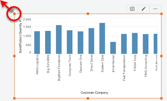
From the ‘Measures’ node, drag the ‘Quantity Purchased’ measure to the ‘Y’ region. This creates a chart that displays quantity purchased for each company.
-
Press the ‘Edit Dimension’ button
 , and use the ‘Ranking’ option to display only the top 10 companies. Press the ‘Apply’ button .
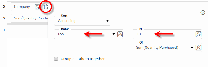
-
Press the ‘Finish’ button
to close the Editor. -
Resize the chart as desired.
-
-
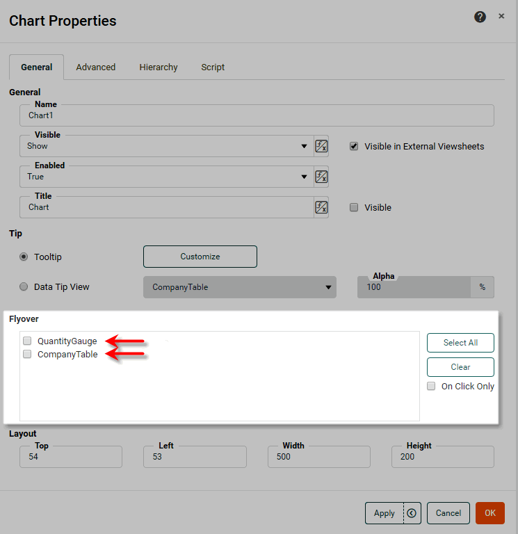
Right-click the Chart, and select ‘Properties’ from the context menu. Note: You can also access menu options from the ‘More’ button (
) in the mini-toolbar. This opens the ‘Chart Properties’ panel.-
Select the General tab.
-
In the ‘Flyover’ panel, click to select the two available components: ‘CompanyTable’ and ‘QuantityGauge’.
-
Optional: Select ‘On Click Only’ if you want the filtered components (‘CompanyTable’ and ‘QuantityGauge’) to update only when the user clicks on the chart. Otherwise, the components will update whenever the user hovers the mouse over the chart.
-
Press OK to close the ‘Chart Properties’ panel.
Data tips are not active in the design view. Preview the Dashboard to see them.
-
-
Press the ‘Preview’ button
 to preview the Dashboard, and hover the mouse (or click) over different companies (data or axis labels) in the Chart. Observe that both the Table and Gauge are filtered to display only the corresponding data.
 -
To lock the selection to a particular company (or set of companies), click on the Chart to select the desired company (or hold the Ctrl key and click to select a set of companies). This will lock the filter in place until the selection is removed.
| You can use a single component in both a data tip (see Add Tips to a Chart) and a flyover view. If you designate a data tip component for flyover duty, the component always remains visible on the Dashboard. |
The sample Executive Sales Summary Dashboard provides an example of a flyover filter.
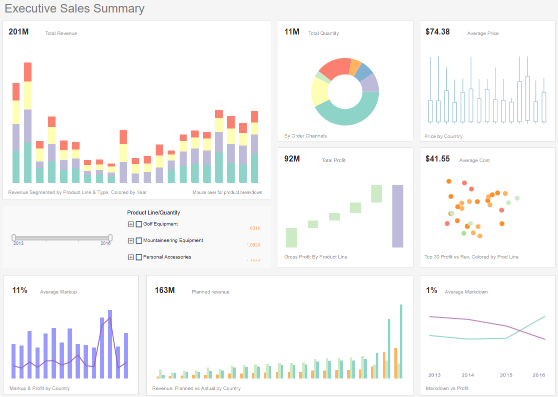
To explore this sample Dashboard, download and import the Executive Sales Summary Dashboard into your environment. (This requires access to Enterprise Manager.) See Import and Export Assets for instructions on how to import.
Drill Down and Filter
When a Chart or Crosstab displays data with a defined hierarchy in the Hierarchy tab (see Chart Properties and Crosstab Properties), you may want to simultaneously drill and filter the data. For example, if the Chart or Crosstab displays sales totals by product category, you may want to drill down into a particular category and view the totals for the individual products in that specific category.
| This is different from the operations described in Drill Through a Chart and Drill Through a Crosstab above, which drill to the next level of hierarchy but do not filter. |
If you have configured a ‘Category’ > ‘Product’ hierarchy for a Chart, then you can drill and filter by following the steps below:
-
Select the ‘Category’ group(s) on the chart that you want to drill and filter.
How to select Chart data:You can select contiguous or discontiguous data in a Chart:
-
Drag the mouse across the data you wish to select. Hold the Ctrl key and drag to add additional regions to the selection.
-
Hold the Ctrl key and click the data you wish to select.
-
Hold the Ctrl key and click the X-axis labels to select the corresponding data.
-
Hold the Ctrl key and click the legend labels to select the corresponding data (subseries).
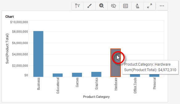
-
-
Press the ‘Drill Down Filter’ button
 in the Chart toolbar.
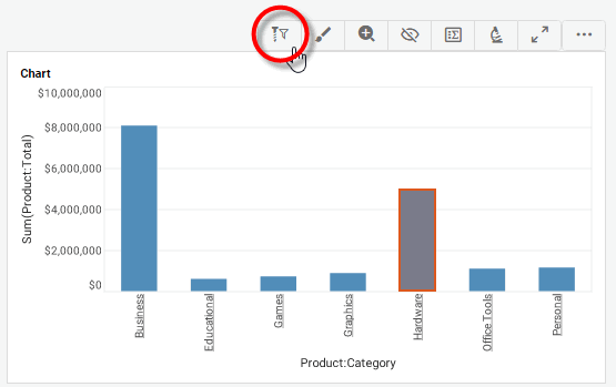
This drills to the ‘Product’ level and filters the Chart to display only the data in the selected ‘Category’. A drill icon indicates that a drill is in effect.
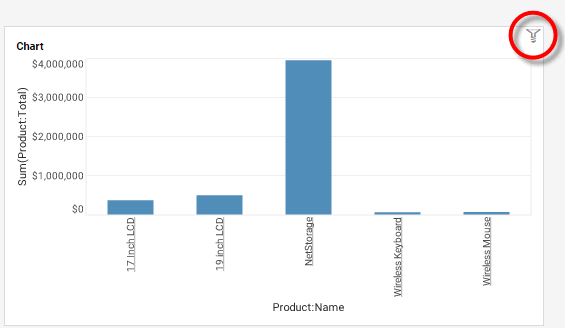
All other Dashboard components that display this dataset will also be filtered. In this respect, the ‘Drill Down Filter’ button behaves like a Filter component (Selection List, etc.).
-
To reverse the drill and filter operation, select a group on the Chart, and then press the ‘Drill Up Filter’ button
 in the Chart toolbar.