Running Total Chart
|
Compare Data by Date, to perform a variety of comparisons on date-based charts. |
A running total chart displays an aggregated measure that accumulates across groups, with optional reset points.
To create a running total chart, follow the basic steps below:
|
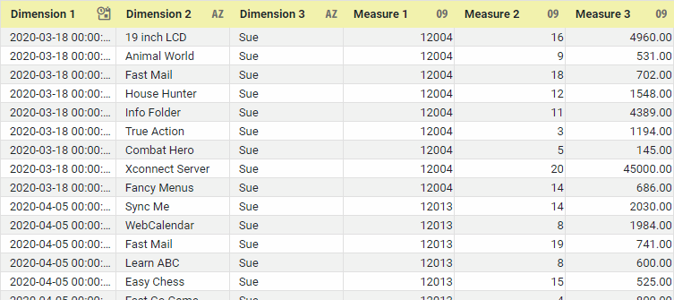
If you are new to charting, see the following sections first: Configure Your Data…The data source for the chart (data block or data model) should represent dimensions and measures as independent columns or fields, as shown below. See Prepare Your Data for information on how to manipulate your data, if it is not currently in this form. (Note: A properly designed data model will already have the correct structure.)
In some cases (e.g., Pie Chart), you may want your data to provide just a single measure. In other cases (e.g., Line Chart), you may want the data to supply multiple measures. If the data does not provide the correct number of measures, you may be able to alter the number of measures to suit the needs of the chart by “pivoting” or “unpivoting” the data. See Pivot Data in Prepare Your Data for more information about this procedure. Open a Chart for Editing…Watch Video: Create a Chart (Open the Chart Editor)This video might show an earlier version of the feature or operation that differs in minor ways from the current version. Follow the steps below to get started with a new Chart. See Basic Charting Steps for more details.
|
-
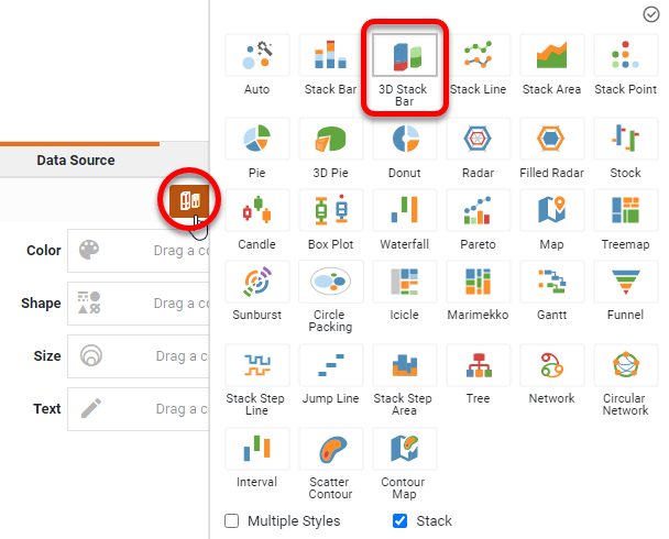
Press the ‘Select Chart Style’ button
 . Choose a desired style. Press the ‘Apply’ button
  .
.
-
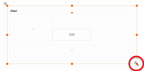
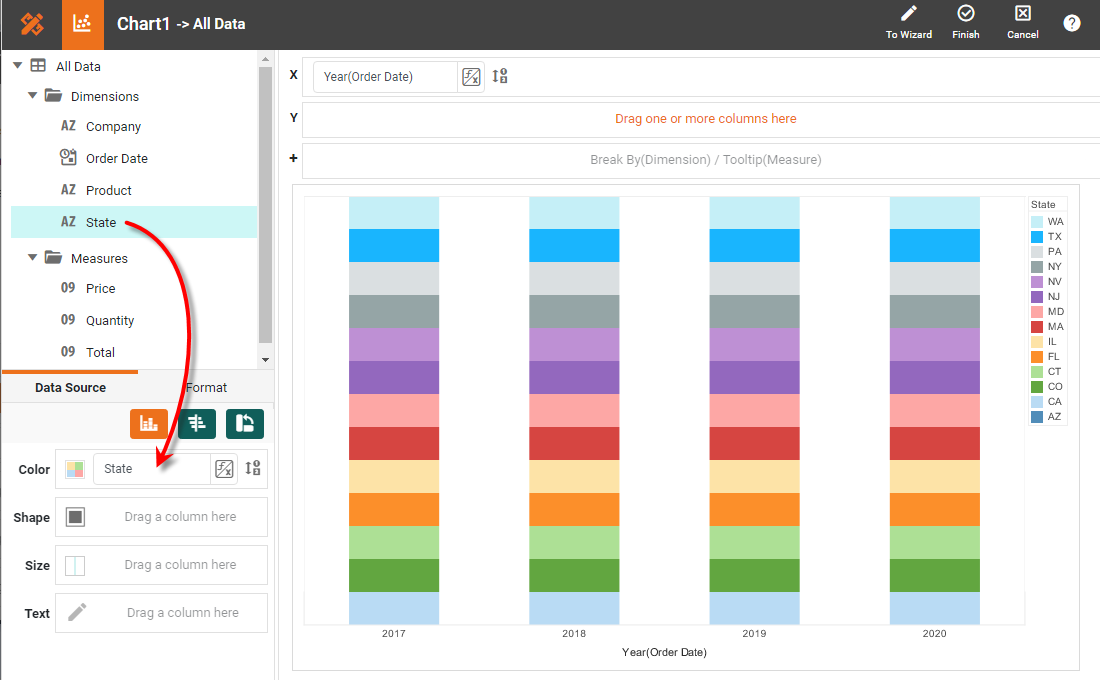
From the ‘Dimensions’ folder of the Data Source panel, drag a desired dimension to the ‘X’ or ‘Y’ region.
What is a dimension?
A dimension is used to break-down the dataset into multiple groups, often within a Crosstab, Chart, or Selection List. Adding a dimension to the ‘X’ region of a Chart distinguishes the different dimension groups by location on the X-axis. Adding a dimension to the ‘Y’ region distinguishes the different dimension groups by location on the Y-axis. You can add multiple dimensions into the ‘X’ or ‘Y’ regions of a Chart, or into the ‘Rows’ or ‘Columns’ regions of a Crosstab, to create multiple grouping levels. You can also distinguish groups in a dimension by using color, shape, size, or label in a Chart.
To convert a measure to a dimension, right-click the measure in the data source and select ‘Convert to Dimension’. -
To break-out the dataset into groups using color, shape, size, or text labeling, drag a dimension from the data source to the ‘Color’, ‘Shape’, ‘Size’, or ‘Text’ region.
-
To break-out the data into groups without applying any visual formatting, drag a dimension to the ‘Break By/Tooltip’ region.
-
Optional: You can add additional dimensions to the Chart if desired. See Trellis Chart (Grid) for information about adding multiple dimensions to a chart axis.
-
Optional: For a date dimension, press the ‘Edit Dimension’ button
 next to the field name in the Chart Editor, and set the ‘Level’ to the desired date grouping. Then press the ‘Apply’ button .
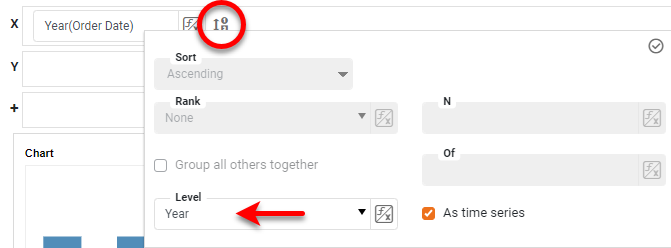
-
From the ‘Measures’ folder of the Data Source panel, drag a measure to the ‘X’ or ‘Y’ region. This places the selected field onto the chart as a measure.
What is a measure?
A measure is generally used for aggregation, for example summation, averaging, correlation, etc., within a Crosstab, Chart, Text component, or Gauge. Adding a measure to the ‘Y’ region in a chart displays the computed aggregates by using locations on the Y-axis. Adding a measure to the ‘X’ region displays the computed aggregates by using locations on the X-axis. You can also display aggregates by using color, shape, size, or label.
To convert a dimension to a measure, right-click the dimension in the data source and select ‘Convert to Measure’. -
Press the ‘Edit Measure’ button
 next to the measure, and select the desired aggregation method for the measure.
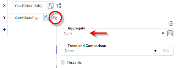
-
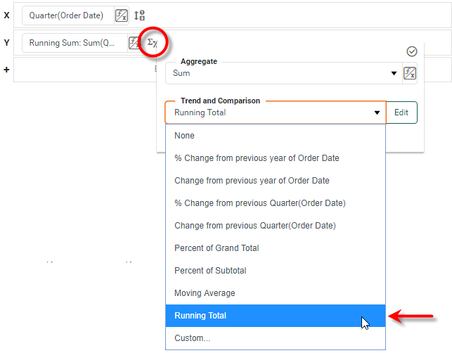
From the ‘Trend and Comparison’ menu, select ‘Running Total’.
-
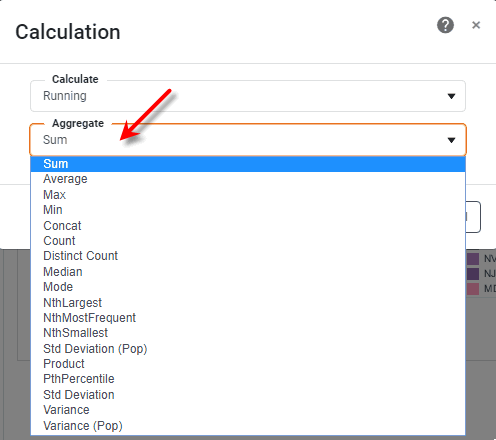
For more precise control, select the ‘Custom’ option, and press Edit. Then choose ‘Running’ from the ‘Calculation’ dialog box.
The ‘Running’ calculation allows you to express each group aggregate as an accumulation of previous aggregate values in the series. The method of accumulation is specified by the ‘Aggregate’ menu in the ‘Calculation’ dialog box.
The ‘Reset at’ option, available for date fields, allows you to specify the date interval (e.g., year, quarter, week, etc.) at which the accumulation should be cleared.
Read more about the available aggregation methods…
The list below describes the available Data Block, Crosstab, and Chart aggregation measures. You can choose to display univariate aggregations (e.g., ‘Sum’, ‘Count’) as a percentage value by selecting the percentage basis (e.g., ‘Group’, ‘GrandTotal’) from the accompanying ‘Percentage’ or ‘Percentage of’ menu. For the bivariate aggregation methods (e.g., ‘Correlation’, ‘Weighted Average’), you will need to select a variable (column) to use as the second operand in the computation. Make this selection in the menu labeled ‘with’.
- Sum
-
Displays the sum of the measure values for the given group.
- Average
-
Displays the average of the measure values for the given group.
- Max
-
Displays the maximum of the measure values for the given group. For dates, this will return the latest date.
- Min
-
Displays the minimum of the measure values for the given group. For dates, this will return the earliest date.
- Count
-
Displays the total count of measure values for the given group. This represents the total number of records corresponding to the given group, and is the same value for any selected measure.
- Distinct Count
-
Displays the count of unique measure values for the given group.
- First
-
Displays the first value for the measure (for the given group) when sorted based on the values in a second column, specified by the menu labeled ‘by’.
- Last
-
Displays the last value for the measure (for the given group) when sorted based on the values in a second column, specified by the menu labeled ‘by’.
- Correlation
-
Displays the Pearson correlation coefficient for the correlation between the measure values (for the given group) and the corresponding values in a second column, specified by the menu labeled ‘with’.
- Covariance
-
Displays the covariance between the measure values (for the given group) and the corresponding values in a second column, specified by the menu labeled ‘with’.
- Variance
-
Displays the (sample) variance of the measure values for the given group.
- Std Deviation
-
Displays the (sample) standard deviation of the measure values for the given group.
- Variance (Pop)
-
Displays the (population) variance of the measure values for the given group.
- Std Deviation (Pop)
-
Displays the (population) standard deviation of the measure values for the given group.
- Weighted Average
-
Displays the weighted average of the measure values for the given group. The weights are given by the corresponding values in a second column, which is specified by the menu labeled ‘with’.
- Median
-
Displays the median (middle) of the measure values for the given group.
- Mode
-
Displays the mode (most common) of the measure values for the given group.
- Product
-
Displays the product (multiplication) of the measure values for the given group.
- Concat
-
Displays the concatenation into a comma-separated list of the measure values for the given group.
- NthLargest
-
Displays the Nth largest of the measure values for the given group.
- NthSmallest
-
Displays the Nth smallest of the measure values for the given group.
- NthMostFrequent
-
Displays the Nth most common of the measure values for the given group.
- PthPercentile
-
Displays the value of the Pth percentile for the measure values for the given group.
-
Optional: You can add additional measures to the Chart if desired. See Multiple Measure Chart for more information about adding multiple measures to a chart axis. See Basic Charting Steps for information on how to add measures using color, shape, or size representation.
-
Press the ‘Finish’ button
to close the Editor.
You can proceed to edit the titles, legend, etc. See Basic Charting Steps and Chart Properties for more information. See Add Data Format for information on how to format text on a Chart.
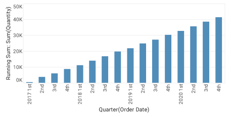
In this example, you will create a chart that computes total quantities sold by month, and displays these values as a running average. The running average will be reset on a yearly basis.
Follow the steps below:
-
Create a new Dashboard based on the ‘Sales Explore’ Data Worksheet. For information on how to create a new Data Worksheet, see Create a Data Worksheet.
The 'Sales Explore' Data Worksheet can be found in . You may need to download the examples.zip file from GitHub into your environment. (This requires access to Enterprise Manager.) See Import and Export Assets for instructions on how to import. -
Drag a Chart component onto the Dashboard, and enlarge the Chart as desired by dragging the handles.
-
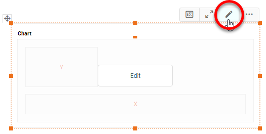
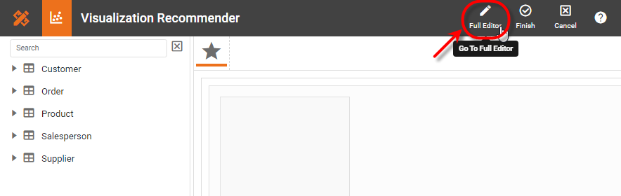
Press the ‘Edit’ button
 at the top-right of the Chart to open the Visualization Recommender. Bypass the Recommender by pressing the ‘Full Editor’ button at the top right. This opens the Chart Editor.
 -
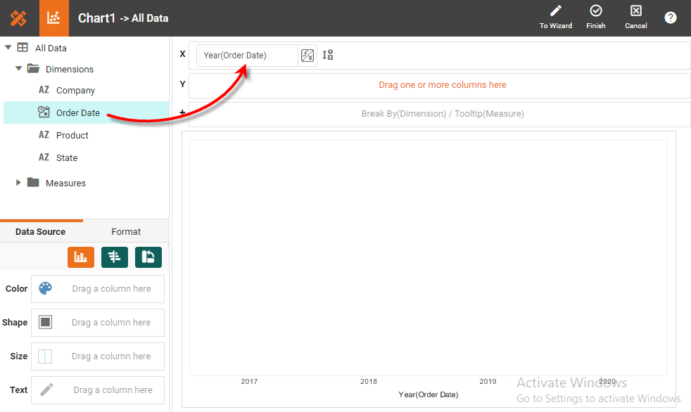
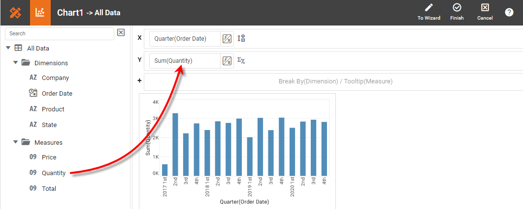
In the Chart Editor, from the ‘Dimensions’ node in the data source, drag the ‘Date’ dimension to the ‘X’ region.
-
From the ‘Measures’ node in the data source, drag the ‘Quantity Purchased’ measure to the ‘Y’ region.
-
Press the ‘Edit Dimension’ button
next to the ‘Date’ measure. -
From the ‘Level’ menu select ‘Month’, and press the ‘Apply’ button
. This groups the date data (i.e., X-axis labels) by month.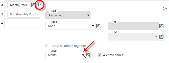
-
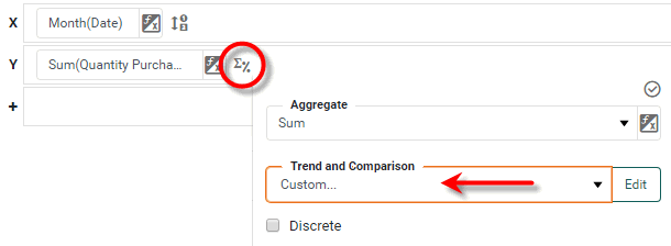
Press the ‘Edit Measure’ button
next to the ‘Quantity Purchased’ measure. -
In the ‘Trend and Comparison’ menu of the pop-up panel, select the ‘Custom’ option.
-
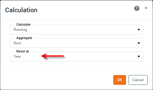
Press the Edit button to open the ‘Calculation’ dialog box. Make the following settings:
-
From the ‘Calculate’ menu, select ‘Running’.
-
From the ‘Aggregate’ menu, select ‘Sum’.
-
From the ‘Reset at’ menu, select ‘Year’.
-
Press OK to close the dialog box.
-
-
Press the ‘Apply’ button
. -
Press the ‘Finish’ button
to close the Editor.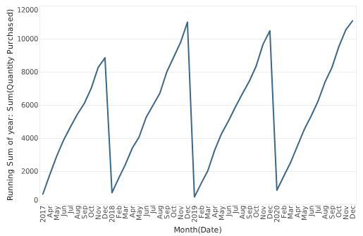
The time series now shows a running total for the summed quantity purchase, re-initialized at each new year.