TextInput Properties
|
The Text Input component’s ‘Properties’ panel provides General, Option, and Script tabs. The next sections discuss the component-specific properties available under these tabs.
General Tab
In addition to the common properties, the General tab in the ‘Text Input Properties’ panel provides the following properties.
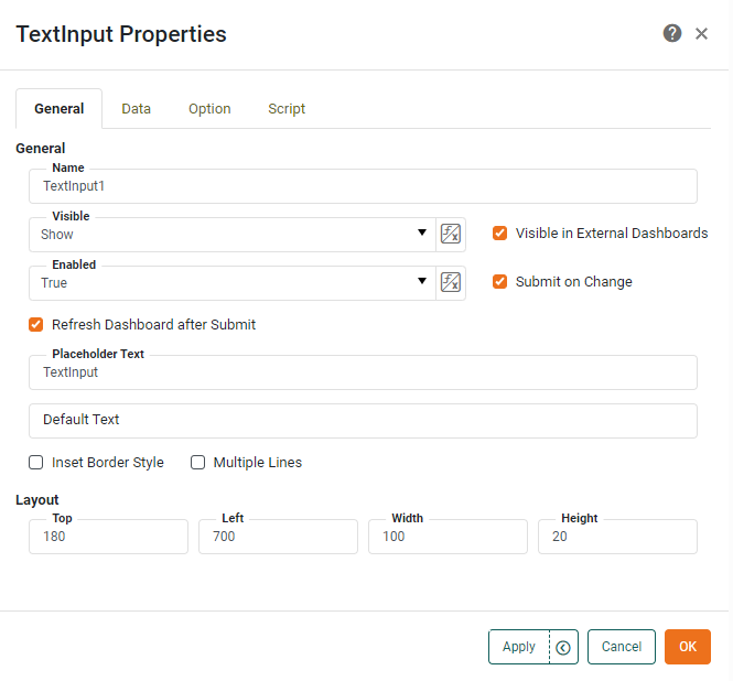
- Submit on Change
-
When enabled (default), submits the entered value when user presses ‘Enter’ or clicks away. Otherwise, a separate ‘Submit’ button is required.
- Refresh Dashboard after Submit
-
Force the dashboard to refresh when the user submits a value from the Form component.
- Placeholder Text
-
Specifies the text to appear within the TextInput field whenever no text has been entered. (This is often a hint to the user about what data they should enter, for example, “Enter the employee name”.) The placeholder text is automatically removed when the user begins entering data, and is never submitted as the value of the TextInput component.
- Default Text
-
Specifies the default text to appear within the TextInput field. If ‘Default Text’ is specified, the ‘Placeholder Text’ is not shown. If the ‘Default Text’ is not subsequently modified by the user, it will be submitted as the value of the TextInput component.
- Inset Border Style
-
Specifies a dimensional “inset” (rather than flat) appearance for the component border.
- Multiple Lines
-
When enabled, allows the user to enter multiple lines of text into the text area.
Option Tab
The Option tab in the ‘TextInput Properties’ panel allows you to select an Input Editor which specifies the control interface and validation for user input. See Validate User Input for details on the available editors.
Label Tab
The Label tab in the ‘Properties’ panel provides the following unique properties for TextInput.
- Show Label
-
Displays a label for the TextInput component when selected.
- Label Text
-
The contents of the label. You can enter static text, or use Form components or script to set the contents by pressing the ‘Value Type’ button
 and selecting the ‘Variable’ or Expression’ option. See Dynamically Set Properties for more information.
 - Label Position
-
The position of the label relative to the component.
- Gap
-
The gap in pixels between the component and the label.
Script Tab
See Script Tab for information about this common tab.