Add a Target Line/Curve Fit
| These features are available to both designers and end-users. |
A target line is a horizontal or vertical line drawn on the Chart that denotes an ideal value (goal or threshold) or representative value (average, minimum, etc.). A target band is a horizontal or vertical band drawn on the Chart that denotes either an ideal range (e.g., goal zone) or representative range (e.g., span of maximum to minimum). A statistical measure is a line or region drawn on the Chart to represent one or more statistical quantities derived from the data (confidence intervals, percentiles, etc.). A trend line (curve fit) is curve that is fit to the data based on a selected model (linear, quadratic, etc.).
Add a Target Line
Watch Video: Creating a Chart (Add Target Lines)
This video might show an earlier version of the feature or operation that differs in minor ways from the current version.
A target line is a horizontal or vertical line drawn on the Chart that generally denotes either an ideal value (goal or threshold) or representative value (average, minimum, etc.). Regions above and below the target value can be assigned independent colors.
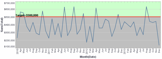
To add a target line, follow the steps below:
-
Right-click the Chart, and select ‘Properties’ from the context menu. Note: You can also access menu options from the ‘More’ button (
 ) in the mini-toolbar. This opens the ‘Chart Properties’ panel.
 -
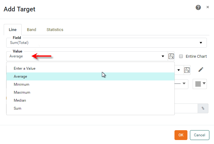
Select the Advanced tab of the ‘Properties’ dialog box. In the ‘Target Lines’ panel, press the Add button. This opens the ‘Add Target’ dialog box.
-
Select the Line tab.
-
In the ‘Field’ menu, select the chart measure to which you want to add the target line.
What is a measure?
A measure is generally used for aggregation, for example summation, averaging, correlation, etc., within a Crosstab, Chart, Text component, or Gauge. Adding a measure to the ‘Y’ region in a chart displays the computed aggregates by using locations on the Y-axis. Adding a measure to the ‘X’ region displays the computed aggregates by using locations on the X-axis. You can also display aggregates by using color, shape, size, or label.
Set the Value
-
In the ‘Value’ field, type a numerical value at which to place the target line for the selected measure, or choose one of the following options to compute the target value from the data: ‘Average’, ‘Minimum’, ‘Maximum’, ‘Median’, ‘Sum’. (For example, select ‘Average’ to place the target line at the average value of the selected measure.)
-
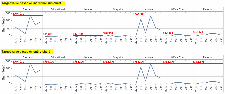
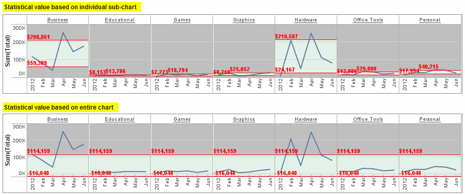
Optional: If you select one of the available target line computations (‘Average’, ‘Minimum’, etc.), enable the ‘Entire Chart’ option to compute the target value based on measure data from the entire chart. Disable the ‘Entire Chart’ option to compute the target value for each sub-chart based only on measure data from the same sub-chart.
Example 1. Effect of ‘Entire Chart’ optionThe following illustration demonstrates the effect of the ‘Entire Chart’ setting (‘Value’ is set to ‘Maximum’ in both cases).
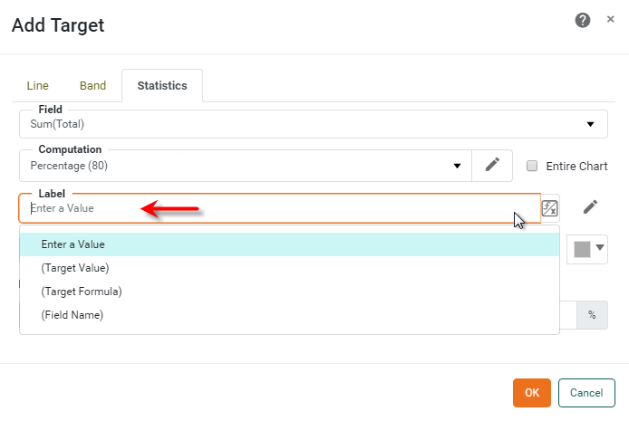
Set the Label
-
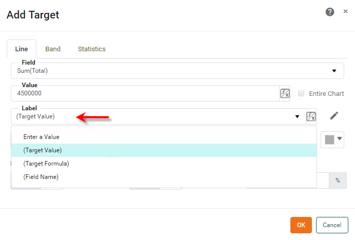
From the ‘Label’ menu, select one of the following label options:
-
Select ‘Enter a Value’ to type a custom label for the target line.
-
Select ‘(Target Value)’ to insert the numerical value of the target line as the label.
-
Select ‘(Target Formula)’ to insert the name of the computation method (‘Average’, ‘Minimum’, etc.) as the label, if applicable.
-
Select ‘(Field Name)’ to insert the field name for the selected measure as the label; for example, “Sum(Total)”.
-
-
Optional: To further customize the label, press the ‘Edit’ button
 next to the ‘Label’ field. This opens a panel in which you can manually enter the label. Press the ‘Apply’ button
  when you have finished entering the label.
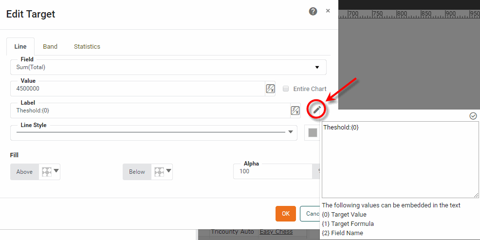
The customized label supersedes any previous selection from the ‘Label’ menu. If desired, you can add the target value, target formula, and field name into the label by inserting the corresponding codes, such as {0}, {1}, {2} shown at the bottom of the panel. You can apply formats to the inserted values by using custom tooltip syntax. (See Add Tips to a Chart.)
Example 2. Insert target value, formula, or field into labelCustom Label Displays As {1} = {0,number,$#,##0}Average = $383,485
{1} of monthly {2}Average of monthly Sum(Total)
Set the Style
-
Select a ‘Line Style’ and ‘Line Color’ in which to display the target line.
-
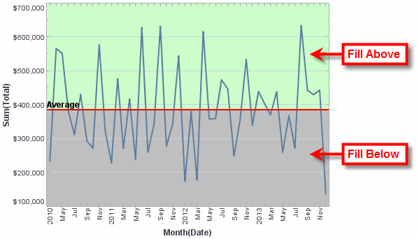
Optional: Select a ‘Fill Above’ color and ‘Fill Below’ color to fill the regions of the chart above and below the target line respectively.
-
Press OK to close the panel.
By default, the target line appears on the chart even if its value is greater than the largest data point. This may sometimes cause the data points on the chart to be compressed into a small region of the plot area, which makes the chart difficult to read. To correct this, turn off the ‘Keep Element in Plot’ option in the ‘Chart Properties’ dialog box. See Chart Properties for more information.
Individual target lines are accessed in script as GraphForm objects. To remove a specific target line, use graph.removeForm(index). Indexing for all GraphForm objects begins at 0 and proceeds in the order that objects were added to the chart. To remove all target lines, use clearTargets().
|
Add a Target Band
A target band is a horizontal or vertical band drawn on the chart that generally denotes either an ideal range (e.g., goal zone) or representative range (e.g., span of maximum to minimum). The region within the target band, as well as the regions above and below, can be assigned independent colors.
To add a target band, follow the steps below:
-
Right-click the Chart, and select ‘Properties’ from the context menu. Note: You can also access menu options from the ‘More’ button (
) in the mini-toolbar. This opens the ‘Chart Properties’ panel. -
Select the Advanced tab of the ‘Properties’ dialog box. In the ‘Target Lines’ panel, press the Add button. This opens the ‘Add Target’ dialog box.
-
Select the Band tab.
-
In the ‘Field’ menu, select the chart measure to which you want to add the target band.
Set the Value
-
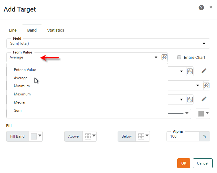
In the ‘From Value’ field, enter a numerical value at which to place the lower band range for the selected measure, or choose one of the following options to compute the lower band range from the data: ‘Average’, ‘Minimum’, ‘Maximum’, ‘Median’, ‘Sum’. (For example, select ‘Average’ to place the lower band boundary at the average value of the selected measure.)
Set the Label
-
In the ‘From Label’ menu, select one of the following label options:
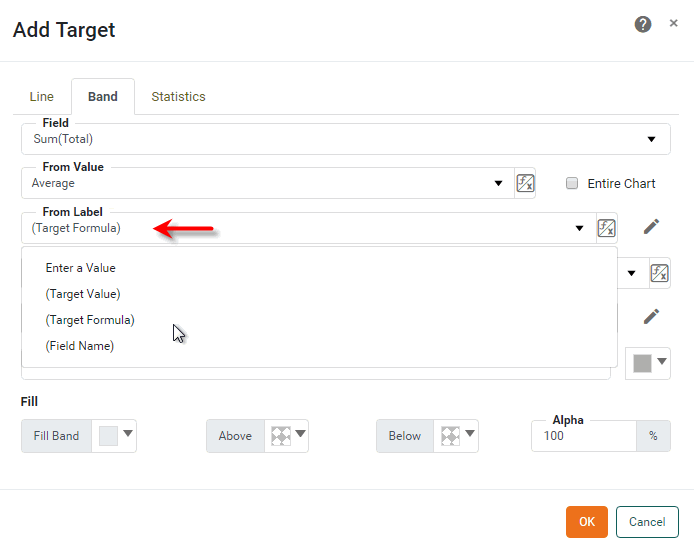
-
Select ‘Enter a Value’ to type a custom label for the lower band boundary.
-
Select ‘(Target Value)’ to insert the numerical value of the lower band boundary as the label.
-
Select ‘(Target Formula)’ to insert the name of the computation method (‘Average’, ‘Minimum’, etc.) as the lower band boundary label, if applicable.
-
Select ‘(Field Name)’ to insert the field name of the selected measure as the lower band boundary label, e.g., “Sum(Total)”.
-
-
Optional: To further customize the label, press the ‘Edit’ button
next to the ‘From Label’ field. This opens a panel in which you can manually enter the label. Press the ‘Apply’ button when you have finished entering the label.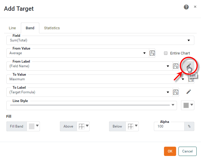
The customized label supersedes any previous selection from the ‘From Label’ menu. If desired, you can add the target band value, target band formula, and field name into the label by inserting the corresponding codes, such as {0}, {1}, {2} shown at the bottom of the panel. You can format the inserted values using custom tooltip syntax. (See Add Tips to a Chart).
Example 3. Insert target value, formula, or field into labelCustom Label Result {1} = {0,number,$#,##0}Average = $383,485
{1} of monthly {2}Average of monthly Sum(Total)
-
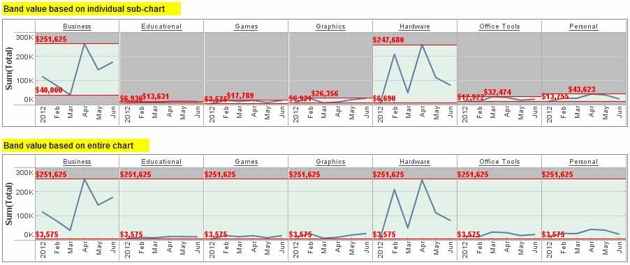
Optional: If you select one of the available target band computations (‘Average’, ‘Minimum’, etc.), enable the ‘Entire Chart’ option to compute the target band value based on measure data from the entire chart. Disable the ‘Entire Chart’ option to compute the target band value for each sub-chart based only on measure data from the same sub-chart.
Example 4. Effect of ‘Entire Chart’ optionThe following illustration demonstrates the effect of the ‘Entire Chart’ setting. (In both cases, ‘From Value’ is set to ‘Minimum’ and ‘To Value’ is set to ‘Maximum’).
-
Repeat the previous steps to set the ‘To Value’ and ‘To Label’ properties, which specify the position and label of the upper band boundary.
Set the Style
-
Select a ‘Line Style’ and ‘Line Color’ in which to display the upper and lower target band boundaries.
-
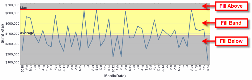
Optional: Press the ‘Fill Band’ button and select a background color to fill the band between the lower and upper boundaries. Select a ‘Fill Above’ color and ‘Fill Below’ color to fill the regions of the chart above and below the band boundaries, respectively.
-
Press OK to close the panel.
By default, the target band appears on the chart even if its upper or lower range values are greater than the largest data point. This may sometimes cause the data points on the chart to be compressed into a small region of the plot area, which makes the chart difficult to read. To correct this, turn off the ‘Keep Element in Plot’ option in the ‘Chart Properties’ dialog box. See Chart Properties for more information.
Individual target lines are accessed in script as GraphForm objects. To remove a specific target line, use graph.removeForm(index). Indexing for all GraphForm objects begins at 0 and proceeds in the order that objects were added to the chart. To remove all target lines, use clearTargets().
|
The sample Generation and Distribution Dashboard provides an example of using a target band on a chart.
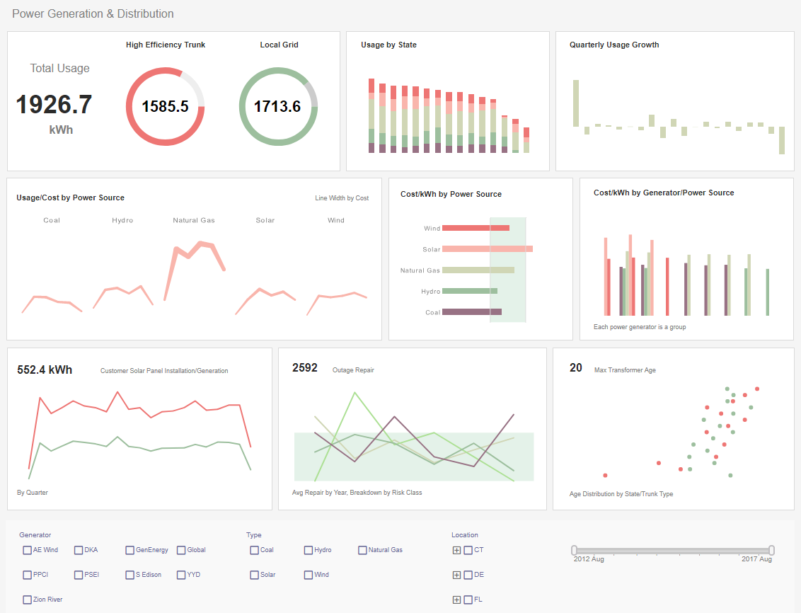
To explore this sample Dashboard, download and import the Generation and Distribution Dashboard into your environment. (This requires access to Enterprise Manager.) See Import and Export Assets for instructions on how to import.
Add a Statistical Measure
A statistical measure is represented by one or more lines drawn on the chart to indicate the values of statistical quantities derived from the data (confidence intervals, percentages, percentiles, quantiles, or standard deviation).
To add a statistical measure, follow the steps below:
-
Right-click the Chart, and select ‘Properties’ from the context menu. Note: You can also access menu options from the ‘More’ button (
) in the mini-toolbar. This opens the ‘Chart Properties’ panel. -
Select the Advanced tab of the ‘Properties’ dialog box.
-
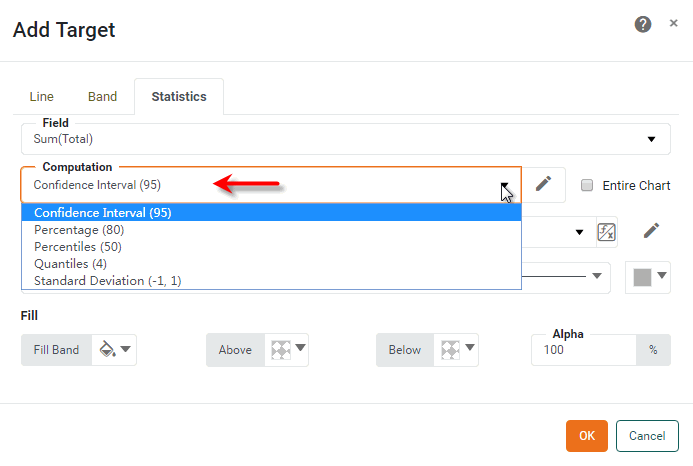
In the ‘Target Lines’ panel, press the Add button. This opens the ‘Add Target’ dialog box.
-
Select the Statistics tab.
-
In the ‘Field’ menu, select the chart measure to which you want to add the statistical measure.
Set the Value
-
In the ‘Computation’ field, select one of the following options to compute statistics from the data: ‘Confidence Interval’, ‘Percentages’, ‘Percentile’, ‘Quantiles’, ‘Standard Deviation’. (See explanations below.)
-
To modify the statistical measure, press the Edit button. The following settings are available:
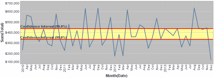
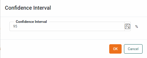
- Confidence Interval
-
For the ‘Confidence Interval’ option, enter a value as a percentage.
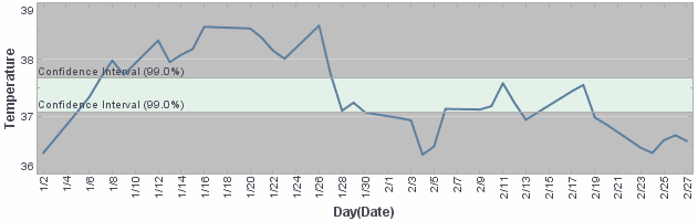
The resulting top and bottom confidence bounds indicate the interval of values in which the “true” value is expected to be found. For example, the “true” temperature in the chart below would be expected to fall within the displayed confidence interval in 99 out of 100 such samples. (In other words, the true temperature is expected to be outside the confidence bounds purely by chance in 1 out of 100 samples.)
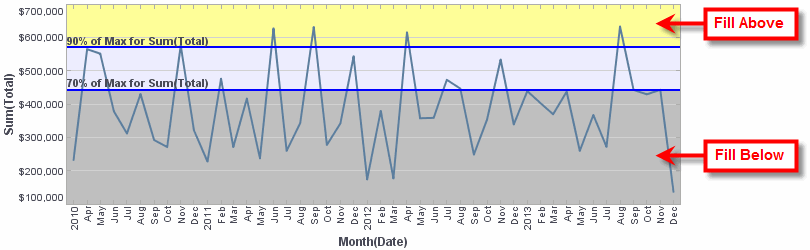
- Percentages
-
For the ‘Percentages’ option, enter a value or comma-separated list of values as percentages. In the ‘Of’ field, specify the basis on which the percentage should be computed. You can type a fixed value or select from the following presets: ‘Average’, ‘Minimum’, ‘Maximum’, ‘Median’, ‘Sum’.
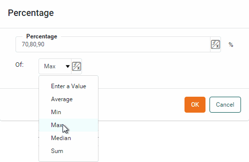
For example, to display percentage lines at 70% and 90% of the Maximum, enter
70,90in the ‘Percentages’ field and select the ‘Maximum’ option from the ‘Of’ field.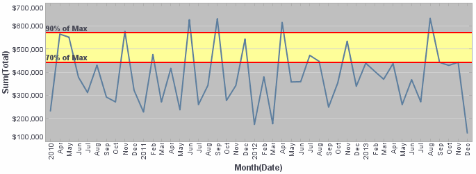
- Percentiles
-
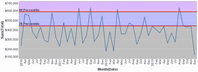
For the ‘Percentiles’ option, enter a value or comma-separated list of values as percentages.
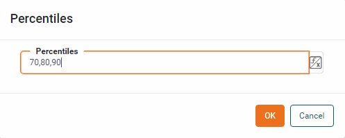
The resulting percentile lines indicate the levels below which the specified percentages of values are found. For example, percentile lines at 70% and 90% (
70,90in the ‘Percentages’ field) designate the levels, respectively, below which 70% and 90% of the data are found. - Quantiles
-
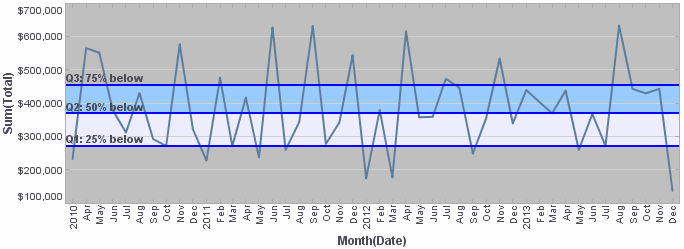
For the ‘Quantiles’ option, enter the number of quantiles to display.
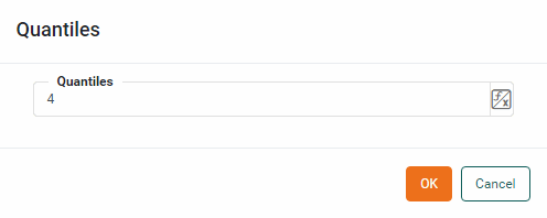
The resulting quantile lines are evenly distributed between 0% and 100% and indicate the levels below which the specified percentage of values are found. For example, enter
4as the ‘Number of Quantiles’ to generate lines designating the levels below which 25%, 50%, and 75% of the data are found. This creates four regions in the data: 0-25%, 25%-50%, 50%-75%, and 75%-100%.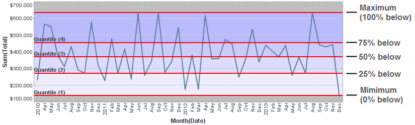
- Standard Deviation
-
For the ‘Standard Deviation’ option, enter a comma-separated list of factors. Each successive pair of factors represents, respectively, the lower and upper multipliers for the standard deviation.
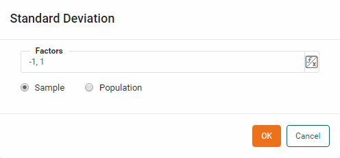
For example, enter
-1,1,-2,2in the ‘Factors’ field to draw lines, respectively, at 1 standard deviation below the mean, 1 standard deviation above the mean, 2 standard deviations below the mean, and 2 standard deviations above the mean.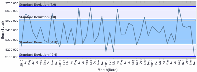
Select the ‘Sample’ option to compute the sample standard deviation or select the ‘Population’ option to compute the population standard deviation. (The distinction between sample and population standard deviation can be found in any Statistics reference.)
-
Optional: Enable the ‘Entire Chart’ option to compute the statistical values based on measure data from the entire chart. Disable the ‘Entire Chart’ option to compute the statistical values for each sub-chart based only on measure data from the same sub-chart.
Example 5. Effect of ‘Entire Chart’ optionThe following illustration demonstrates the effect of the ‘Entire Chart’ setting (‘Computation’ is set to ‘Standard Deviation’ in both cases).
Set the Label
-
From the ‘Label’ menu, select one of the following label options:
-
Select ‘Enter a Value’ to type custom labels for the statistical measures. Labels for individual lines should be separated by commas. For example, if you are generating the 4-quantile (which creates three lines), enter three labels separated by commas, for example:
Q1: 25% below, Q2: 50% below, Q3: 75% below
If you enter only a single label, this label will be attached to all the lines. This can be useful when you include customization codes in the label, as described below.
To enter a literal comma in the label, escape the comma with a backslash (e.g., Q1\,25% below, Q2\, 50% below, Q3\,75% below). -
Select ‘(Target Value)’ to insert the numerical value of the lines as the labels.
-
Select ‘(Target Formula)’ to insert the name of the computation method (e.g., ‘Quantile 1’, ‘Quantile 2’, etc.) as the label, if applicable.
-
Select ‘(Field Name)’ to insert the field name for the selected measure as the label, e.g., “Sum(Total)”.
-
-
Optional: To further customize the labels, press the ‘Edit’ button
next to the ‘Label’ field. This opens a panel in which you can manually enter the labels. Press the ‘Apply’ button when you have finished entering the labels.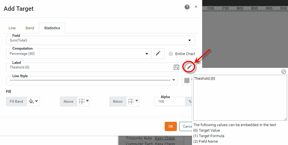
Labels for individual lines should be separated by commas. For example, if you are generating the 4-quantile (which creates three lines), enter three labels separated by commas, e.g.,
Q1: 25% below, Q2: 50% below, Q3: 75% below.To enter a literal comma in the label, escape the comma with a backslash (e.g., Q1\,25% below, Q2\, 50% below, Q3\,75% below).If desired, you can add the target value, target formula, and field name into a label by inserting the corresponding codes, such as {0}, {1}, {2} shown at the bottom of the panel. You can format the inserted values using custom tooltip syntax. (See Add Tips to a Chart.)
Example 6. Insert target value, formula, or field into labelCustom Label Displays As {1} = {0,number,$#,##0}70% of Max = $383,485
{1} for monthly {2}70% of Max for monthly Sum(Total)
The customized label supersedes any previous selection from the ‘Label’ menu.
Set the Style
-
Select a ‘Line Style’ and ‘Line Color’ in which to display the statistical lines.
-
Optional: Press the ‘Fill Band’ button to open a color picker and select a set of colors for the specified bands (i.e., the regions between the statistical lines). Select one color for each band. The colors are applied to the bands from left to right; the left-most color is applied to the lowest band, and so on. When you have selected the desired colors, press the ‘Apply’ button
.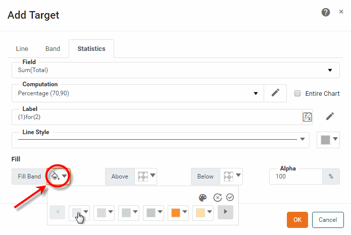
-
Optional: Select a ‘Fill Above’ color and ‘Fill Below’ color to fill the regions of the chart above and below the maximum and minimum statistical lines, respectively.
-
Press OK to close the dialog box.
By default, a statistical line appears on the chart even if its value is greater than the largest data point. This may sometimes cause the data points on the chart to be compressed into a small region of the plot area, which makes the chart difficult to read. To correct this, turn off the ‘Keep Element in Plot’ option in the ‘Chart Properties’ dialog box. See Chart Properties for more information.
Individual target lines are accessed in script as GraphForm objects. To remove a specific target line, use graph.removeForm(index). Indexing for all GraphForm objects begins at 0 and proceeds in the order that objects were added to the chart. To remove all target lines, use clearTargets().
|
Add a Trend Line
Watch Video: Creating a Chart (Add Trend Lines)
This video might show an earlier version of the feature or operation that differs in minor ways from the current version.
To add a trend line (curve fit), follow the steps below:
-
Right-click on the chart and select ‘Properties’. Note: You can also access menu options from the ‘More’ button (
) in the mini-toolbar. This opens the ‘Chart Properties’ dialog box.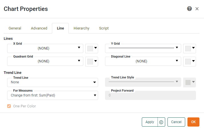
-
Under the Line tab, use the 'Trend Line' menu to select the desired type of curve fit, such as Linear or Quadratic.
-
Use the ‘Trend Line Style’ menu and color chip to specify the trend line style and color. The ‘Default’ option indicates that the style should match the corresponding measure line.
If there are multiple measures or if there is a dimension associated with the chart’s ‘Color’ binding, select the ‘One Per Color’ option to create an independent trend line for each color group. The trend line colors are matched to the corresponding data colors unless you explicitly specify a trend line color. In that case, all trend lines share the same color.
What is a measure? What is a dimension?
A measure is generally used for aggregation, for example summation, averaging, correlation, etc., within a Crosstab, Chart, Text component, or Gauge. Adding a measure to the ‘Y’ region in a chart displays the computed aggregates by using locations on the Y-axis. Adding a measure to the ‘X’ region displays the computed aggregates by using locations on the X-axis. You can also display aggregates by using color, shape, size, or label.
A dimension is used to break-down the dataset into multiple groups, often within a Crosstab, Chart, or Selection List. Adding a dimension to the ‘X’ region of a Chart distinguishes the different dimension groups by location on the X-axis. Adding a dimension to the ‘Y’ region distinguishes the different dimension groups by location on the Y-axis. You can add multiple dimensions into the ‘X’ or ‘Y’ regions of a Chart, or into the ‘Rows’ or ‘Columns’ regions of a Crosstab, to create multiple grouping levels. You can also distinguish groups in a dimension by using color, shape, size, or label in a Chart.
-
Optional: To enable simple forecasting based on historical patterns, you can extrapolate the trend line to the right. To do this, use the ‘Project Forward’ field to enter the number of axis units that the trend line should extend beyond the final data point.
Projection requires that axis values be a linear and complete series of either numbers or dates. Projection is not available for the following chart types: Waterfall, Pie, 3D Pie, Radar, Filled Radar, Map. It is also not available for the following data types: String, Boolean. -
If there are multiple measures on the Chart, use the ‘For Measures’ menu to select the individual measures that should display the specified trend line.
See Chart Properties for full information about available plot properties.
The sample Marketing Lead Trends Dashboard provides an example of trend lines.
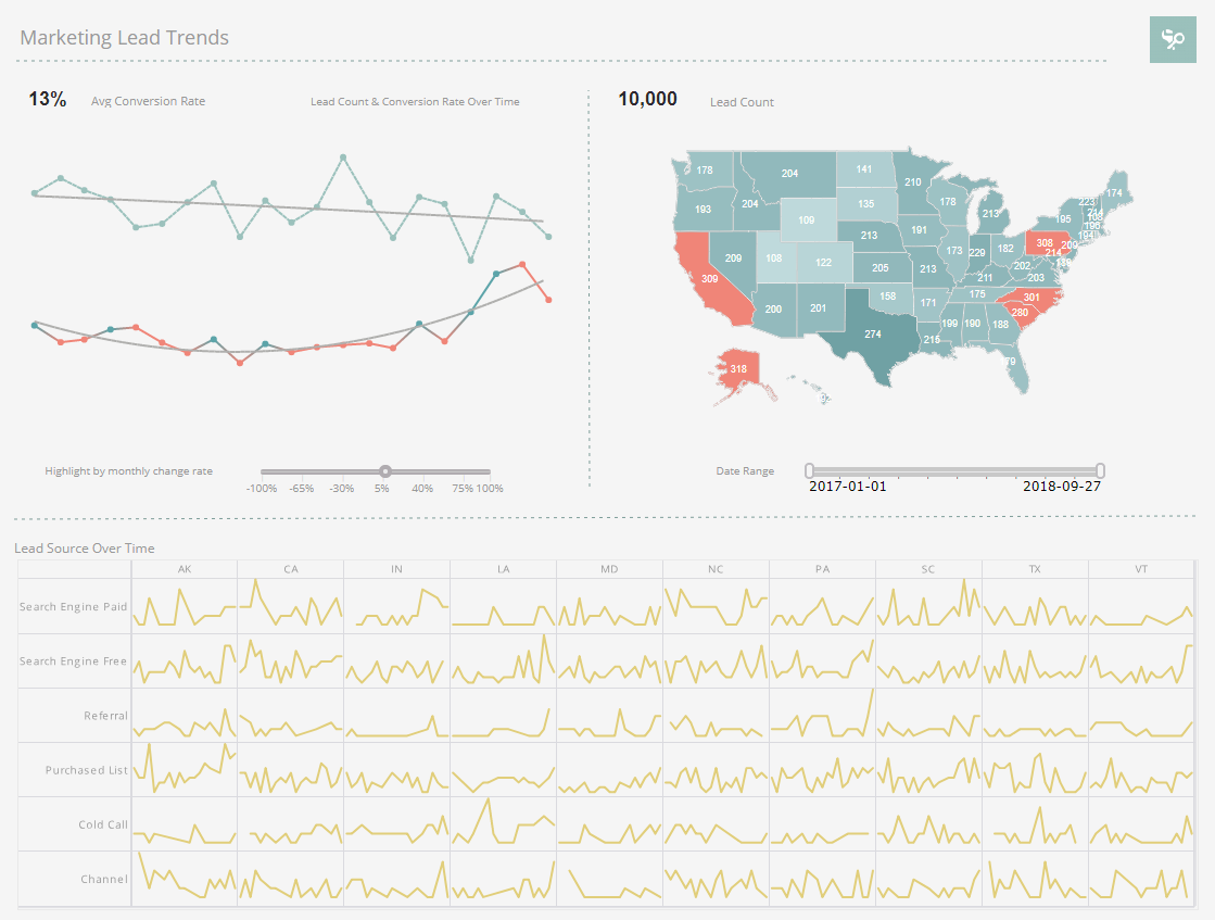
To explore this sample Dashboard, download and import the Marketing Lead Trends Dashboard into your environment. (This requires access to Enterprise Manager.) See Import and Export Assets for instructions on how to import.