Dashboard Options
You can set global options for a Dashboard from the ‘Dashboard Options’ dialog box in Visual Composer. To open the ‘Dashboard Options’ dialog box, press the ‘Options’ button  in the toolbar.
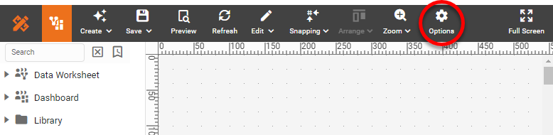
You can also right-click in an empty location on the Dashboard, and select ‘Options’ from the context menu.
Options Tab
The Options tab of the ‘Dashboard Options’ dialog box provides the following settings:
- Data Source
-
The Data Worksheet, data model, or table to which the current Dashboard is linked. Press Select to choose a data source. Data Worksheets are listed under the ‘Data Worksheet’ and ‘Private Data Worksheet’ nodes. The Dashboard will have access to all of the data blocks in the selected Data Worksheet. Queries, data models, and database tables are listed under the ‘Data Source’ node. The Dashboard has access to all of the fields in the selected asset.
If a Dashboard contains components that are already bound to a data source, those components will stop functioning when you change the Dashboard data source. However, the components will remain functional if the tables and columns in the new data source are named identically to the tables and columns in the old data source. - Convert Source to a Data Worksheet
-
Converts the existing data source to a new Data Worksheet named “Dashboard_Name Worksheet”. The Dashboard will subsequently use this Data Worksheet as the data source.
- Use Metadata
-
Suppress the display of live data to help speed Dashboard design. With ‘Use Metadata’ enabled, data-view and filter components in the design view display meta-data rather than the actual data. (This can be helpful when the Dashboard creates long-running queries or when the data source is not immediately available.)
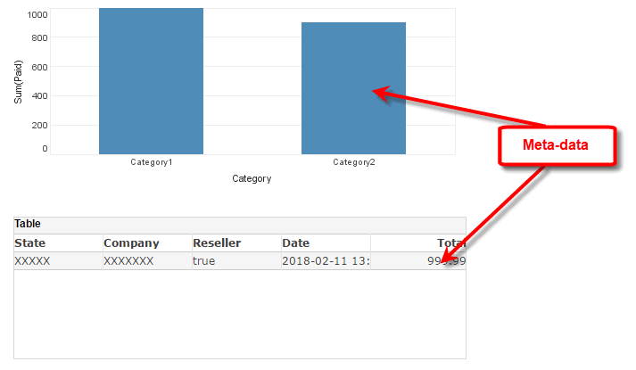
While metadata view can be useful for layout purposes, Filter components such as Selection Lists and Calendars will not function normally because they do not have access to the data.
If you press the Cancel button in the Dashboard loading dialog box, the Dashboard is automatically displayed in meta-data mode. - Prompt for parameters
-
Enables user prompting for any parameters defined in the linked data source. Disable ‘Prompt for parameters’ to completely suppress prompting. This may be necessary when parameter values are being supplied from another source (script, hyperlink, session data, etc.) and the user should therefore not be prompted to enter values.
Press the Customize button to selectively disable prompting for certain parameters or to set the display order for parameters. (If disabled parameters are used within filter conditions, the corresponding filter conditions are dropped.) See Add Conditions for more information.
- Selection Association
-
Specifies that selections the user makes in one Filter component (Selection List, Selection Tree, etc.) should be reflected in the values shown within other Filter components (e.g., by highlighting values included in result set, hiding incompatible values, etc.). Disabling this feature may improve performance for Dashboards that have a very large number of filters.
- Max Rows Warning
-
When selected, provides a warning to the user that results have been truncated due to a maximum row setting. The warning will also be printed on exported Dashboards whose results have been truncated. See Data Block Properties to configure the row maximum.
- Create MV On-demand
-
Specifies that a new materialized view should be automatically created on-the-fly if the Dashboard does not have an existing materialized view, either because the materialized view was never populated with data or because the Dashboard underwent modifications that rendered an existing materialized view unusable. The materialized view will supply data to the Dashboard both at design time and at runtime. (This option must be enabled by an administrator.)
- Design mode sample data size
-
Limits the number of records retrieved by a Dashboard in design mode.
- Snap Grid
-
Number of pixels defining the snap increment for the ‘Snap to Grid’ feature. See Snap Components for more details.
- Alias
-
Specifies a designation to be used in place of the actual Dashboard name. The alias replaces the Dashboard name in all contexts except the Repository tab and the ‘Export Assets’ page in Enterprise Manager. These always display the actual Dashboard name.
- Description
-
A description for the Dashboard. The description appears as a tooltip when the user hovers the mouse over the Dashboard in the Portal tree.
For Test Drive and Visualize Free, the description appears in the Dashboard information panel. - Server-Side Update
-
Automatically refreshes Dashboard data at the period specified by the ‘Refresh Interval’. To customize the refresh behavior, see Customize Server-Side Update. If a materialized view has been created for the Dashboard, server-side update is inactive. (See Materialized View for more information on materialized views.)
- List on Portal Tree
-
Determines whether the current Dashboard will be visible in the User Portal, subject to permissions set by administrator.
Watch Video: Add Drill Down Hyperlinks (Hide Detail Dashboard)
This video might show an earlier version of the feature or operation that differs in minor ways from the current version.
Filters Tab
The Filters tab of the ‘Dashboard Options’ dialog box allows you to specify the manner in which selection elements in different Dashboards should interact within the Portal. See Modularize a Dashboard for more information.
Layout Tab
The Layout tab of the ‘Dashboard Options’ dialog box provides the following settings:
- Target Screen
-
Displays a dashed border of the specified pixel dimensions on the Dashboard to assist with Dashboard sizing.
By laying out the Dashboard components within these border lines, you can ensure that the Dashboard will fit within a screen of the specified dimensions. See Create a Device Layout for a more flexible method of adapting the Dashboard to specific devices.
- Scale to Screen
-
When enabled, scales the Dashboard to the browser window so that all components are visible without scrolling. This applies only to the “Master” layout. To set scaling for other layouts, see Create a Device Layout.
- Fit to Width
-
When enabled, scales the Dashboard to the full width of the browser window. The Dashboard height is scaled proportionally to the width and may therefore exceed the height of the window. (A vertical scroll bar is provided in this case.) This applies only to the “Master” layout. To set scaling for other layouts, see Create a Device Layout.
- Balance Padding
-
Adds uniform margins to the Dashboard by padding the right and bottom of the Dashboard to match the padding on the left and top.
- Layout
-
Specifies the page or screen layout for the Dashboard. See Create a Device Layout for more information.
Localization Tab
The Localization tab allows you to identify Dashboard elements that should be translated into one or more languages based on user locale. See Localize a Dashboard for more information.
Script Tab
The Script tab allows you to create scripts that will execute whenever the Dashboard initializes or reloads. See Add Dashboard-Level Script for more information.