Access Chart Data
You can access Chart data in scripts by referencing the Chart’s data property. The data object contains the aggregate values displayed on the Chart (the same values shown by the ‘Show Summary Data’ button  in a Dashboard Chart). The
 data object is accessible as a two-dimensional array, where each column represents a distinct dataset (measure). The first column of the array, data[i][0], contains the X-axis labels. The first row of the array, data[0][i], contains the dataset or measure titles.
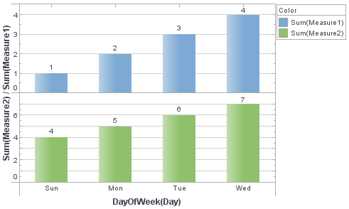
For example, consider a chart with two aggregated datasets (measures), as shown below:
The data object provides access to these aggregate values as the following array:
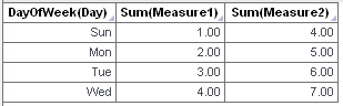
data[0][0] = 'DayOfWeek(Day)'
data[0][1] = 'Sum(Measure1)'
data[0][2] = 'Sum(Measure2)'
data[1][0] = 'Sun'
data[1][1] = 1
data[1][2] = 4
data[2][0] = 'Mon'
data[2][1] = 2
data[2][2] = 5
etc.
You can index the datasets (columns) numerically, table[1][2], or by using the dataset name, table[1]['Sum(Measure2)']. You can also use more complex formula table syntax; see data in Chart Script Reference.
In this example, add a script to display data values on the chart only if the measure falls below a certain threshold.
-
Create a new Dashboard. Select the ‘Sales Explore’ Data Worksheet as the data source. (See Create a New Dashboard.)
The 'Sales Explore' Data Worksheet can be found in . You may need to download the examples.zip file from GitHub into your environment. (This requires access to Enterprise Manager.) See Import and Export Assets for instructions on how to import. -
Add a new Chart component to the Dashboard. Press the ‘Edit’ button
 on the Chart to open the Chart Editor.
 -
Bind the ‘Category’ field of the ‘Sales Explore’ Data Worksheet to the X-axis.
-
Bind both ‘Total’ and ‘Quantity Purchased’ fields of the ‘Sales Explore’ Data Worksheet to the Y-axis. This creates a facet chart with two sets of axes. Resize the chart to show all data.
-
Open the Chart Script Editor: Right-click the Chart and select ‘Properties’ from the context menu. This opens the ‘Chart Properties’ panel. Select the Script tab.
-
Add the following script:
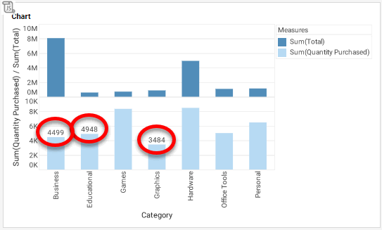
var threshold = 5000; // Step through the rows of chart data with index i for (var i = 1; i < table.length; i++) { // Obtain the ith value of 'Category' and 'Quantity' var Xvalue = data[i][0]; var Yvalue = data[i]['Sum(Quantity Purchased)']; // Test the value of Quantity against the threshold if(Yvalue < threshold) { // Create the label object var form = new LabelForm(); // Set the label to appear only on Quantity axes form.setMeasure('Sum(Quantity Purchased)') // Set the label text form.setLabel(Yvalue); // Set the label position and alignment form.setValues([Xvalue,Yvalue]); form.setAlignmentX(Chart.CENTER_ALIGNMENT); // Add the label to the graph graph.addForm(form) } } -
Press OK to close the Script Editor.
-
Press the ‘Preview’ button
 to preview the Dashboard. Observe that values are shown for groups that have totals falling below the threshold of 5000.