Group Data by Dimension
Watch Video: Grouping Data in a Dashboard (Group Using Color, Shape, Size)
This video might show an earlier version of the feature or operation that differs in minor ways from the current version.
To group data on a chart by using chart axis labels or color, shape, size, or text, see Basic Charting Steps. The following sections explain some special ways of grouping chart data.
| To perform calculations and create aggregates based on grouped data, see Create a New Data Field. |
Group by Color
To group using color, follow the steps below:
-
Drag the dimension that you want to group from the data source panel to the ‘Color’ field in the bottom left panel.
What is a dimension?
A dimension is used to break-down the dataset into multiple groups, often within a Crosstab, Chart, or Selection List. Adding a dimension to the ‘X’ region of a Chart distinguishes the different dimension groups by location on the X-axis. Adding a dimension to the ‘Y’ region distinguishes the different dimension groups by location on the Y-axis. You can add multiple dimensions into the ‘X’ or ‘Y’ regions of a Chart, or into the ‘Rows’ or ‘Columns’ regions of a Crosstab, to create multiple grouping levels. You can also distinguish groups in a dimension by using color, shape, size, or label in a Chart.
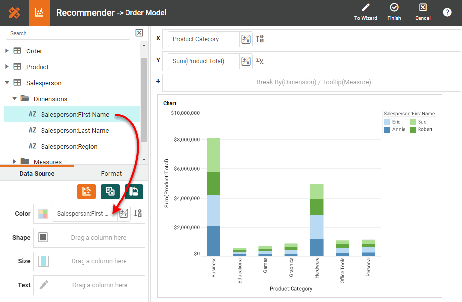
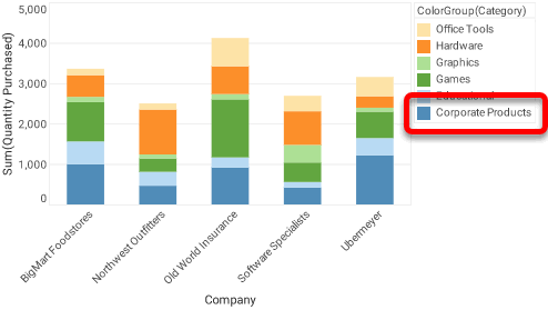
This distinguishes the different values by color and adds a color legend to the chart. (See Modify Chart Legend for information about modifying the legend.) Set the ‘Stack’ option for the chart if you want to display the groups stacked vertically. See Basic Charting Steps for more information.
-
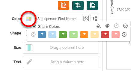
Optional: Press the ‘Edit’ button next to the ‘Color’ field.This opens the color panel.
-
Optional: Press the ‘Select Palette’ button
 to open the ‘Select Palette’ dialog box.
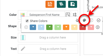
-
Optional: Choose the desired palette from the ‘Select Palette’ menu. If desired, select the ‘Reverse’ option to reverse the order of the palette colors. Press OK.
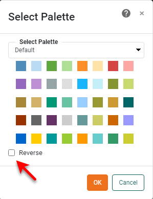
If the selected palette does not contain enough colors to represent all the distinct data groups, additional groups will be represented by colors from previously selected palettes or from the default palette.
-
Click on the color chips to create the desired color order. (Colors are assigned to values from left to right.) To reset the color order, press the ‘Reset’ button
 on the color menu.
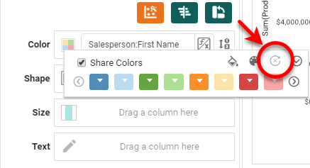
-
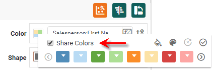
Optional: Synchronize the color mapping with other charts, or create a custom color mapping. Follow the steps below:
-
To ensure that this chart assigns the same colors to values as other charts in the Dashboard, enable the ‘Share Colors’ option.
All charts that have ‘Share Colors’ enabled will apply the same colors to values in the following cases:
-
The values are drawn from columns having the same column name (from any data source).
-
The values are drawn from data model attributes having the same name (from any entity in any data model).
For example, colors for values taken from attribute ‘Customer:State’ will be synchronized with values taken from attribute ‘Company:State’ across all charts.
Colors remain synchronized across all charts when any filtering or sorting is applied. -
-
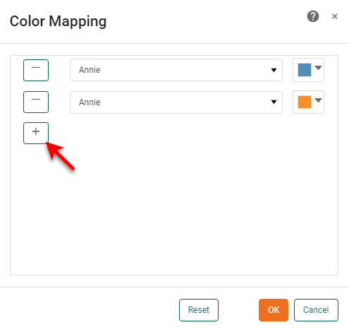
Optional: To manually assign custom colors to values, press the ‘Assign Fixed Mapping’ button
 to open the ‘Color Mapping’ dialog box.
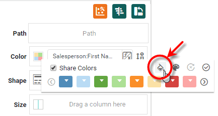
-
In the ‘Color Mapping’ dialog box, press the ‘Add Row’ + button to add a new value, and use the color swatch to set a fixed color for that value. Press the ‘Delete Row’ - button to remove a mapping.
-
-
Press ‘OK’.
-
Press the ‘Apply’ button
 to apply the color setting.
Group by Shape
| Color, Shape, Size in Multiple Measure Chart to edit the shapes used for measures. |
To group using shape, follow the steps below:
-
Drag the dimension that you want to group from the data source panel to the ‘Shape’ field in the bottom left panel.
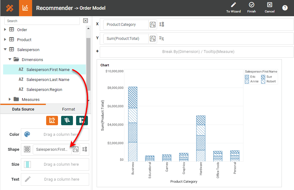
This distinguishes the different values by shape and adds a shape legend to the chart. (See Modify Chart Legend for information about modifying the legend.) Set the ‘Stack’ option for the chart if you want to display the groups stacked vertically. See Basic Charting Steps for more information.
What is a dimension?
A dimension is used to break-down the dataset into multiple groups, often within a Crosstab, Chart, or Selection List. Adding a dimension to the ‘X’ region of a Chart distinguishes the different dimension groups by location on the X-axis. Adding a dimension to the ‘Y’ region distinguishes the different dimension groups by location on the Y-axis. You can add multiple dimensions into the ‘X’ or ‘Y’ regions of a Chart, or into the ‘Rows’ or ‘Columns’ regions of a Crosstab, to create multiple grouping levels. You can also distinguish groups in a dimension by using color, shape, size, or label in a Chart.
-
Optional: Press the ‘Edit’ button next to the ‘Shape’ field. This opens the shape panel.
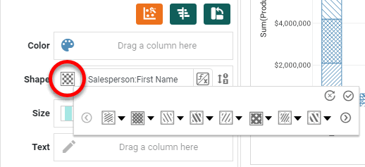
The available shape options vary depending on the Chart type. -
Click on the shape chips to create the desired shape order. (Shapes are assigned to values from left to right.) To reset the shape order, press the ‘Reset’ button
on the shape menu.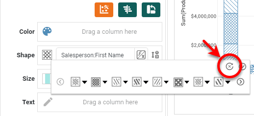
-
Optional: To upload a custom image to use as a shape, press the ‘Add Shape’ button
 , and select the desired file.
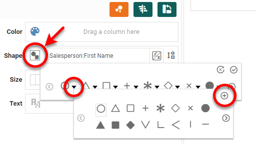
An administrator can make custom shapes available by placing the image files (png, gif, jpg, svg) in the portal/shapes directory. (See Look and Feel and Storage for information on how to upload a file to this location.) The icons are sorted alphabetically by file name. Custom shape images can be any size, and are scaled according to the ‘Size’ setting in the Chart Editor. -
Press the ‘Apply’ button
to apply the shape setting.
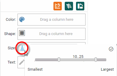
Group by Size
To group using size, follow the steps below:
-
Drag the dimension that you want to group from the data source panel to the ‘Size’ field in the bottom left panel.
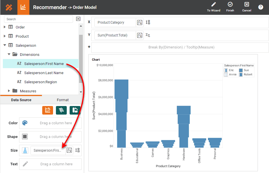
This distinguishes the different values by size and adds a size legend to the chart. (See Modify Chart Legend for information about modifying the legend.) Set the ‘Stack’ option for the chart if you want to display the groups stacked vertically. See Basic Charting Steps for more information.
What is a dimension?
A dimension is used to break-down the dataset into multiple groups, often within a Crosstab, Chart, or Selection List. Adding a dimension to the ‘X’ region of a Chart distinguishes the different dimension groups by location on the X-axis. Adding a dimension to the ‘Y’ region distinguishes the different dimension groups by location on the Y-axis. You can add multiple dimensions into the ‘X’ or ‘Y’ regions of a Chart, or into the ‘Rows’ or ‘Columns’ regions of a Crosstab, to create multiple grouping levels. You can also distinguish groups in a dimension by using color, shape, size, or label in a Chart.
-
Optional: Press the ‘Edit’ button next to the ‘Size’ field. This opens the size panel. Use the slider to set the desired size range.
-
Press the ‘Apply’ button
to apply the size setting.
Group by Text
To group using text labels, follow the steps below:
-
Drag the dimension that you want to group from the data source panel to the ‘Text’ field in the bottom left panel.
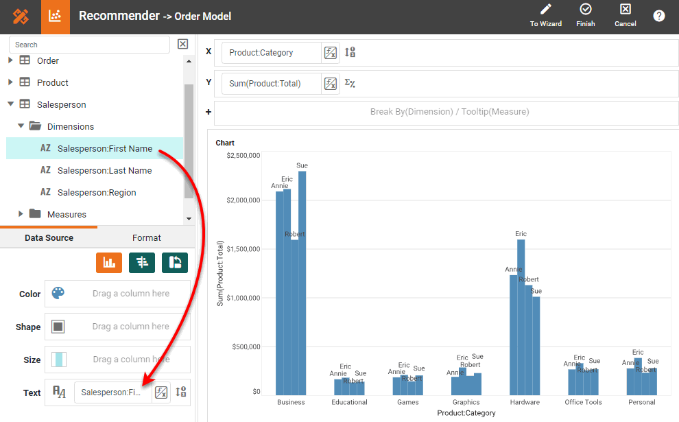
This distinguishes the different values by label. Set the ‘Stack’ option for the chart if you want to display the groups stacked vertically. See Basic Charting Steps for more information.
What is a dimension?
A dimension is used to break-down the dataset into multiple groups, often within a Crosstab, Chart, or Selection List. Adding a dimension to the ‘X’ region of a Chart distinguishes the different dimension groups by location on the X-axis. Adding a dimension to the ‘Y’ region distinguishes the different dimension groups by location on the Y-axis. You can add multiple dimensions into the ‘X’ or ‘Y’ regions of a Chart, or into the ‘Rows’ or ‘Columns’ regions of a Crosstab, to create multiple grouping levels. You can also distinguish groups in a dimension by using color, shape, size, or label in a Chart.
-
Optional: Press the ‘Edit Text’ button
 next to the ‘Text’ field to change the formatting of the text. This opens the top Format panel.
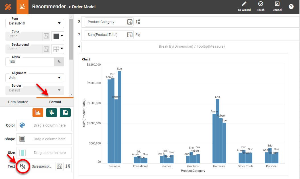
-
Press the ‘Apply’ button
to apply the formatting.
Group Dates by Week, Month, Year, Quarter, etc.
Watch Video: Grouping Data in a Dashboard (Date Grouping in Chart)
This video might show an earlier version of the feature or operation that differs in minor ways from the current version.
-
Open the Chart Editor. (Press the ‘Edit’ button
 at the top-right corner of the chart.)
 -
For a date dimension, press the ‘Edit Dimension’ button
 next to the field name in the Chart Editor, and set the ‘Level’ to the desired date grouping. Then press the ‘Apply’ button .
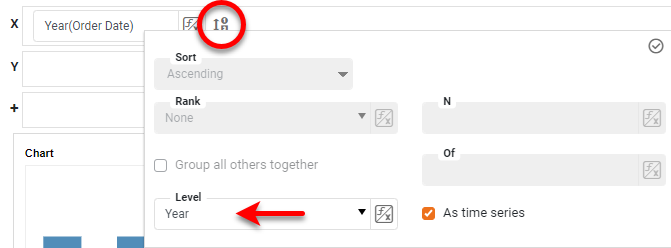
What is a dimension?
A dimension is used to break-down the dataset into multiple groups, often within a Crosstab, Chart, or Selection List. Adding a dimension to the ‘X’ region of a Chart distinguishes the different dimension groups by location on the X-axis. Adding a dimension to the ‘Y’ region distinguishes the different dimension groups by location on the Y-axis. You can add multiple dimensions into the ‘X’ or ‘Y’ regions of a Chart, or into the ‘Rows’ or ‘Columns’ regions of a Crosstab, to create multiple grouping levels. You can also distinguish groups in a dimension by using color, shape, size, or label in a Chart.
-
Press the ‘Apply’ button
to apply the grouping.
Merge Chart Labels into Larger Groups
Watch Video: Grouping Data in a Dashboard (Combine Groups in Chart)
This video might show an earlier version of the feature or operation that differs in minor ways from the current version.
You can agglomerate data from different chart groups (axis groups, legend groups) into larger categories called named groups. For example, you can combine X-axis labels designating individual states MA, CT, NY, NJ, etc., into larger groups such as ‘New England’ and ‘Mid-Atlantic’.
| Named groups cannot be defined for date fields. |
To create named groups for chart axis labels or legend labels, follow the steps below:
-
Hold the Ctrl and click to select the individual axis labels or legend labels that you want to combine into a single group.
-
Right-click on one of the selected labels, and choose ‘Group Items’ from the context menu. Note: You can also access menu options from the ‘More’ button (
 ) in the mini-toolbar. This opens the ‘Group Name’ dialog box.
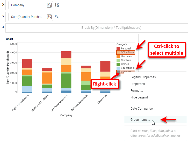
You can group existing named groups to make larger groups. -
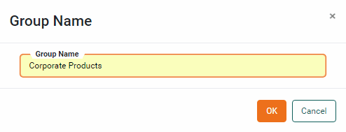
Enter a name for the new group in the ‘Group Name’ dialog box, and press OK.
This agglomerates the data corresponding to the original labels and replaces the original labels with the named grouping label.
-
Repeat the above steps to add additional named groups.
In the following example, you will create a chart that displays total sales by state. You will then group the states into one of six standard regions: New England, Mid-Atlantic, Midwest, South, Mountain, and Pacific. Follow the steps below:
-
Create a new Dashboard based on the ‘Sales Explore’ Data Worksheet. (See Create a New Dashboard.)
The 'Sales Explore' Data Worksheet can be found in . You may need to download the examples.zip file from GitHub into your environment. (This requires access to Enterprise Manager.) See Import and Export Assets for instructions on how to import. -
Drag a Chart element from the Toolbox panel into the Dashboard.
-
Press the ‘Edit’ button
on the Chart to open the Wizard. Press the ‘Full Editor’ button at the top right to open the Chart Editor. -
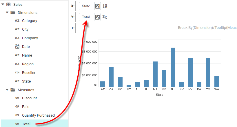
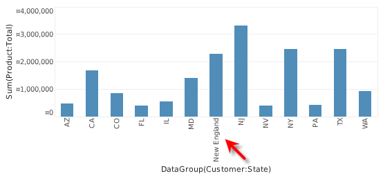
Expand the ‘Sales’ data block. From the ‘Dimensions’ node, drag the ‘State’ field to the ‘X’ region of the Chart Editor.
-
From the ‘Measures’ node, drag the ‘Total’ field to the ‘Y’ region.
-
Click the ‘CT’ label on the Chart’s X-axis to select it. Hold the Ctrl key and click on the ‘MA’ label to select it also.
-
Right-click on either of the selected labels, and choose ‘Group Items’ from the context menu.
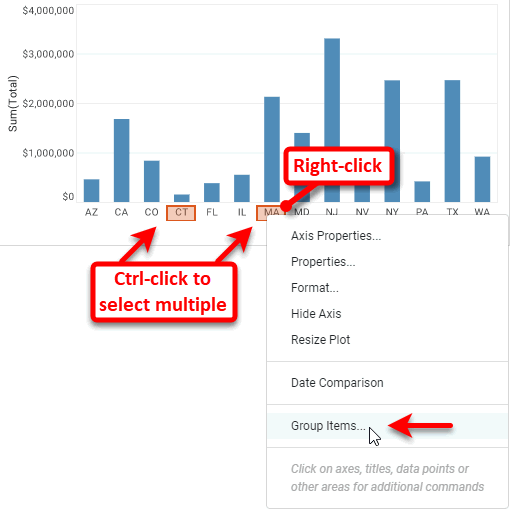
This opens the ‘Group Name’ dialog box.
-
In the ‘Group Name’ dialog box, enter the label for the new composite group: “New England”.
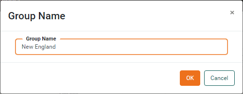
This adds ‘New England’ as a new X-axis label, and agglomerates the data from ‘MA’ and ‘CT’ into this new composite group.
-
Repeat the above steps to create the following additional named groups:
-
“Mid-Atlantic,” including states ‘NY’, ‘PA’, ‘NJ’.
-
“South,” including states ‘MD’, ‘TX’, ‘FL’.
-
“Mountain,” including states ‘AZ’, ‘CO’, ‘NV’.
-
“Pacific,” including states ‘CA’, ‘WA’.
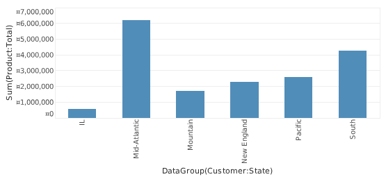
All states are now grouped into larger regions, except for ‘IL’, which belongs to the Midwest region. You cannot create a named group for ‘Midwest’ on the basis of a single label. Instead, if you need a group labeled ‘Midwest’, you can simply rename the ‘IL’ label as described in the next step.
-
-
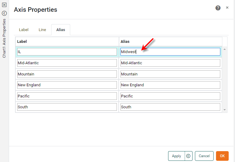
Optional: Rename the ‘IL’ label to “Midwest”. Follow the steps below:
-
Right-click the ‘IL’ label on the X-axis, and select ‘Axis Properties’ from the context menu. This opens the ‘Axis Properties’ panel.
-
In the ‘Axis Properties’ dialog box, select the Alias tab. Double-click in the ‘Alias’ column next to the ‘IL’ label, and enter the text “Midwest”.
-
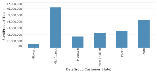
Press OK to close the dialog box. The Chart now displays all states grouped by region.
-
To rename an existing group, right-click the group label, and select ‘Rename’ from the context menu. Note: You can also access menu options from the ‘More’ button () in the mini-toolbar. Alternatively, select ‘Axis Properties’ or ‘Legend Properties’ from the context menu, and change the label’s alias on the Alias tab of the ‘Properties’ panel. (See Axis Properties or Legend Properties for more details.)
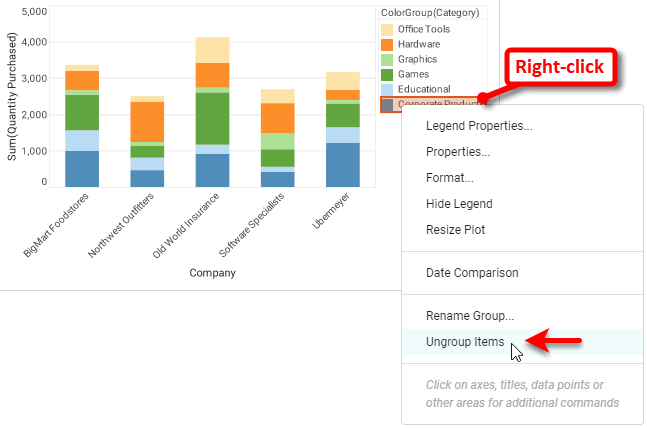
To decompose an existing named group, right-click on the group label and select ‘Ungroup Items’ from the context menu.
+
Rank Top or Bottom Chart Groups
Watch Video: Creating a Chart (Sort and Rank)
This video might show an earlier version of the feature or operation that differs in minor ways from the current version.
In some cases, you may want a chart to display only the top or bottom groups according to a selected measure. For example, "top five companies according to revenue". To do this, set a ranking filter for the dimension.
What is a dimension?A dimension is used to break-down the dataset into multiple groups, often within a Crosstab, Chart, or Selection List. Adding a dimension to the ‘X’ region of a Chart distinguishes the different dimension groups by location on the X-axis. Adding a dimension to the ‘Y’ region distinguishes the different dimension groups by location on the Y-axis. You can add multiple dimensions into the ‘X’ or ‘Y’ regions of a Chart, or into the ‘Rows’ or ‘Columns’ regions of a Crosstab, to create multiple grouping levels. You can also distinguish groups in a dimension by using color, shape, size, or label in a Chart. |
What is a measure?A measure is generally used for aggregation, for example summation, averaging, correlation, etc., within a Crosstab, Chart, Text component, or Gauge. Adding a measure to the ‘Y’ region in a chart displays the computed aggregates by using locations on the Y-axis. Adding a measure to the ‘X’ region displays the computed aggregates by using locations on the X-axis. You can also display aggregates by using color, shape, size, or label. |
To set a ranking filter for a dimension, follow the steps below:
-
Open the chart in the Chart Editor. (Press the ‘Edit’ button
at the top-right corner of the chart. If this opens the Visualization Recommender, press the ‘Full Editor’ button button at the top right of the Recommender to open the Chart Editor.) -
Press the ‘Edit Dimension’ button
next to the dimension for which you to apply the ranking filter.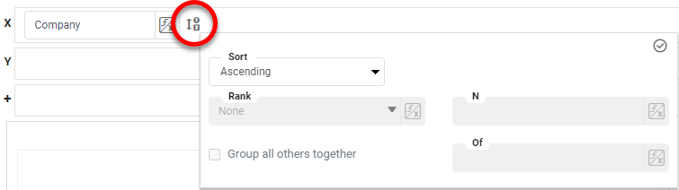
-
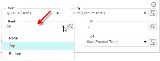
From the 'Ranking' menu, select 'Top' or 'Bottom', respectively, to select the top or bottom groups based on the measure you specify in the next step.
-
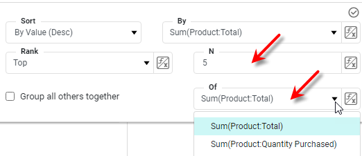
Enter the number of top or bottom groups to select, and choose the measure on which to rank the groups.
-
Optional: To sort the selected top or bottom groups in order of the aggregated measure, select an option from the 'Sort' menu: 'By Value (Asc)' or 'By Value (Desc)'. Then choose the measure on which to sort the groups.
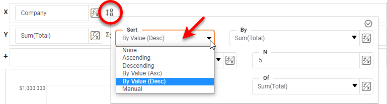
-
To specify an arbitrary sort order, select the ‘Manual’ option in the ‘Sort’ menu, and press the ‘Edit’ button
to open the ‘Manual Ordering’ dialog box. To reorder an item in the ‘Manual Ordering’ dialog box, select the item and press the ‘Up’ or ‘Down’ buttons. Press OK to close the dialog box.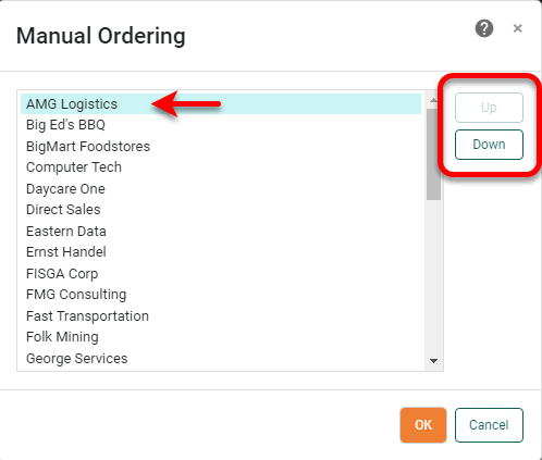
-
Enable ‘Group all others together’ to create an “Others” group representing an aggregate of the items that have not been ranked.
-
Press the ‘Apply’ button
to apply the ranking filter and sorting.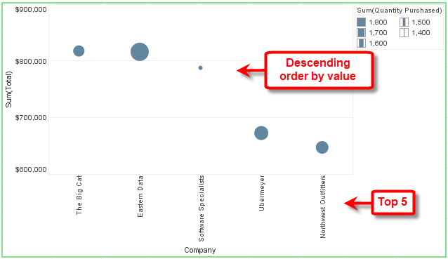
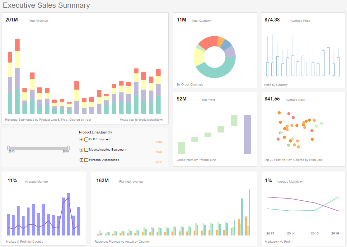
The sample Executive Sales Summary Dashboard provides anexample of top-N filtering (ranking).
To explore this sample Dashboard, download and import the Executive Sales Summary Dashboard into your environment. (This requires access to Enterprise Manager.) See Import and Export Assets for instructions on how to import.