bindingInfo.setCandleBindingField(arr)
| bindingInfo.getCandleBindingField(measure) to obtain existing binding information. |
Configure the binding for a Candle Chart. A candlestick chart displays four different measures, “low,” “high,” “opening,” and “closing,” and is most often used to plot trading information.
Parameter
- arr
-
Array of properties for a candle chart measure:
[field1,measure,formula,option,field2]The items in the array are described below:
Example
To create a candle chart that displays the average high, low, opening, and closing prices by quarter, follow the steps below:
-
Create a new Dashboard. (See Create a New Dashboard.)
-
Select the ‘Stock Prices’ query as the data source.
The 'Stock Prices' Data Worksheet can be found in . You may need to download the examples.zip file from GitHub into your environment. (This requires access to Enterprise Manager.) See Import and Export Assets for instructions on how to import. -
Add a new Chart component.
-
Enter the following script in the onRefresh handler of the Dashboard.
Chart1.query='Stock Prices';
Chart1.chartStyle = Chart.CHART_CANDLE;
var data_high = ["Stock Prices.High",Chart.HIGH,Chart.AVERAGE_FORMULA];
var data_low = ["Stock Prices.Low",Chart.LOW,Chart.AVERAGE_FORMULA];
var data_close = ['Stock Prices.Close/Last',Chart.CLOSE,Chart.AVERAGE_FORMULA];
var data_open = ['Stock Prices.Open',Chart.OPEN,Chart.AVERAGE_FORMULA];
Chart1.bindingInfo.xFields=[['Date',Chart.DATE]];
Chart1.bindingInfo.setGroupOrder('Date',Chart.QUARTER_INTERVAL);

Chart1.bindingInfo.setCandleBindingField(data_high);
Chart1.bindingInfo.setCandleBindingField(data_low);
Chart1.bindingInfo.setCandleBindingField(data_close);
Chart1.bindingInfo.setCandleBindingField(data_open);
Dashboard script that modifies bindingInfoshould generally be placed in the onRefresh handler. See Add Dashboard Script. -
Press the ‘Preview’ button
 to preview the chart.
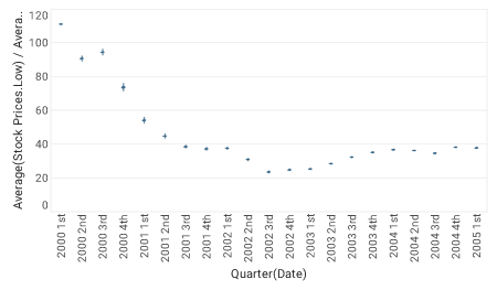
You can also use the ‘Zoom In’ button  to limit the date range.
-
To observe the structure of the Chart more closely, set a condition on the chart to limit the date range (e.g., limit to the year of 2004).
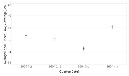
Note that for each quarter, the values of each of the measures (High, Low, Close/Last, Open) have been independently aggregated as specified by the corresponding formula parameter (in this case, Chart.AVERAGE_FORMULA for each). The “high” and “low” measures are represented by the extremes of the vertical line, and the “open” and “close” measures are represented, respectively, by the left and right horizontal lines.
| Typically, different formulas are used for the different measures. For example, max for the "high", min for the "low", first for the open, and last for the close. See Candle Chart for an example that uses this approach. |