Arrange Components
Watch Video: Creating a Dashboard (Position Components)
This video might show an earlier version of the feature or operation that differs in minor ways from the current version.
Because screen real estate is limited, it is often important to organize Dashboard components for maximum efficiency. There are a variety of ways that you can efficiently arrange components and combine multiple components to conserve screen real estate.
These methods often require selecting multiple components at the same time. See Select Components below for different approaches to making multiple selections.
Select Components
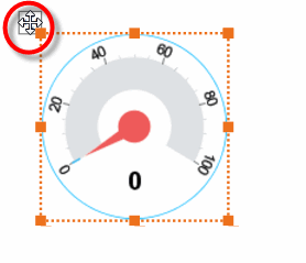
To select a single component on the Dashboard, click on the component with the mouse. This activates the component’s “move” handle and “resize” handles, which then allow you to position and size the component.
To simultaneously select multiple components on the Dashboard, use one of the following techniques.
| In some cases you may need to hold the Ctrl key and click on the component title bar or “move” handle to select or deselect the component. |
-
Hold the Ctrl key and click on each component in turn to add it to the selection. (Hold the Ctrl key and click an already-selected component to remove it from the selection.)
-
Hold the Shift key and click on each component in turn to add it to the selection. (Hold the Ctrl key and click an already-selected component to remove it from the selection.)
-
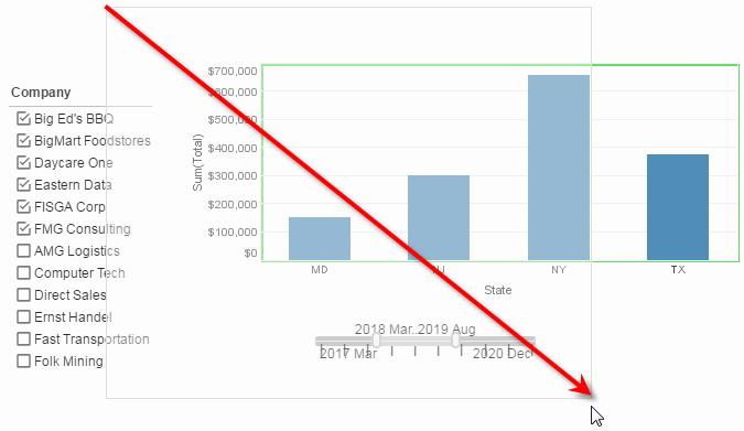
Click in an empty region of the Dashboard, and drag the mouse to draw a selection region (“lasso”) covering the desired components. When you release the mouse, all components that are partially or wholly covered by the selection region become selected.
You can also use these techniques in combination with each other.
For example, by dragging the mouse to create the selection region below, you can easily select all three components. You only need to include part of each component within the selection region.
Selecting multiple components allows you to move the components together, group the components, and set common properties (e.g., font).
Snap Components
Watch Video: Creating a Dashboard (Snap Objects)
This video might show an earlier version of the feature or operation that differs in minor ways from the current version.
When moving components on the Dashboard, you can choose to snap components to the grid or to other components. Press the ‘Snapping’ button  in the toolbar and select ‘Snap to Grid’ or ‘Snap to Objects’, or both. You can adjust the grid snapping interval from the ‘Options’ dialog box. See Dashboard Options for more information.
Group Components
When you need to position a set of components together, it is helpful to combine the components into a group. Grouped components are represented by a Container component. Components within a Container always retain their relative positions when the group is moved.
| Selection Containers cannot be grouped. |
To create a group, follow these steps:
-
Select the components you want to group into a Container. (See Select Components for different ways to select.)
You can also select existing groups to combine into a new Container. However, a Container component contains only individual components, not other Container components. Therefore, if you group together two existing groups, the existing Containers are deleted, and a single new Container is created to contain all the individual components from the two preexisting groups. -
Right-click any selected component, and choose ‘Group’ from the context menu.
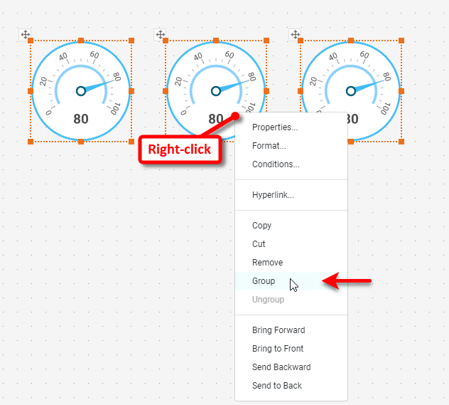
This creates a new Container component to group the selected components. The components within a Container remain fully functional, and you can adjust the component settings and properties in the usual manner.
You can select and move a component within the group in the normal manner. To move the group as a whole, click twice on a component within the group to select the whole group.
To undo a grouping, right-click the Container and select ‘Ungroup’ from the context menu.
Align and Distribute Components
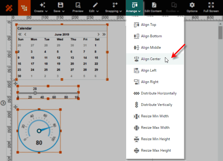
You can align, distribute, and match sizes of multiple components on the Dashboard. To align multiple components, first select the desired components. (See Select Components.) Then press the ‘Arrange’ button  on the toolbar and choose the desired alignment.
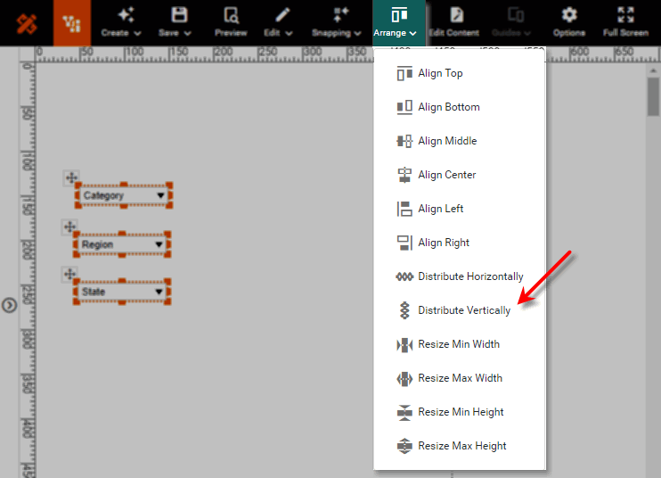
To distribute (equally space) multiple components, select the desired components and press the ‘Arrange’ button on the toolbar. Then choose the ‘Distribute Horizontally’ option  or ‘Distribute Vertically’ option
  .
.
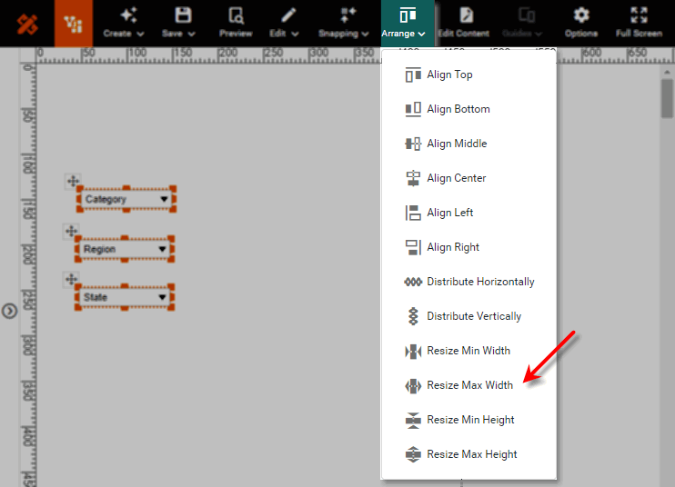
To match the sizes of multiple components, select the desired components and press the ‘Arrange’ button on the toolbar. Then choose the desired ‘Resize’ option.
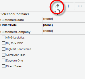
Combine Multiple Filters into a Selection Container
A Selection Container can display a variety of filter components such as Selection Lists and Range Sliders in a single region of the Dashboard. This is an effective way to package Filter components to save space on the screen.
To add filter components to a Selection Container, follow the steps below:
-
Drag a Selection Container component from the Toolbox panel onto the Dashboard. This creates an empty Selection Container element.
-
Drag a data field from the data source at the top of the Toolbox panel onto the Selection Container. (Use the green highlight to place the field as desired.)
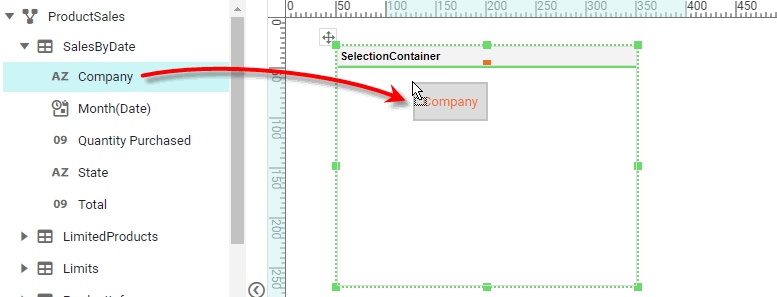
This adds the chosen field to the Selection Container as a Selection List (string field) or a Range Slider (numerical or date field).
You can also press the ‘Add Filter’ button  in the mini-toolbar to select the field to add.
-
Optional: Right-click on the Selection Container, and select ‘Properties’ from the context menu. Note: You can also access menu options from the ‘More’ button (
 ) in the mini-toolbar. This opens the ‘Selection Container Properties’ panel.
To permit the end-user to drag new fields from the Chart Editor to the Selection Container, enable ‘Allow User to Add/Remove Selections’. See Selection Container Properties for more information.
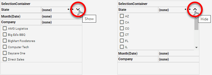
To display a selection component in a Selection Container, press the ‘Show’ button  in the selection component title bar. This expands the selection component and its toolbar. (See Use Filter Components for information on how to use these selection components.) To collapse a selection component in a Selection Container, press the ‘Hide’ button
  .
.
To clear the filters on all selection components in the Selection Container, press the ‘Unselect All’ button  in the Selection Container title bar.
See Selection Container Properties for information about additional Selection Container features.
Combine Multiple Components in a Tabbed Interface
A Tabbed Interface allows you to stack components onto distinct pages that are accessed by tabs. Since only one tab is visible at a time, this allows you to comfortably display many components in the same space on the Dashboard.
To create a tabbed interface, follow the steps below.
-
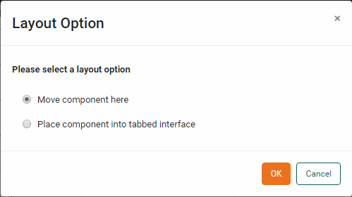
Drag and drop one component (or group) onto another component (or group). This opens the ‘Layout Option’ dialog box.
-
Choose the ‘Place component into tabbed interface’ option. This places the two components (or groups) into a tabbed interface.
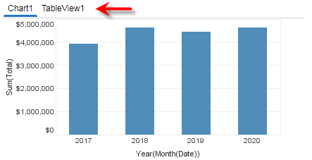
Note that each component is placed in the top-left corner within its own tab. To display a component at a different location within its tab, first group the component together with a background (e.g., an Image or Shape component), and then use the group as the contents of the tab. See Group Components for information on how to create a group.
To apply a unique style to the active (currently selected) tab, click on a tab to make it active, and then apply the desired styling from the Format panel. (See Tabbed Interface Properties for additional information.)
Pop or Tip a Component
In some cases, you may want display a component only when the user takes a specific action, and otherwise keep it hidden. There are several ways to do this:
-
Switch component visibility on and off. See Adapt Component Visibility below.
-
Make the component a Data Tip. A Data Tip displays the component (or group of components) only when the user hovers the mouse over another component, such as a Chart, and automatically filters the Data Tip component based on the hover region. The Data Tip component is displayed at the hover location, and otherwise remains hidden. See Add Tips to a Chart for more about how to use a Data Tip.
-
Make the component a Pop Component. This displays the component (or group of components) when the user clicks on a Text component. The component is displayed at the click location, and otherwise remains hidden. See Text Properties for more information.
Adapt Component Visibility
To hide a Dashboard component, set the ‘Visible’ property on the General tab of the Properties dialog box to ‘Hide’. See General Tab for more details.
Use Form controls to allow the user to selectively hide and show various components on the Dashboard. For example, you can provide a Form component that lets the user choose whether to see data displayed in a Table or Chart (by dynamically controlling the ‘Visible’ property of a Table and Chart that occupy the same space on the Dashboard). See Dynamically Set Properties for more information.
Adapt Component Data Display
Use Form controls to allow the user to modify the data displayed on data view components such as Charts or Crosstabs. For example, rather than adding several different Charts to the Dashboard, provide Form components that let the user choose from a set of dimensions and measures to display on a single Chart (by dynamically controlling the fields bound in the 'X' and 'Y' regions of the Chart Editor). See Dynamically Set Properties for more information.
Enable User Editing
Provide the user with access to the Chart Editor and Crosstab Editor so that the user can change the properties of a Chart or Crosstab to suit their own needs, thus eliminating the need for multiple Charts and Crosstabs. End-user access to these tools is enabled by default. See End-User Chart Control for more information.
Scale Components to the Screen
By default, a Dashboard is displayed in the Portal at the same size that you designed it. However, this may not be convenient for a user whose screen or browser window is significantly smaller or larger than the Dashboard dimensions. To address these issues, set the Dashboard to automatically scale to the user’s browser window.
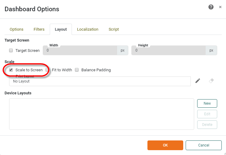
To enable Dashboard scaling, follow the steps below:
-
Press the ‘Options’ button
 in the Dashboard toolbar. This opens the 'Dashboard Options' dialog box.
-
Select the Layout tab.
-
Enable the ‘Scale to Screen’ option. This scales the Dashboard to the browser window so that all components are visible without scrolling.
-
Optional: Select ‘Fit to Width’ to scale the Dashboard to the full width of the browser window. In this case, the Dashboard height is scaled proportionally to the width and may exceed the height of the window. (A vertical scroll bar is provided in this case.)
-
Press OK to close the dialog box.
| If you want the Dashboard to appear with different layouts or with different sets of components for different viewing devices, see Create a Device Layout. If you specify such device layouts, then the ‘Scale to Screen’ option on the Layout tab applies only to the “Master” layout. |