Map Chart
Watch Video: Create a Custom Map (Create a Built-In Map)
This video might show an earlier version of the feature or operation that differs in minor ways from the current version.
You can use maps to display data either based on regional information (country, state, city, etc.) or based on latitude and longitude. For information on creating maps with user-defined regions, see Create a Custom Map in Manage the Server.
Display Data by Region
To display data on a map by region (state, city, zip code, etc.), follow the steps below:
|
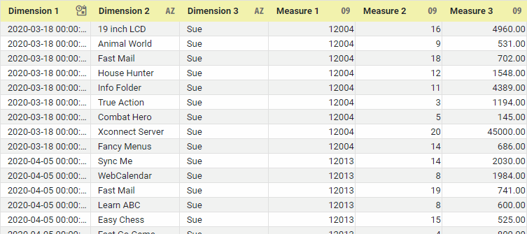
If you are new to charting, see the following sections first: Configure Your Data…The data source for the chart (data block or data model) should represent dimensions and measures as independent columns or fields, as shown below. See Prepare Your Data for information on how to manipulate your data, if it is not currently in this form. (Note: A properly designed data model will already have the correct structure.)
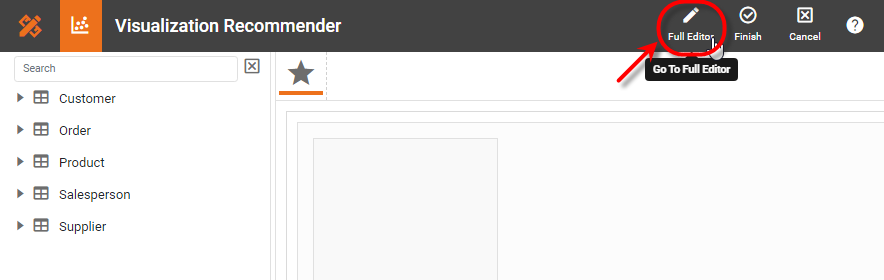
In some cases (e.g., Pie Chart), you may want your data to provide just a single measure. In other cases (e.g., Line Chart), you may want the data to supply multiple measures. If the data does not provide the correct number of measures, you may be able to alter the number of measures to suit the needs of the chart by “pivoting” or “unpivoting” the data. See Pivot Data in Prepare Your Data for more information about this procedure. Open a Chart for Editing…Watch Video: Create a Chart (Open the Chart Editor)This video might show an earlier version of the feature or operation that differs in minor ways from the current version. Follow the steps below to get started with a new Chart. See Basic Charting Steps for more details.
|
-
Press the ‘Select Chart Style’ button
 . Choose the ‘Map’ style. Press the ‘Apply’ button
  (or double-click the ‘Map’ icon).
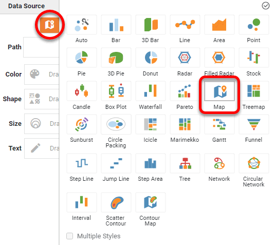
The Chart Editor now provides a ‘Geographic’ field.
-
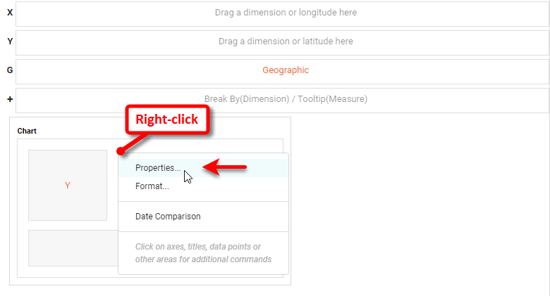
Optional: If you want to use a web map background (Mapbox map or Google Map, depending on what your administrator has configured), follow the steps below:
The Mapbox and Google Map APIs impose restrictions on the size of a map. If you see an error when you attempt to display the map background, resize the Chart to a smaller width. -
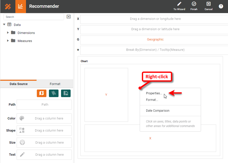
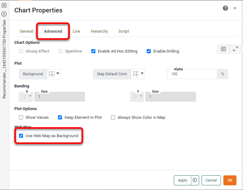
Right-click the Chart and select ‘Properties’. This opens the ‘Chart Properties’ dialog box.
-
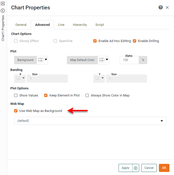
Under the Advanced tab, enable ‘Use Web Map as Background’ and press OK. (If this option is not available, ask your administrator to enable the Web Map feature.)
-
Optional: If your geographical field represents areas on the Chart (e.g., states) rather than points (e.g., cities), adjust the ‘Alpha’ setting to less than 100% so that the filled regions do not obscure the underlying map background.
-
Press OK to exit the ‘Chart Properties’ dialog box.
-
-
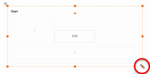
Mark the dimensions you want to use on the map as geographical fields. To do this, see Set a Geographical Field.
What is a dimension?
A dimension is used to break-down the dataset into multiple groups, often within a Crosstab, Chart, or Selection List. Adding a dimension to the ‘X’ region of a Chart distinguishes the different dimension groups by location on the X-axis. Adding a dimension to the ‘Y’ region distinguishes the different dimension groups by location on the Y-axis. You can add multiple dimensions into the ‘X’ or ‘Y’ regions of a Chart, or into the ‘Rows’ or ‘Columns’ regions of a Crosstab, to create multiple grouping levels. You can also distinguish groups in a dimension by using color, shape, size, or label in a Chart.
-
From the Data Source panel in the Chart Editor, drag a geographic dimension onto the ‘Geographic’ field in the Chart Editor.
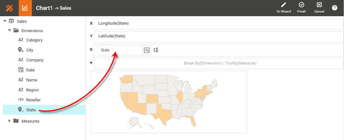
The chart updates to display the locations contained in the geographic field.
-
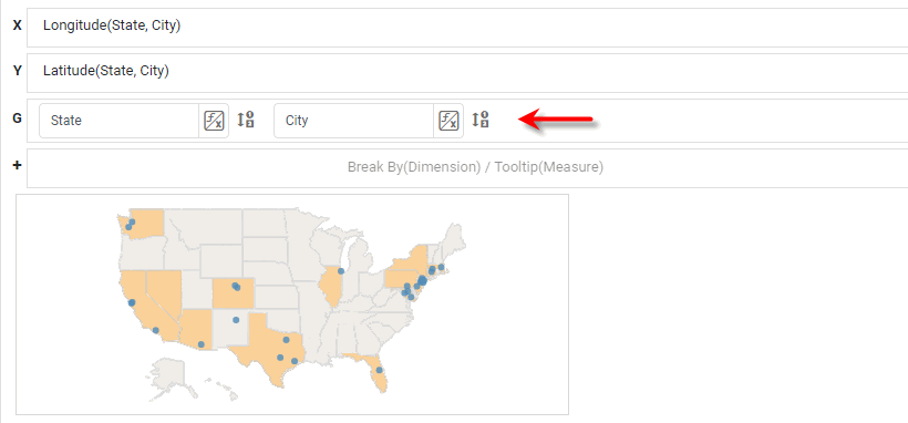
Repeat the previous step to bind additional ‘Geographic’ levels. For example, you can bind ‘City’ and ‘State’ fields.
-
From the Data Source panel, drag a measure onto one of the ‘Color’, ‘Shape’, ‘Size’, or ‘Text’ regions.
What is a measure?
A measure is generally used for aggregation, for example summation, averaging, correlation, etc., within a Crosstab, Chart, Text component, or Gauge. Adding a measure to the ‘Y’ region in a chart displays the computed aggregates by using locations on the Y-axis. Adding a measure to the ‘X’ region displays the computed aggregates by using locations on the X-axis. You can also display aggregates by using color, shape, size, or label.
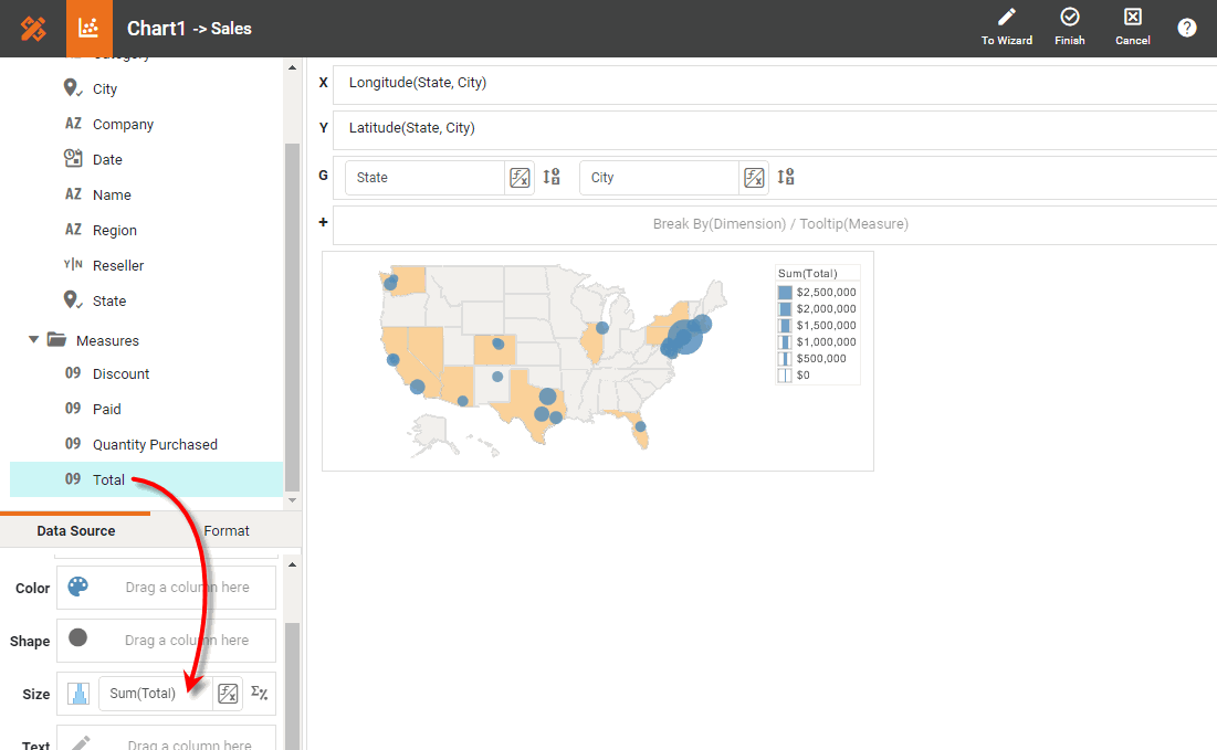
This displays the measure on the chart using the visual coding you selected (color, shape, or size), and automatically creates a corresponding legend.
-
Press the ‘Edit Measure’ button
 , and select the desired aggregation method for the measure.
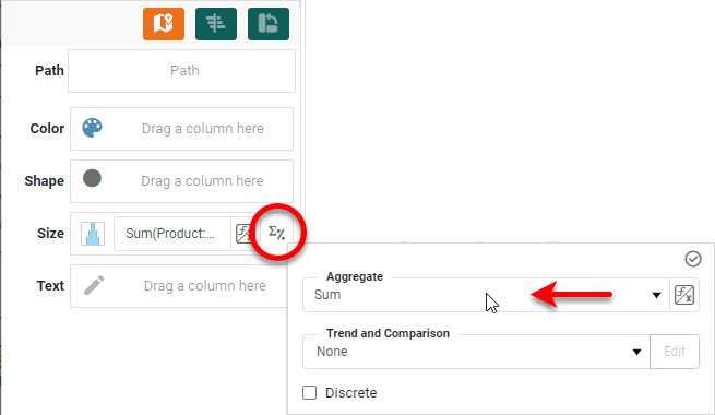
-
Optional: For any geographical fields that you specified, press the ‘Edit Dimension’ button
 , and select the desired ranking for the geographical data. For example, you can display just the top three states according to the measure.
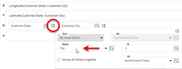
-
Optional: To create a particular trajectory through the points on the chart, drag a path field to the ‘Path’ region. The values of this field are used to assign the sort order for the plotted data so that connecting lines are drawn between points that are adjacent in the path sort order.
If your data set contains map data points in separate columns (such as origin and destination columns), you should combine these into a single column. -
Press the ‘Finish’ button
to close the Editor. -
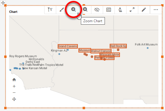
Optional: Set the initial map view by selecting a region, and pressing the ‘Zoom Chart’ button
 .
.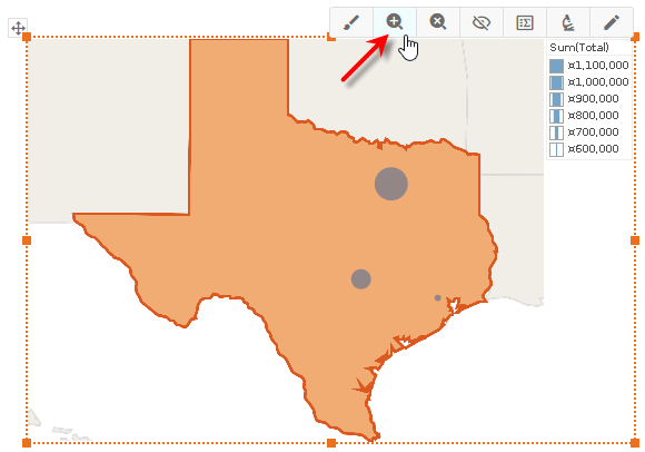
You can also press the ‘Pan’ button
 and drag the map to reposition, and press the ‘Zoom In’ button or ‘Zoom Out’ button
  to zoom. Press the ‘Clear’ button
  to reset the view.
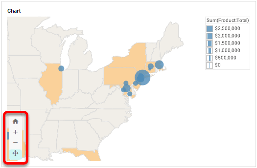
Display Data by Latitude and Longitude
To learn how to display data on a map by latitude and longitude, follow the steps in the walk-through below.
In this example, you will label a map with a list of landmarks along Historic Route 66. The locations of the landmarks are provided by the ‘Map Points’ Data Worksheet data block, which contains raw latitude and longitude data.
Follow the steps below:
|
If you are new to charting, see the following sections first: Configure Your Data…The data source for the chart (data block or data model) should represent dimensions and measures as independent columns or fields, as shown below. See Prepare Your Data for information on how to manipulate your data, if it is not currently in this form. (Note: A properly designed data model will already have the correct structure.)
In some cases (e.g., Pie Chart), you may want your data to provide just a single measure. In other cases (e.g., Line Chart), you may want the data to supply multiple measures. If the data does not provide the correct number of measures, you may be able to alter the number of measures to suit the needs of the chart by “pivoting” or “unpivoting” the data. See Pivot Data in Prepare Your Data for more information about this procedure. Open a Chart for Editing…Watch Video: Create a Chart (Open the Chart Editor)This video might show an earlier version of the feature or operation that differs in minor ways from the current version. Follow the steps below to get started with a new Chart. See Basic Charting Steps for more details.
|
-
Create a new Dashboard based on the ‘Map Points’ Data Worksheet. (See Create a New Dashboard.)
The ‘Map Points’ Data Worksheet can be found in . You may need to download the examples.zip file from GitHub into your environment. (This requires access to Enterprise Manager.) See Import and Export Assets for instructions on how to import. -
Press the ‘Select Chart Style’ button
. Choose the ‘Map’ style. Press the ‘Apply’ button (or double-click the ‘Map’ icon).The Chart Editor now provides a ‘Geographic’ field.
-
Optional: If you want to use a web map background (Mapbox map or Google Map, depending on what your administrator has configured), expand the section below:
Use Web Map…
-
Right-click the Chart and select ‘Properties’. This opens the ‘Chart Properties’ dialog box.
-
Under the Advanced tab, enable ‘Use Web Map as Background’ and press OK. (If this option is not available, ask your administrator to enable the Web Map feature.)
-
Optional: If your geographical field represents areas on the Chart (e.g., states) rather than points (e.g., cities), adjust the ‘Alpha’ setting to less than 100% so that the filled regions do not obscure the underlying map background.
-
Press OK to exit the ‘Chart Properties’ dialog box.
The Mapbox and Google Map APIs impose restrictions on the size of a map. If you see an error when you attempt to display the map background, resize the Chart to a smaller width.
-
-
In the Data Source panel, right-click the ‘Lat’ measure or press the ‘Actions’ button
 , and select ‘Set Geographic’ from the context menu.
The ‘Lat’ field contains latitude values. 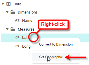
This opens the ‘Edit Geographic’ dialog box. If you need to open the ‘Edit Geographic’ dialog box later, right-click the ‘latitude’ measure or press the ‘Actions’ button
, and select ‘Edit Geographic’ from the context menu. -
From the ‘Map’ menu, select ‘U.S.’, and press OK.
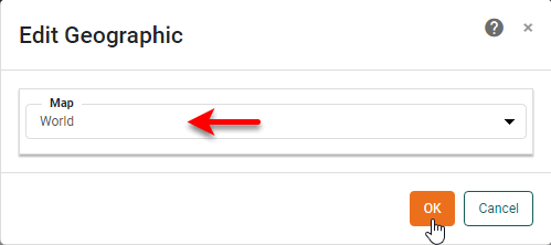
If you are using a Web Map background with latitude and longitude data, you should always use the ‘World’ map option. -
Repeat the above steps to set the ‘Long’ measure as a geographic field.
-
Drag the ‘Long’ field to the ‘X’ region.
The ‘Long’ field contains longitude values. -
Drag the ‘Lat’ field to the ‘Y’ region.
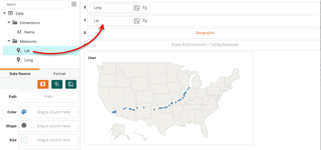
Data points now appear on the map to mark the locations specified by the latitude and longitude data, outlining Historic Route 66.
-
From the Data Source panel, drag a measure onto one of the ‘Color’, ‘Shape’, ‘Size’, or ‘Text’ regions.
What is a measure?
A measure is generally used for aggregation, for example summation, averaging, correlation, etc., within a Crosstab, Chart, Text component, or Gauge. Adding a measure to the ‘Y’ region in a chart displays the computed aggregates by using locations on the Y-axis. Adding a measure to the ‘X’ region displays the computed aggregates by using locations on the X-axis. You can also display aggregates by using color, shape, size, or label.
This displays the measure on the chart using the visual coding you selected (color, shape, or size), and automatically creates a corresponding legend.
-
Press the ‘Edit Measure’ button
, and select the desired aggregation method for the measure. -
To add the landmark labels to the points on the map, drag the ‘Name’ field from the Data Source panel to the ‘Text’ field.
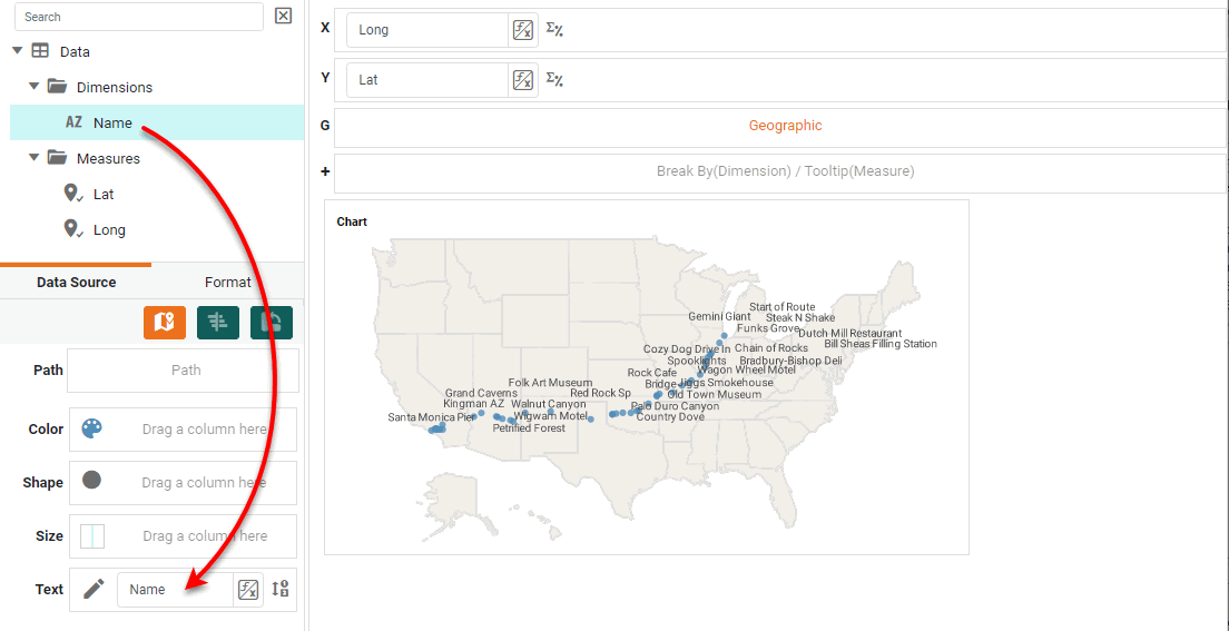
The labels appear fairly crowded because of the long landmark names. You can zoom the chart to see the labels more clearly. (See below.)
By default, the landmark names are displayed as tooltips. -
Optional: Set the initial map view by selecting a region, and pressing the ‘Zoom Chart’ button
.
You can also press the ‘Pan’ button
and drag on the map to reposition, or press the ‘Zoom In’ button or ‘Zoom Out’ button to zoom. Press the ‘Clear’ button to reset the view.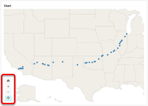
-
Press the ‘Finish’ button
to close the Editor.
Set a Geographical Field
To mark a field as geographical, follow these steps:
-
Right-click the field in the tree or press the ‘Actions’ button
, and select ‘Set Geographic’ from the context menu. This places a location icon  next to the field name.
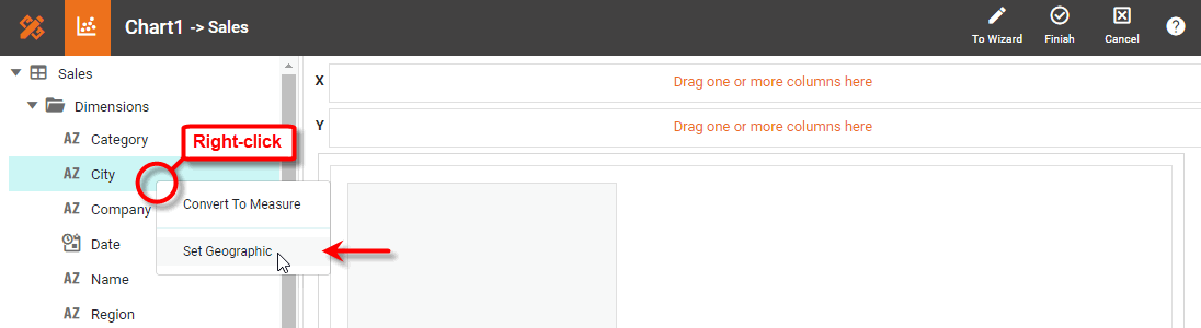
If the field is shown with a location icon
, this means the field has been already been mapped to a geographical level. If the field is shown with an unmapped location icon  , this means you may need to set the geographical level for the field or resolve location names.
 -
To set the geographical level, right-click the field name and select ‘Edit Geographic’ from the context menu. This opens the ‘Edit Geographic’ dialog box.
-
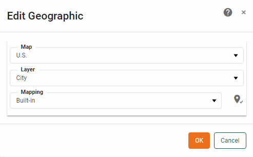
In the ‘Edit Geographic’ dialog box, select the desired region from the ‘Map’ menu: Asia, Canada, Europe, Mexico, U.S., or World.
The map that you select for a geographic field applies to all other geographical fields. -
From the ‘Layer’ menu, select the geographical layer that corresponds to the data in the selected field.
This specifies the layer of the geographical database against which field values should be matched (e.g., city names should be matched against the city layer, etc.). The options available in the ‘Layer’ menu depend on the previously selected ‘Map’ option.
-
From the ‘Mapping’ menu, select the desired map database. (This is almost always ‘Built-in’.) The Chart Editor attempts to resolve values in the selected geographic field against the corresponding layer in the map database.
If the field was shown with an unmapped location icon
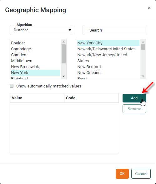
, this means you may need to resolve location names. To do this, follow the steps below:-
Press the ‘Edit’ button
 next to the ‘Mapping’ menu. This opens the ‘Geographic Mapping’ dialog box, which allows you to manually match place names.
 -
Select an unmatched location in the left panel, and choose the correct match from the right panel. Use the ‘Algorithm’ and ‘Search’ options to help you find the desired match.
-
Press Add to add the match to the list of matched locations.
-
Optional: Enable ‘Show automatically matched values’ to see all currently matched locations.
-
Repeat the above steps to match all locations and press OK.
-
-
Optional: To remove the geographical status of a field, right click the field or press the ‘Actions’ button
, and select ‘Clear Geographic’ from the context menu.
Transforming Coordinates for Alaska and Hawaii
For convenience, the default ‘U.S.’ map does not display Alaska and Hawaii in their geographical locations, but shifts and (in the case of Alaska) re-scales them to an inset position below California. For this reason, if you are plotting data on the ‘U.S.’ map you should transform your raw latitude and longitude data for Alaska and Hawaii prior to generating the chart.
To remap your raw longitude and latitude data, [long lat], to the corrected values, [long' lat'], apply the following matrix transformations to your data.
The sample Global Visual Analysis Dashboard provides an example of a world map.
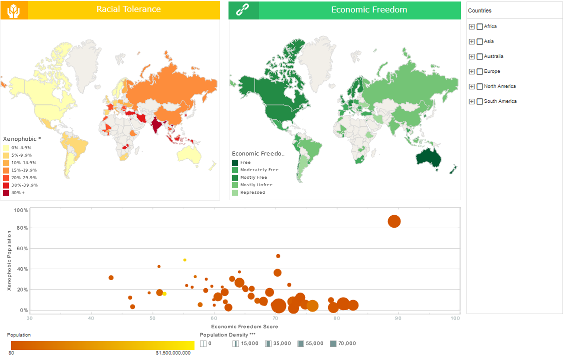
To explore this sample Dashboard, download and import the Global Visual Analysis Dashboard into your environment. (This requires access to Enterprise Manager.) See Import and Export Assets for instructions on how to import.
The sample Marketing Lead Trends Dashboard provides an example of a state map.
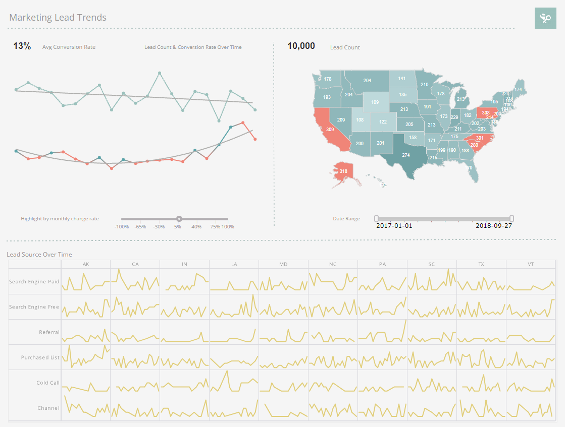
To explore this sample Dashboard, download and import the Marketing Lead Trends Dashboard into your environment. (This requires access to Enterprise Manager.) See Import and Export Assets for instructions on how to import.
The sample Hurricane Dashboard provides an example of a map chart displaying a connected series of locations in the data.
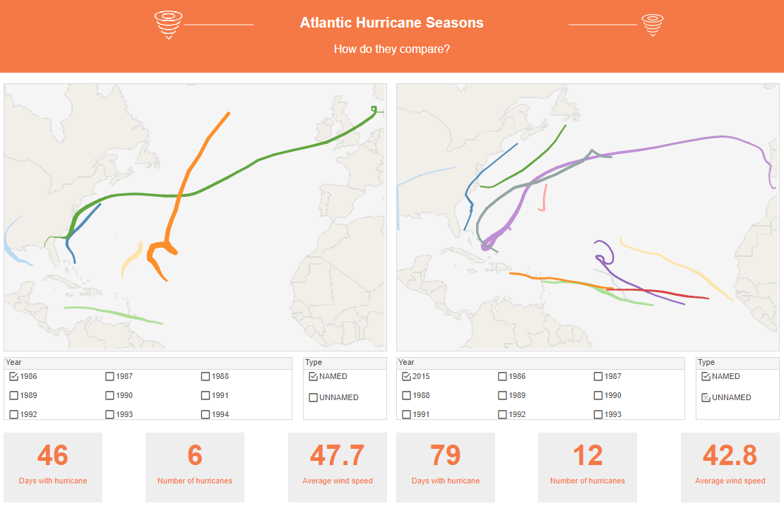
To explore this sample Dashboard, download and import the Hurricane Dashboard into your environment. (This requires access to Enterprise Manager.) See Import and Export Assets for instructions on how to import.