General Tab
| Common Properties in Dashboard Object Reference to set these properties dynamically using script. |
The General tab of the ‘Properties’ panel is common to many components. It has five standard properties, shown in the table below.
Properties that offer the ‘Value Type’ button  can also be set by the user (‘Variable’) or by scripted logic (‘Expression’). See Dynamically Set Properties for more information. can also be set by the user (‘Variable’) or by scripted logic (‘Expression’). See Dynamically Set Properties for more information.
|
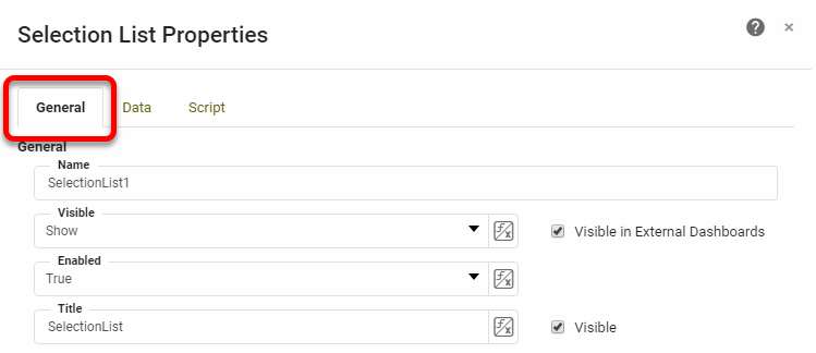
- Name
-
This name is used to refer to the component in binding and scripting. For purposes of scripting, the name should contain no spaces.
- Visible in External Dashboards
-
If checked, the component will be visible when this Dashboard is embedded in another Dashboard (see Modularize a Dashboard).
- Visible
-
-
Show: Component is visible.
-
Hide: Component is invisible.
-
Hide on Print and Export: Component is visible on screen but hidden when exported.
-
- Enabled
-
-
true: Component is interactive.
-
false: Component is not interactive.
For Filter components, when ‘Enabled’ is ‘false’, existing selections in the component do not affect Dashboard data.
-
- Title
-
The text that appears in the title bar (for components which have one). The ‘Visible’ option determines whether the title bar itself is displayed. Besides the ‘Title’ field, you can also edit title bar text by double-clicking the title bar itself.