Dual Axis Chart
Watch Video: Creating a Chart (Use Secondary Axis)
This video might show an earlier version of the feature or operation that differs in minor ways from the current version.
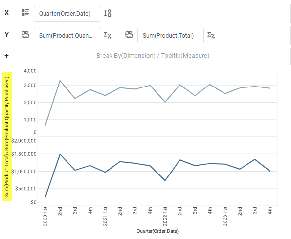
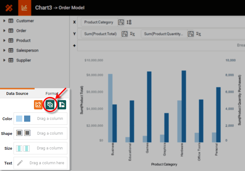
By default, when you add two or more measure fields on the Y-axis, the selected datasets are plotted on adjacent sets of axes, as shown below in the Chart Editor:
What is a measure?A measure is generally used for aggregation, for example summation, averaging, correlation, etc., within a Crosstab, Chart, Text component, or Gauge. Adding a measure to the ‘Y’ region in a chart displays the computed aggregates by using locations on the Y-axis. Adding a measure to the ‘X’ region displays the computed aggregates by using locations on the X-axis. You can also display aggregates by using color, shape, size, or label. |
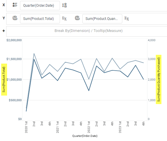
In some cases, you may want to use dual Y-axes to represent these measures, as shown below:
To display a dataset on the right-side (secondary) Y-axis, follow the steps below:
|
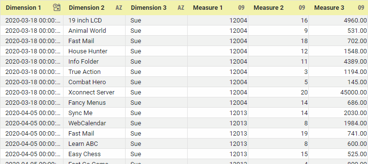
If you are new to charting, see the following sections first: Configure Your Data…The data source for the chart (data block or data model) should represent dimensions and measures as independent columns or fields, as shown below. See Prepare Your Data for information on how to manipulate your data, if it is not currently in this form. (Note: A properly designed data model will already have the correct structure.)
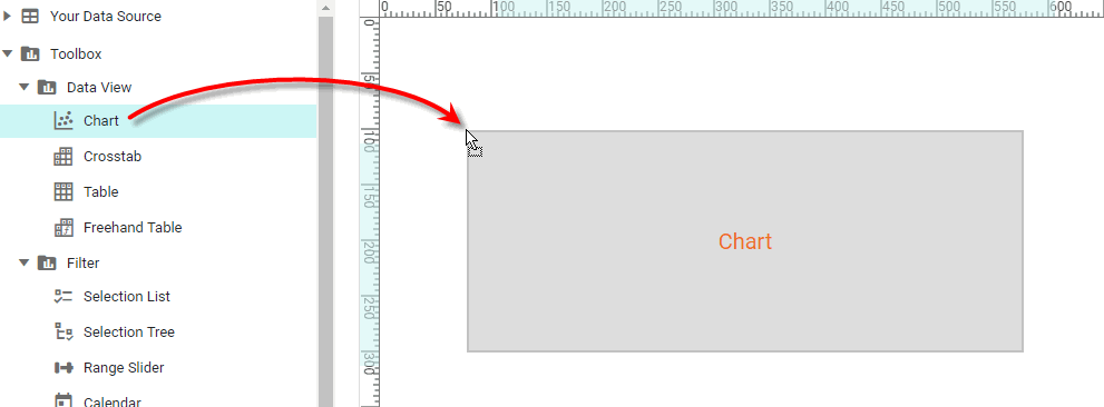
In some cases (e.g., Pie Chart), you may want your data to provide just a single measure. In other cases (e.g., Line Chart), you may want the data to supply multiple measures. If the data does not provide the correct number of measures, you may be able to alter the number of measures to suit the needs of the chart by “pivoting” or “unpivoting” the data. See Pivot Data in Prepare Your Data for more information about this procedure. Open a Chart for Editing…Watch Video: Create a Chart (Open the Chart Editor)This video might show an earlier version of the feature or operation that differs in minor ways from the current version. Follow the steps below to get started with a new Chart. See Basic Charting Steps for more details.
|

-
Add multiple measures to the chart. (See Multiple Measure Chart for additional details.)
-
Press the ‘Switch to Single Graph’ button
 in the Chart Editor.
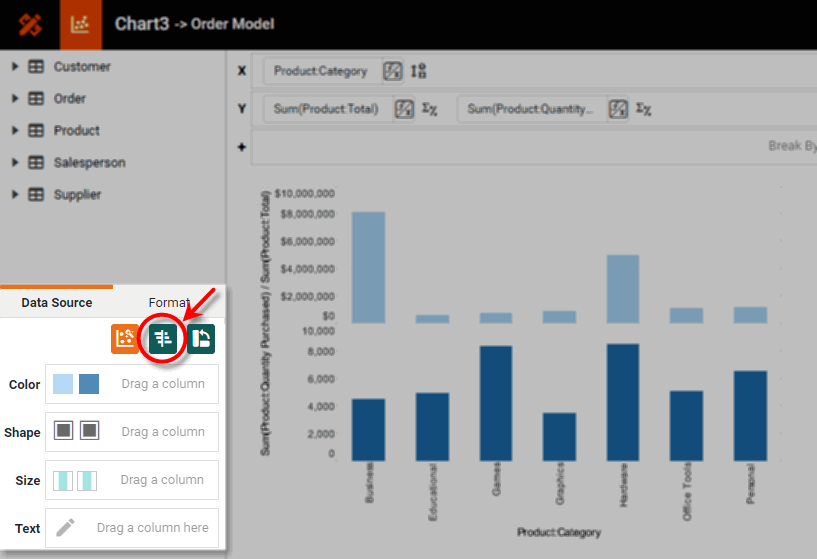
This places all measuress on the same Y-axis rather than on adjacent axes.
To return to the multiple axis style, open the Chart Editor and press the ‘Switch to Separate Graph’ button
 .
.
-
Press the ‘Edit Measure’ button
 next to the measure that you wish to display against the secondary Y-axis.
 -
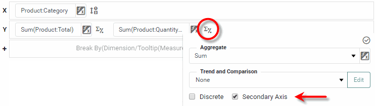
Enable the ‘Secondary Axis’ option at the bottom of the panel.
-
Press the ‘Apply’ button
 to update the chart axes.
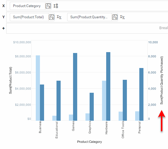
-
Press the ‘Finish’ button
to close the Editor.
You can proceed to edit the titles, legend, etc. See Basic Charting Steps and Chart Properties for more information. See Add Data Format for information on how to format text on a Chart.
The sample Accounts Receivable Management Dashboard provides an example of a dual axis chart.
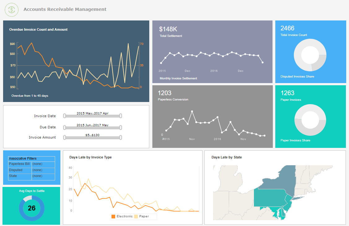
To explore this sample Dashboard, download and import the Accounts Receivable Management Dashboard into your environment. (This requires access to Enterprise Manager.) See Import and Export Assets for instructions on how to import.