Create a Device Layout
Watch Video: Creating a Dashboard (Layout for Mobile)
This video might show an earlier version of the feature or operation that differs in minor ways from the current version.
You can set the layout that determines how a Dashboard is displayed on an electronic device and on the printed page.
Create a Layout for Mobile Device
A Dashboard layout identifies a class of devices (e.g., phone, tablet) based on screen dimensions. The Dashboard layout allows you to tailor the display of the Dashboard to this class of devices. To create a Dashboard layout for a device class, follow the steps below:
-
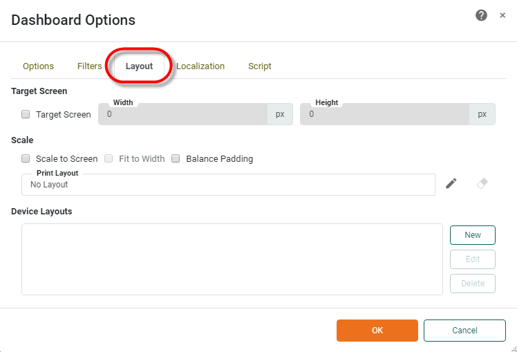
Press the ‘Options’ button
 in the toolbar to open the ‘Dashboard Options’ dialog box.
 -
Select the Layout tab.
-
Press the New button in the ‘Device Layouts’ panel. This opens the ‘Dashboard Device Layout’ dialog box.
-
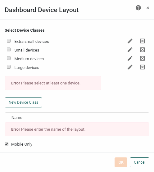
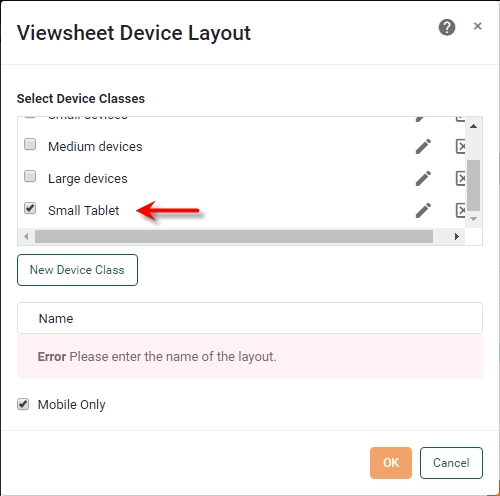
Optional: Add a custom device class to the ‘Select Device Classes’ panel. See below:
Add a Custom Device ClassThe four default device classes provided on the Layout tab of the ‘Dashboard Options’ dialog box are:
-
‘Extra small devices’
-
‘Small devices’
-
‘Medium devices’
-
‘Large devices’
These classes are adequate for a majority of applications, but may not correctly characterize every device. For example, you may want a particular tablet device to use a “small device” layout even though the tablet’s actual width falls within the “medium device” range. In this case you can create custom device classes based on minimum and maximum device widths suitable for your application.
To add a custom device class, follow the steps below:
-
Press the New Device Class button.
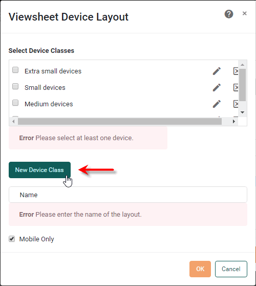
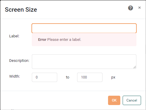
This opens the ‘Screen Size’ dialog box.
-
Enter a ‘Label’ for the device class (e.g., “Small Tablet”) in the ‘Label’ field, and add an optional description of the class in the ‘Description’ field.
-
In the ‘Width’ fields, enter the minimum and maximum device widths that define this device class.
The pixel values that you enter for the width should be CSS pixel values, not physical pixel values. 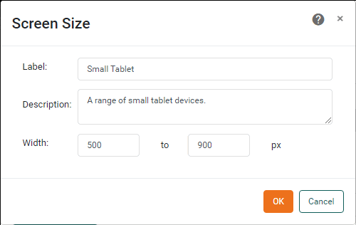
-
Press OK to close the dialog box and add the new device class to the list of existing device classes.
To edit or remove a device class, press the ‘Edit’ button
 or ‘Delete’ button
  button to the right of the label in the ‘Select Device Classes’ list.
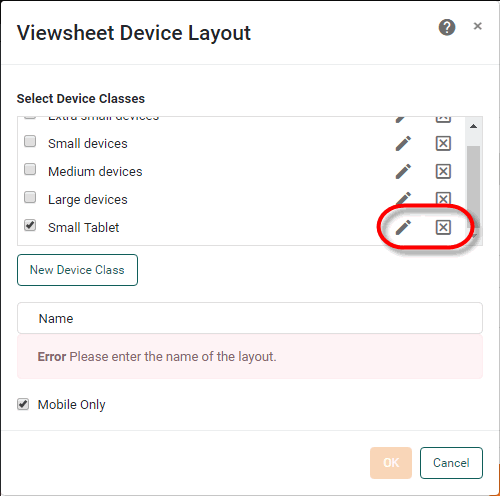
Custom device classes are saved globally, and can be accessed from any Dashboard on the server. Custom device classes that are used by a Dashboard are included with the Dashboard when you import or export the Dashboard from the server environment. (See Import and Export Assets for more information.) -
-
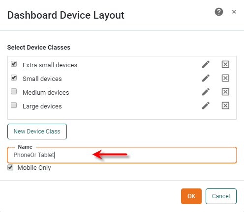
In the ‘Select Device Classes’ panel, select one or more classes that you want to share a single layout. In the ‘Name’ field, enter a name for the shared layout.
The named layout is triggered whenever the Dashboard is being viewed on a device in one of the selected size classes. To customize the Dashboard for a named layout, see Assign Dashboard Components to a Layout below.
-
Enable the ‘Mobile Only’ option to trigger the layout only when the Dashboard is genuinely being viewed on a mobile device. (This prevents the layout from being triggered on a desktop computer when the browser window is set to a narrow width.)
‘Mobile Only’ enabled is the recommended setting. -
Press OK to close the ‘Dashboard Device Layout’ dialog box.
-
Press OK to close the ‘Dashboard Options’ dialog box.
Create a Layout for Print
A print layout specifies the page settings for printing the Dashboard. This allows you to tailor the arrangement of the Dashboard to these page settings. The print layout automatically modifies certain Dashboard components when the Dashboard is printed: Tables are fully expanded to show all rows, and Filter components such as Selection Lists and Range Sliders are presented with their current selections only.
To configure a print layout for a Dashboard, follow the steps below. (You can only define a single print layout.)
| The print layout attempts to fit the contents of components within the bounds of the page layout, and may result in contents spilling over onto subsequent pages. |
-
Press the ‘Options’ button
in the toolbar to open the ‘Dashboard Options’ dialog box. -
Select the Layout tab.
-
Press the ‘Edit’ button
next to the ‘Print Layout’ field. This opens the ‘Dashboard Print Layout’ dialog box.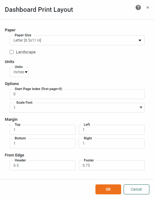
-
For the ‘Paper’ field, choose the size of paper on which the Dashboard will be printed. Optional: To create a custom-sized page, select the ‘Custom Size’ option and enter the desired paper dimensions.
-
Select ‘Landscape’ to force the Dashboard to print in landscape orientation.
-
Select the desired units from the ‘Units’ menu.
-
In the ‘Start page index’ field, indicate the page on which page numbering should commence. The first page is index 0.
-
Select a value in the ‘Scale Font’ menu. This value multiplies the font size of all text on the Dashboard.
-
Enter the desired values in the ‘Margins’ and ‘From Edge’ fields based on the units specified in the ‘Units’ menu.
-
Press OK to close the ‘Dashboard Print Layout’ dialog box.
-
Press OK to close the ‘Dashboard Options’ dialog box.
To assign Dashboard components to an existing print layout, see Assign Dashboard Components to a Layout below.
Edit an Existing Device Layout
To edit the existing layout settings for a device class or print layout, follow the steps below:
-
Press the ‘Options’ button
in the toolbar to open the ‘Dashboard Options’'Dashboard Options' dialog box. -
Select the Layout tab.
-
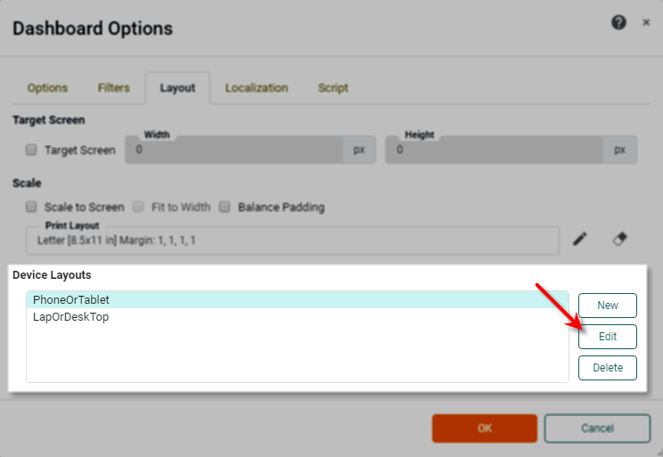
Select the desired layout in the ‘Device Layouts’ panel and press the Edit button.
-
Edit the layout as desired. See Create a Layout for Mobile Device and Create a Layout for Print for more details.
To delete an existing layout, select the layout in the ‘Device Layouts’ panel and press the Delete button.
Assign Dashboard Components to a Layout
You can tailor the arrangement of Dashboard components for different devices or for print. For example, if the Dashboard is viewed on a large-screen device you may want to display all the components of the Dashboard, but if the Dashboard is viewed on a tablet or phone, you may want to display only a subset of components in an arrangement that suits the smaller viewing area.
To assign components to a Dashboard layout, follow the steps below:
-
Define one or more device layouts. See Create a Layout for Mobile Device and Create a Layout for Print for more details.
-
Verify that Visual Composer is currently displaying the Dashboard in design view (not preview).
-
From the ‘Layout’ menu in the Dashboard status bar (at the bottom of the Visual Composer window), select the layout for which you want to assign components.
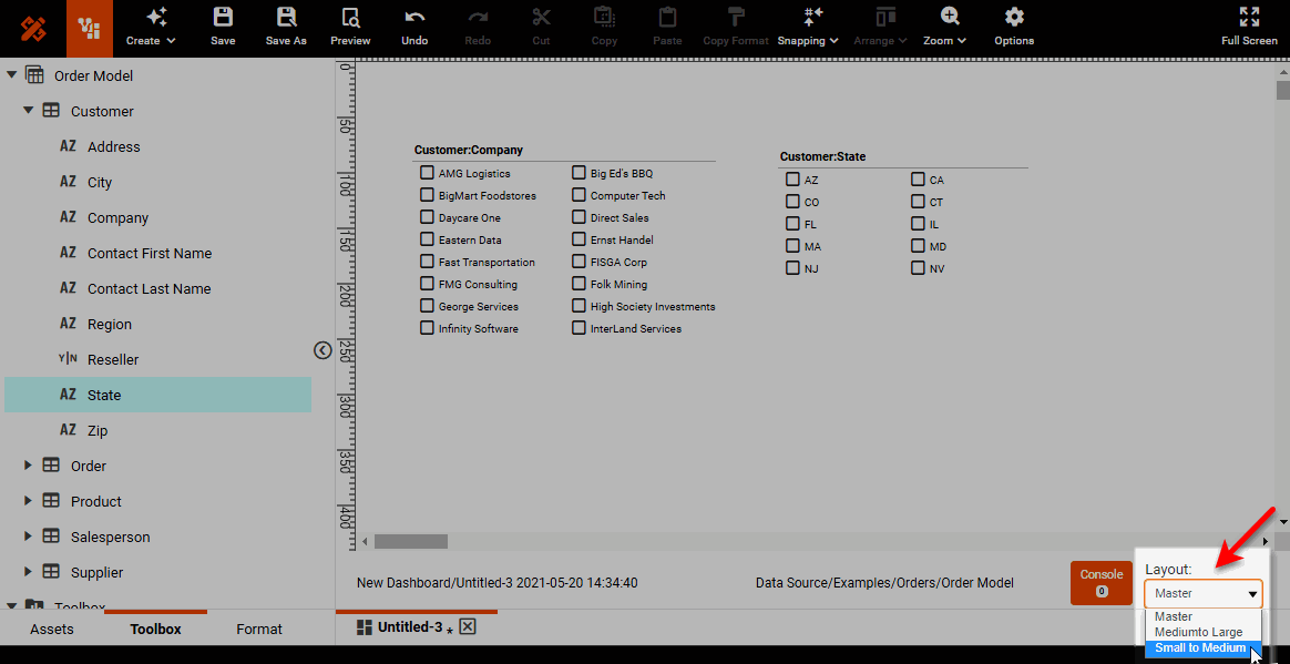
The ‘Master’ layout is the standard design view of the Dashboard, which includes all components.
-
For print layout, press the ‘Edit’ button
 in the toolbar, and select ‘Edit Content’.
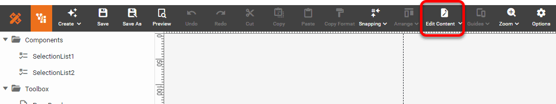
-
Optional: Press the ‘Guides’ button
 in the toolbar and choose the guidelines you want to display in the layout view. The options provided (16:9 and 4:3, landscape, or portrait) are the most common screen proportions. Choose the option that most closely matches the intended device proportions. To hide the guidelines, select ‘None’.
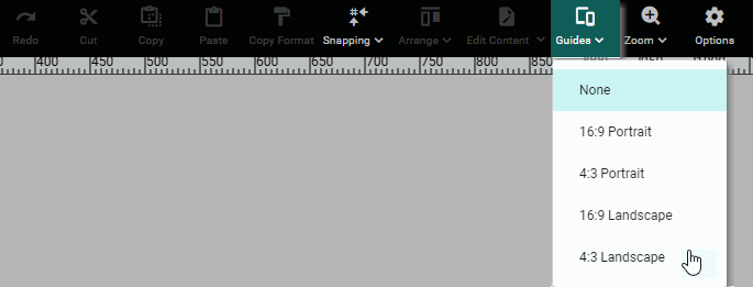
Guidelines are provided for informational purposes only. Use the guidelines to arrange components so that the Dashboard best utilizes the available screen dimensions.
The final Dashboard layout is automatically scaled to fit the device screen, so only the relative sizes and positions of the components are important when you lay out the Dashboard. Components can be placed outside the guidelines if desired, and the Dashboard will be scaled to place these components on the screen. -
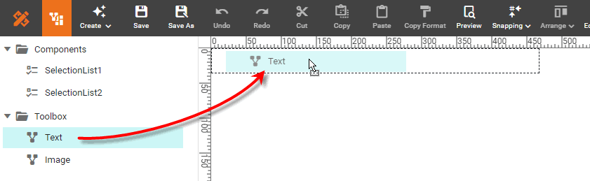
Drag components from the Components folder into the layout area. You can add each component only once into the layout.
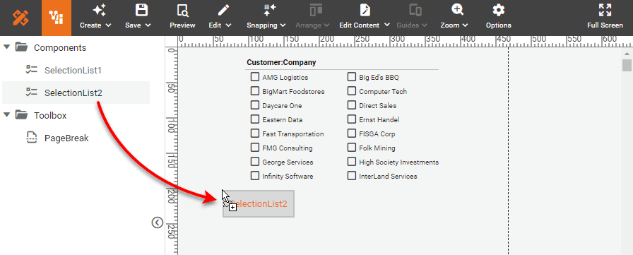
-
Position and resize components in the layout as desired by dragging on the “move” handle and “resize” handles. Note that the layout for print provides multiple pages, and you can drag components onto any available page.
Layouts for devices will be automatically scaled to fit the device screen. -
Optional: To force components to be displayed on a new page, drag a ‘PageBreak’ component from the Toolbox folder into the layout area. Any components positioned below the PageBreak will be shifted to the following page.
-
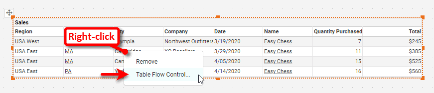
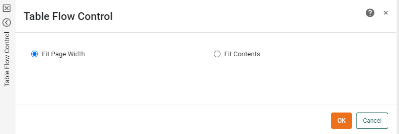
Optional: For a Table component in a print layout (and for a Tabbed Interface, Container, or nested Dashboard that contains a Table), right-click the Table and select ‘Table Flow Control’ to choose ‘Fit Page Width’ or ‘Fit Contents’.
For the ‘Fit Page Width’ option the table width is set to the width of the page. The column widths are approximately proportional to the size of the data they contain. If the contents are too wide to fit in the column, the size of the row is increased and/or the contents are wrapped. For the ‘Fit Contents’ options, the column widths are sized to fit the data they contain. If a row is wider than the page, the table is wrapped.
-
Optional: For a print layout, add additional Text components into the page header or footer. See below:
Add Text to Print LayoutTo add a Text component into the layout, follow the steps below:
-
Press the ‘Edit’ button
in the toolbar, and select ‘Edit Header’ or ‘Edit Footer’.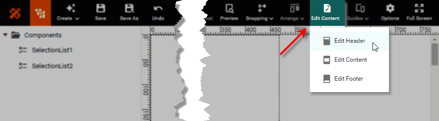
-
Drag a Text component from the Toolbox folder into the header or footer region.
-
Right-click on the Text component, and select ‘Properties’ from the menu to open the ‘Text Properties’ dialog box. Enter the desired text in the ‘Text’ field, and press OK.
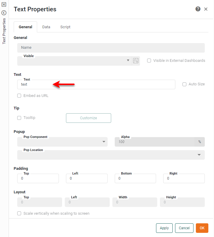
You can use the following special codes within the text that you enter: {P}inserts the current page number,{N}inserts the total number of pages, and{D}and{T}insert the current date and time. To control the formatting of the inserted values, use the optionalformatparameter, for example,{P,format}. The format for page numbering should follow the syntax described in Number Format. The format for date and time should follow the syntax described in Date Format. -
Optional: To format the text, click the Text component to select it and select the Format tab in the left panel. Apply the desired formatting.
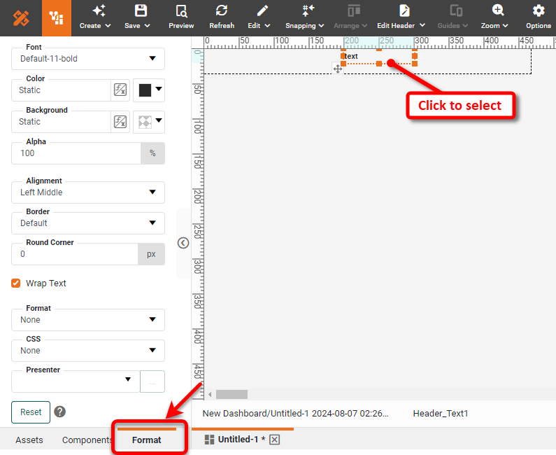
See Add Visual Format for more information about the Format panel.
-
Repeat the above steps to add additional Text components into the header or footer.
-
Position and resize Text components in the header or footer as desired by dragging on the “move” handle and “resize” handles.
-
-
Optional: For a print layout, add additional Image components into the page header or footer.
Add Images to Print LayoutTo add an image into the layout, follow the steps below:
-
Press the ‘Edit’ button
button in the toolbar, and select ‘Edit Header’ or ‘Edit Footer’. -
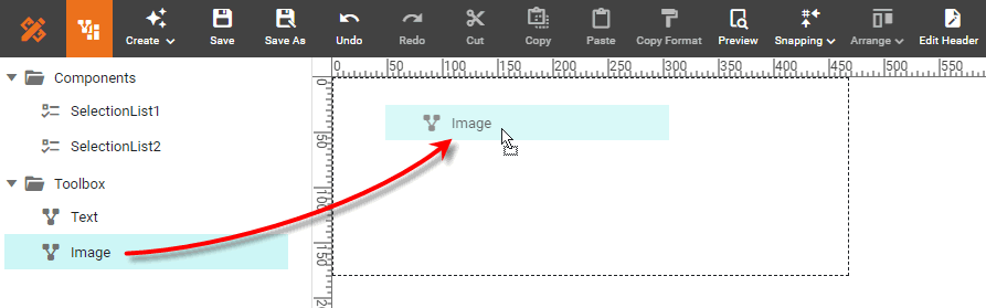
Drag an Image component from the Toolbox folder into the header or footer region.
-
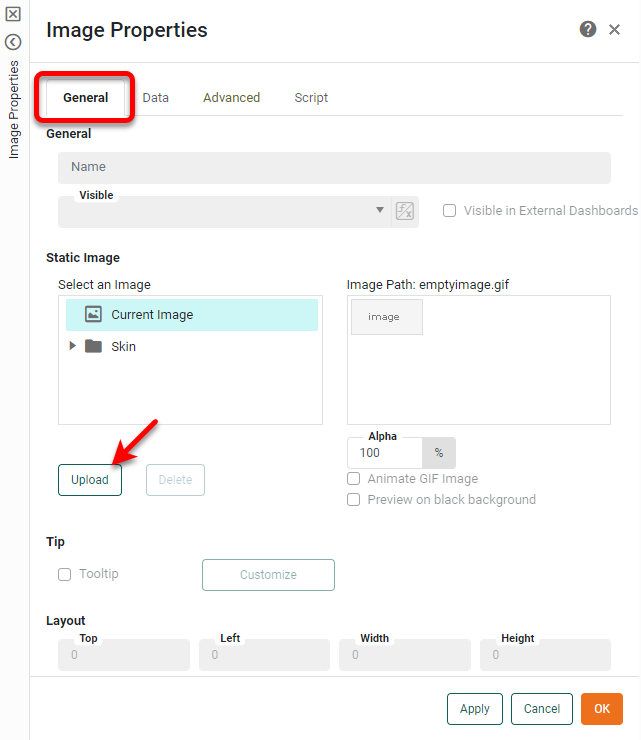
Right-click on the Image component, and select ‘Properties’ from the menu to open the ‘Image Properties’ panel.
-
Select the General tab. Select an existing image from the list, or press Upload to upload a new image from a local source. (See Image Properties for more information.)
-
Select the Advanced tab and set the desired scaling for the image. (See Image Properties for more information.)
-
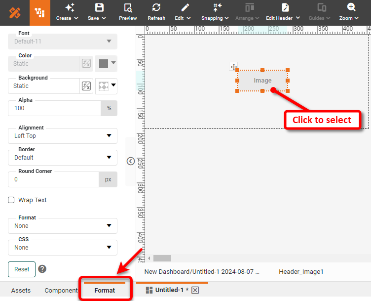
Optional: To format the Image, click the Image component to select it, and select the Format tab in the left panel. Apply the desired formatting using the ‘Format’ dialog box, and press OK. See Add Visual Format for more information about the Format panel.
-
Repeat the above steps to add additional Image components into the header or footer.
-
Position and resize Image components in the header or footer as desired by dragging on the “move” handle and “resize” handles.
-
-
Press the ‘Preview’ button
 in the toolbar to see a preview of the Dashboard for the selected devices or for print.
-
The preview for devices is displayed within Visual Composer. The Dashboard is automatically scaled to fit the screen.
-
The preview for print is displayed as PDF. The print version of the Dashboard automatically adapts Dashboard components as suitable for printing: Tables are fully expanded to show all rows, and selection components such as Selection Lists and Range Sliders display any selected values as plain text.
-
-
Press the ‘Save’ button
 in the toolbar to save the Dashboard. (Layouts are saved together with the Dashboard.)
 -
Select the ‘Master’ option from the ‘Layout’ menu in the status bar to return to the normal design view of the Dashboard.
When the Dashboard is viewed on a device that matches a specified layout, the Dashboard will be displayed with the configuration that you designed. The device layout will be automatically scaled to fit the device screen.