Axis Properties
|
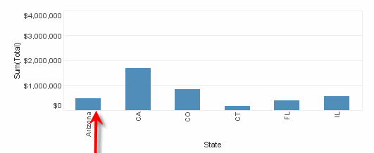
To edit the labels and line format of an axis, right-click the axis or axis label, and select ‘Axis Property’ from the context menu. Note: You can also access menu options from the ‘More’ button ( ) in the mini-toolbar. This opens the ‘Axis Properties’ panel, which provides the following tabs: Label, Line, Alias.
|
To hide axis line and labels, right-click the axis and choose ‘Hide Axis’ from the context menu. To reveal a hidden axis, right-click the chart and select ‘Show All Axes’ from the context menu. Note: You can also access menu options from the ‘More’ button () in the mini-toolbar.
|
Label Tab
The Label tab offers the following options
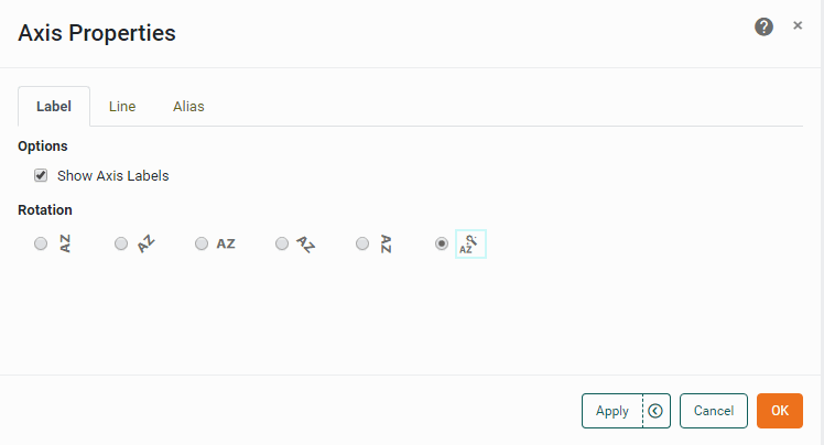
- Show Axis Labels
-
Display text labels on the axis.
- Rotation
-
The angle of the label text.
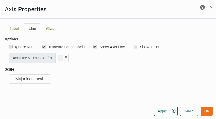
Line Tab
The Line tab offers the following options
- Logarithmic Scale
-
Set logarithmic scaling for the axis. (The logarithm base is selected automatically.)
- Reverse
-
Orient the axis with maximum at bottom, minimum at top.
- Shared Range
-
For a facet-type chart (i.e., a chart with both a measure and dimension on the same axis or with multiple dimensions on the same axis), this specifies that sub-charts in the same column share the same X-axis scaling, and sub-charts in the same row share the same Y-axis scaling. Otherwise, sub-charts are individually scaled.
- Ignore Null
-
For Date/Time and Categorical axes, ‘Ignore Null’ suppresses the display of null dimension values. When ‘Ignore Null’ is disabled, null values are represented without labels.
- Truncate Long Labels
-
When enabled, truncates labels that exceed 1/3 of the total chart width or height (using ellipses to indicate omitted text). When disabled, truncates labels only if they exceed 2/3 of the total chart width or height.
- Show Axis Line
-
Display the axis line, in the specified color.
- Show Ticks
-
Display tick marks on the axis line.
- Axis Line & Tick Color
-
Color of the axis line and tick markers.
- Minimum
-
Lowest value shown on axis.
- Maximum
-
Highest value shown on axis.
- Minor Increment
-
The interval between axis tick marks.
- Major Increment
-
The interval between axis labels. For a date/time field which is represented as a time-series (e.g., when ‘As time series’ is selected in the ‘Edit Dimension’ panel), the increment is specified in terms of the prevailing time unit (weeks, months, etc.)
Alias Tab
The Alias tab is available for dimension (categorical) axes, and displays a table containing the mapping between original axis labels and new axis labels.
What is a dimension?A dimension is used to break-down the dataset into multiple groups, often within a Crosstab, Chart, or Selection List. Adding a dimension to the ‘X’ region of a Chart distinguishes the different dimension groups by location on the X-axis. Adding a dimension to the ‘Y’ region distinguishes the different dimension groups by location on the Y-axis. You can add multiple dimensions into the ‘X’ or ‘Y’ regions of a Chart, or into the ‘Rows’ or ‘Columns’ regions of a Crosstab, to create multiple grouping levels. You can also distinguish groups in a dimension by using color, shape, size, or label in a Chart. |
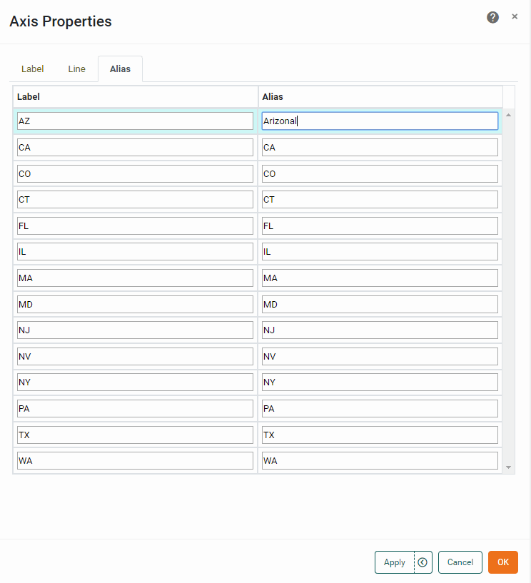
To modify the labels of a categorical axis, double-click the cells in the ‘Alias’ column that correspond to the axis labels that you wish to rename, and enter the desired replacement text. Press OK to close the panel. This updates the axis labels with the specified replacement text.