Basic Charting Steps
The following sections explain how to add a Chart to your Dashboard.
Watch Video: Creating a Chart
This video might show an earlier version of the feature or operation that differs in minor ways from the current version.
Understanding Dimensions and Measures
Watch Video: Creating a Chart (Dimensions and Measures)
This video might show an earlier version of the feature or operation that differs in minor ways from the current version.
A chart visualizes a dataset, which is a table containing rows and columns. Columns (also called fields) in the dataset are classified as either dimensions or measures in the Chart Editor.
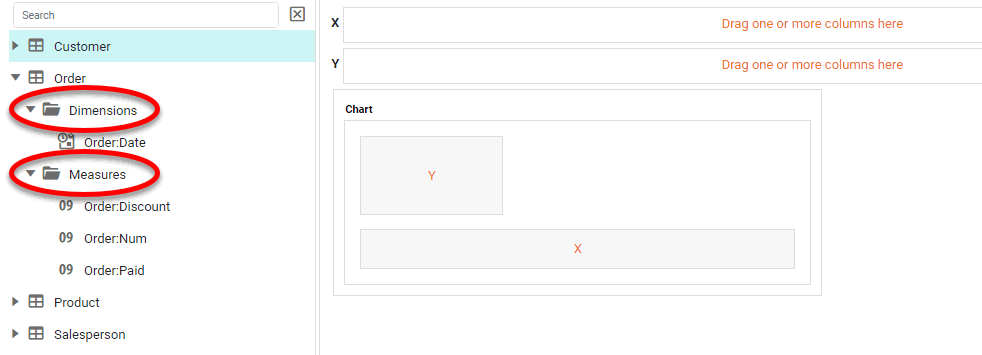
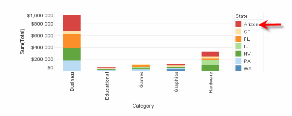
What is a dimension?A dimension is used to break-down the dataset into multiple groups, often within a Crosstab, Chart, or Selection List. Adding a dimension to the ‘X’ region of a Chart distinguishes the different dimension groups by location on the X-axis. Adding a dimension to the ‘Y’ region distinguishes the different dimension groups by location on the Y-axis. You can add multiple dimensions into the ‘X’ or ‘Y’ regions of a Chart, or into the ‘Rows’ or ‘Columns’ regions of a Crosstab, to create multiple grouping levels. You can also distinguish groups in a dimension by using color, shape, size, or label in a Chart. |
What is a measure?A measure is generally used for aggregation, for example summation, averaging, correlation, etc., within a Crosstab, Chart, Text component, or Gauge. Adding a measure to the ‘Y’ region in a chart displays the computed aggregates by using locations on the Y-axis. Adding a measure to the ‘X’ region displays the computed aggregates by using locations on the X-axis. You can also display aggregates by using color, shape, size, or label. |
In some cases you may need to use a dimension as a measure, or a measure as a dimension. To convert a field between dimension and measure in a Dashboard Chart, right-click the field in the Data Source panel of the Chart Editor and select ‘Convert to Dimension’ or ‘Convert to Measure’.
Create a Basic Chart
|
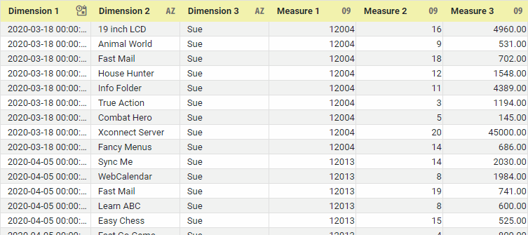
If you are new to charting, see the following sections first: Configure Your Data…The data source for the chart (data block or data model) should represent dimensions and measures as independent columns or fields, as shown below. See Prepare Your Data for information on how to manipulate your data, if it is not currently in this form. (Note: A properly designed data model will already have the correct structure.)
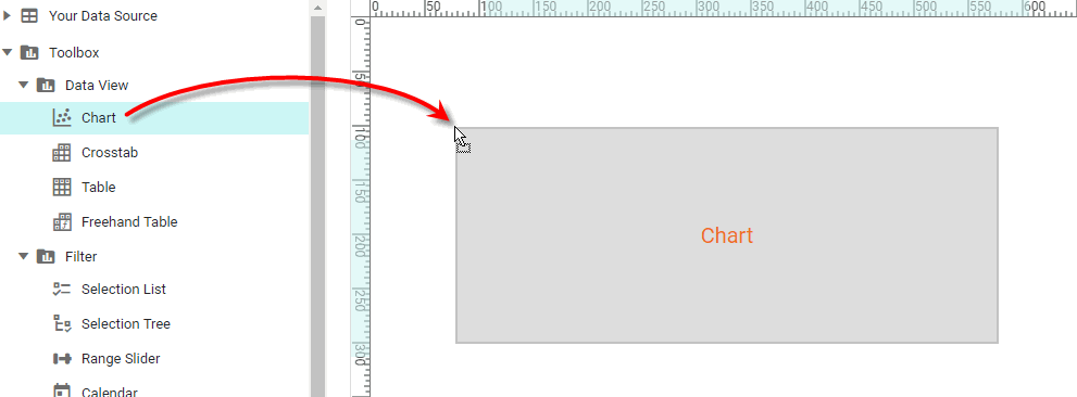
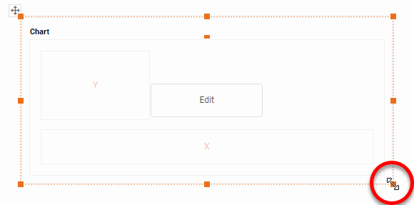
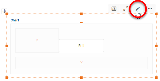
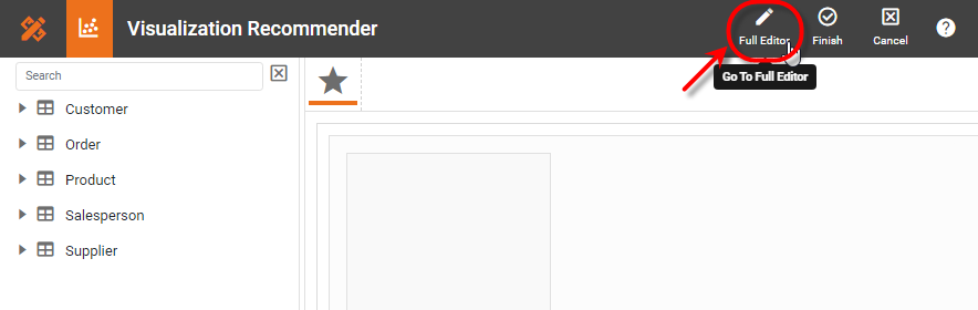
In some cases (e.g., Pie Chart), you may want your data to provide just a single measure. In other cases (e.g., Line Chart), you may want the data to supply multiple measures. If the data does not provide the correct number of measures, you may be able to alter the number of measures to suit the needs of the chart by “pivoting” or “unpivoting” the data. See Pivot Data in Prepare Your Data for more information about this procedure. Open a Chart for Editing…Watch Video: Create a Chart (Open the Chart Editor)This video might show an earlier version of the feature or operation that differs in minor ways from the current version. Follow the steps below to get started with a new Chart. See Basic Charting Steps for more details.
|

These features are available to both designers and end-users.
See End-User Chart Control for information about how to make the Ad Hoc Chart Editor available to end users. In the Ad Hoc Chart Editor, press the ‘Enable Manual Refresh’ button in the mini-toolbar to update the chart only when the ‘Refresh’ button  button is pressed. Press the ‘Enable Auto Refresh’ button to update the Chart when any changes are made in the Editor. button is pressed. Press the ‘Enable Auto Refresh’ button to update the Chart when any changes are made in the Editor.
|
Choose the Chart Style
-
Optional: Set the style of the chart. To do this, press the ‘Select Chart Style’ button
 . Choose a desired style, such as ‘Line’ or ‘Bar’, and press the ‘Apply’ button
  .
.Watch Video: Creating a Chart (Set the Chart Style)
This video might show an earlier version of the feature or operation that differs in minor ways from the current version.
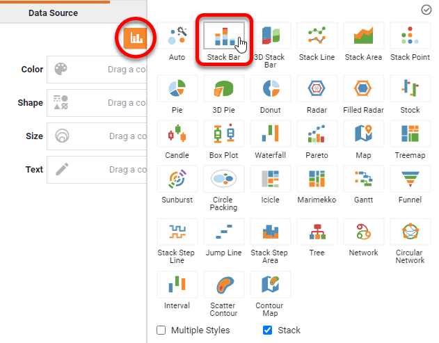
To set different styles for different datasets, see Multiple Style Chart. To create a stacked chart, enable the ‘Stack’ option at the bottom of the panel. If you do not select a specific chart style, the default ‘Auto’ style automatically selects a chart style appropriate to your dataset.
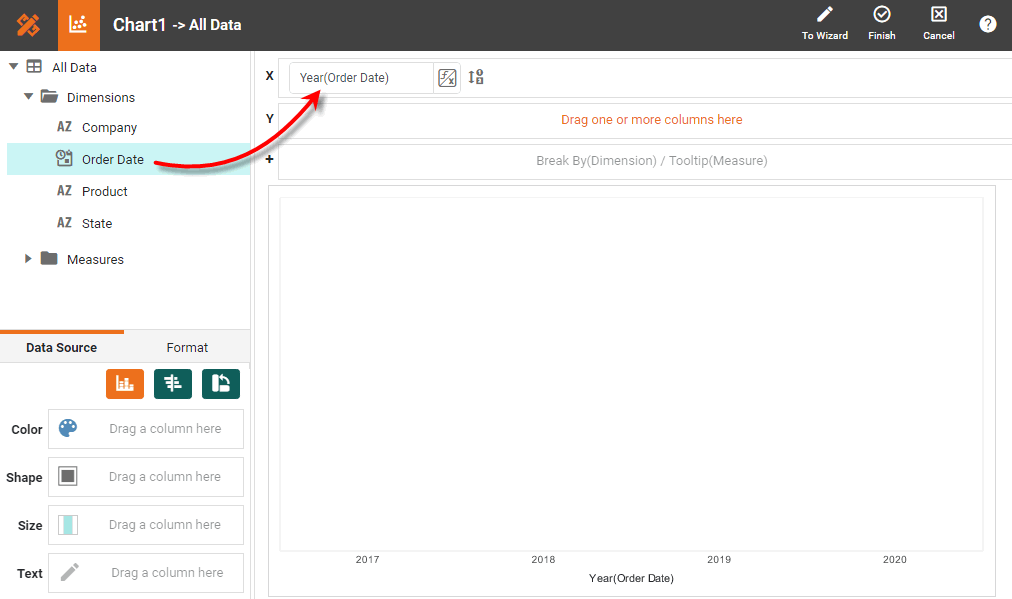
Bind a Dimension to the Chart
-
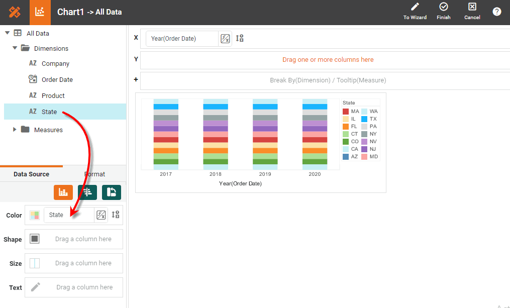
From the ‘Dimensions’ folder of the data source, drag a desired dimension to the ‘X’ region.
Watch Video: Creating a Chart (Group and Summarize)
This video might show an earlier version of the feature or operation that differs in minor ways from the current version.
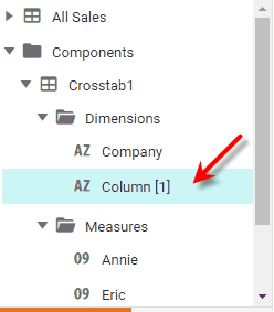
If you selected a ‘Pie’ style, you should place the dimension field in either the ‘Color’ or ‘Shape’ region rather than the ‘X’ region. If the Dashboard contains other Tables or Crosstabs, you can use the data in those components as the data source. Simply expand the ‘Components’ folder, and select the desired fields.
There are two restrictions on binding a component to another component’s data:
-
This option is not available in meta-data mode. See Dashboard Options for information about meta-data mode.
-
You will not be able to filter the component using a Selection List or Range Slider. However, you can still filter the component by using a condition (see Add Conditions).
Optional: You can drag multiple dimensions to the ‘X’ region. Dimensions will be represented automatically against the top or bottom X-axis depending on the order that you place them in the ‘X’ region. You can change that order by dragging the fields within the ‘X’ region.
-
-
To rotate the Chart (interchange the X and Y axes), press the ‘Swap XY’ button
 . You can also do this by interchanging the fields in the ‘X’ region and ‘Y’ region of the Editor.
 -
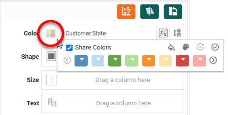
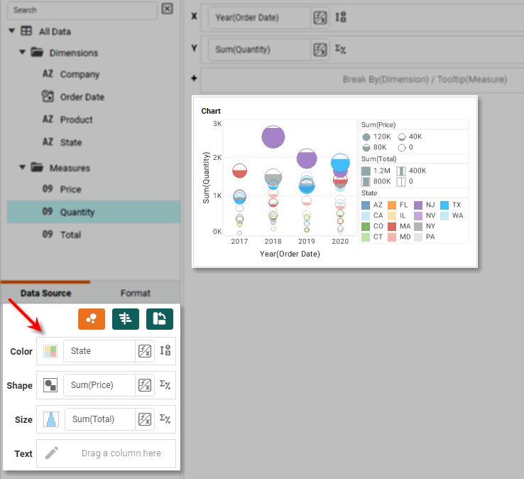
To break out the dataset into groups using color, shape, size, or text labeling, drag a dimension from the data source to the ‘Color’, ‘Shape’, ‘Size’, or ‘Text’ region.
Watch Video: Creating a Chart (Use Color, Shape, Size)
This video might show an earlier version of the feature or operation that differs in minor ways from the current version.
Note that the effect of color, shape, and size coding varies by chart style. For example, in a bar-type chart the ‘Shape’ representation affects the style of the fill pattern, whereas in a point-type chart the ‘Shape’ representation affects the image of the point.
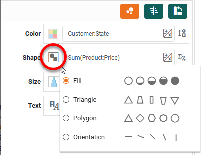
To change the color, shape, or size assignment, press the corresponding ‘Edit Color’, ‘Edit Shape’, or ‘Edit Size’ buttons.
Watch Video: Creating a Chart (Change Dimension Color)
This video might show an earlier version of the feature or operation that differs in minor ways from the current version.
-
Optional: To upload a custom image to use as a shape, press the ‘Add Shape’ button
 , and select the desired file.
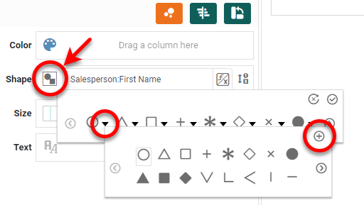
An administrator can make custom shapes available by placing the image files (png, gif, jpg, svg) in the portal/shapes directory. (See Look and Feel and Storage for information on how to upload a file to this location.) The icons are sorted alphabetically by file name. Custom shape images can be any size, and are scaled according to the ‘Size’ setting in the Chart Editor. -
To break out the data into groups without applying any visual formatting, drag a dimension to the ‘Break By/Tooltip’ region.
Watch Video: Creating a Chart (Group Without Format)
This video might show an earlier version of the feature or operation that differs in minor ways from the current version.
-
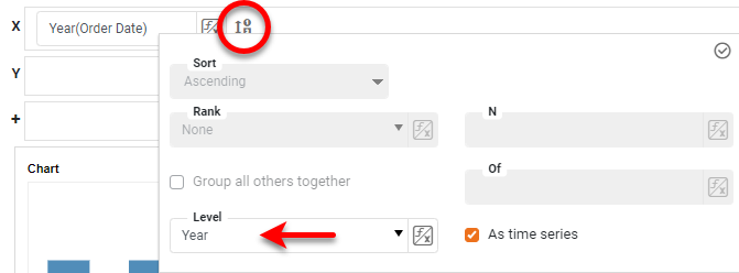
Optional: For a date dimension, press the ‘Edit Dimension’ button
 next to the field name in the Chart Editor, and set the ‘Level’ to the desired date grouping. Then press the ‘Apply’ button .
Watch Video: Creating a Chart (Date Grouping)
This video might show an earlier version of the feature or operation that differs in minor ways from the current version.
To group dates using a fiscal calendar, create Calculated Fields for the desired date ranges (fiscal week, month, etc.) by using the corresponding fiscal functions, such as CALC_fiscalweek and CALC_fiscalmonth, and then use those Calculated Fields as the desired dimensions on the Chart. See Create a Calculated Field in a Dashboard for more details.
Bind a Measure to the Chart
-
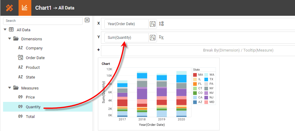
From the ‘Measures’ folder of the data source panel, drag measure the ‘Y’ region. This places the selected field onto the chart as a measure. You can add multiple measures to a chart. (See Multiple Measure Chart.)
To convert a dimension to a measure, right-click the dimension in the data source and select ‘Convert to Measure’. -
To represent a measure using color, shape, size, or labeling, drag the desired measure field from the data source to the ‘Color’, ‘Shape’, ‘Size’, or ‘Text’ region.
Watch Video: Creating a Chart (Show Values)
This video might show an earlier version of the feature or operation that differs in minor ways from the current version.
Note that the effect of color, shape, and size coding varies by chart style. For example, in a bar-type chart the ‘Shape’ representation affects the density of the fill pattern, whereas in a point-type chart the ‘Shape’ representation affects the geometry of the point or the fraction filled.
To change the color, shape, or size assignment, press the corresponding ‘Edit Color’, ‘Edit Shape’, or ‘Edit Size’ buttons.
Watch Video: Creating a Chart (Change Measure Color)
This video might show an earlier version of the feature or operation that differs in minor ways from the current version.
-
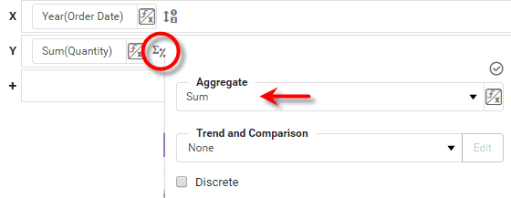
Press the ‘Edit Measure’ button
 next to any measure, and select the desired aggregation method for the measure.
Watch Video: Creating a Chart (Change Aggregation)
This video might show an earlier version of the feature or operation that differs in minor ways from the current version.
Read more about the available aggregation methods…
The list below describes the available Data Block, Crosstab, and Chart aggregation measures. You can choose to display univariate aggregations (e.g., ‘Sum’, ‘Count’) as a percentage value by selecting the percentage basis (e.g., ‘Group’, ‘GrandTotal’) from the accompanying ‘Percentage’ or ‘Percentage of’ menu. For the bivariate aggregation methods (e.g., ‘Correlation’, ‘Weighted Average’), you will need to select a variable (column) to use as the second operand in the computation. Make this selection in the menu labeled ‘with’.
- Sum
-
Displays the sum of the measure values for the given group.
- Average
-
Displays the average of the measure values for the given group.
- Max
-
Displays the maximum of the measure values for the given group. For dates, this will return the latest date.
- Min
-
Displays the minimum of the measure values for the given group. For dates, this will return the earliest date.
- Count
-
Displays the total count of measure values for the given group. This represents the total number of records corresponding to the given group, and is the same value for any selected measure.
- Distinct Count
-
Displays the count of unique measure values for the given group.
- First
-
Displays the first value for the measure (for the given group) when sorted based on the values in a second column, specified by the menu labeled ‘by’.
- Last
-
Displays the last value for the measure (for the given group) when sorted based on the values in a second column, specified by the menu labeled ‘by’.
- Correlation
-
Displays the Pearson correlation coefficient for the correlation between the measure values (for the given group) and the corresponding values in a second column, specified by the menu labeled ‘with’.
- Covariance
-
Displays the covariance between the measure values (for the given group) and the corresponding values in a second column, specified by the menu labeled ‘with’.
- Variance
-
Displays the (sample) variance of the measure values for the given group.
- Std Deviation
-
Displays the (sample) standard deviation of the measure values for the given group.
- Variance (Pop)
-
Displays the (population) variance of the measure values for the given group.
- Std Deviation (Pop)
-
Displays the (population) standard deviation of the measure values for the given group.
- Weighted Average
-
Displays the weighted average of the measure values for the given group. The weights are given by the corresponding values in a second column, which is specified by the menu labeled ‘with’.
- Median
-
Displays the median (middle) of the measure values for the given group.
- Mode
-
Displays the mode (most common) of the measure values for the given group.
- Product
-
Displays the product (multiplication) of the measure values for the given group.
- Concat
-
Displays the concatenation into a comma-separated list of the measure values for the given group.
- NthLargest
-
Displays the Nth largest of the measure values for the given group.
- NthSmallest
-
Displays the Nth smallest of the measure values for the given group.
- NthMostFrequent
-
Displays the Nth most common of the measure values for the given group.
- PthPercentile
-
Displays the value of the Pth percentile for the measure values for the given group.
Use the ‘Trend and Comparison’ menu to perform calculations based on chart aggregates, such as running total or percent change. See Trend and Compare Data for full details.
-
To represent a measure by using tooltip information, drag the measure to the ‘Break By/Tooltip’ region.
Watch Video: Creating a Chart (Aggregate Without Format)
This video might show an earlier version of the feature or operation that differs in minor ways from the current version.
-
Press the ‘Finish’ button
to close the Editor.
Adjust Chart Axes
To hide an axis, right-click the axis and select ‘Hide Axis’ from the context menu. Note: You can also access menu options from the ‘More’ button ( ) in the mini-toolbar. To format axis labels, use the Format panel. (See Add Data Format.)
Watch Video: Creating a Chart (Format Chart Labels)
This video might show an earlier version of the feature or operation that differs in minor ways from the current version.
To make other adjustments to an axis, right-click the axis and select ‘Axis Properties’ from the context menu. See Axis Properties in Dashboard Reference for more information about these axis settings.
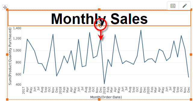
Add a Chart Title
To add a title above a chart, follow the steps below:
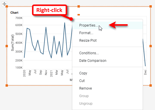
. Right-click on the chart and select ‘Properties’. Note: You can also access menu options from the ‘More’ button () in the mini-toolbar. This opens the ‘Chart Properties’ panel.
+
-
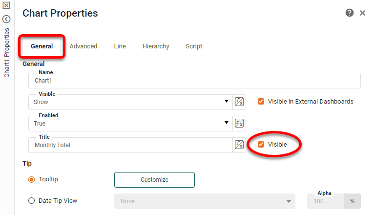
Under the General tab, enter the desired text for the 'Title' property.
-
Select the ‘Visible’ option next to the 'Title' property.
-
Press OK to close the panel.
-
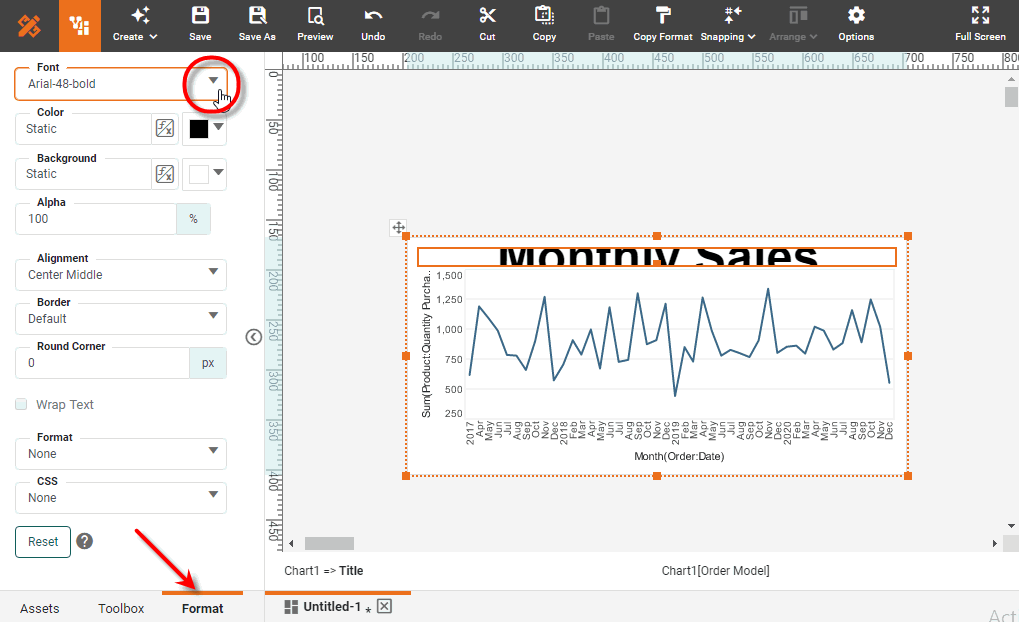
To format the title, click the title area to select it, and then select the Format tab in the left panel of Visual Composer. Use the formatting options to style the text as desired. (See Add Visual Format for more information.)
-
To increase the vertical space available for the title, drag down the handle under the title text.
See Chart Properties for full information about the ‘Chart Properties’ dialog box.
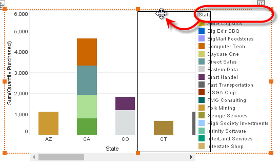
Modify Chart Legend
To edit a legend, right-click the legend, and select ‘Legend Properties’ from the context menu. This opens the ‘Legend Properties’ panel, which features the following tabs: General, Scale, Alias.
| To hide a legend, right-click the legend and choose ‘Hide Legend’ from the context menu. To show all legends, right-click the chart and select ‘Show Legend’ from the context menu. |
General Tab
The General tab offers the following options:
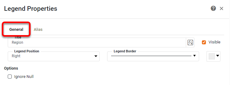
- Title
-
The text to display in the legend title bar.
- Visible
-
Sets the visibility of the legend title bar.
- Legend Border
-
The line style and color of the legend boundary.
- Legend Position
-
Sets the position of the legend on the plot. Legend position can also be changed by dragging with the mouse.
Watch Video: Creating a Chart (Change Legend Position)
This video might show an earlier version of the feature or operation that differs in minor ways from the current version.
- Ignore Null
-
Ignore null values when generating the legend.
Scale Tab
The Scale tab offer the following options.
| The Scale tab is available for measure (numerical) legends. |
Alias Tab
The Alias tab of the ‘Legend Properties’ dialog box allows you to change the labels displayed in the legend.
| The Alias tab is available for dimension (categorical) legends. |
To modify the labels of a legend, follow the steps below:
-
Right-click the legend, and select ‘Legend Properties’. Note: You can also access menu options from the ‘More’ button (
) in the mini-toolbar. This opens the ‘Legend Properties’ panel. -
Click the Alias tab. This displays a table containing the mapping between original legend labels and new legend labels.
-
Double-click the cells in the ‘Alias’ column that correspond to the legend labels that you wish to rename, and enter the desired replacement text.
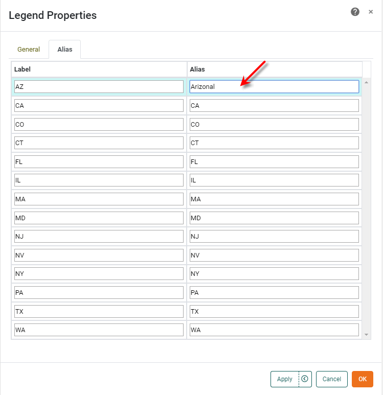
-
Press OK to close the panel. This updates the legend labels with the specified replacement text.
Adjust Chart Spacing
To change the vertical or horizontal spacing of elements on a chart, follow the steps below:
-
Right-click on the Chart and select ‘Resize Plot’ from the context menu. This will enable vertical or horizontal slider controls (as appropriate).
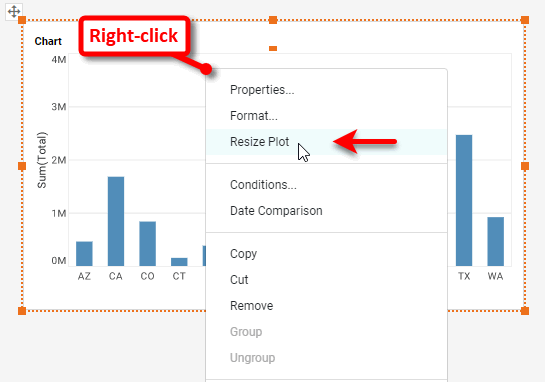
-
Drag the slider control to change the element spacing. The chart will automatically enable scroll bars as required to accommodate the new spacing.
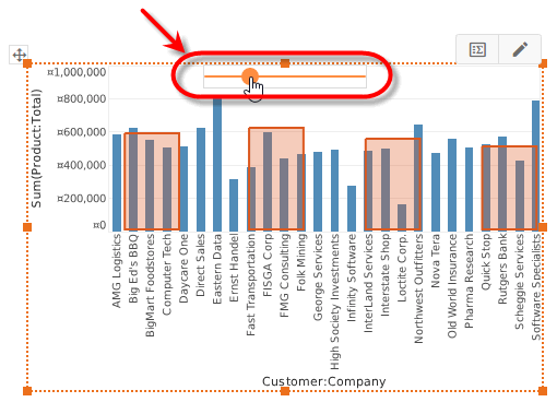
-
To reset the Chart to its original spacing, right-click on the Chart and select ‘Reset Size’ from the context menu.
The sample Census Dashboard (in the ‘Examples’ folder) provides an example of a chart that uses color and fill to represent dimensions and measures.
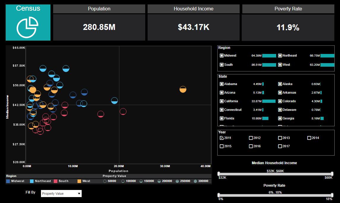
To explore this sample Dashboard, download and import the Census Dashboard into your environment. (This requires access to Enterprise Manager.) See Import and Export Assets for instructions on how to import.