Calendar Properties
|
The ‘Calendar Properties’ dialog box provides General, Data, Advanced, and Script tabs. The next sections discuss the component-specific properties available under these tabs.
General Tab
The General tab in the ‘Calendar Properties’ dialog box provides only the common general properties. See Common Properties.
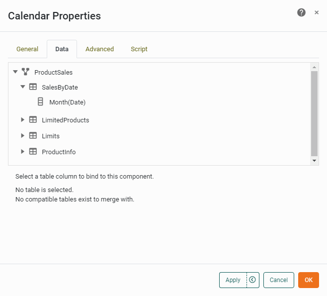
Data Tab
The Data tab in the ‘Calendar Properties’ dialog box allows you to choose the date field on which Calendar selections operate. Only columns with date formatting are displayed.
Advanced Tab
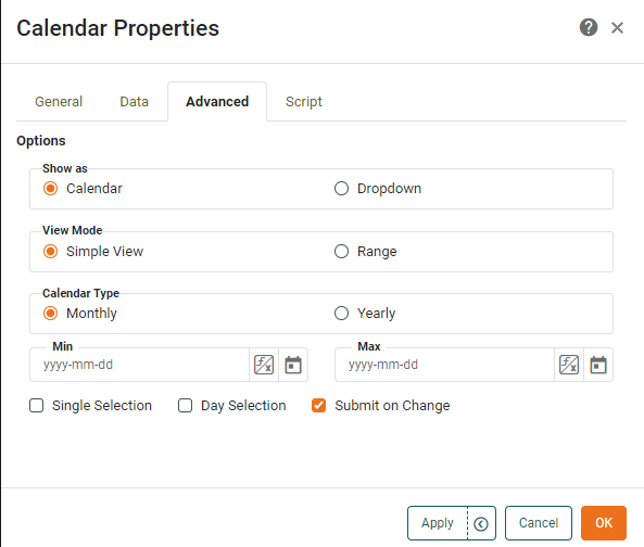
The Advanced tab in the ‘Calendar Properties’ dialog box provides the following Calendar-specific properties.
Properties that offer the ‘Value Type’ button  can also be set by the user (‘Variable’) or by scripted logic (‘Expression’). See Dynamically Set Properties for more information. can also be set by the user (‘Variable’) or by scripted logic (‘Expression’). See Dynamically Set Properties for more information.
|
- Show as
-
-
Calendar: Displays the calendar as a traditional wall calendar.
-
Dropdown: Displays the calendar as a drop-down list.
-
- View Mode
-
-
Simple View: Displays a single calendar unit.
-
Range: Displays two calendars side by side, facilitating range selection.
-
- Calendar Type
-
-
Yearly: Displays all twelve months in a single calendar.
-
Monthly: Displays a single month.
-
Day Selection: Enables selection of individual days on the calendar.
-
Single Selection: Prevents the user from selecting multiple date units on the Calendar.
-
- Min
-
Specifies the earliest date that can be selected on the Calendar.
- Max
-
Specifies the latest date that can be selected on the Calendar.
- Submit on Change
-
When enabled (default), submits the selected value immediately upon selection. Otherwise, a separate ‘Submit’ button is required.
Script Tab
See Script Tab for information about this common tab.