Add Tips to a Chart
| These features are available to both designers and end-users. |
The following sections describe two important ways to display helpful information on a Chart:
You can also use annotations to add information to Charts and other components, as well as to the Dashboard as a whole. See Annotate a Dashboard for more information. For other ways to explore your data, see Drill Down into Data.
Data Tip
| Data tips are also available for Crosstabs. (See Crosstab Properties.) |
When you hover the pointer over a data group on a Chart or Crosstab, the tooltip provides useful information about the dimensions and measures represented by the group.
What is a measure? What is a dimension?A measure is generally used for aggregation, for example summation, averaging, correlation, etc., within a Crosstab, Chart, Text component, or Gauge. Adding a measure to the ‘Y’ region in a chart displays the computed aggregates by using locations on the Y-axis. Adding a measure to the ‘X’ region displays the computed aggregates by using locations on the X-axis. You can also display aggregates by using color, shape, size, or label. A dimension is used to break-down the dataset into multiple groups, often within a Crosstab, Chart, or Selection List. Adding a dimension to the ‘X’ region of a Chart distinguishes the different dimension groups by location on the X-axis. Adding a dimension to the ‘Y’ region distinguishes the different dimension groups by location on the Y-axis. You can add multiple dimensions into the ‘X’ or ‘Y’ regions of a Chart, or into the ‘Rows’ or ‘Columns’ regions of a Crosstab, to create multiple grouping levels. You can also distinguish groups in a dimension by using color, shape, size, or label in a Chart. |
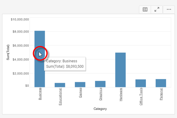
You can also choose to replace the tooltip with a data tip. A data tip displays information about a data group using another Dashboard component, such as Chart, Text, or Gauge (or a collection of such components). The data tip is dynamically filtered to show only data corresponding to the particular chart group on which you hover.
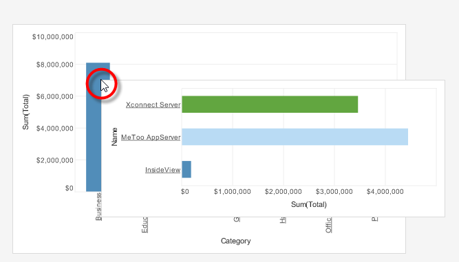
The data tip component and the component on which the data tip is displayed can be based on the same data block or on different data blocks. In the latter case, the data tip component is filtered based on any matching fields in the two data blocks.
| For a Table data-tip, enable ‘Shrink to Fit’ in the Table Properties to minimize the data-tip footprint. See Table Properties. |
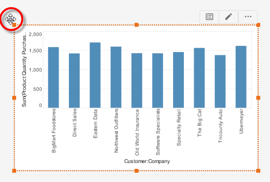
In this example, you will create a Chart that displays quantity purchased by company. When the user hovers the mouse over a given company, the Chart will display a Gauge as a Data Tip. This Gauge will display the average quantity purchased by the individual company.
-
Create a new Dashboard based on the ‘Sales Explore’ Data Worksheet. (See Create a New Dashboard.)
The 'Sales Explore' Data Worksheet can be found in . You may need to download the examples.zip file from GitHub into your environment. (This requires access to Enterprise Manager.) See Import and Export Assets for instructions on how to import. -
Drag a Gauge from the Toolbox panel into the Dashboard.
-
Configure the Gauge to display the average quantity purchased. Follow the steps below:
-
From the ‘Sales’ data block (top of the Toolbox panel), drag the ‘Quantity Purchased’ field onto the Gauge. This binds the Gauge to the data block.
-
Right-click the Gauge, and select ‘Gauge Properties’ from the context menu. Note: You can also access menu options from the ‘More’ button (
 ) in the mini-toolbar. This opens the ‘Gauge Properties’ panel.
 -
Under the General tab, change the ‘Name’ property to “QuantityGauge”.
-
Set the following limits: ‘Maximum’=200, ‘Minor Increment’=10, ‘Major Increment’=25.
-
Under the Data tab, select ‘Count’ from the ‘Aggregate’ menu. This will allow the gauge to display the number of records (orders) for each company.
-
Press OK to close the ‘Gauge Properties’ panel.
-
Resize the Gauge to be about half the default size.
-
-
Drag a Chart element onto the Dashboard. Press the ‘Edit’ button
 at the top right corner of the chart to open the Visualization Recommender. Press the ‘Full Editor’ button at the top right of the Recommender to bypass the Recommender and open the Chart Editor.
 -
Make the following selections:
-
From the ‘Dimensions’ node, drag the ‘Company’ dimension to the ‘X’ region.
-
From the ‘Measures’ node, drag the ‘Quantity Purchased’ measure to the ‘Y’ region. This creates a chart that displays quantity purchased for each company.
-
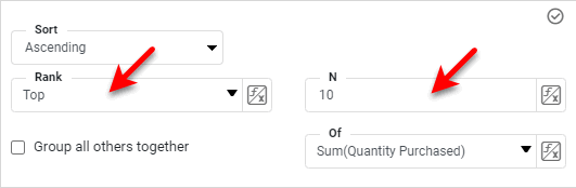
Press the ‘Edit Dimension’ button
 , and use the ‘Ranking’ option to display only the top 10 companies. Press the ‘Apply’ button
  .
.
-
Press the ‘Finish’ button
to close the Editor.
-
-
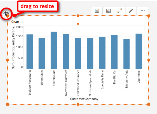
Resize the chart as desired.
-
Right-click the Chart, and select ‘Properties’ from the context menu. Note: You can also access menu options from the ‘More’ button (
) in the mini-toolbar. This opens the ‘Chart Properties’ panel.-
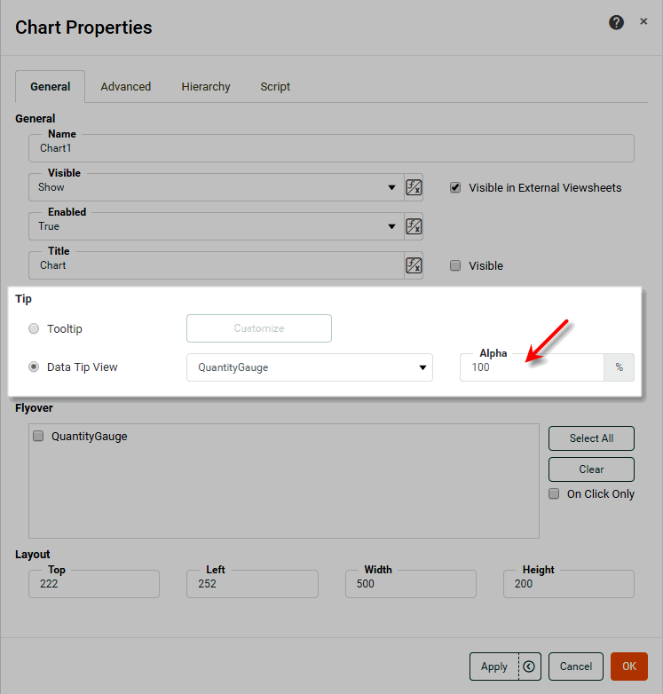
Under the General tab, select ‘Data Tip View’. From the adjacent menu, select the ‘QuantityGauge’ component.
-
To adjust the transparency of the data tip component (Gauge), enter a value in the ‘Alpha’ menu (or choose one of the preset values). A value of 0% indicates complete transparency; a value of 100% indicates complete opacity.
-
Press OK to close the ‘Chart Properties’ panel.
Data tips are not active in the design view. Preview the Dashboard to see them. -
-
Press the ‘Preview’ button
 to preview the Dashboard, and hover the mouse over different companies in the Chart to view the corresponding Data Tip (i.e., number of orders).
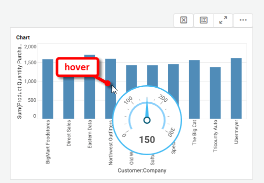
The data tip Gauge is not displayed as part of the Dashboard layout. The Gauge appears only when you hover the mouse over one of the companies in the chart, and it displays only the data for that particular company.
| You can use a single component in both a data tip view and a flyover view (see Drill Down into Data). If you designate a data tip component for flyover duty, the component always remains visible on the Dashboard. |
The sample Executive Sales Summary Dashboard provides an example of using data tips.
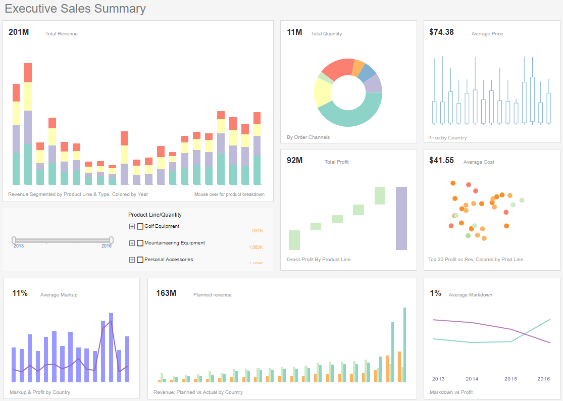
To explore this sample Dashboard, download and import the Executive Sales Summary Dashboard into your environment. (This requires access to Enterprise Manager.) See Import and Export Assets for instructions on how to import.
Custom Tooltip
Watch Video: Creating a Chart (Customize Tooltip)
This video might show an earlier version of the feature or operation that differs in minor ways from the current version.
You can create a custom tooltip by using HTML markup to style the tooltip text for Chart, Text, Gauge, and Image components. The tooltip can incorporate data values in java.text.MessageFormat format.
To create a custom tooltip, follow the steps below:
-
Right-click the Chart, Text, Gauge, and Image component, and select ‘Properties’ from the context menu. Note: You can also access menu options from the ‘More’ button (
) in the mini-toolbar. This opens the ‘Properties’ panel. -
Select the General tab.
-
Select the ‘Tooltip’ option, and press the Customize button. This opens the ‘Customize Tooltip’ dialog box.
-
To hide the tooltip entirely, select the ‘None’ option.
-
For a Line or Area type chart, select ‘Combine tooltips from different lines’ to display a single tooltip with details from all lines. (The amount of data displayed will be limited by available space in the tooltip.) Otherwise, the tooltip displays details only for the line to which the user points.
-
Select the ‘Custom’ option, and enter the desired tooltip markup into the edit box. The names and indices for the data fields are listed at the bottom of the dialog box. You can insert a value into the tooltip by using either the index or the field name within curly braces, e.g.,
{1}or{Sum(Total)}. You can mix indices and names within a single tooltip. For Text, Gauge, and Image components, there is just a single value available, represented by{0}.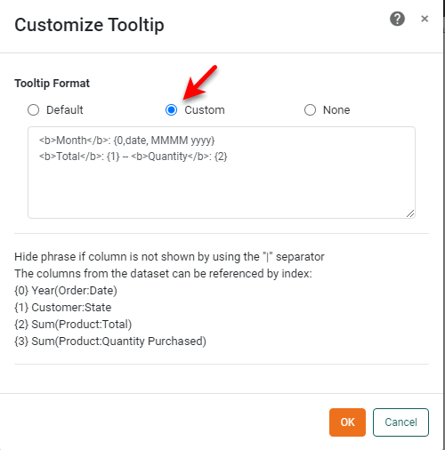
For example, the following tooltip options are equivalent for the fields shown in the Chart dialog box above:
Example 1. Custom tooltip using indexes<b>Month</b>: {0,date, MMMM yyyy} <b>Total</b>: {1} -- <b>Quantity</b>: {2}Example 2. Custom tooltip using field names<b>Month</b>: {Month(Date),date, MMMM yyyy} <b>Total</b>: {Sum(Total)} -- <b>Quantity</b>: {Sum(Quantity Purchased)}If you expect end-users to make changes to the Chart using the Ad Hoc Editing feature, you should use field names rather than indices. Indices may not work as expected after a user makes ad hoc changes to the Chart. See Chart Properties to enable or disable the Ad Hoc Editing feature. You can use HTML tags to style the text (e.g.,
<b>,<i>,<u>,<font>) and to create line breaks (<br>), etc. Use java.text.MessageFormat to format the inserted data. See Add Data Format for more information about the format masks (#,0,MMM, etc.).Example 3. Insert HTML and formatting instructions<b>Date</b>: {0, date, MMM-yy} <b>Sales</b>: {1, number, $#,###.00}For Charts that contain multiple measures, you can restrict the tooltip to display information only about the measure to which the user points. To do this, enclose any line of the tooltip that you want to make conditional within two
|(pipe) symbols.This does not apply to Gauge, Text, and Image components. Example 4. Conditional tooltipDate: {0, date, MMM-yy} |Quantity: {1, date, MMM-yy}| |Sales: {2, number, $#,###.00}|The above tooltip will display the “Date” line for all measures. The ‘Quantity’ line and ‘Sales’ line of the tooltip will display only when the user points at the corresponding measure (‘Quantity’ or ‘Sales’, respectively) on the chart.
-
Press OK to save the custom tooltip.
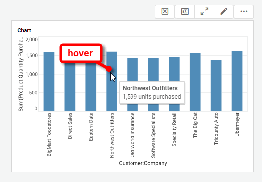
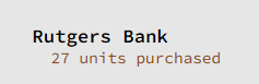
In this example, you will create a Chart that displays quantity purchased by company. When the user hovers the mouse over a given company (e.g., “Rutgers Bank”), the Chart will display a tooltip similar to the following:
Follow the steps below:
-
Create a new Dashboard based on the ‘Sales Explore’ Data Worksheet. For information on how to create a new Data Worksheet, see Create a Data Worksheet.
The 'Sales Explore' Data Worksheet can be found in . You may need to download the examples.zip file from GitHub into your environment. (This requires access to Enterprise Manager.) See Import and Export Assets for instructions on how to import. -
Drag a Chart element onto the Dashboard.
-
Press the ‘Edit’ button
at the top-right to open the Visualization Recommender. Bypass the Recommender by pressing the ‘Full Editor’ button at the top right. This opens the Chart Editor. -
Make the following selections:
-
From the ‘Dimensions’ node, drag the ‘Company’ dimension to the ‘X’ region in the Chart Editor.
-
From the ‘Measures’ node, drag the ‘Quantity Purchased’ measure to the ‘Y’ region. This creates a chart that displays quantity purchased for each company.
-
Press the ‘Edit Dimension’ button
, and use the ‘Ranking’ option to display only the top 10 companies. Press the ‘Apply’ button .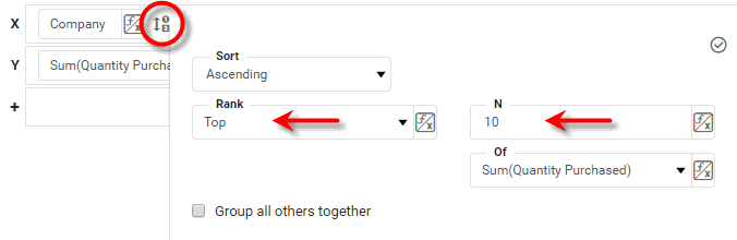
-
Press the ‘Finish’ button
to close the Editor.
-
-
Resize the chart as desired.
-
Right-click the Chart, and select ‘Properties’ from the context menu. Note: You can also access menu options from the ‘More’ button (
) in the mini-toolbar. This opens the ‘Chart Properties’ panel.-
Under the General tab, select the ‘Tooltip’ option, and press Customize. This opens the ‘Customize Tooltip’ dialog box.
-
Select the ‘Custom’ option and enter the following in the text field:
<b>{0}</b><br />{1} units purchased -
Press OK to close the ‘Customize Tooltip’ dialog box, and press OK again to close the ‘Chart Properties’ dialog box.
-
When you hover the mouse over the bars on the chart, you will now see the custom tooltip you specified.