Table Properties
|
The Table component’s ‘Properties’ panel provides General, Advanced, and Script tabs. The next sections discuss the component-specific properties available under these tabs.
General Tab
In addition to the common properties, the General tab in the ‘Table Properties’ panel provides the following properties.
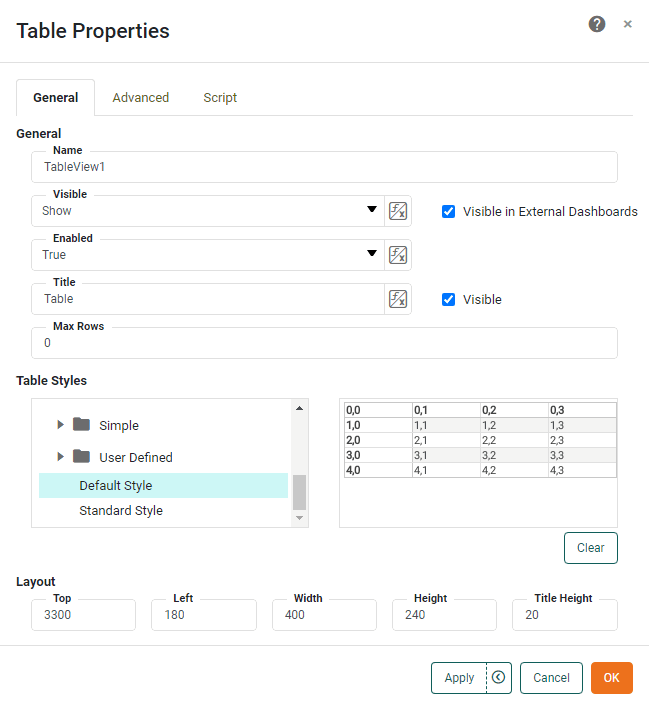
- Table Styles
-
A table style is a set of predefined formats (fonts, alignments, backgrounds etc.) that is directly applied to any table. The ‘Table Styles’ panel provides access to a Style Library containing a large number of predefined table styles. To select a table style, expand the desired category node (e.g. ‘Grid’, ‘Columns’, ‘Rows’, etc.) and click on one of the styles. A preview is of the style is displayed on the right side. See Create a Table Style to create a custom style.
Advanced Tab
The Advanced tab in the ‘Table Properties’ panel provides the following Table-specific properties:
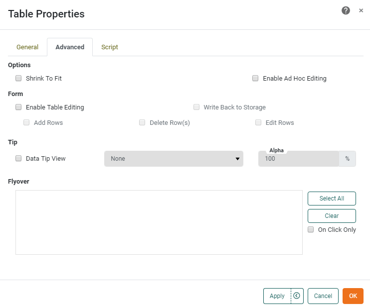
- Shrink to Fit
-
When enabled, this reduces the height of the table to match the number of records displayed, and allows final column width to be set manually. For example, if the original table height (as designed) was 10 rows, and the user then makes selections which restrict the result set to five rows, the table’s bottom border will retract or “shrink” to eliminate any empty rows at the bottom of the table.
- Enable Table Editing
-
This option allows users to modify an Embedded Table by inserting, removing, or changing data records. To perform validation checks on data entered by users, see Validate User Input. Modified table data can be stored across sessions in the Data Worksheet by setting the ‘Write Back to Storage’ option.
- Add Rows
-
Allows a user to add new rows to the table. To add a new row, the user should right-click a row in the table and select ‘Insert Row’ or ‘Append Row’ from the context menu to respectively add a row before or after the clicked row. Note: You can also access menu options from the ‘More’ button (
 ) in the mini-toolbar. Added rows are not retained across sessions unless they are saved to the Data Worksheet by setting the ‘Write Back to Storage’ option. See Validate User Input for information about validation.
 - Delete Rows
-
Allows a user to delete rows from the table. To do this, the user should right-click a row in the table and select ‘Delete Row’ from the context menu. Note: You can also access menu options from the ‘More’ button (
) in the mini-toolbar. Deletions are not retained across sessions unless they are saved to the Data Worksheet by setting the ‘Write Back to Storage’ option. - Edit Rows
-
Allows a user to edit data in the table. Edited data is not retained across sessions unless saved to the Data Worksheet by setting the ‘Write Back to Storage’ option. See Validate User Input for information about validation.
- Write Back to Storage
-
Allows user-modified data in an Embedded Table to persist across sessions by saving the modified data together with the underlying Data Worksheet.
- Data Tip View
-
A Dashboard component is displayed when mouse hovers over table area. The component is filtered based on the hover region. See Add Tips to a Chart for more details.
- Flyover Views
-
Allows you to select a set of Dashboard components which will be adaptively filtered as the user hovers the mouse or clicks on the table area. (Select ‘On Click Only’ if you want the filtered components to update when the user clicks.) If the table contains aggregated data, filtering is based on the grouping field dimension(s) in the row on which the user hovers or clicks. If the table contains detail data, filtering is based on the non-numeric columns in the row on which the user hovers or clicks. See Drill Down into Data for more details.
Script Tab
See Script Tab for information about this common tab.